
You can have the best product in the world, but nothing else matters if you don’t ask your prospects to make a purchase.
This blog post will share the best examples of call-to-action phrases and buttons across three key places: popups, email, and website.
By the end of reading this post, you’ll know how to write a winning call to action that drives massive clicks and conversions.

Call to Action Examples: What You Need to Know
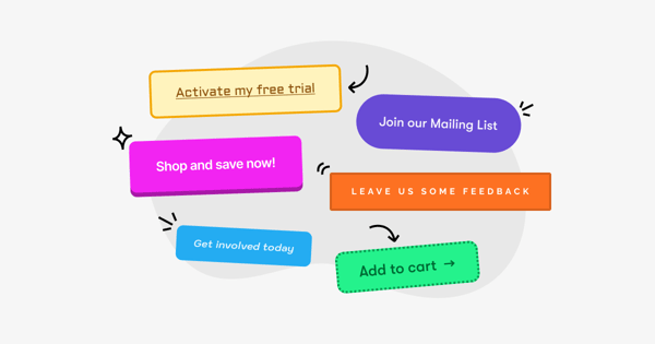
CTA Meaning: What Is a Call to Action?
A call to action (CTA) is a short piece of copy that prompts the reader to perform a desired action — such as clicking a link, joining a mailing list, downloading a piece of content, or adding an item to their shopping cart.
Calls to action can be found in various places, including product and checkout pages, onsite popups, and email newsletters. They come in three main flavors, namely text links…
%20Examples.png?width=638&height=441&name=The%20Body%20Shop%20Call%20to%20Action%20(CTA)%20Examples.png)
…CTA buttons…
%20Examples.png?width=604&height=302&name=Bonobos%20Call%20to%20Action%20(CTA)%20Examples.png)
…and plain text segments with no link:
%20Examples.png?width=553&height=247&name=ZBiotics%20Call%20to%20Action%20(CTA)%20Examples.png)
Whatever form they take, CTAs play a key role in the path to purchase, giving customers clear instructions on what to do next. With the right messaging and offer, a well-placed call to action can spark curiosity and urgency, prompting the reader to find out more (and, hopefully, make a purchase).
Most marketers will tell you to use CTAs sparingly—too many and you risk confusing your customers. Still, there are plenty of instances where you might want to add a primary and secondary call to action to an email or landing page, such as if you want to direct different audiences to different pages:
%20Examples.png?width=635&height=273&name=Shop%20Gender%20Call%20to%20Action%20(CTA)%20Examples.png)
(We’ll go through a bunch more CTA best practices later in this very article.)
Right, that’s enough theory.
Let’s take a look at 21 high-converting email, website, and popup CTA examples from some of our favorite brands…
Part 1. CTA Examples in Popups
Popups convert. We know that much. We found from our research that mobile popups outperform desktop popups by as much as 46.37 percent in some cases.
%20Examples.png?width=1954&height=1999&name=Which%20Converts%20Better%20Desktop%20or%20Mobile%20Call%20to%20Action%20(CTA)%20Examples.png)
But many brands rely on generic call-to-action copy including, but not limited to, “get updates” or worse, “subscribe.”
Wondering how to write a call to action for popups that grabs attention and guides the user along the path to purchase? Here are seven brands that get it right…
1. Claim Offer (Barkbox)
Popups are for more than email collection.
If you’re promoting an offer that deserves more than a line of copy in a popup, it’s better to guide visitors to a page where they can learn more.
Take Barkbox, for instance. The brand currently uses a slide-in on its homepage with a call to action titled“Claim Offer.”
%20Examples.png?width=1024&height=489&name=Barkbox%20slide%20in%20Call%20to%20Action%20(CTA)%20Examples.png)
Clicking the call to action takes you to a page where you can complete a form to get a free dog bed.
%20Examples.png?width=1024&height=489&name=Barkbox%20Personalization%20Form%20Call%20to%20Action%20(CTA)%20Examples.png)
Why We Love It
Using a word like “claim” implies rightful ownership, and that’s hard to say no to (especially when coupled with the word “offer”).
2. Get My 25% (Bombas)
One popular signup incentive for many retailers is to offer a discount to new visitors on their first purchase.
Here’s how it works:
A brand shows a popup asking for the visitor’s email address, and in return, offers a coupon that the visitor can redeem on a future purchase.
In the below example, Bombas offers 25 percent, using the call to action, “Get My 25%.”
%20Examples.png?width=1024&height=489&name=Bombas%20Popup%20Call%20to%20Action%20(CTA)%20Examples.png)
(You can replace the call to action copy with the value you’re offering, of course.)
Why We Love It
Using imperative verbs (like “Get”) with pronouns (like “My”) is a winning formula you can duplicate across your website popups.
3. I’m In (Glossier)
I’m writing this blog post during BFCM week.
And as such, brands try converting as many visitors as possible into subscribers to market to later via email.
One brand that’s doing that well is Glossier.
Here’s why:
Rather than invite you to “Join Our Newsletter,” Glossier informs you that it’s “getting ready for the Black Friday Sales, and you should too.”
%20Examples.png?width=1024&height=489&name=Glossier%20Newsletter%20Popup%20Call%20to%20Action%20(CTA)%20Examples.png)
To do that, all you need to do is enter your email, click “I’m in,” and Glossier will email you a “secret code.”
Why We Love It
I don’t know about you, but inviting me to participate in anything that implies exclusivity triggers my FOMO.
That’s more than enough to make me subscribe. And I’m betting I’m not the only one.
4. Join Now (Origins)
As we established above, many brands encourage opt-ins by offering a coupon to new website visitors.
If you enter your email address, we will offer you a discount on a future purchase.
And it makes sense.
But another, albeit equally effective, approach is to offer a discount as a by-product of joining a loyalty program.
Origins, for instance, offers 15 percent off your order when you join “My Origins Rewards.”
%20Examples.png?width=1024&height=489&name=Origins%20Rewards%20Popup%20Call%20to%20Action%20(CTA)%20Examples.png)
Why We Love It
If you have a loyalty program, consider promoting it in a popup and offering a coupon as an incentive to join.
Bonus points if you can expand on Origin’s example and convey the benefits of joining (beyond receiving a future purchase discount).
5. Shop [Gender] (Fabletics)
Like many brands, Fabletics’ marketing aims to turn as many visitors as possible into buyers.
To do that, the brand uses a quiz funnel to recommend the right product(s) to the right visitor.
But before doing that, the brand needs to know the visitor’s gender to guide them to the correct category page.
To determine the visitor’s gender, Fabletics uses a popup with two calls to action:
- Shop Men
- Shop Women
%20Examples.png?width=1024&height=489&name=Fabletics%20Shop%20Gender%20Call%20to%20Action%20(CTA)%20Examples.png)
Clicking either call to action takes the visitor to the correct category page, making it easier to purchase in less time.
Why We Love It
If you’re selling fashion and apparel and want to welcome new visitors, you can’t go wrong with “Shop [Gender]” as a call to action.
6. Sign Up (Cult Beauty)
One popup copywriting best practice is not writing a generic call to action like “sign up.”
But there are exceptions to the rule (or best practice, rather). One such exception comes from beauty retailer Cult Beauty.
%20Examples.png?width=1024&height=489&name=Cult%20Beauty%20Call%20to%20Action%20(CTA)%20Examples.png)
Why We Love It
Now, I’ll be the first to admit that “Sign Up” doesn’t exactly get me jumping at the chance to enter my email.
But the bullets that precede the call to action — especially the promise to receive expert advice — make opting in an absolute no-brainer.
Avoid using generic CTA copy where possible, but if copywriting isn’t your strong suit, throw in an offer new visitors can’t refuse.
7. Start Shopping (J. Crew)
Have you ever browsed a website and added an item to your cart only to learn that the brand doesn’t ship to your country at checkout?
I know I have. And it isn’t a fun experience.
So, if you ship worldwide, don’t be afraid to guide visitors if they’re coming from a foreign country.
In the popup below, US-based brand J. Crew offered me two calls to action:
- Either I could “Continue Shopping” on the Swedish version of its website; or
- I could click “Take Me to The U.S. Site.”
%20Examples.png?width=1024&height=489&name=J.%20Crew%20Localization%20Pop%20up%20Call%20to%20Action%20(CTA)%20Examples.png)
Why We Love It
It might not seem like much, but assuring visitors that they’re in the right place can make a big difference in how they view your brand.
Part 2. 7 Examples of Call-to-Action Emails
So, you’ve got visitors opting in through your popups and converting into email subscribers.
Congratulations! But you’ve got a long way to go.
You now need to turn those subscribers into prospects by gently nudging them to click through from your emails to your website. In short, you need to know how to write a strong email CTA.
Here are seven brands that will help you do that.
1. Activate Now (Green Chef)
If you offer monthly subscriptions, asking readers to “buy now” to activate them doesn’t always make sense. After all, what is the buyer getting in return? A monthly subscription?
Green Chef illustrates a better call to action by inviting readers to “Activate Now.”
%20Examples.png?width=750&height=662&name=Green%20Chef%20Green%20Monday%20Call%20to%20Action%20(CTA)%20Examples.png)
The brand promotes its Cyber Monday deal by offering subscribers ten free meals plus free shipping.
When the reader clicks the CTA, they arrive on a page (complete with a countdown timer) to specify which deal is right for them.
%20Examples.png?width=1024&height=561&name=Green%20Chef%20Box%20Personalization%20Call%20to%20Action%20(CTA)%20Examples.png)
If you’re selling a subscription, invite potential buyers to “activate” rather than “buy” to get started.
Why We Love It
The phrase “Activate Now” suggests the reader’s personalized subscription is ready to go at the click of a button, making the path to purchase seem straightforward and seamless.
2. Create Your Set (Bobbi Brown Cosmetics)
Black Friday is an opportune time to make more money from your audience.
But it’s not limited to limited-time discounts, as is commonplace in e-commerce.
In a recent email campaign, Bobbi Brown Cosmetics included an invitation to “Create Your Set.”
%20Examples.png?width=1024&height=625&name=Bobbi%20Brown%20Cosmetics%20Customize%20a%20Set%20Call%20to%20Action%20(CTA)%20Examples.png)
The brand offered a chance to customize a free five-piece set, complete with two full-sized products with any $50 purchase.
Why We Love It
Inviting the reader to create their set not only triggers intrigue (what’s included in the set?) but involves them in the buying process.
If you’re offering a bundle any time soon, you know who to turn to for inspiration.
3. Finish Checking Out (The North Face)
Cart abandonment is a nightmare for retailers. And while there are many reasons — couldn’t find a coupon code, long and confusing checkout — there’s one, albeit often overlooked one: the buyer simply got distracted during checkout.
It’s not that they’re no longer interested; they just need a gentle reminder to help them get back on track and complete their purchase.
Rather than offering a coupon — a homestay of the cart recovery email — consider inviting the buyer to “Finish Checking Out” as The North Face does in its email.
%20Examples.png?width=750&height=522&name=The%20North%20Face%20Cart%20Abandonment%20Popup%20Call%20to%20Action%20(CTA)%20Examples.png)
Why We Love It
(A personal highlight is the added scarcity of “Place your order before items sell out” to nudge the buyer to complete their order.)
Invite abandoned shoppers to “Finish Checking Out.” It won’t eliminate cart abandonment entirely, but it will help.
4. Shop [Blank] Gifts (Estée Lauder)
For many, buying a loved one a gift — come holiday-season or otherwise — is a hair-pulling experience.
Fortunately, many brands — including Estée Lauder — offer subscribers gift buying options, as seen in the example below. Over Christmas, the brand invited subscribers to gift loved ones “a festive fragrance set.”
%20Examples.png?width=1024&height=628&name=Est%C3%A9e%20Lauder%20Holiday%20Offer%20Call%20to%20Action%20(CTA)%20Examples.png)
Why We Love It
Given Estée Lauder’s invitation to buy its “best-selling scents,” it made sense to end with the fragrance-inspired call to action “Shop Fragrance Gifts.”
So, if you offer gift-buying options over the holiday season, consider inviting subscribers to “Shop [Product] Gift” to drive last-minute purchases.
5. Find Out More (The White Company)
While “Find Out More” might not feel like the most enticing call to action, it can work wonders when combined with an offer that inspires further reading.
Let me share a recent example. Over Christmas, I got an email from The White Company, promoting “Last-minute gifts delivered for the big day.”
%20Examples.gif?width=970&height=491&name=The%20White%20Company%20Build%20Your%20Gift%20Box%20Holiday%20Offer%20Call%20to%20Action%20(CTA)%20Examples.gif)
Why We Love It
For this offer, subscribers could create a premium gift box with a free gift message.
All subscribers had to do was click “Find Out More,” and the brand took them to a page where they could learn more about its gift boxes.
%20Examples.png?width=1024&height=561&name=The%20White%20Company%20Find%20Out%20More%20Page%20Call%20to%20Action%20(CTA)%20Examples.png)
Coupled with a well-made GIF showcasing the product, “Find Out More” is the perfect call to action for evoking curiosity and driving clicks.
6. Shop the Look (MAC Cosmetics)
I hate online shopping. Okay. That’s a lie. I don’t hate the shopping part — adding items to my cart and checking out.
What I hate is the browsing part. I don’t have the patience to browse endless pages, hoping to discover what I’m looking for.
Sometimes, I just want to be told what to buy. I want the brand to say, “Hey! You liked X, right? Well, you’ll love Y, too.”
Many brands, including MAC Cosmetics, are now using “trending” as a category to remedy that very problem.
In the example below, the brand promotes its olive suede product before inviting the reader to “Shop the Look.”
%20Examples.png?width=600&height=890&name=MAC%20Trend%20Email%20Call%20to%20Action%20(CTA)%20Examples.png)
Why We Love It
You can imagine a call to action like this working well for fashion and apparel brands. Feature a model wearing the latest trend, and then invite the reader to buy what they’re seeing.
Simple but effective.
7. Use Code [Code] (Kiwi Co.)
Giving buyers a coupon is common practice in e-commerce.
A website visitor enters their email in exchange for a coupon which is either revealed upon signup or in an email.
But discounts aren’t limited to capturing emails. Sometimes, offering a coupon is a way to fast-track activating buyers.
Here’s a nicely illustrated example from KiwiCo.
%20Examples.jpg?width=900&height=858&name=KiwiCo%20Subscription%20Offer%20Call%20to%20Action%20(CTA)%20Examples.jpg)
In a recent email promoting holiday savings, the brand included a coupon in its email, offering 60 percent off the reader’s first month.
(You’ll notice that, like many of the examples listed above, KiwiCo makes its CTA part of the image itself.)
Why We Love It
Similar to other examples we’ve looked at like “Create Your Set,” there’s something about “Use Code [Code]” that involves the reader.
You can’t help but click through and enter the code, if only to see how much you are eligible to save.
Part 3. 7 Website CTA Examples
You’re turning visitors into subscribers and inviting those subscribers to click through to your website with email campaigns.
Now there’s only one thing left to do: convert them into (returning) customers.
From call to action buttons to simple text links, here are seven onsite CTA examples to boost sales and revenue.
1. Add to Shopping Bag (Mytheresa)
While common, “Add to Shopping Bag” (or its variation, “Add to Cart”) is one of the most common calls to action you’ll see on a product page.
One brand that uses the “Add to Shopping Bag” call to action is Mytheresa.
%20Examples.png?width=1024&height=489&name=Mytheresa%20Add%20to%20Shopping%20Bag%20Call%20to%20Action%20(CTA)%20Examples.png)
Why We Love It
It’s easy to overcomplicate any copywriting-related task. But some CTAs are best kept simple — especially those related to high-value actions before and during the checkout process.
2. Add to Wishlist (Torrid)
Another call to action that is common, albeit less prominent, on a product page is “Add to Wishlist.”
Sometimes, it’s an anchor, as is the case in the above example, but more often, it’s represented as a heart, or written out, or both.
Here’s a good example from Torrid:
%20Examples.png?width=1024&height=489&name=Torrid%20Add%20to%20Wishlist%20Call%20to%20Action%20(CTA)%20Examples.png)
Why We Love It
Inviting a visitor to add an item to their wishlist allows retailers to:
- Collect the visitor’s email (wishlist require an account, which, in turn, requires an email to log in); and
- Give a reason for emailing (“An item you added to your wishlist is back in your size).
If you’re not using “Add to Wishlist” already, there’s no better time than now.
3. Find in Store (New Look)
Omnichannel marketing is a big part of the buying process today.
A buyer might browse an item on desktop, add it to their cart on mobile and forget about it, only to buy it in-store a day or two later.
With that in mind, it often makes sense for companies of a certain size to invite as New Look does.
%20Examples.png?width=1024&height=505&name=New%20Look%20Find%20in%20Store%20Call%20to%20Action%20(CTA)%20Examples.png)
Why We Love It
Like “Add to Wishlist,” “Find In Store” doesn’t need to be as prominent as “Add to Basket,” but it’s worth adding if you want buyers to enjoy a more omnipresent experience.
4. Find Your Size (Levi’s)
One reason for ecommerce returns, especially in apparel, is buying an item in the wrong size.
To combat that problem, many retailers invite visitors to find their correct size before purchasing the item.
One brand that does that well is Levi’s.
On its Levi’s Originals product page, the brand uses the call to action “Find the Right Size.”
%20Examples.png?width=1024&height=470&name=Levis%20Find%20the%20Right%20Size%20Call%20to%20Action%20(CTA)%20Examples.png)
Why We Love It
If you browse the page or others like it, you’ll notice that the call to action doesn’t detract from the page’s main call to action: “Add to Bag.”
If you want to minimize returns, you can’t go wrong with adding a call to action to “Find Your Size.”
5. Leave a Review (Bed Bath & Beyond)
It’s no secret that customer reviews influence our buying decisions.
In one study, nearly nine out of ten consumers said they read reviews before making a purchase.
%20Examples.png?width=1024&height=650&name=Oberlo%20Consumers%20Consult%20Reviews%20Online%20Before%20Making%20a%20Purchase%20Call%20to%20Action%20(CTA)%20Examples.png)
It’s no surprise, then, that many online brands invite previous buyers to leave reviews.
One such brand is Bed Bath & Beyond, with the call to action to “Write a Review” noticeable on many of its product pages.
%20Examples.png?width=1024&height=489&name=Bed%20Bath%20and%20Beyond%20Write%20a%20Review%20Call%20to%20Action%20(CTA)%20Examples.png)
There’s even an option to leave a review if you click “Reviews” first.
%20Examples.png?width=1024&height=489&name=Bed%20Bath%20and%20Beyond%20Reviews%20Call%20to%20Action%20(CTA)%20Examples.png)
Few buyers will return to a product page after purchase (unless they’re making a repeat purchase), so consider using email to invite previous buyers to leave a review.
Why We Love It
Adding a “Write a Review” CTA to your product page gives you an easy place to send customers post-purchase to leave a review.
Just point them in the direction of the relevant product page, tell them what to look out for, and they can instantly leave their thoughts and feedback.
6. Try It On (MAC Cosmetics)
Many brands are now experimenting with augmented reality commerce as a way to give potential buyers a more immersive buying experience.
One brand that’s doing that well, using a virtual try-on experience, is MAC Cosmetics.
If you browse one of its many product pages, you will see a call to action to “Try It On.”
%20Examples.png?width=1024&height=489&name=MAC%20Cosmetics%20AR%20Try%20it%20On%20Call%20to%20Action%20(CTA)%20Examples.png)
When clicked, you can choose “Live Camera,” “Upload Photo,” or “Choose a Model.”
%20Examples.png?width=1024&height=489&name=MAC%20Virtual%20Try%20On%20Call%20to%20Action%20(CTA)%20Examples.png)
Virtual try-on experiences are growing in popularity and are worth considering, especially if you’re in the cosmetics industry.
Why We Love It
Obviously, online shoppers can’t physically try a product before buying. So adding a virtual “Try It On” CTA is one way to remove a potential barrier to purchase.
7. Send as a Gift (Too Faced)
Not everyone who visits your website is a buyer. Sometimes, visitors are browsing for others.
For those visitors, it’s worth having a call to action specifically for them: “Send as a Gift.”
One brand that does that well is Too Faced.
%20Examples.png?width=1024&height=489&name=TooFaced%20Send%20as%20a%20Gift%20Call%20to%20Action%20(CTA)%20Examples.png)
When the visitor clicks “Send as a Gift,” there’s the option to add the recipient’s details.
%20Examples.png?width=1024&height=489&name=TooFaced%20Preview%20Smart%20Gift%20Call%20to%20Action%20(CTA)%20Examples.png)
There’s even a minor call to action in the form of a question mark to help visitors through the process.
%20Examples.png?width=1024&height=489&name=TooFaced%20Smart%20Gift%20Help%20Call%20to%20Action%20(CTA)%20Examples.png)
Why We Love It
Make no mistake, a call to action like this works well, but it works even better when combined with a well-written product recommendation email.
Call to Action Best Practices
You’ve seen some of our favorite CTA examples. Now let’s take a look at some tried-and-trusted best practices to help you write more impactful calls to action.
How to Write a Great CTA
Before adding yet another “Shop Now” CTA to your next email, landing page, or popup, consider these tips for how to write a call to action that drives real results…
Use Urgency
Instilling a sense of urgency in your CTAs is about compelling the customer to take immediate action.
Because if they don’t buy right now, they risk missing on your new product or limited-time offer.
In reality, most urgency-related messaging is totally artificial. Unless an important shipping deadline is approaching or a specific product is likely to sell out, there’s often no reason for the customer to purchase straight away (and they know that).
Still, if they’re visiting your website or reading your email newsletters, they’ve clearly got some interest in your brand. So a little urgency-infused messaging might be all it takes for them to convert.
Be Creative
If you’re a regular reader of the Drip blog, you might know we keep an email marketing swipe file containing newsletters from hundreds of our favorite ecommerce and DTC brands.
Want to know what proportion of emails sent in the last week contained the phrases “Shop Now” or “Buy Now”? More than one in three.
Don’t get me wrong; there’s nothing wrong with either of those CTAs. If they're genuinely the best option for your campaign, go for it—simple is often best.
But customers get bored easily. If they see dozens of “Shop Now” CTAs a day, the words quickly lose all meaning, so don’t be afraid to experiment with more creative phrasing.
(Hopefully, the CTA examples in this article have given you plenty of inspiration.)
Just remember to write from the customer’s perspective, because it’s far more personable.
That means lots of “you” and “your”, and not too much “we” or “our”. For instance, “Find your summer fit” is a whole lot more engaging than “Browse our new summer collection”.
Keep It Short and Sweet
Creativity is important. But at the same time, you shouldn’t overcomplicate things or get too wordy.
For starters, space is almost always at a premium where CTAs are concerned. Per the folks at Really Good Emails, the average length of call-to-action buttons is just 14 characters (or about three to five words), so this definitely isn’t the place for War and Peace.
%20Examples.png?width=480&height=427&name=Frequency%20of%20Character%20Length%20for%20a%20CTA%20Call%20to%20Action%20(CTA)%20Examples.png) Lengthy CTAs also feel less persuasive and, well, actionable. And honestly, if you can’t communicate the “goal” of your call to action in three-or-so words, your offer is probably too complex.
Lengthy CTAs also feel less persuasive and, well, actionable. And honestly, if you can’t communicate the “goal” of your call to action in three-or-so words, your offer is probably too complex.
While we don’t want to be too prescriptive, you should be able to fit most CTAs into one of these two classic formats:
- Verb + adverb (e.g. “Shop now”)
- Verb + possessive adjective + adverb (e.g. “Get yours here”)
Why start with a verb? Because they’re action words, and are therefore ideally suited to CTAs. We’ll give you some of our favorites later on, in the section on powerful call to action phrases.
Make Sure Your CTA Passes the Squint Test
The “squint test” is a quick way to assess the design of landing pages, emails, and other digital assets.
It works like it sounds: just squint your eyes, glance over whatever you're designing, and see which elements stand out.
Those areas to which your eyes are naturally drawn sit at the top of the page’s so-called “visual hierarchy”. You’ll want to incorporate your most valuable content — including your CTAs — in these high-traffic sections.
You should also consider getting someone else to look over your calls to action before setting them live. A second pair of eyes can help to weed out mistakes and highlight any confusing or ambiguous phrasing that might limit the effectiveness of your CTAs.
27 Powerful Call to Action Phrases
Before you start writing your next CTA, check out this list of call to action words, segmented across three common ecommerce goals: lead generation, engagement, and conversion.
| Lead generation | Engagement | Conversion |
|
|
|
Conclusion
I’ve covered a lot of good call to actions examples in this blog post. But ultimately, there’s no magic bullet to finding the perfect call to action. The best call to actions come from your own writing, testing, and above all, knowing your own customer.
A great CTA is only half the battle though. You could craft the best CTA in the world, and it doesn't mean anything if your customer doesn't see it. But combined with an excellent multichannel marketing approach? You'll be hitting them out of the park all day.
That's where Drip comes in, offering marketing automation that makes it easier to handle your most important channels from a single, easy-to-use platform. No more customers slipping through the cracks!
Try Drip free for 14 days and see for yourself just how easy it can be.

