"We need to send a newsletter this week."
Five words that send most ecommerce marketers spiraling into a blank-canvas panic.
You know you need to show up in the inbox. You know consistency matters. But beyond the occasional discount code or product drop, what are you actually supposed to send?
You're not alone in that feeling. The truth is, the best email newsletter examples rarely start with a template.
They start with a purpose. A reason to land in someone's inbox that goes beyond "it's Tuesday and we haven't emailed in a while."
So I went hunting.
I've collected 17 real newsletter examples from ecommerce brands that are doing it right, organized by purpose so you can find exactly what you need, whether that's launching a product, running a sale, building community, or driving cross-channel signups.
Each one includes a breakdown of what makes it work and how to apply it to your own sends.
We send a lot of emails at Drip, so we know what good looks like. More importantly, we know what converts. Let's get into it.

- 1. Estrid: Product Launch Newsletter
- 2. Caraway: New Arrivals Newsletter
- 3. Fussy: Back-in-Stock Newsletter
- 4. Billie: How-to Content Newsletter
- 5. Chamberlain Coffee: User-Generated Content Newsletter
- 6. Makesy: Success Story Newsletter
- 7. Kosas: Testimonial Newsletter
- 8. Bangn Body: Community-Driving Newsletter
- 9. The Sill: Seasonal Newsletter
- 10. Health-Ade: Round-up Newsletter
- 11. Dusen Dusen: Gift Guide Newsletter
- 12. Javvy Coffee: Sale Newsletter
- 13. Bite: Last-Chance Newsletter
- 14. Kirrin Finch: Sale Follow-up Newsletter
- 15. Huron: Upsell Newsletter
- 16. Grüns: SMS Newsletter
- 17. Maeve Chocolate: Survey Newsletter
- What the Best Email Newsletters Have in Common
1. Estrid: Product Launch Newsletter
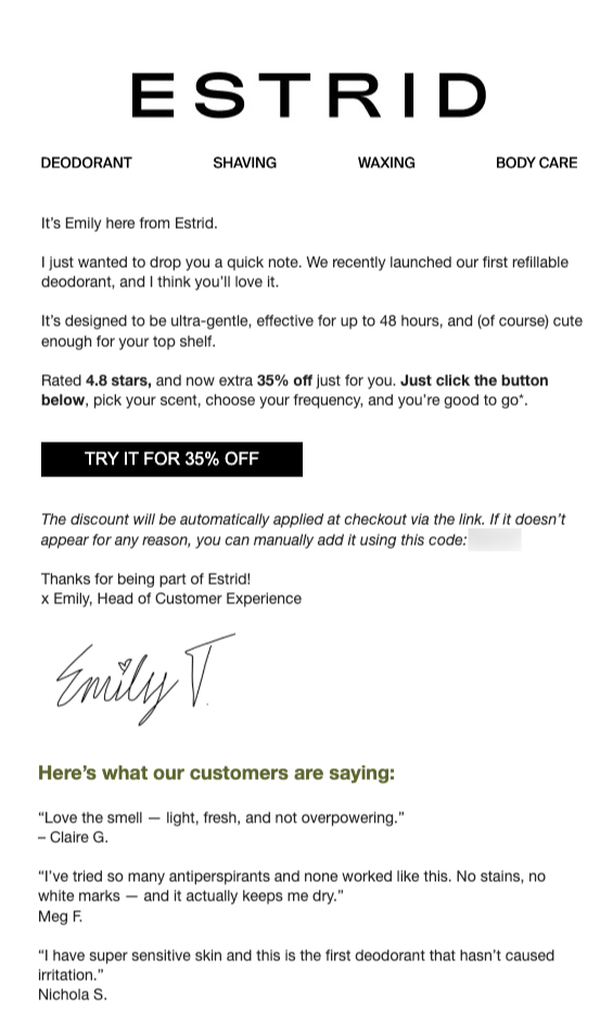
Estrid takes a completely different approach to launching a product.
No flashy design, no hero image, no bold graphics. Instead, it's a plain-text-style email written from "Emily, Head of Customer Experience" that reads like a personal note you'd actually want to open.
Emily introduces their first refillable deodorant in a few casual sentences, drops the key proof points (4.8 stars, 48-hour effectiveness, ultra-gentle), and offers 35% off with a single call to action. Below her handwritten-style signature, three customer testimonials reinforce the pitch without adding visual clutter.
2. Caraway: New Arrivals Newsletter
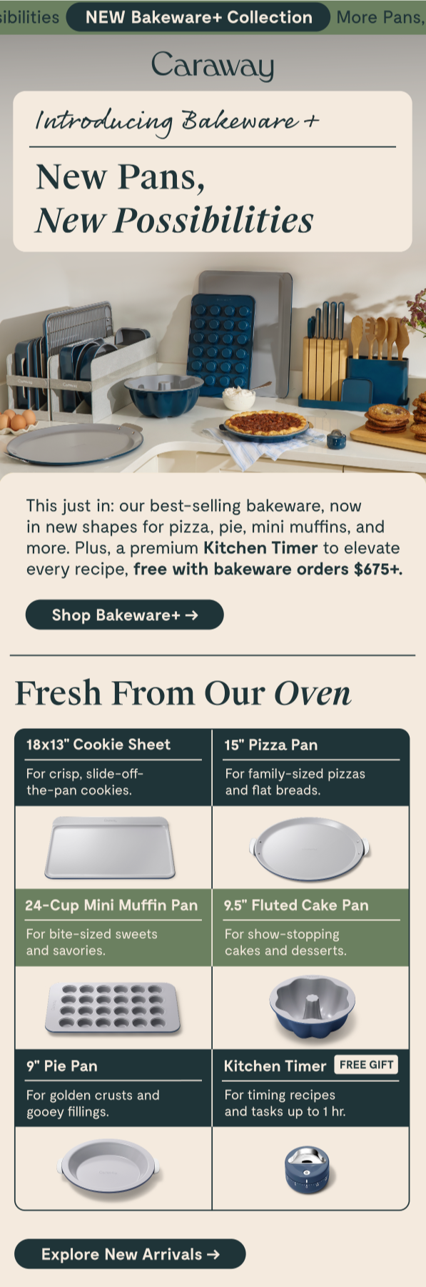
Caraway's Bakeware+ launch email showcases a multi-product collection without overwhelming the reader.
It opens with a lifestyle hero image, then transitions to a "Fresh From Our Oven" section that breaks every item into a clean two-column grid. Each piece gets a product name, a one-line use case description ("For crisp, slide-off-the-pan cookies"), and a product photo.
3. Fussy: Back-in-Stock Newsletter
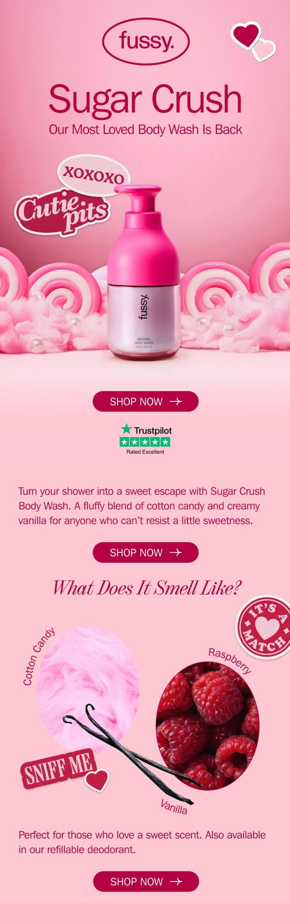
Fussy's "Sugar Crush" back-in-stock email is pure visual energy.
A massive hero section features the product name in oversized type, a Valentine's-themed pink palette, and playful sticker-style graphics. Below, a "What Does It Smell Like?" section breaks the scent into individual ingredients (Cotton Candy, Raspberry, Vanilla) with a collage-style layout.
4. Billie: How-to Content Newsletter
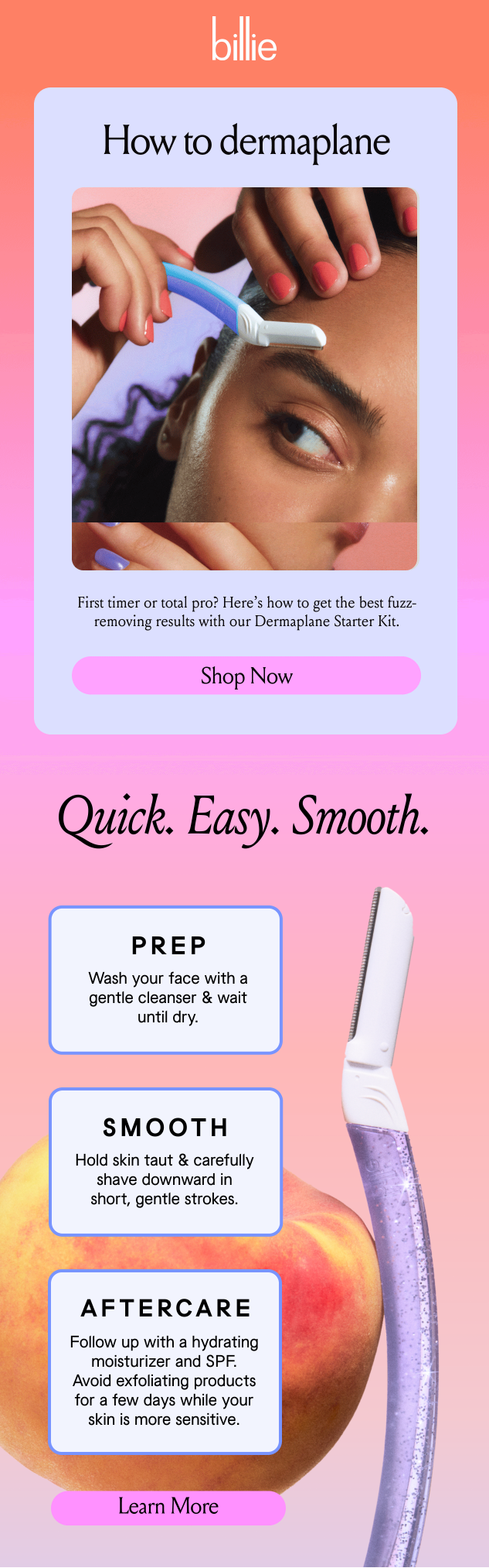
Billie's "How to Dermaplane" email teaches readers a beauty technique in three clean steps: Prep, Smooth, Aftercare.
The top half features a hero image with a CTA for the Dermaplane Starter Kit. The bottom half is the tutorial itself, laid out in three rounded cards with bold step headers and concise instructions.
5. Chamberlain Coffee: User-Generated Content Newsletter
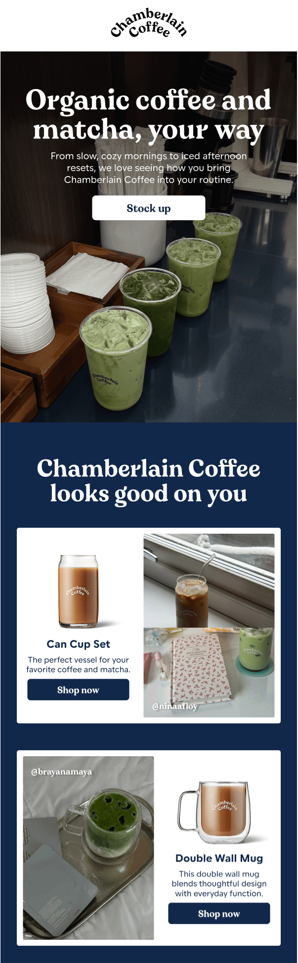
Chamberlain Coffee opens with "Organic coffee and matcha, your way," then pivots to real customer photos (with Instagram handles credited) paired alongside product shots and shop links.
The layout alternates between UGC photos on one side and product cards with CTAs on the other.
6. Makesy: Success Story Newsletter
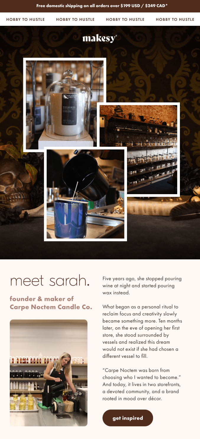
Makesy's email profiles Sarah, the founder of Carpe Noctem Candle Co., telling her story from pouring wax at night as a personal ritual to opening two storefronts. The copy is warm and specific, with a direct quote from Sarah anchoring the emotional payoff.
7. Kosas: Testimonial Newsletter
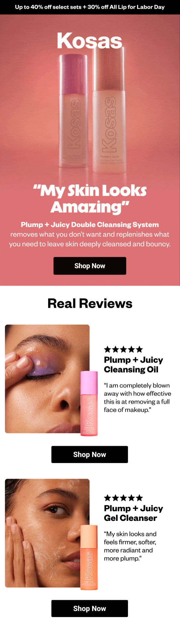
Kosas builds the entire email around a single customer quote: "My Skin Looks Amazing" in huge bold type over a pink hero section. Below, a "Real Reviews" section features individual five-star reviews for specific products, each paired with a close-up photo, review text, and a "Shop Now" CTA.
8. Bangn Body: Community-Driving Newsletter
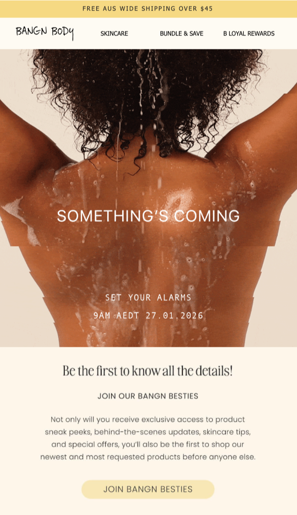
Bangn Body's email is a teaser, pure and simple.
"Something's Coming" in big serif type over a minimal hero image, with a specific launch date and time. The bottom half invites subscribers to "Join Our Bangn Besties," a VIP group that gets exclusive access to sneak peeks and early shopping.
9. The Sill: Seasonal Newsletter
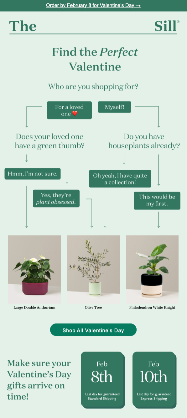
The Sill's Valentine's Day email uses an interactive decision-tree flowchart to guide gift selection. "Who are you shopping for?" splits into branches with follow-up questions that lead to specific product recommendations. Below, shipping deadline dates add urgency without feeling forced.
10. Health-Ade: Round-up Newsletter
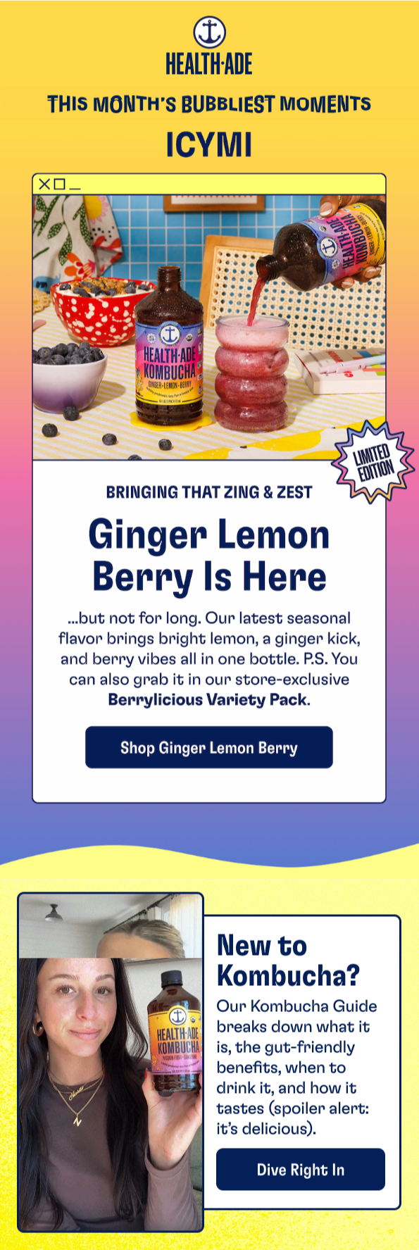
Health-Ade's "This Month's Bubbliest Moments, ICYMI" is a colorful monthly digest featuring a new seasonal flavor launch, a "New to Kombucha?" content block, and community moments. The "ICYMI" framing makes it feel casual and low-pressure.
11. Dusen Dusen: Gift Guide Newsletter
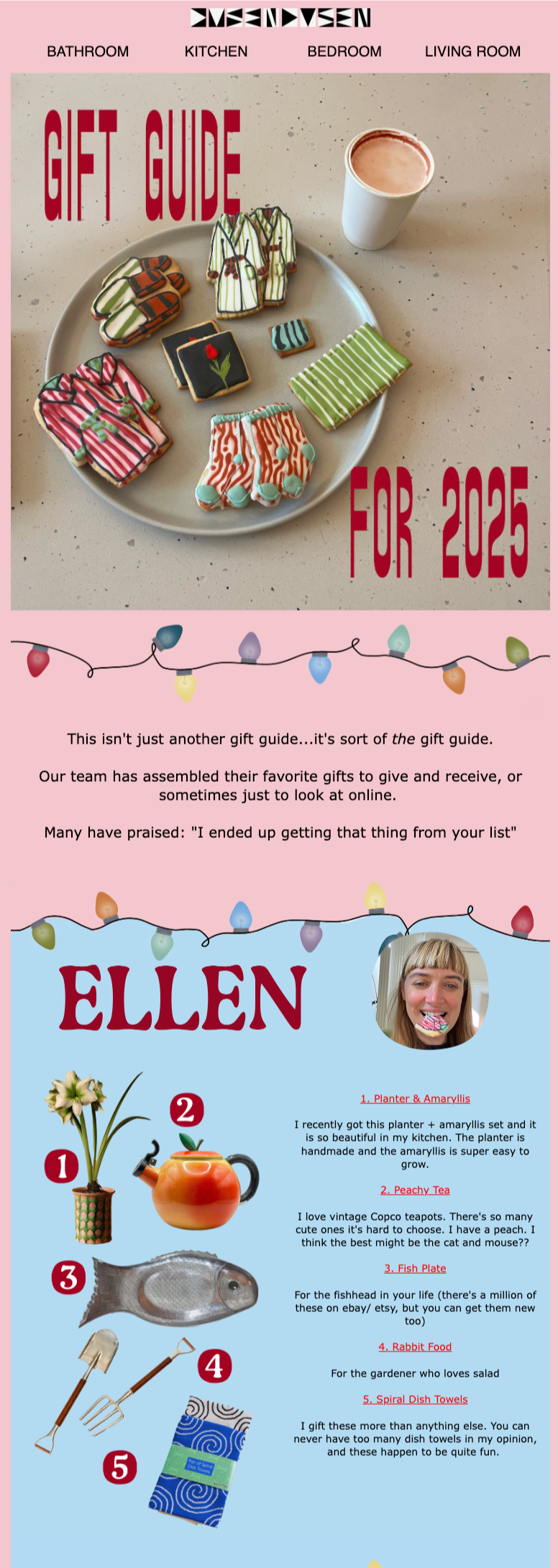
Dusen Dusen's gift guide goes full editorial with a staff picks format.
Individual team members share their personal top five items with photos, product names, links, and short personal notes. "For the fishhead in your life" is the kind of recommendation you'd actually trust.
12. Javvy Coffee: Sale Newsletter
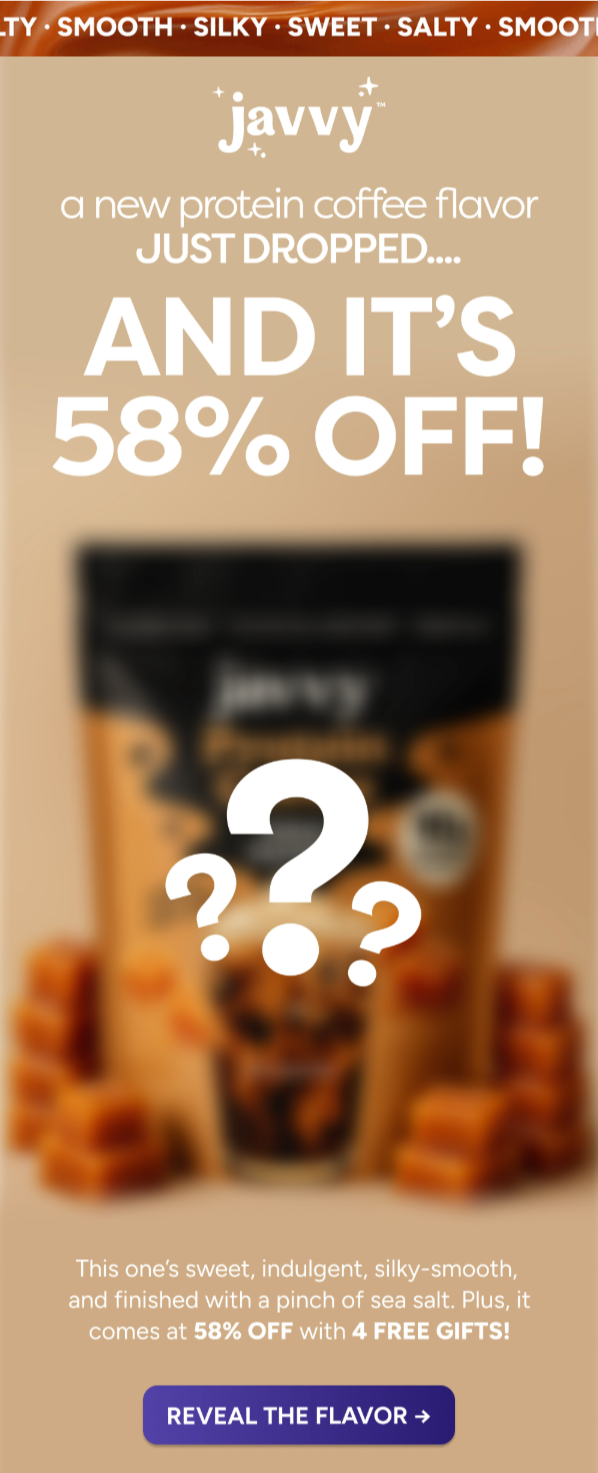
Javvy's email combines a new product drop with a steep discount: "A new protein coffee flavor JUST DROPPED... AND IT'S 58% OFF!"
But here's the twist: the product image is intentionally blurred with oversized question marks, turning the sale into a mystery reveal. The CTA is "REVEAL THE FLAVOR →".
13. Bite: Last-Chance Newsletter
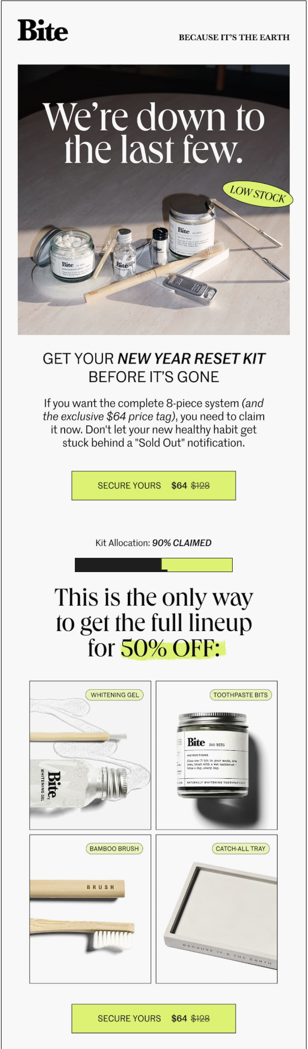
Bite's "We're down to the last few" email layers multiple urgency signals.
The hero shows the New Year Reset Kit with a "LOW STOCK" badge. The standout element is a "Kit Allocation: 90% CLAIMED" progress bar that visually shows scarcity.
14. Kirrin Finch: Sale Follow-up Newsletter
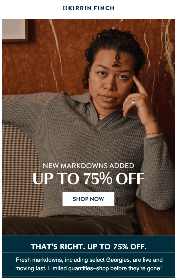
Kirrin Finch's follow-up is direct and bold: "NEW MARKDOWNS ADDED, UP TO 75% OFF" overlaid on a lifestyle portrait.
The copy mentions new additions and limited quantities. The entire email is one image, one message, one CTA.
15. Huron: Upsell Newsletter
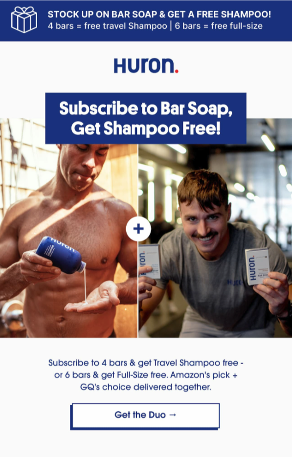
Huron's upsell email is built around a simple bundle offer: "Subscribe to Bar Soap, Get Shampoo Free!"
The offer structure is tiered (four bars gets you a free travel shampoo, six bars gets you a free full-size), and the email name-drops Amazon's pick and GQ's choice as credibility anchors.
16. Grüns: SMS Newsletter
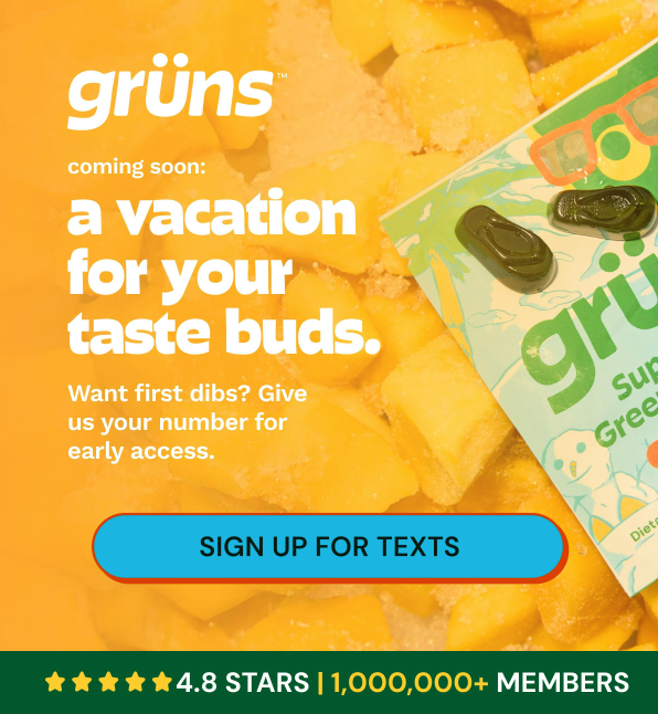
Grüns uses an email to drive SMS sign-ups for an upcoming product launch.
"Coming soon: a vacation for your taste buds" teases a new product without revealing it, and the CTA is "SIGN UP FOR TEXTS" in exchange for early access. One ask, one CTA, no distractions.
17. Maeve Chocolate: Survey Newsletter
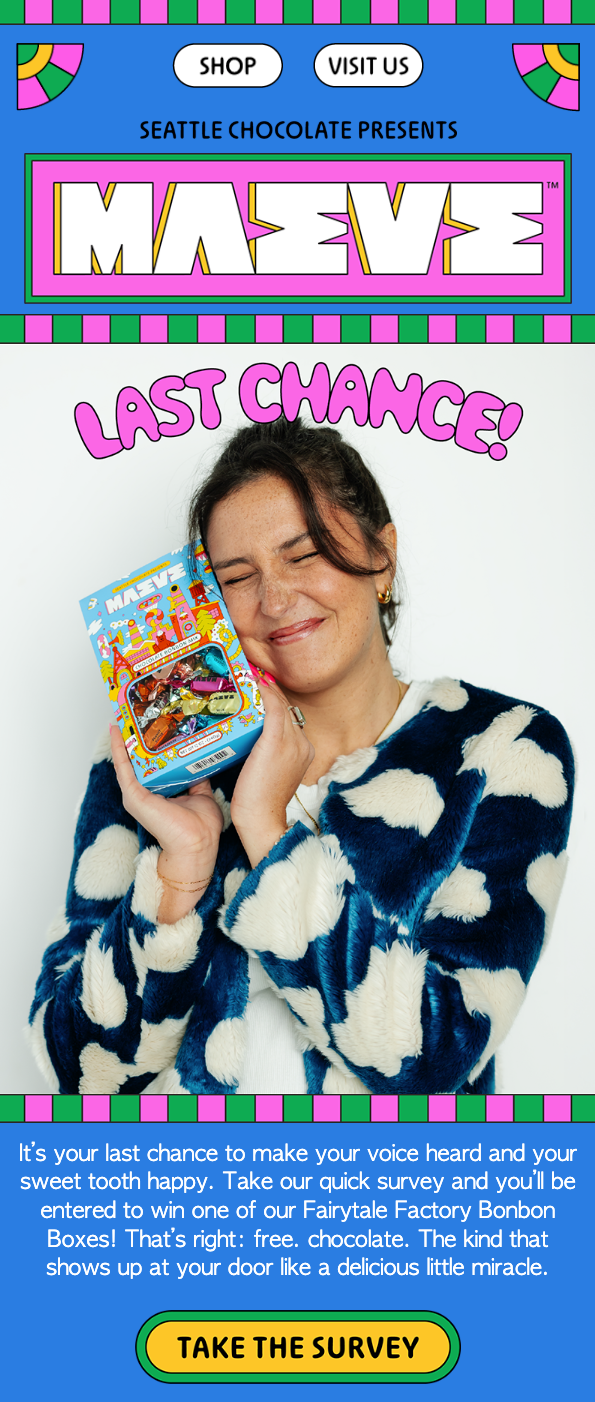
Maeve Chocolate's survey email is unmistakably on-brand: loud, colorful, irreverent.
The pitch? Take a quick survey and enter to win a Fairytale Factory Bonbon Box. The copy leans all the way into playful: "That's right: free. chocolate. The kind that shows up at your door like a delicious little miracle."
What the Best Email Newsletters Have in Common
After breaking down all 17 of these email newsletter examples, the patterns become impossible to ignore. Here's what separates the newsletters people actually read from the ones they archive without a glance.
Every great email has a clear, single purpose
Not just "it's Tuesday."
Whether it's launching a product, building community, or driving a survey, the best ecommerce newsletters start with a reason to exist. Without that, even the most beautiful design falls flat.
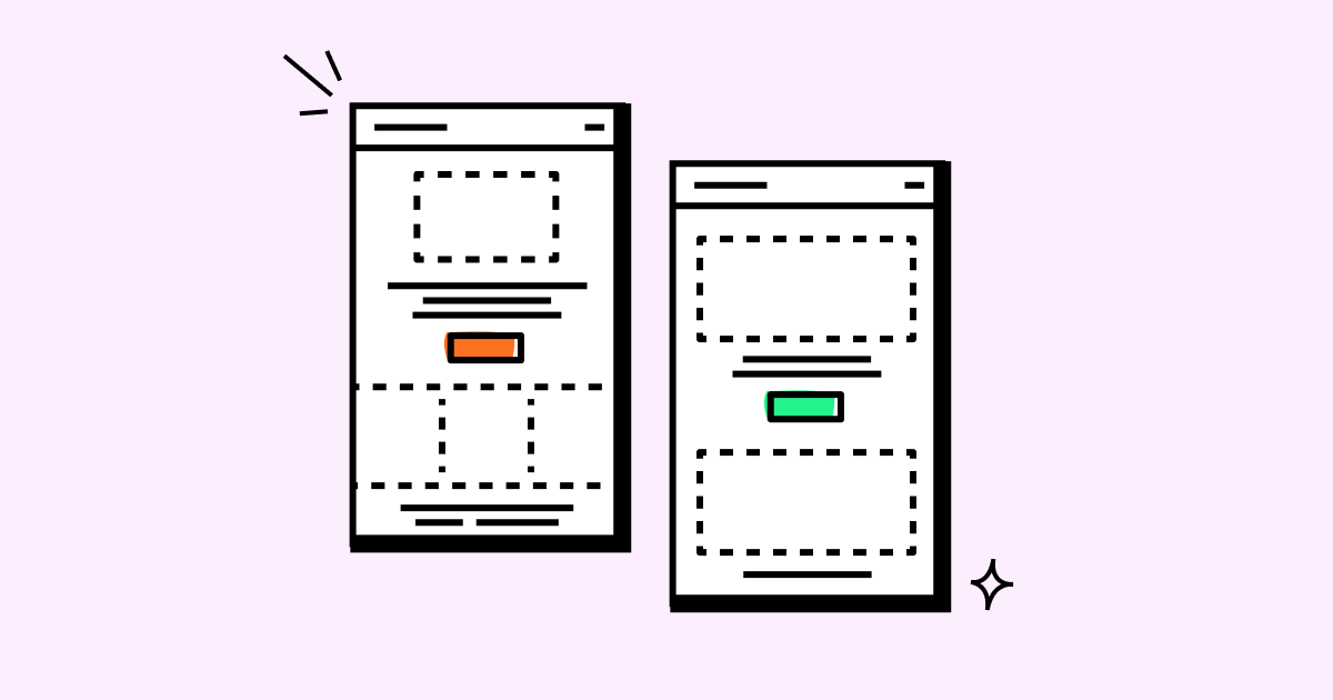
Design serves the content, never the other way around
Plain text can be just as intentional as maximalist pink. A muted palette can be just as strategic as bright yellows and blues.
Newsletter layout isn't about looking good in isolation. It's about making the message land faster. For design principles that convert, see our guide to email newsletter design best practices.
One primary CTA per email wins
Even roundup-style newsletters maintain a clear hierarchy.
When you give readers five competing links, they choose none. When you give them one obvious next step, they take it.
Consistent brand voice matters more than consistent design templates
Playfulness, calm sophistication, approachable expertise: each brand sounds like itself in every send. Your subscribers should be able to identify your email without seeing the logo.
The best emails add something beyond the product
- Education (teaching a technique)
- Community (VIP access, insider status)
- Entertainment (mystery reveals, playful copy)
- Inspiration (customer success stories)
Each one gives the reader a reason to care that goes deeper than "here's what we sell."
The good news
You don't need a massive design team to execute any of these.
What you need is a clear purpose for each send, an understanding of who you're sending to, and the right tools to personalize at scale.
That's where an ecommerce-focused platform like Drip comes in, with dynamic segmentation to target the right audience, workflow automations to trigger sends based on real behavior, and a visual email builder that lets you create these newsletter layouts without touching code.
The brands in this list aren't winning because they have bigger budgets. They're winning because they treat every email like it needs to earn its place in the inbox.
Start Building Better Newsletters Today
Great newsletters aren't about flashy design or clever copywriting tricks.
They're about sending the right message to the right person at the right time, with a clear purpose that respects your reader's attention.
You've just seen 17 email newsletter examples that prove it.
Product launches that feel like personal notes. Sale emails that lead with mystery instead of discounts. Survey asks that feel like games.
Every one of them started with a simple question: "Why should someone care about this email?"
If you're looking for a platform that makes it easy to build, automate, and personalize emails like the ones you just saw, give Drip a try.
It's free for 14 days, no credit card required.
You'll get the visual email builder, automation workflows, and segmentation engine you need to turn your newsletter from an afterthought into a revenue channel.