
I doubt there’s a single ecommerce company in the world that’s truly happy with its conversion rate.
According to IRP Commerce, conversion rates fluctuate throughout the year, but typically range from 1.5–2.5 percent:
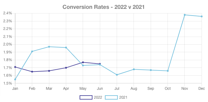 So on average, at best, you can expect to convert about one in 40 people who visit your website.
That’s… not great.
Say you wanted to drive an extra 1,000 transactions a month.
At a 2.5 percent conversion rate, that’d mean generating an extra 40,000 monthly visits.
Of course, if you could increase that rate to 5 percent, you’d hit your sales target with “only” 20,000 extra visits a month.
Which is why conversion rates are so important to direct-to-customer brands.
Many are already making smart use of onsite elements like popups and slide-ins to engage and convert potential customers.
Want to know how they’re doing it?
You’ve come to the right place, because I’ve looked at some of my favorite ecommerce websites and raided our own best practice vaults to find seven intelligent, high-converting onsite marketing examples.

Table of Contents
Example #1: Build Your Email List
First up, let’s discuss the most popular reason for adding popups and slide-ins to ecommerce sites: building an email list.
According to the latest figures from the Data & Marketing Association, email marketing delivers an estimated average return on investment of $35 for every $1 spent, while delivering an average customer lifetime value of more than $40.
So it stands to reason that D2C brands are desperate to get their hands on customers’ email addresses.
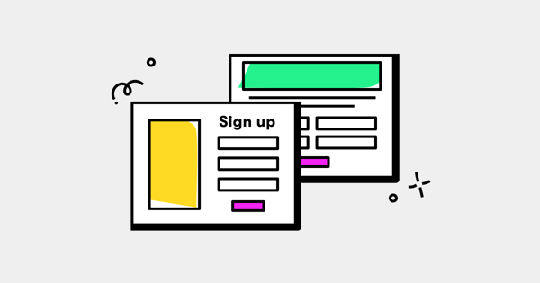
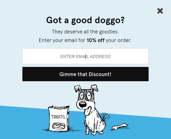
Email popups are one of the best solutions.
For the uninitiated, email popups are small forms that give website visitors an opportunity to submit their email address in exchange for a small but appealing gift.
They look a little like this:
 Used well, website popups can be extremely effective.
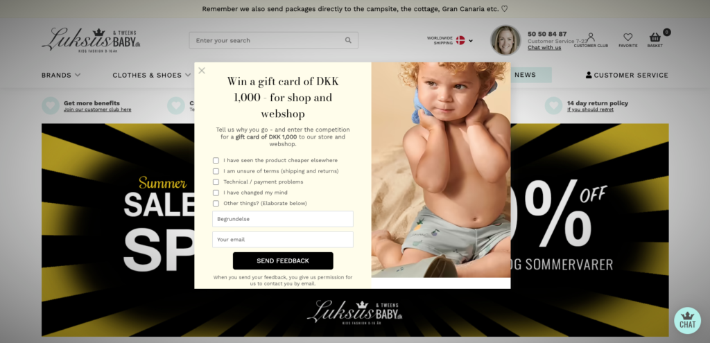
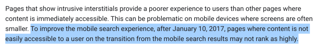
But if they’re hard to close or take up too much of the screen, they can also ruin the user experience—particularly on mobile. For that reason, Google announced back in 2016 that sites would be penalized for displaying “intrusive interstitials”.
 As a result, many websites have swapped traditional popups for “slide-ins”—literally popups that slide in from the left or right of the screen—to ensure users can still access on-page content.
Another approach—which we use on our blog articles—is to add a small, expandable popup that’s eye-catching but relatively unobtrusive, which means it doesn’t hamper the user experience (but still delivers results):
 Whatever tactic you use, the end goal is the same: giving website visitors a compelling reason to hand over their email address.
BarkBox does this by offering customers a discount on their next purchase in return for joining their email list:
 Once they’ve signed up, you can reach out via email with personalized recommendations, targeted offers, product launches, and other announcements designed to drive sales.
Example #2: Tackle Shopping Cart Abandonment
One of the most effective ways to boost your conversion rate is to cut down on cart abandonments.
You might think this isn’t a big problem.
Surely once someone’s added a product to their shopping cart, they’re basically guaranteed to purchase unless they encounter a major issue (like the website crashing)?
Unfortunately, you’re wrong.
According to the Baymard Institute, the average cart abandonment rate stands at 69.82 percent.
That means for every three customers who add a product to their shopping cart, two will bail out before converting.
What’s more, only a small proportion (13 percent) of cart abandonments are caused by website errors.
The biggest single factor—responsible for 48 percent of all abandonments—is the high price of unavoidable “extra” costs like shipping, fees, and taxes.
That’s why I love this popup from Kate Spade New York, which speaks directly to some of those extra charges:
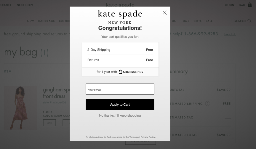 Thing is, these two “offers” were likely available anyway.
But by highlighting them via a popup, the brand ensures customers are aware that they won’t pay a cent for shipping or returns.
Which means there’s less chance of them abandoning the transaction.
Example #3: Drive Conversions From New Customers
If you can build a base of loyal customers, you’re far more likely to hit your business goals.
Three-quarters of consumers say they feel loyal to a particular brand or company, while half report going out of their way to buy from their favorite brands, according to research from Zendesk.
But if a customer is going to become loyal to your brand, they need to buy from you in the first place.
That’s why converting new customers is such an important goal for ecommerce companies.
One way to do this is by using popups to offer website visitors a discount on their first purchase, like in this onsite marketing example:
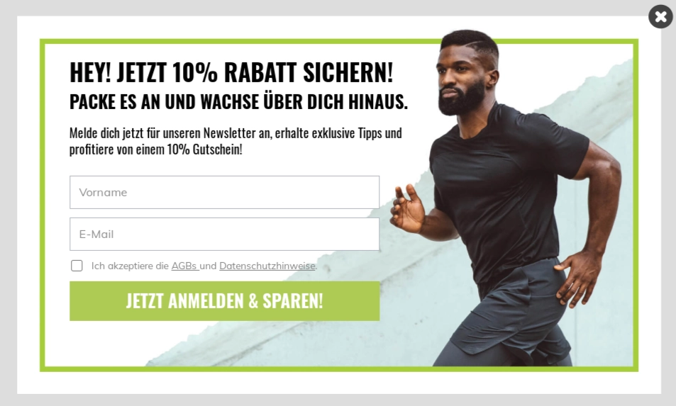 Combined with an email capture element, this approach—from German supplements e-tailer Brain Effect—offers a ton of value.
Not only does it help to boost conversions from new customers, but even if those customers aren’t ready to convert straight away, it still gives Brain Effect a fighting chance of capturing their email address.
Example #4: Boost Average Order Value
But new customers aren’t the only audience you should be incentivizing.
Another key metric for D2C brands is average order value.
The higher your AOV, the more revenue you’ll generate per transaction, which means you need less traffic to hit your revenue goals.
So it makes sense to encourage high-spending customers to complete their transactions.
There are various onsite marketing examples that show us how to do this.
One smart approach is to hit shoppers with a popup once they add a certain value of products to their shopping cart.
When they reach the threshold, you give them a discount, which makes it more likely they’ll complete the transaction:
 Another tactic is to target existing customers based on their previous buying behavior.
For instance, a customer might have bought from you multiple times before, spending around $100 each time.
In that case, it makes sense to reach them with a targeted popup offering them some money off if they spend just a little more—say, $130—on their next transaction.
They get a small discount; you get to boost your AOV. Everyone wins.
Example #5: Add Timers to Popups & Slide-Ins
This next tactic is less of a standalone best practice, and more of an add-on to the other onsite marketing examples in this article.
Before I explain it, I’m going to dig into some data.
We recently analyzed 1+ billion popup sessions from more than 3,000 customers.
In the process, we discovered that popups are more likely to convert when they include a countdown timer.
Much more likely.
Specifically, we found that campaigns without a countdown timer converted at a rate of 3.79 percent, while those containing a timer converted at 8.07 percent.
For all you non-mathematicians, that’s an increase of more than 110 percent.
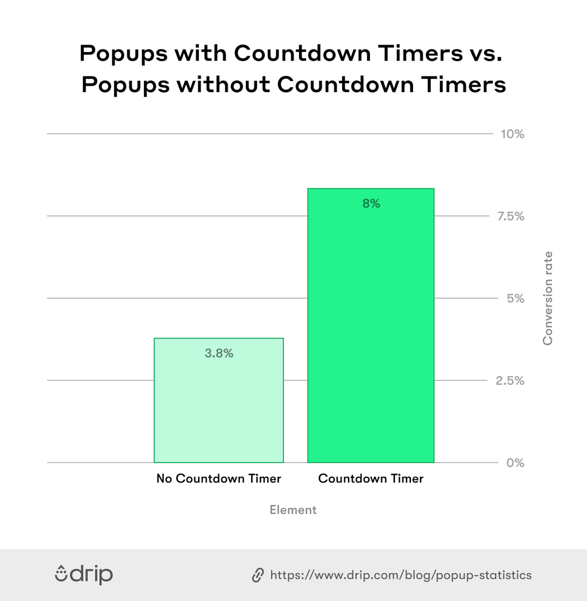 All that, just from adding a simple timer to your popups and slide-ins.
Why is this tactic so effective?
Because it plays on our natural fear of missing out.
If we think an attractive-sounding offer is going to pass us by, we’re much more likely to buy right now.
So consider adding a timer to your future campaigns to drive conversion rates, just like in this onsite marketing example:
 There’s nothing especially complex here.
It’s just a simple discount with a clear call to action, but the addition of a timer gives it far more immediacy.
However, it’s worth noting that timers should be used sparingly.
Sometimes, they’re just not going to be relevant.
For instance, if the purpose of your popup is simply to drive newsletter subscriptions, a timer likely isn’t going to be much help, because there’s no urgency to join an email list. It’ll still be there in a week, a month, and a year.
Reserve them for more timely campaigns, such as:
- Product launches
- Limited-time offers
- Key shopping dates, like Black Friday or Mother’s Day
Example #6: Use Multi-Step Forms to Enrich Lead Data
Sometimes, you want more than just a name and email address from new leads.
Wouldn’t it be great if you knew information like the types of products they were planning to buy, their date of birth, their favorite social media channels, and their budget for products like yours?
Unfortunately, (most) prospective customers will be put off if you ask for all that information upfront—even if you’re offering a small discount in return.
Our data shows that fields with up to two input fields convert at three times the rate of forms with three or more fields:
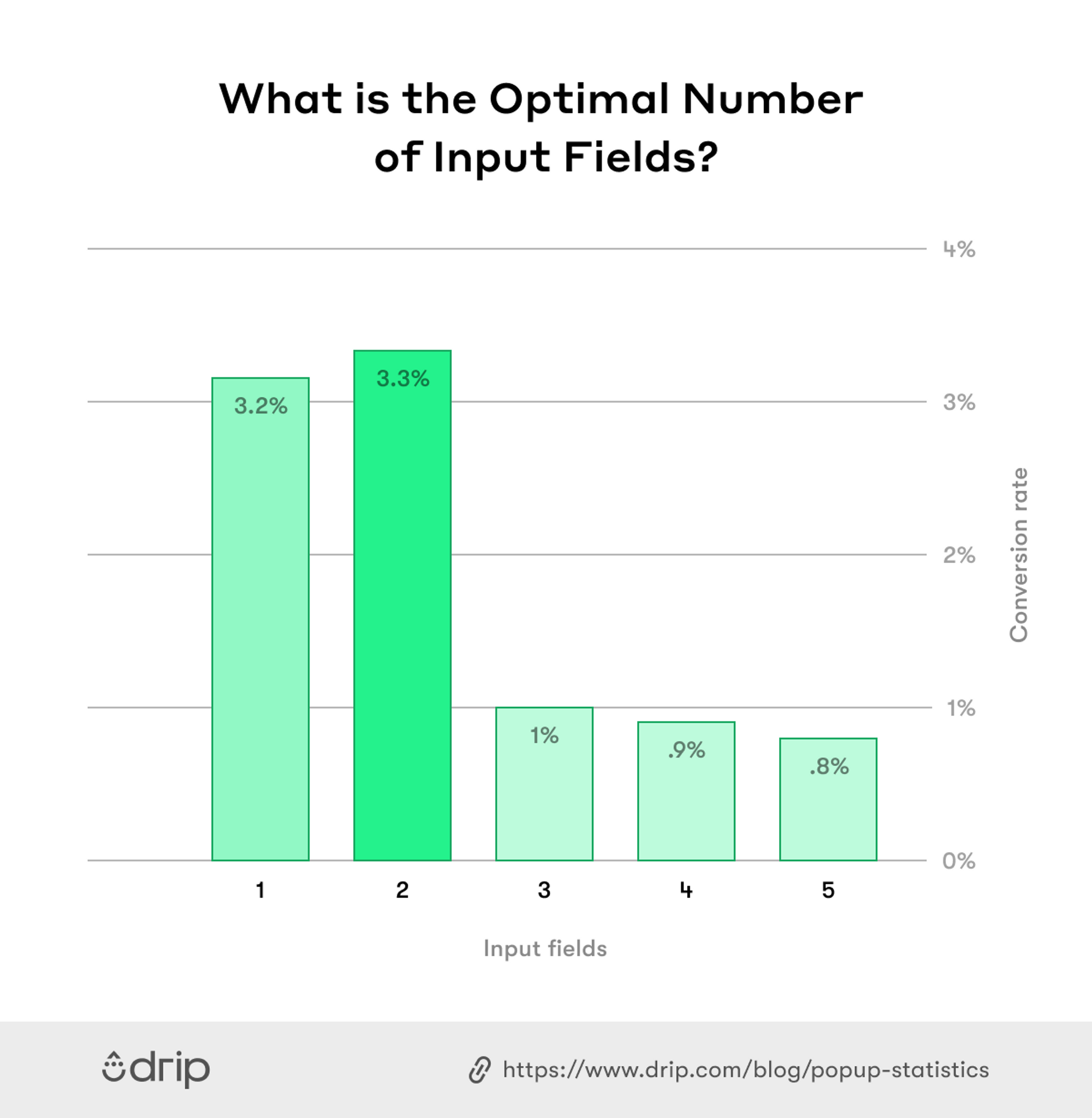 Just two fields? That doesn’t give you much scope for capturing additional information.
That’s why we recommend using multi-step forms rather than displaying a bunch of intimidating-looking fields on a single form.
Multi-step forms allow you to capture the visitor’s email address during the first “step” (we call this the “form”), then gather additional info in subsequent steps—without losing the email address if they bounce after step #1.
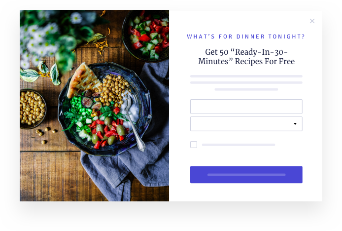
For example, let’s say you’re a D2C meal kit brand.
You want to use popups or slide-ins to learn new customers’ email addresses and dietary preferences.
You could ask for all that information upfront, like this:
 Or you could ask for the email address at step one, then capture all the extra detail in the second step.
Simple, right?
But does it work?
According to our research, it does—in a big way.
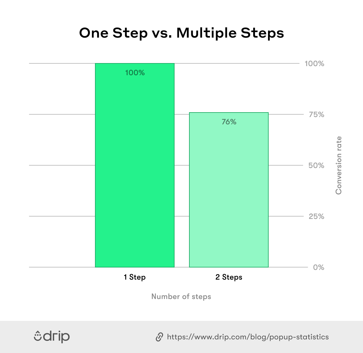
We looked at more than one million leads generated by a multi-step popup, then dug into how many of those leads went on to complete the second step.
It turns out that three-quarters of leads ended up submitting more information at step #2:
 And remember: for the quarter of leads who didn’t complete the second step, the brands in question were still able to capture their email addresses at step one.
So there’s really no downside here.
Example #7: Use Delay Triggers to Avoid Scaring Off Leads
We love popups and slide-ins at Drip.
But only when they’re used well.
Used badly, they’re a UX nightmare.
One of the biggest and most common mistakes is to hit website visitors with a popup the second they land on a page.
Before they’ve had a chance to confirm they’re in the right place, they’re being asked to sign up to an email list.
This approach is pretty much guaranteed to fail.
It’s only going to drive potential customers away.
For that reason, some brands add delay triggers to their popups and slide-ins.
Typically, they work in one of two ways:
- Timed triggers will only display once a visitor has spent a certain amount of time on a webpage.
- Scroll triggers appear once the visitor scrolls a certain way down the page.
Either way, the intention is the same: give your visitor the opportunity to engage with your content, then hit them with a compelling offer.
Makes sense, right?
But this approach still leaves you with the question: how much of a delay should you employ?
Fortunately, we can answer that for you:
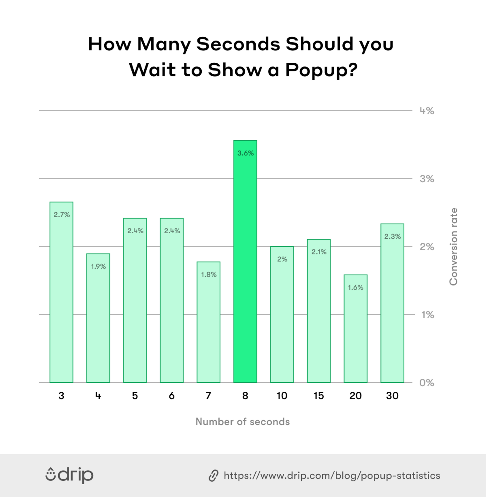
Best Timing for Timed Popup Triggers
Our research found that popups shown after eight seconds convert at a higher rate than popups shown before or after.
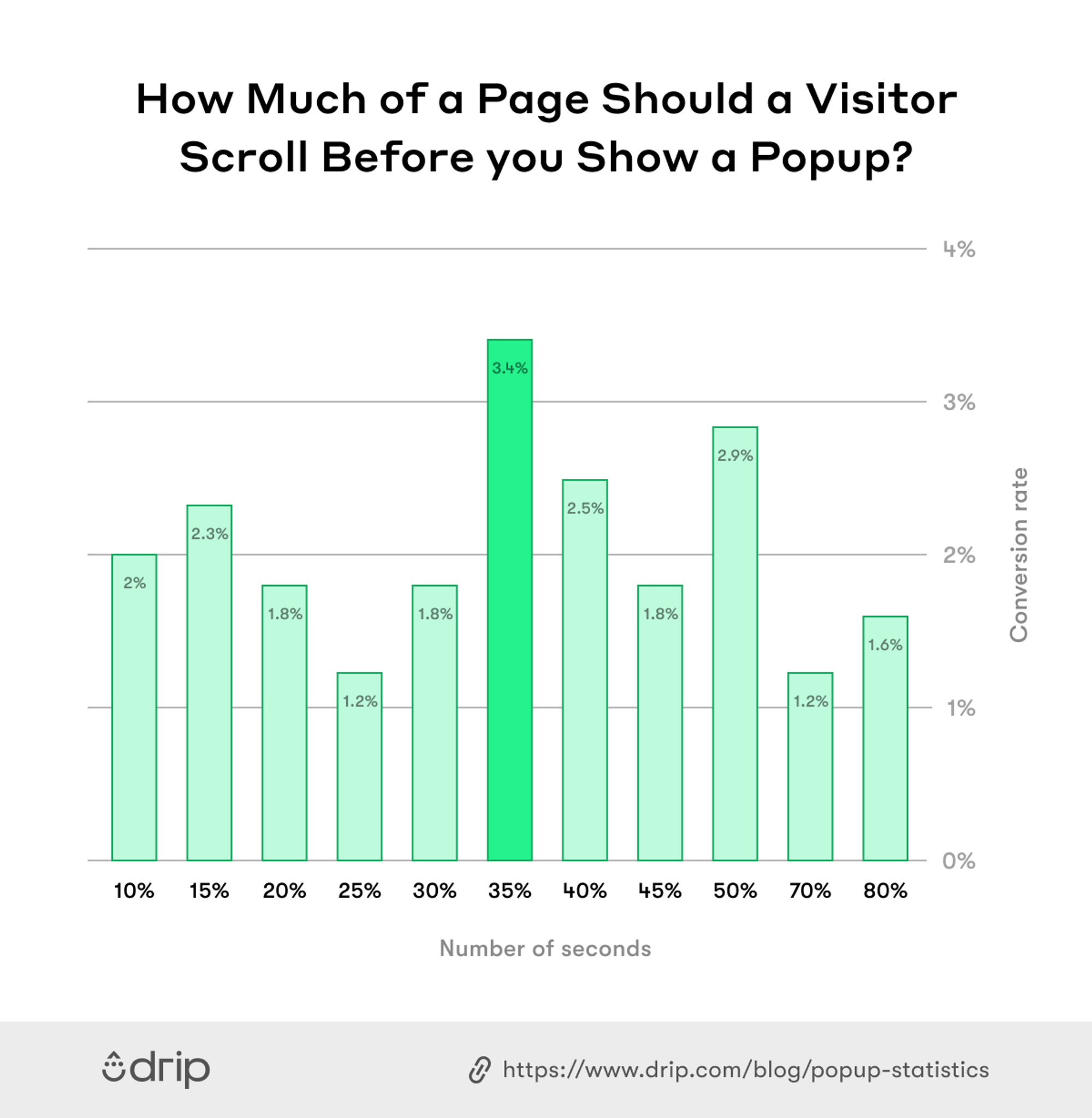
 Best Scroll Depth for Scroll Triggers
We found that popups shown after a visitor scrolls 35 percent of a page convert better than popups that are shown before or after.
Elevate Your Onsite Marketing With Drip
As you can see from these onsite marketing examples, brands that make smart use of popups and slide-ins can expect to generate more leads, grow traffic to their websites, and boost conversions.
But that stuff isn’t easy—if it was, everyone would do it.
That’s why you need Drip.
Our tools make it simple to build on-brand forms and popups in a matter of seconds.
Start with our engaging templates and customize to your heart’s content—from buttons to fonts to imagery—without having to type a single line of code.
Try Drip for free by signing up for a free 14-day trial (no credit card required).

