

E-commerce success involves several different factors. You need a fast loading site, professional design and of course products worth buying.
But one area that’s incredibly important, yet sometimes overlooked is website navigation.
You need to ensure that users have a smooth, fluid, friction-free experience where they can seamlessly find what they want.
Research by eMarketer found that e-commerce customers spend an average of:
- 9.4 minutes during each visit on a desktop/laptop
- 7.5 minutes on a mobile phone
- 9.9 minutes on a tablet
And the average e-commerce conversion rate for sites across all industries is 1.6 percent.
Although these are solid numbers, there’s certainly room for improvement.
For this post, I’m going to focus exclusively on e-commerce website navigation—how to improve it, optimize it and perfect it.
I’ll also provide examples from brands that effective at it.
By using the strategies I highlight, you can create a better user experience to increase the average time spent on your site and, of course, your conversion rate.
Let’s get down to it.

Table of Contents
1. Develop a Logical and Relevant Homepage Design
2. Include Specific Product Categories in Your Main Navigation
3. Use the Right Number of Categories
1. Develop a Logical and Relevant Homepage Design
You have a very narrow window to impress visitors and grab their attention. So first impressions are crucial.
One of the biggest parts of making a great impression is quickly conveying what the heck your store is all about. If it’s not instantly obvious, you can run into trouble.
And this is a bigger issue than you may think.
“Forty-two percent of mobile e-commerce sites do not have a homepage design that enables users to accurately infer the type of site they’ve landed on,” explains the Baymard Institute.
Testing actually found that 70 percent of people scrolled up and down the entire homepage to “get an overview of their options” and figure out what the offerings were.
I don’t know about you, but that sounds like a recipe for disaster to me.
If visitors are unclear about what you’re selling and the overall theme of your site, it’s going to cause confusion.
And that’s the last thing you want when you’re trying to maximize conversions.
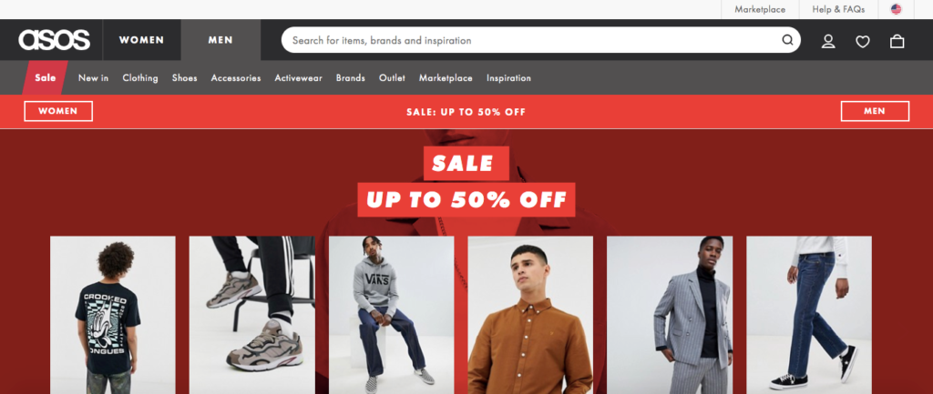
Here’s an example of an e-commerce site that hasn’t succumb to this simple mistake and does a great job at using a logical and relevant e-commerce homepage design—ASOS.
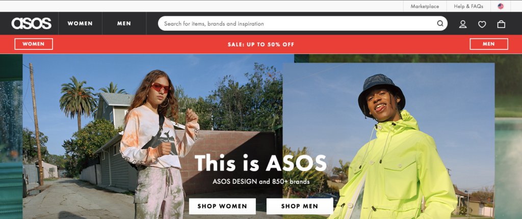
While the name itself doesn’t tell you anything, checking out their homepage quickly lets you know it’s a clothing fashion brand with both women’s and men’s apparel.
It’s a very simple homepage, where you scroll down only to find a footer, and that’s it.
In my eyes, that’s a good thing because it leaves very little room for confusion.
And while I’m certainly no fashion expert, I can tell by the somewhat offbeat clothing modeled on the homepage that the collection is probably a little unconventional and off the wall.
So it’s clothing that would be of interest to people with unique tastes.
The bottom line here is that your homepage design should be simple and straightforward, and visitors should understand what you’re offering without excessive scrolling.
Do that and you should be in good shape.
Further Reading
2. Include Specific Product Categories in Your Main Navigation
I see a ton of e-commerce sites that include broad categories in their main navigation such as products, catalog, deals, and so on.
Best Buy is a good example.
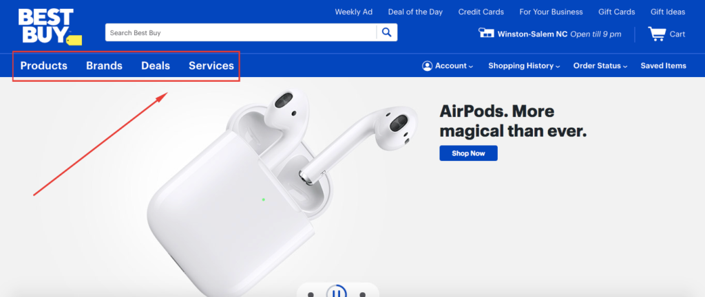
Although pointing visitors in the direction that they need can be helpful, it’s often insufficient.
Why?
Because it creates at least one other step in the navigation process before users can find what they’re looking for.
Known as solitary main navigation items, these require users to hover over something like a broad product or catalog category before seeing specific product categories.
Now I’m not knocking Best Buy’s website. It’s actually quite efficient. And their massive archive of products probably needs to start off with extremely broad categories.
What I’m saying is that this isn’t the approach most smaller e-commerce stores will want to take.
Large-scale usability testing found, “not displaying product categories directly in the main site navigation causes multiple and severe navigational issues for users.”
Setting it up so users can identify specific product categories in the main navigation at a glance is your ticket to smoother navigation and should encourage a higher percentage of people to fully explore your site.
Take, for instance, Herschel Supply Co., a brand that specializes in hipster retro backpacks and accessories.
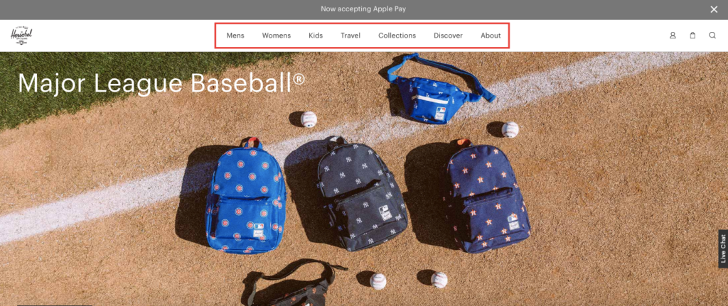
They feature super simple navigation where specific categories are displayed across the top header.
This prevents any ambiguity as to what’s being offered and eliminates a lot of confusion in terms of navigation.
Once someone hovers over a particular category, they’ll instantly see the full line of products that are available.
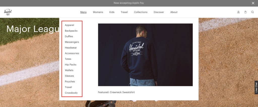
It’s simple and clean and reduces a lot of user frustration.
This brings me to my next point.
3. Use the Right Number of Categories
Another common mistake is having either too many or too few categories—something that’s especially problematic for mobile users.
“Thirty-eight percent of mobile sites have a category hierarchy that is either too deep, too shallow, or have overlaps that make it very difficult for users to grasp and navigate the site structure,” says the Baymard Institute.
Here’s the deal.
Having too few categories means users will have to hover over one category, then click through to another, then another and maybe even another. You get the idea.
But at the same time, forcing users to sift through too many categories can be equally as troubling.
They may be able to find what they need from the homepage with just a click or two, but a large number of categories is overwhelming.
“Both issues lead users into overly narrow category scopes without them fully realizing it—something that caused major detours during testing, and frequent site abandonments as the subjects (understandably but wrongly) perceived the site’s product selection to be too narrow.”
The trick here is to find the sweet spot.
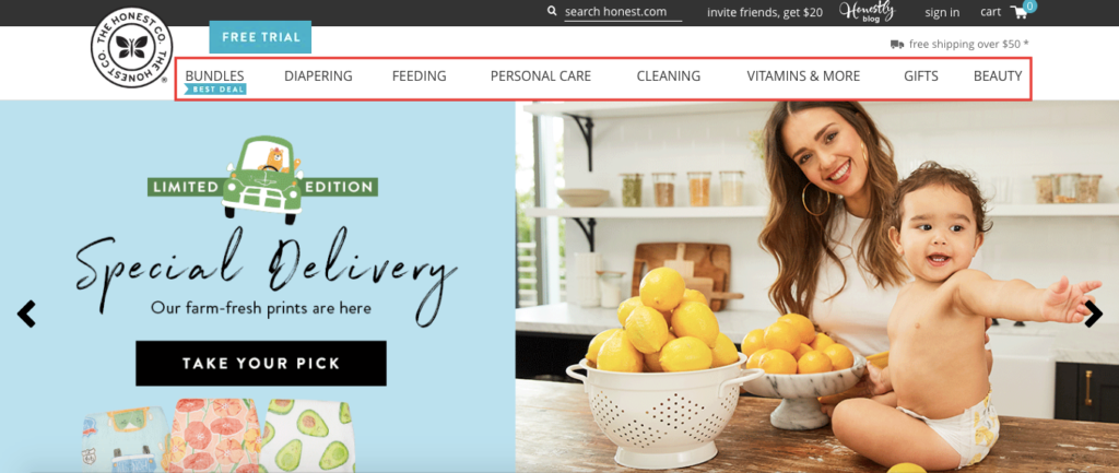
I think The Honest Company, an ethical consumer household products company, founded by Jessica Alba, does a great job of this with their website navigation.
They’ve got eight categories clearly displayed across the header where you can instantly figure out what types of products are being offered.
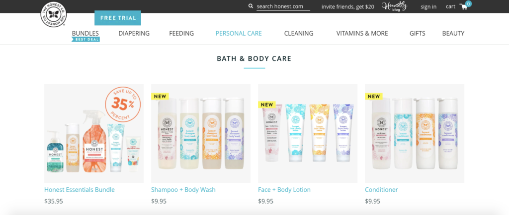
Click on one like “Personal Care,” and you arrive on a well-organized page where you can find individual personal care products.
Click once more on a particular product like “Conditioner,” and that’s it. You’ve arrived at your product destination.
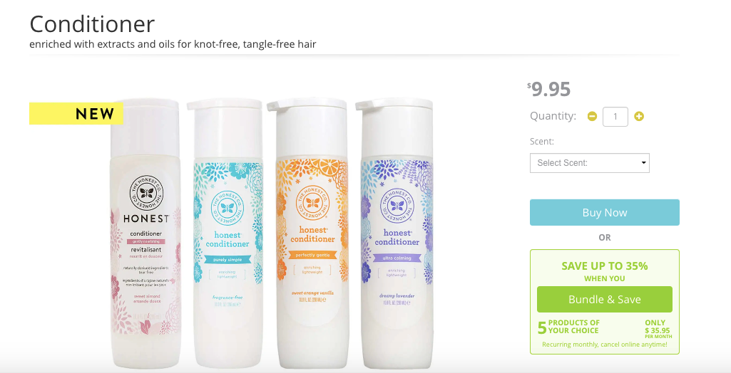
Scroll down a bit more, and you can learn more about the product like ingredients, instructions on how to use it, etc.
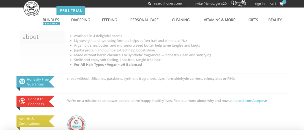
This is super simple, intuitive navigation that gets you where you want to go without any drama.
There are enough product categories to break things down nicely but not so many that you’re overwhelmed.
This makes for a pleasant digital shopping experience, which I’m sure translates into a solid average session duration and conversion rate.
4. Incorporate Internal Search
Here’s the scenario. Someone arrives on your site and has a specific product in mind, and they don’t want to filter through a ton of product pages to find it.
They just want to perform a quick search, learn the details, and if it meets their expectations, buy it.
One of the best ways to accommodate these customers and facilitate their search is by installing an internal search function.
“At least 50 percent of shoppers prefer to use an online business’s internal search function to find products,” writes Go Media. “If your website is offering a robust internal search, it can do more than just increase your sales.”
It makes their lives much easier, helps you segregate products and ensures they don’t wind up searching for a product under the wrong category.
I know I’m personally a huge fan of internal search and find myself using it quite frequently to expedite my product searches.
So I highly recommend incorporating this feature into your website navigation.
Here’s a nice example from anti-theft bag company, Loctote.
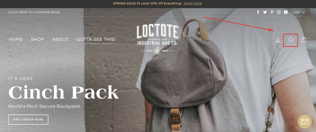
The simple little magnifying glass icon signals to users that they can click on it and perform a search.
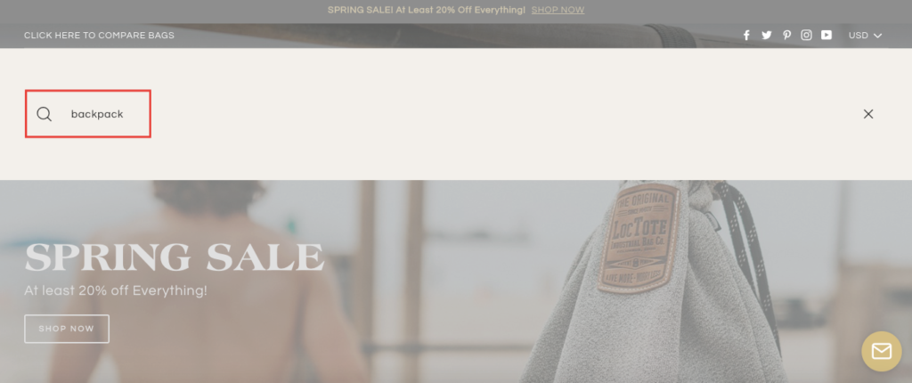
Type in a particular type of Loctote product like a backpack, press enter, and voila.
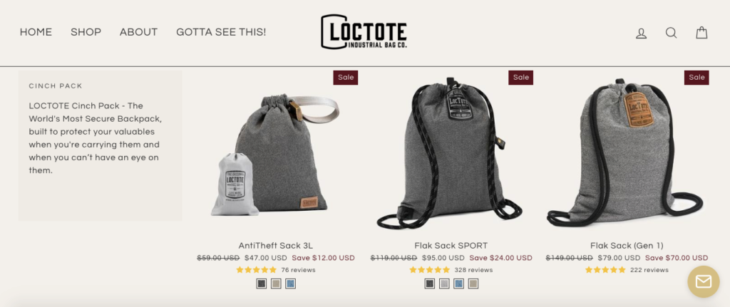
You can quickly find a selection of their anti-theft backpacks. No sweat.
5. Offer Search Suggestions
But you take it one step further and improve your search function even more by providing users with some direction.
Maybe they know what they’re looking for but aren’t exactly sure how they should phrase it.
You can streamline things even more by offering search suggestions so users don’t have to overthink it.
Here’s what I mean.
Frank Body is a natural skincare company that created The Original Coffee Scrub.
On their homepage, they too have a search feature located in the header.
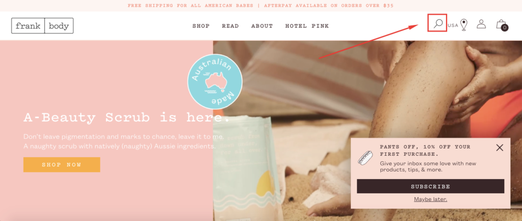
But here’s what happens when you click on it.

It lets you know what criteria you can use to search for products on their site.
You can search by product name, product type or ingredient. They even throw in a dash of humor saying you can search by emoji but add that they’re only kidding.
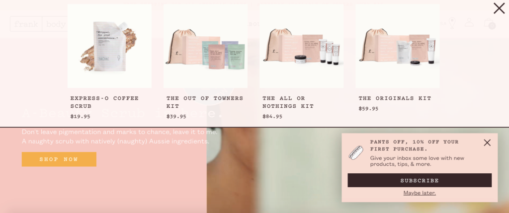
On top of that, they include links to three of the most popular searches—“body,” “face” and “coffee scrub.”
If you click on coffee scrub, some of their top products immediately pop up without having to even leave the homepage. It’s pretty clever.
Book retailer, Waterstones, does something similar with their search feature.
They designed it so customers know they can search by a book’s title, author, keyword or ISBN.
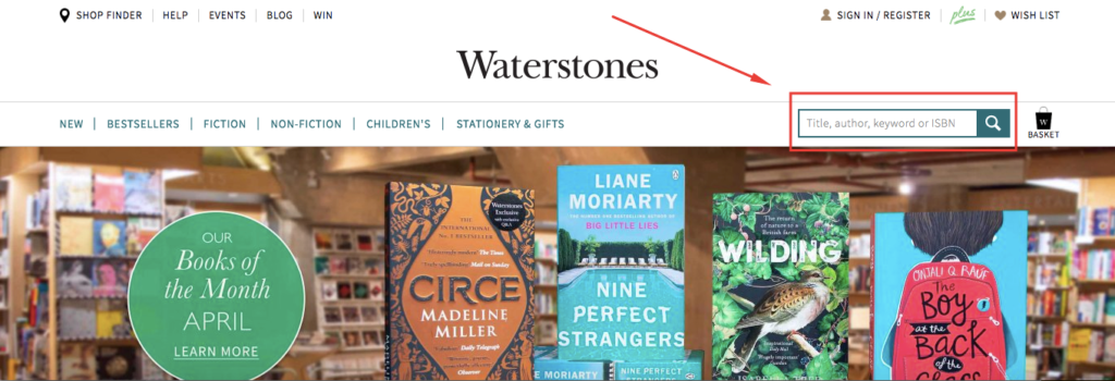
That way there’s no guessing how to perform a search.
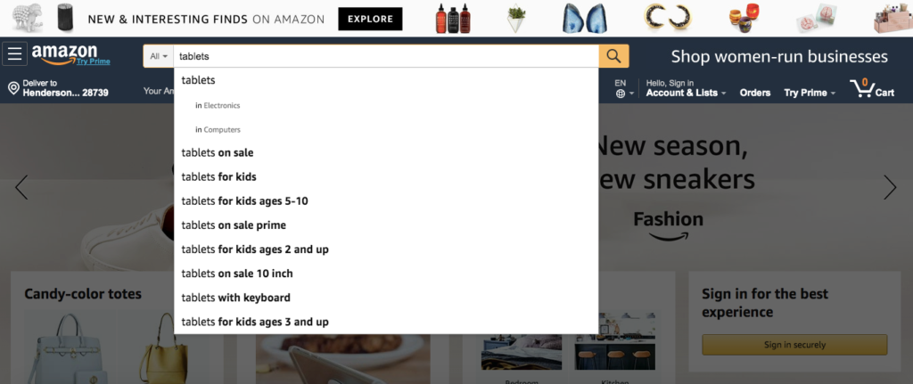
You can always add an autocomplete option—a trend that Amazon is well known for.
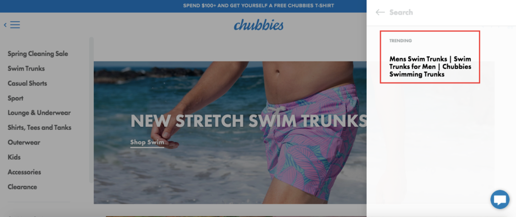
Or you can show which products are trending, which is something Chubbies Shorts does.
The point here is to optimize your internal search so shoppers can find exactly what they’re looking for with as little mental expenditure as possible.
6. Use Cookie Retargeting
You’re probably aware of how big personalization is right now.
Seventy-nine percent of shoppers are only likely to engage with a brand when offers have been personalized to reflect previous interactions.
And by 2020, 51 percent will expect brands to anticipate their needs and make relevant suggestions.
E-commerce sites that emphasize personalization have a huge advantage over those who don’t. It’s really that simple.
That’s why I think cookie retargeting is such a great idea.
If you’re unfamiliar with this concept, it’s when you use cookies to track visitor behavior so that you can provide them with targeted content once they return.
I’m going to go back to apparel company ASOS once again for an example.
When I first visited their site, I clicked on “Shop Men” to see what their men’s selection was like.
Here’s their homepage again for a refresher.
I looked through a few items but didn’t purchase anything.
But once I returned to their site, ASOS remembered that I had browsed through their men’s clothing section during my first visit.
So rather than sending me back to the same generic homepage, they sent me straight to their men’s section again.
That’s really smart because it saved me a step where I didn’t have to begin my search all over again from scratch, which made things more convenient.
And you can bet that a strategy like this will have a positive impact on conversions long-term.
After all, returning visitors are being led to the specific product categories they’re interested in, which should increase their likelihood of buying.
This type of personalized, dynamic experience is becoming extremely popular with e-commerce shoppers and is definitely something to consider.
Conclusion
I feel that because navigation is such a fundamental part of an e-commerce website, it’s sometimes overlooked.
Brands think, “Let’s just slap up some nice looking pictures and a few categories and be done with it.”
But as we’ve just learned, there’s a lot more to it than that. You really want to pour over the details and do the little things to make your visitors’ lives easier and allow them to navigate your store with ease.
Using the strategies listed above should cover the essentials and positively impact the amount of time spent on your site as well as conversions.

