

Images enhance emails: They make your brand recognizable and your company relatable.
When used right, images can also drive more customers to your e-commerce store.
That’s why marketers place such value on imagery. According to a study, 52 percent of marketers say visuals are “very important” to their strategy, while 9.4 percent say their strategy is nothing without visual content.
And it makes a lot of sense. After all, an e-commerce email promoting products is almost unthinkable without images.
Today, I’ll cover the six best practices for using images in email marketing to ensure that your visual content is top-notch in every email you send.

How to Use Images in Emails: 6 Best Practices
1. Get Through the Spam Filters
3. Choose the Right Image Format
1. Get Through the Spam Filters
If your emails are too image-heavy, they may be sent to users’ spam folders.
Today, email providers can’t automatically scan images to reveal their content, but they can scan text. So, if there isn’t enough text to contextualize your images, your email may be flagged as spam.
The bottom line: ensure there’s a good balance between images and text in your emails. The most common recommendation is a ratio of 80 percent text and 20 percent images.
If you usually place your email content within a graphic, consider adding text to the email footer to balance it out. For instance, you could add your contact details and store information.
Another thing you should be aware of is that many email providers automatically restrict images even if the email makes it to a user’s inbox. Your recipients might get a message like this:
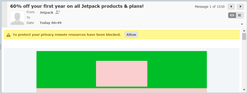
The images show up as blank rectangles and the warning reads “To protect your privacy remote resources have been blocked”.
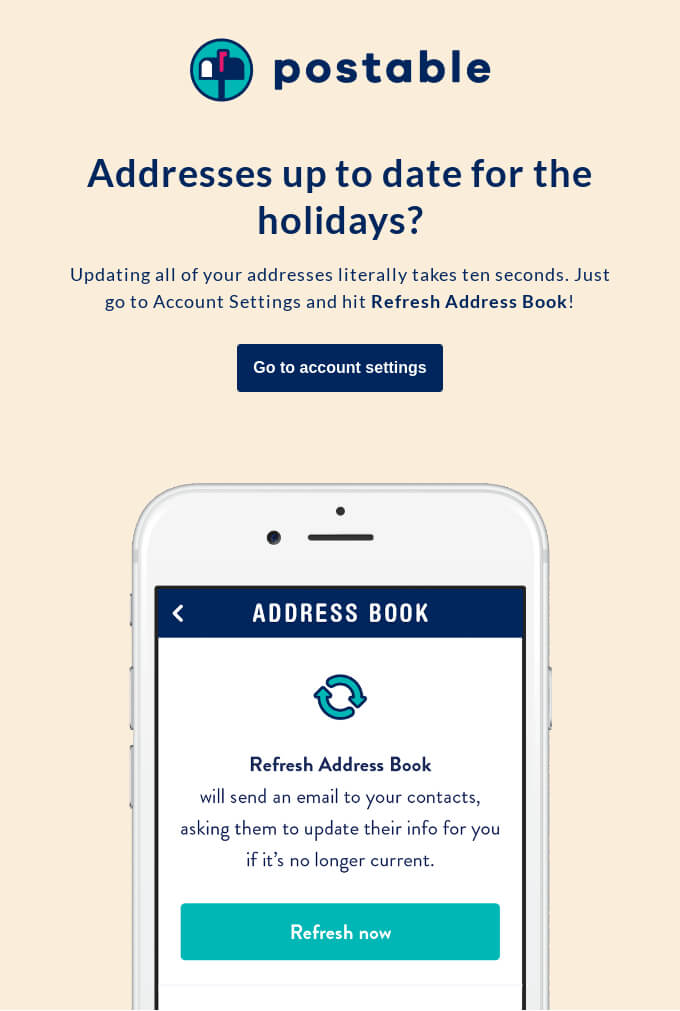
To avoid this problem, make sure that your email copy is clear. You might consider starting an email with text before getting to the images in case they’re blocked. Here’s a perfect example from Postable:
Source: ReallyGoodEmails
Like in this example, your recipients should immediately understand what your email is about. Then they’re less likely to think it’s spam and hit delete. Plus, if your copy is engaging, they’re likely to switch the images back on and read the email carefully.
2. Get the Size Right
When it comes to images in emails, size matters.
The size of an image impacts its definition and the time it takes to load. At the same time, you want your images to look good on any device.
To guarantee image quality, make sure the original image is at least twice the size of the area where it will be displayed in the email. For example, if you’re using a 1280px wide image, scale it down to 640px with HTML.
If you’re using an email marketing tool, you can adjust the size of the image to double the size of the box in your email template.
Keep in mind that larger images take longer to load. If your emails take too long to load, your recipients are likely to move on. As a general rule, try to keep the amount of space an image takes up to 600-800 kb.
3. Choose the Right Image Format
The main image formats, JPG, PNG, and GIF vary when it comes to file size, compression, and quality. Again, you need to use high-quality images to have the highest impact and for a positive reader experience.
Each image format has its pros and cons. The one you choose depends on the purpose of the image in question:
- JPG. Use the JPG format for photos and when you need to save space in an email. JPGs are usually fine for photographs, but you’ll see the poor quality in images that contain text.
- PNG. Use this format for high res images that contain text, layered images, or screenshots. The only problem is that their file size is generally larger.
- GIF. Use GIFs in emails for images that don’t contain too many colors. They also look amazing as interactive product images in emails.
Source: ReallyGoodEmails
GIFs retain their quality in emails. However, they’re best used for simple illustrations and images with color blocks as they support a smaller color palette than PNG and JPG.
Keep in mind that Outlook doesn’t support GIFs. So if your recipients use Outlook, all they’ll see is the first frame of the GIF as a static image. Make sure that your first frame also works as a standalone image for Outlook users.
All in all, when it comes to choosing the right image format, you need to find a good balance between image size and quality.
4. Make Images Accessible
Everybody deserves a positive user experience. Therefore, you should make your email images accessible for the visually impaired.
The Bureau of Internet Accessibility explains,
Marketing content that excludes people with disabilities, even unintentionally, prevents millions of people from learning about your products and interacting with your brand. To make your business as open and inclusive as possible, accessibility must be a core component of your organization’s marketing plan.
Consider accessibility from the get-go, i.e. when you’re planning and constructing marketing emails.
Note that visually-impaired people use screen readers to assist them when accessing emails. You can add informative alt text to images that describe their contents for screen readers to pick up on.
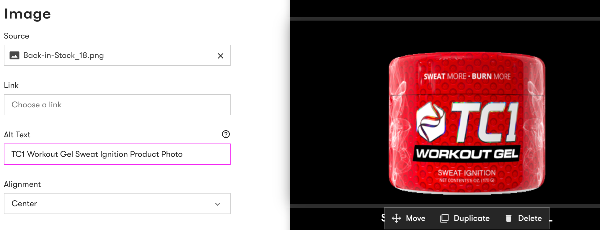 Your alt text should be concise and unique to each image. Don’t repeat the same alt tags even if the images are the same or similar.
Dividers or spacers don’t need alt tags; you can use an empty attribute for images like these.
Similarly, you should use descriptive text for links and buttons. Instead of using copy that reads “click here” next to an image, communicate clearly where the link takes the user. This call to action (CTA) button in an email from Good Pair Days reads “Pre-order your box” and is completely transparent:
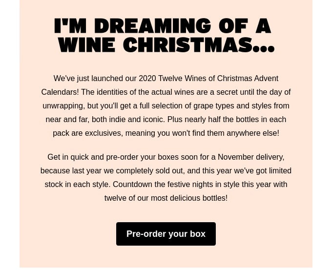
Source: ReallyGoodEmails
Avoid using images for clickable buttons for the same reason. Plus, if any recipient’s email client blocks images, then readers won’t be able to view the button.
What’s more, make sure to differentiate sections, headers, text, and images in your emails with visual hierarchy in your code.
Finally, consider increasing the contrast between backgrounds and images. This helps users who have difficulties differentiating colors.
5. Align Images with Your Branding
Images are a major part of branding. Having a certain aesthetic for your images makes your brand memorable, recognizable, and relatable. It also helps you to portray the identity and even the values of your brand, which can help increase revenue by 33 percent.
The first thing you can do to align email images with your branding is to create a recognizable style. This means being consistent with your design elements, such as the composition, typography, and color palette of your images.
P.F. Candle Co., for instance, has a consistent autumnal color palette and uses a minimalist aesthetic in its emails:
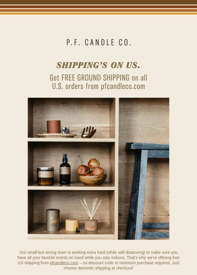
Source: ReallyGoodEmails
Many e-commerce brands also choose to create original graphics to differentiate themselves. In this example, Magic Spoon uses the same style of original graphics in its emails as it does on its packaging:
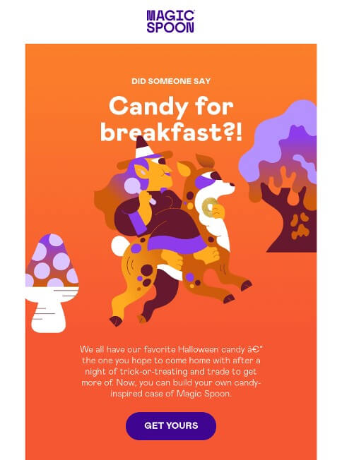
Source: ReallyGoodEmails
It’s clever to apply your recognizable imagery to emails as well as elsewhere, such as on your website and in social media campaigns. This helps maintain consistent branding across the board.
6. Select the Right Images
Images have a great impact when placed in e-commerce emails. But, that doesn’t mean you should throw them in randomly.
Make sure your images are relevant and have a purpose, even if that purpose is to add to the brand aesthetic. Use images strategically to have the greatest impact.
For example, use high-quality images of your products and make them clickable with links leading to the relevant product or category page. This creates a positive user experience and makes the path to purchase simpler.
Another best practice is to incorporate images of people that reflect your target audience. This makes it easier for potential customers to picture themselves using your product, just like Brooks Running does in this email:

Source: ReallyGoodEmails
The company doesn’t simply have pictures of its shoes and sports clothes, but rather sporty people having a great time wearing them. This makes sense because active folks like the above represent its target market.
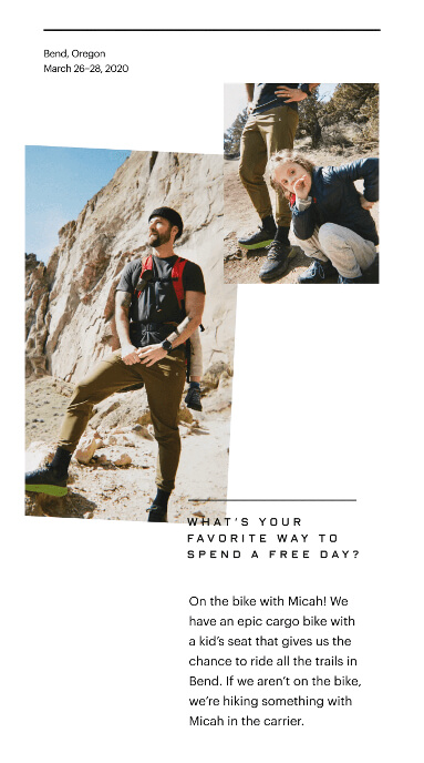
It’s even better to use real customers in your emails to add to the relatability factor. See how Everlane does that by featuring customer stories in its email:
Source: ReallyGoodEmails
Last but not least, consider adding dynamic content to your emails, such as personalized product recommendations or images that reflect the location of the recipient.
Here’s how Halfords does both in one email:
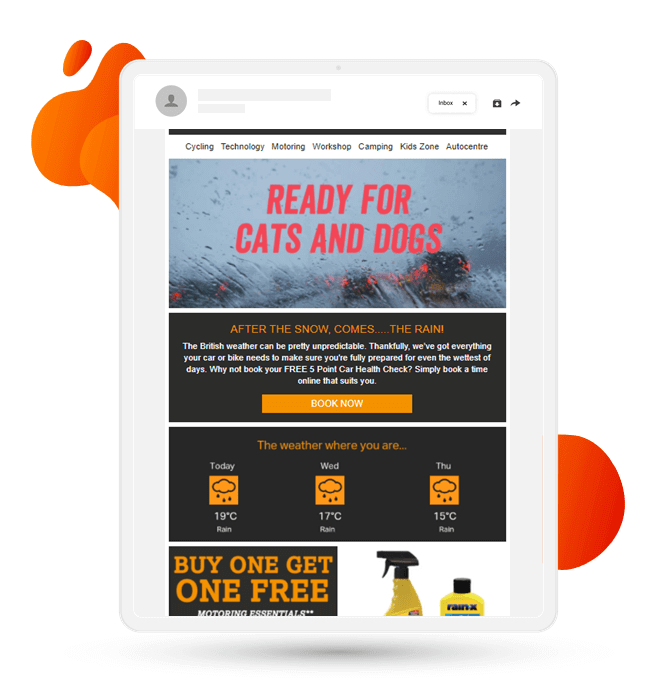
Source: Freshrelevance
This is an interesting way to add an element of personalization to your marketing emails. And personalization makes potential customers feel that their specific needs are being catered to.
Conclusion
Visual content is invaluable, particularly in the e-commerce space. For this reason, you must make sure your images are of the highest quality and are placed strategically.
On the technical side of things, pay extra attention to the user experience. When images are low quality, take too long to load, or aren’t accessible, users are simply going to hit delete.
When it comes to strategy, always have your audience at the forefront of your mind. Create an aesthetic that’s consistent and people can relate to. And place images in such a way that has the highest impact.

