
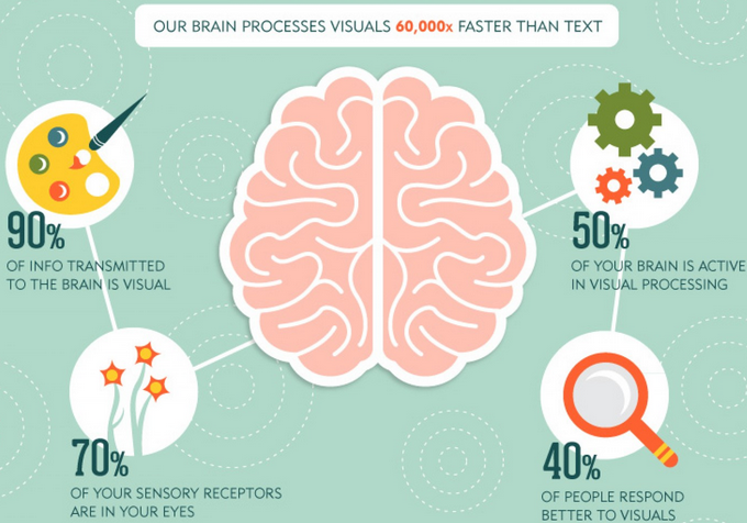
To say that humans are visual creatures is an understatement. We literally pick apart the world with our eyes, and vision is the primary way in which we transmit information to our brain.
StoryPorts even explains that “90 percent of info transmitted to the brain is visual, and 70 percent of your sensory receptors are in your eyes.”
So it only makes sense that high-quality, eye-popping product photography is vital to conversions. It’s all about making that visual connection.
Even with slick, sharp, snappy copy, conversions will likely take a hit if product photos fail to hit their mark and captivate customers.
So this is definitely an area you want to nail.
Fortunately, you don’t have to be a world-renowned photographer to create some killer product photography.
The right technology and techniques combined with a bit of fundamental psychology should help get results even if you don’t have an ounce of photography chops.
Here are some essential best practices to follow.

Table of Contents
2. Start with a Plain White Background Shot
4. Show at Least One Close-Up Show
Let’s look at each in more detail.
Tip #1: Use the Right Camera
There’s no need for me to drone on about the importance of having a solid camera.
That’s a necessary precursor.
But don’t think that you have to spend a fortune on some elite, top-of-the-line camera.
In fact, there are plenty of cameras that are perfectly suited for product photography that can be purchased for under $1,000 and will give you A+ images.
I recommend checking out this guide from Pixc for more on this.
They break down the various types of camera systems and show you some potential cameras that will give you plenty of bang for your buck.
But let me briefly touch on a few features to look for:
- The ability to change lenses. This ensures that you can always get the right shot whether you’re shooting indoors, outdoors, close-up, at long range, and more.
- Macro capabilities. This is critical for nailing close-up shots for highlighting subtle product details.
- Low light capabilities. Even when lighting isn’t ideal, you can still get a great shot.
Now that we’ve gotten that out of the way, here are some specific strategies that will wow your customers and help persuade them to buy.
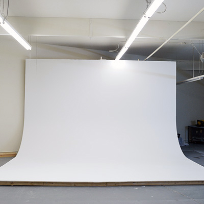
Tip #2: Start with a Plain White Background Shot
You could argue that a plain, white background is the universal approach for the vast majority of product photos.
This is the norm and for good reason.
By isolating a product like this, you’re able to present it “as is,” which is important for seeing it in it’s unfiltered form.
TOMS is one particular company that has mastered this shot with their products.
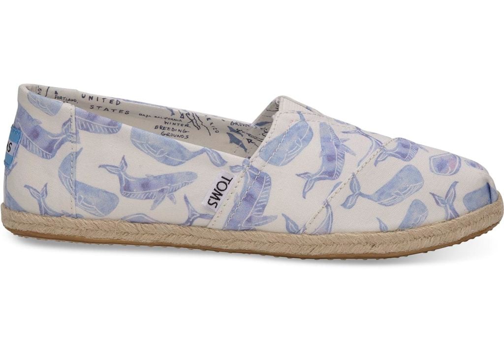
So I suggest using this approach for your primary photo.
And how exactly do you get this shot?
It’s simple. You’ll want to use what’s called an infinity curve, which looks something like this on the small scale.
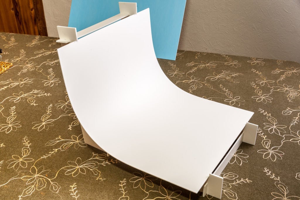
And like this on the large scale.
They’re actually quite affordable if you’re photographing smaller products.
For instance, you can buy one from B&H Photo that’s 18” x 28” for only $34.95.
To learn more about infinity curves, check out this resource from SHOOTFACTORY.
The bottom line is that featuring a product on a plain white background is often a great starting point, and you can build off from there, which brings us to our next point.
Tip #3: Use Multiple Angles
Your goal is to offer potential customers an overarching vantage point of your product.
Within seconds, they should have a thorough understanding of your product and all of its features.
That’s why you never want to use just a single image.
Instead, provide images from multiple angles—as many as necessary.
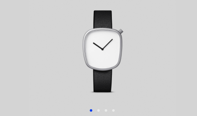
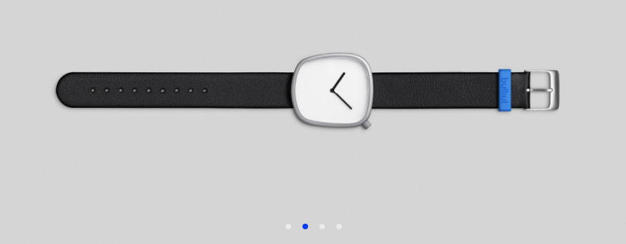
Here’s a great example of a watch called the Pebble 02 from Bulbul Watches:
Angle #1:
Angle #2:
Angle #3:
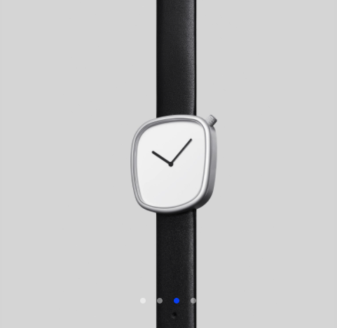
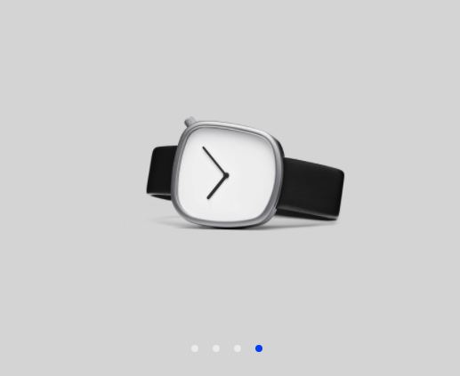
Even though it’s a pretty straightforward product that people are obviously familiar with, it provides shoppers with a comprehensive understanding.
This should eliminate (or at least greatly reduce) any question marks or surprises, thus making them more comfortable with the idea of purchasing.
Tip #4: Show at Least One Close-Up Shot
Think for a moment about how shoppers behave in a physical brick-and-mortar store.
Often they’ll pick up a product and inspect it closely to see the minor details.
It’s a very tactile experience.
While this obviously isn’t possible with an e-commerce store, you can mimic the experience by including at least one close-up shot of your product.
Take this image of the Motiv fitness ring for example.
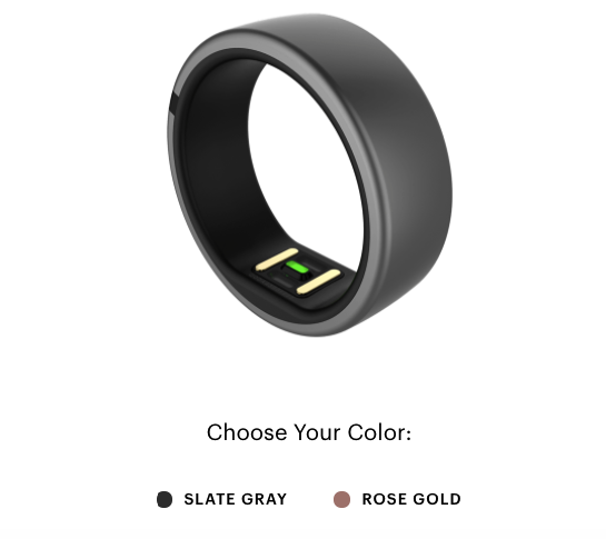
Although this is a small product, Motiv let’s shoppers see the finer details so they can get a better feel for the design and overall aesthetics.
Tip #5: Better Yet, Offer Zoom
Many e-commerce platforms now offer zoom features that allow customers to easily zoom in on products.
I’m sure you’ve seen this before.
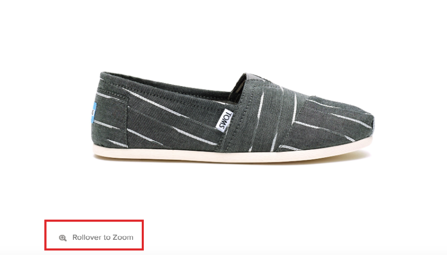
Fortunately, this isn’t a feature that’s all that difficult to set up.
If you run your e-commerce store on Shopify, you can simply install the Magic Zoom Plus plugin.
Otherwise, you can use the Magic Toolbox which is compatible with a plethora of different platforms.
This gives shoppers an up close and personal view of your products in high-resolution.
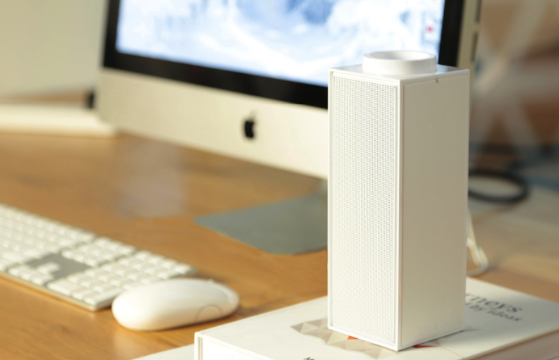
Tip #6: Provide Context
It’s one thing to see a photo of a product on a blank background.
It’s another to see it within a real world setting.
Providing a bit of context like this is what helps people fill in the gaps.
Here’s a perfect example of the Switch portable Bluetooth speaker from Native Union.
They start with a basic image of the Switch all by itself.
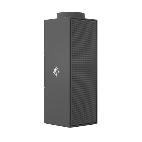
However, they also show you how it would look resting on your bookshelf…
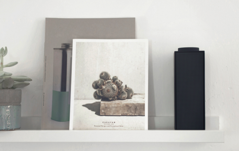
…Or on your desk…
Needless to say, this is especially important when displaying clothing like this women’s cashmere sweater from Ralph Lauren.
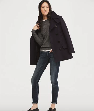
All of a sudden a product goes from being alone in a sterile environment to coming to life.
The point here is to let your shoppers know what it would look and feel like if they owned your product.
So the better job you do at adding context, the likelier they are to buy.
Tip #7: Offer a Sense of Scale
Although not necessary for all products, it’s nice to provide some perspective of a product’s size as it compares to familiar items.
It’s all about giving shoppers a sense of scale.
Infinity Supply does a great job at doing this with their photos of the Infinity Wallet—a sleek, minimalist wallet that allows you to carry the essentials and nothing more.
They’re trying to emphasize the fact that this is a small wallet that takes up very little space.
Here’s a shot of the Infinity Wallet buy itself:
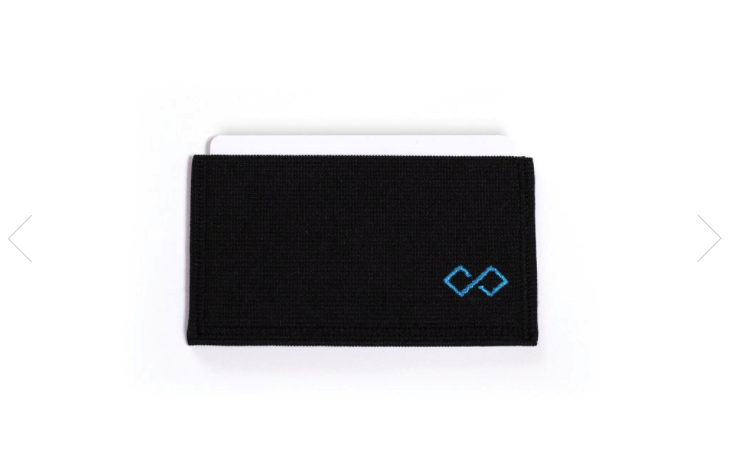
It looks nice, but doesn’t really give you a feel for its size.
So they provide some perspective with these two photos.
One features measuring tape.
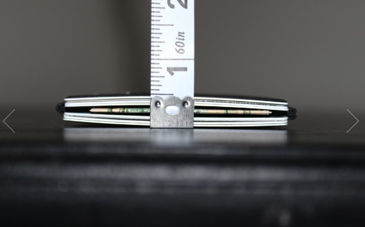
The other compares it side-by-side with a bulky, traditional wallet.

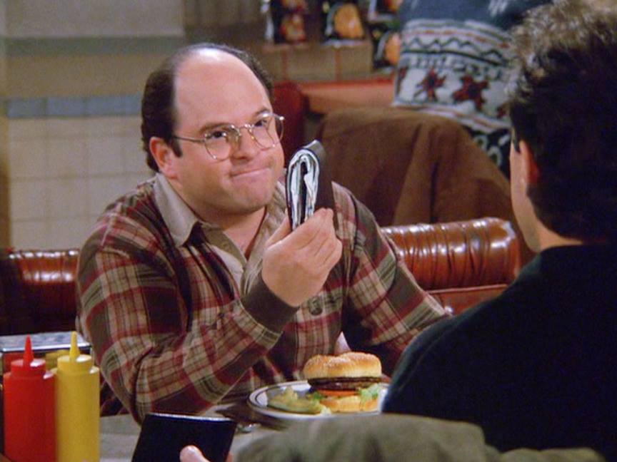
Voila! Just like that, you can tell that this wallet is in fact very minimalist and is clearly a great alternative if your current wallet resembles George Costanza’s.
Square also pulls this off well with the product photography for the Square Chip Reader.
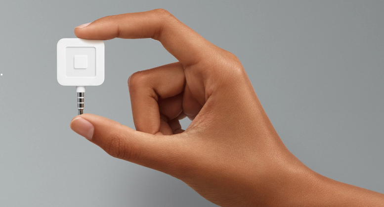
Showing its size in relation to a person’s hand instantly provides a sense of scale.
Tip #8: Show People Using It
Another way to get shoppers more excited about a product is to show other people using it.
In other words, let them see the product in action.
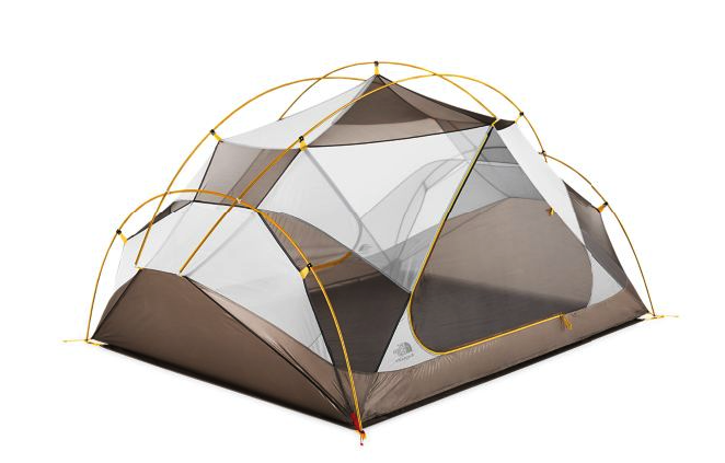
The North Face pulls this off seamlessly on the product page of one of their tents—the Triarch 3.
Here’s a basic shot of it with a plain white background:
Now here it is in the outdoors with someone actually using.
Shot #1:

Shot #2:

It’s all about helping your customers envision themselves with your product.
The better you are at doing this, the more likely they are to purchase.
Tip #9: Add Reviews or Ratings
Consumers absolutely love reviews and ratings.
It’s a simple way for them to get a sense of what a product’s quality level is like and benchmark it against competitors.
Vendasta even reports, “More than 88 percent of online shoppers incorporate reviews into their purchase decision.”
So it only makes sense that adding reviews or ratings to your product photos is a smart idea.
This is something that REI does with their products.
Take their selection of sleeping bags for example.
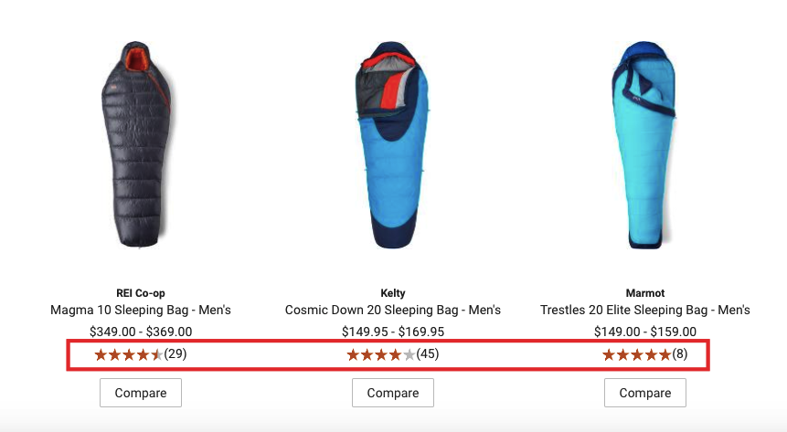
Shoppers can instantly see how one sleeping bag stacks up against another to better inform their decision making.
But here’s the thing:
You’ll usually want to include the number of ratings each product has received.
Why?
It gives consumers some added perspective. Just think of it like this:
Which option would impress you more?
A product with a five star rating and 50 reviews or a product with a five star rating and only three reviews?
Odds are it would be the one with 50 because you have a much larger data set to borrow from.
It’s hard to argue with 50 people saying a product is legit. But the verdict could still be out if it was only three.
Baymard Institute adds, “Displaying the number of ratings an average is based on seems to be close to a ‘best practice’ among e-commerce sites, with 68 percent of the 50 top grossing US e-commerce sites getting this right in their product list design.”
So this is something to keep in mind.
Tip #10: Be Conscious of Image File Size
I’m sure you’re aware of how critical website load time is.
People just don’t want to bother with a clunky site that takes forever to load.
But performance is especially vital when it comes to appeasing online shoppers.
“Forty-seven percent of consumers expect a web page to load in two seconds or less, and 40 percent abandon a website that takes more than three seconds to load,” according to Kissmetrics.
Even a one second delay in page response can result in a seven percent reduction in conversions.
Seven percent!
With a statistic like this, having a sluggish site simply isn’t an option.
And while numerous pictures are great for providing eye candy that helps your products sell, you should always be aware of the file size and how long it’s taking your site to load.
Even if your product photography is completely brilliant, your conversions are going to suffer if a big chunk of shoppers ditch your site prematurely.
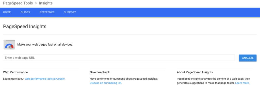
A quick way to tell how well a product page is performing is to use Google’s PageSpeed Insights.
Simply enter the URL of the page and click “Analyze.”
This will give you all of the details along with a rating.
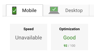
If you find any problem pages, you’ll want to follow Google’s optimization suggestions.
Besides that, you’ll always want to be conscious of image file size.
When left unchecked, image loading may lag, which can eat away at conversions.
One simple trick for increasing load time is to use a tool like ImageSmaller to compress product photos.
This will reduce the file size of images by up to 90 percent, which can increase performance considerably.
Conclusion
Your product photos can literally make or break your e-commerce store.
So this is definitely an area that you want to devote plenty of effort to.
Amateurish, Mickey Mouse photos that look like they came from your dad’s old Polaroid just won’t cut it.
Fortunately, camera technology has come a long way.
And even with a limited budget and skill set, you can find a solid camera and take stunning, eye-catching product photos.
From there, it’s really just a matter of putting yourself in your customers’ shoes.
Providing them with a variety of different shots allows them to dissect your product and fully understand all of its features and capabilities.
Get it just right, and your product photography will rival your shoppers’ experience in a brick-and-mortar store, and they’ll get the full effect.
By doing so, they can truly visualize themselves using the product, and they become much more comfortable with the idea of making a purchase.
The end result?
Making the most of your leads and an increase in conversions.

