
On average, visitors form an opinion of an e-commerce site in just half a second. If their initial opinion is positive, they’ll likely engage with your site, check out your products, and consider making a purchase.
However, if it’s not, you’re fighting an uphill battle and your odds of making a sale decline dramatically. More often than not, the first page a visitor lands on will be your homepage. It’s like your virtual front door.
If you can make a great impression, it should put you in a good position and set the stage for maximum conversions. That’s why you need to go out of your way to design a winning e-commerce homepage.
Beautiful, professional design is the most vital element of a great homepage. Still, there are several other elements that are important as well, such as having a compelling, unique selling proposition (USP), intuitive navigation, consistent branding, and clear CTAs.
For this post, I’m going to showcase seven of the best e-commerce homepages I’ve seen in 2020 and highlight their specific strengths. That way, you’ll hopefully walk away with some inspiration that you can apply to your homepage.

Table of Contents
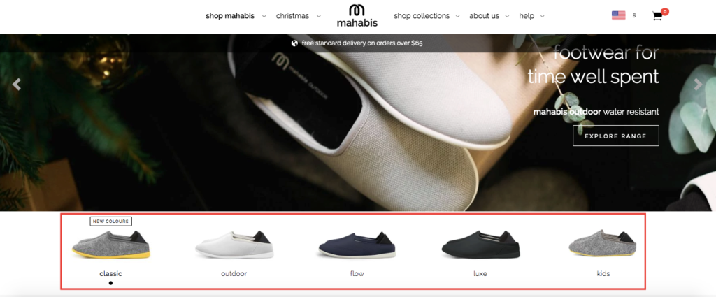
1. mahabis
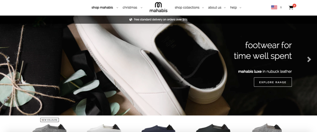
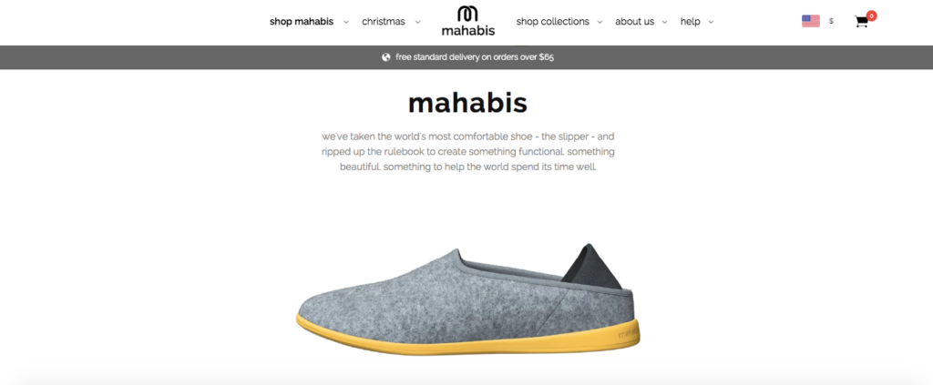
“Footwear for time well spent” is the USP of this London-based lifestyle brand, mahabis. And I think their homepage is one of the best in the business for succinctly demonstrating what they offer and explaining what differentiates their products from the competition.
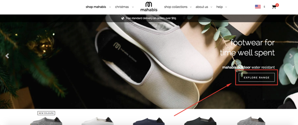
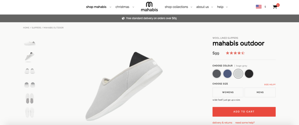
Immediately after landing on it, you see one of their top products, a wool-lined slipper called “mahabis outdoor.” With a simple click on a well-placed CTA, you can check it out in detail.
Or you can check out some of their other top products just below that.
Scroll down just a bit more, and mahabis has an innovative explainer section that shows you how their products are constructed and what makes them so unique.
It’s cool because it starts with a regular picture of their “classic” slipper.
But once you scroll down, the slipper “pulls apart,” and you can see the different levels of construction.
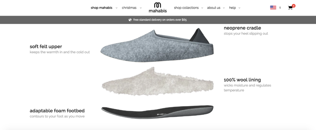
They follow it up with some more helpful information that fills you in on the details like their minimalist philosophy, why their materials are high quality, and the performance standards they adhere to.
I love the mahabis homepage because it allows you to quickly get your bearings and sort through their products without any hassle.
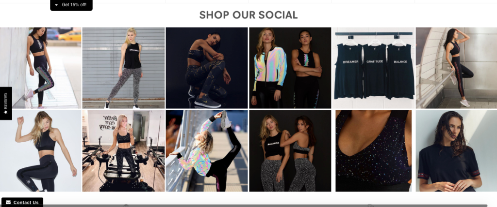
2. Noli Yoga
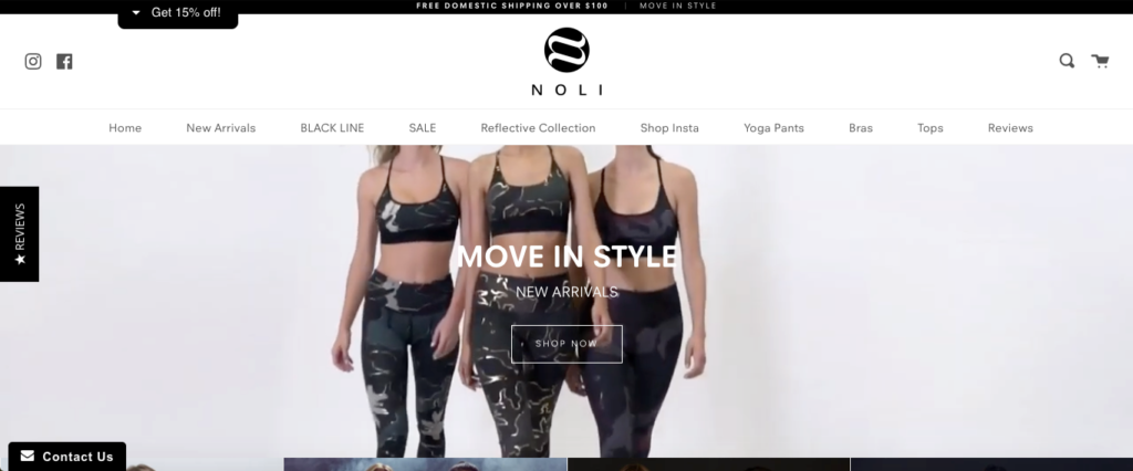
Noli Yoga is a women’s yoga apparel and activewear company.
The first thing you notice when landing on their homepage is the video loop that features several models using their products.
It’s professional and gives you a firsthand feel for how their yoga gear looks and feels. And as you probably already know, weaving a video into your e-commerce store can have a profound impact.
In fact, studies have found that including a video can increase conversions by as much as 80 percent. Noli Yoga is a great example of a brand that’s pulled vid off brilliantly.
In terms of navigation, they have a crisp, clean layout just on top of the video loop, allowing you to find what you’re looking for quickly.
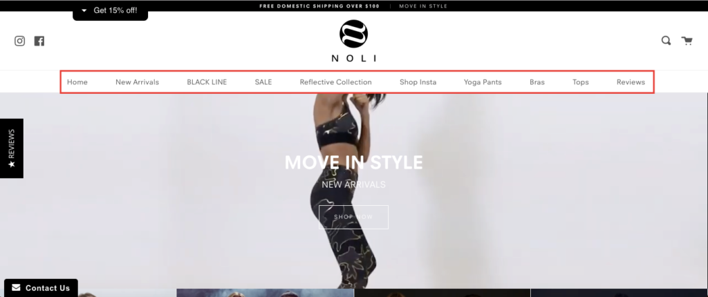
They also feature a nice section just beneath the video that includes new arrivals, collections, and items that are on sale.
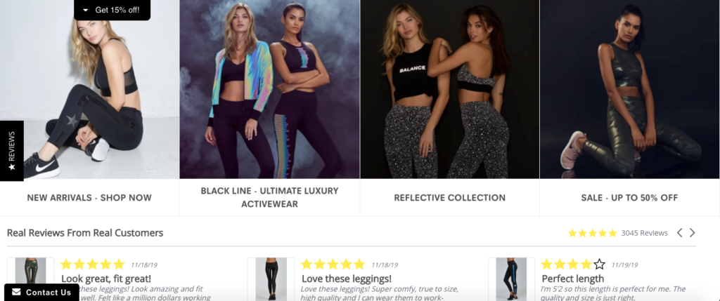
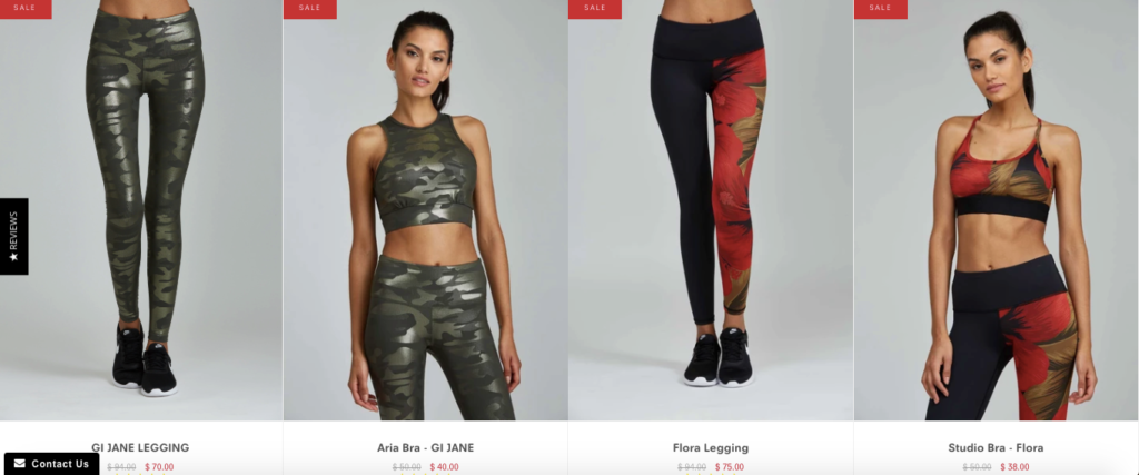
So, if you’re looking to find a good discount, clicking on the sales section provides you with a full selection of products for easy browsing.
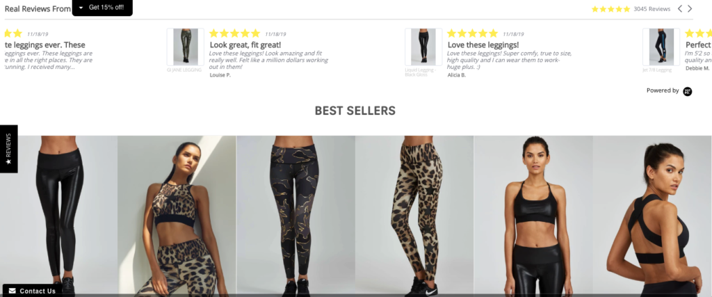
Besides that, Noli Yoga also offers a reviews section, their bestsellers, and they even allow you to shop via their Instagram page, which is a nice touch.
Their homepage is short and sweet but allows you to navigate your way to whatever you’re looking for painlessly. And because it’s so visual-centric, it’s eye-appealing and naturally boosts engagement.
3. Tropical Sun Foods
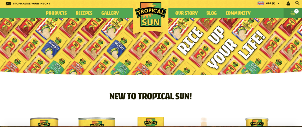
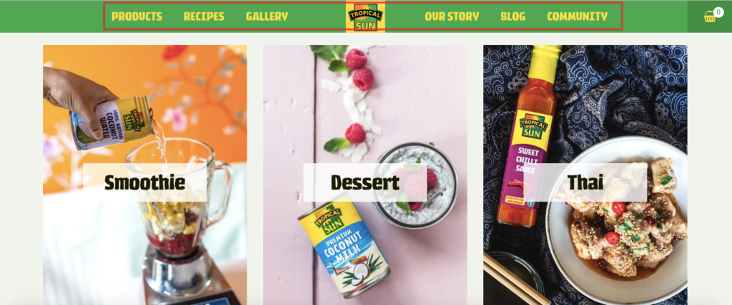
Here’s a brand that specializes in providing high-quality ingredients for ethnic foods such as Thai, Indian, and Caribbean cooking. And I think they do an amazing job of matching their branding color scheme with their company name.
After all, their homepage has a nice tropical feel with juicy, vibrant colors.
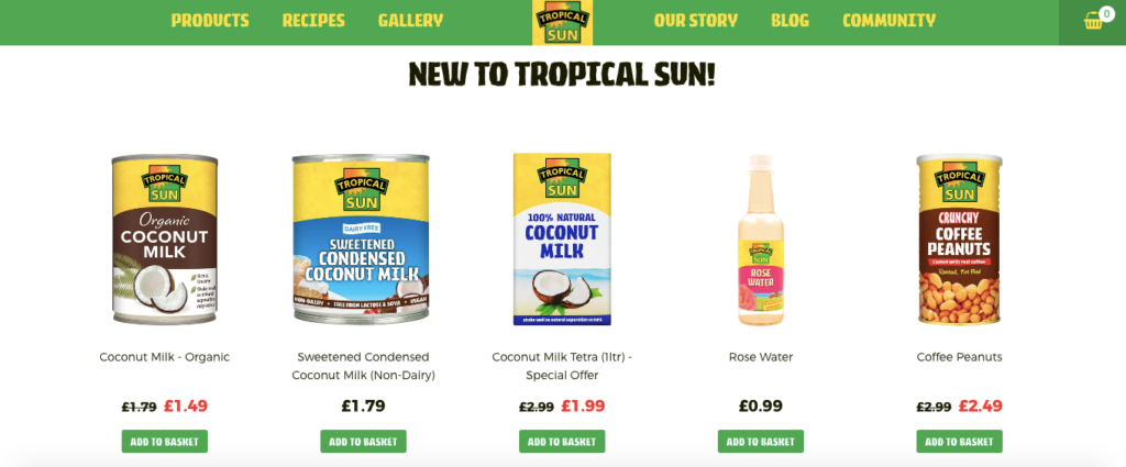
A quick scroll and you see some of their popular products with primarily yellow and green coloring that offers a nice contrast to the white background.
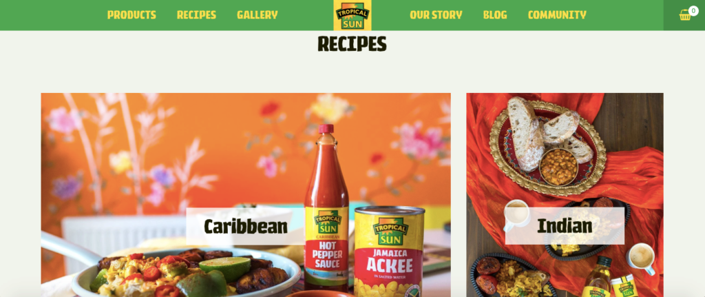
Scroll down a bit more, and you can find recipes that are broken down by culture that also incorporate a stunning color contrast.
Below that, you find a section that talks about the story behind Tropical Sun Foods, including how they got started, the types of foods they specialize in, and what their mission is.
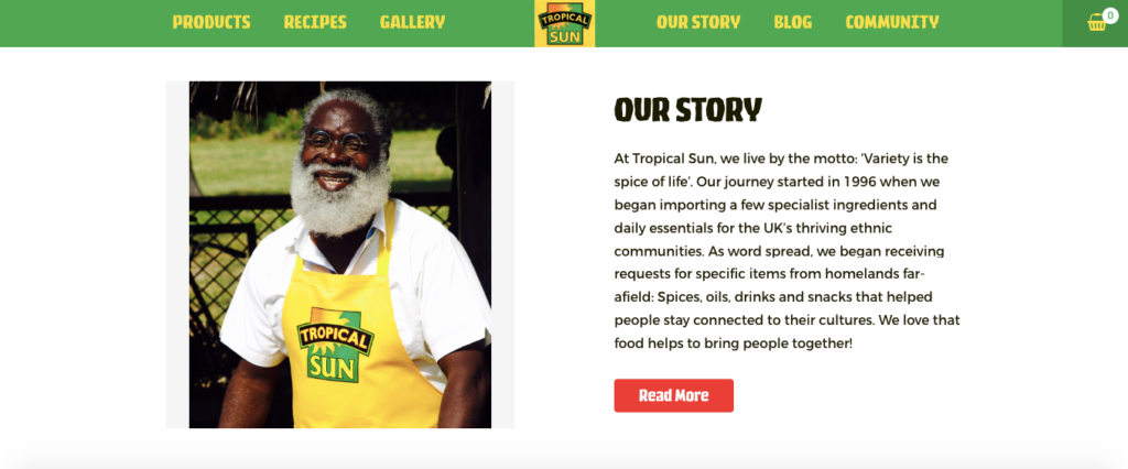
They also have a neatly organized fixed navigation menu that you can access wherever you’re at while scrolling through their homepage.
It’s all smooth and streamlined.
Tropical Sun Foods is proof that e-commerce homepages don’t have to be flashy or fancy to work. They just need to be unique, eye-appealing, and easy to browse.
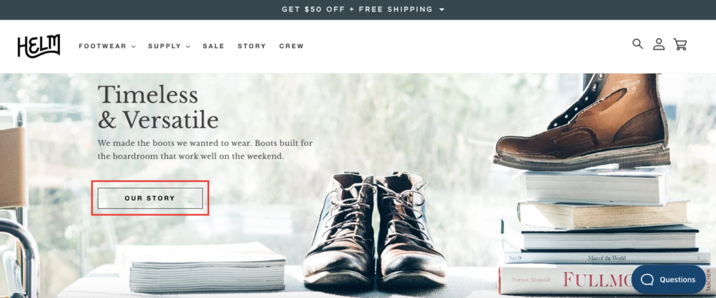
4. HELM Boots
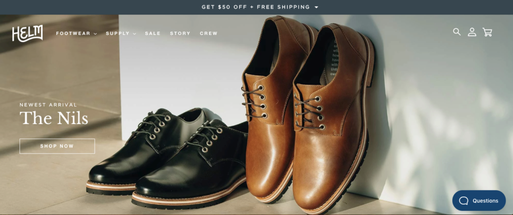
Based in Austin, Texas, HELM Boots is a brand that offers handcrafted premium leather footwear.
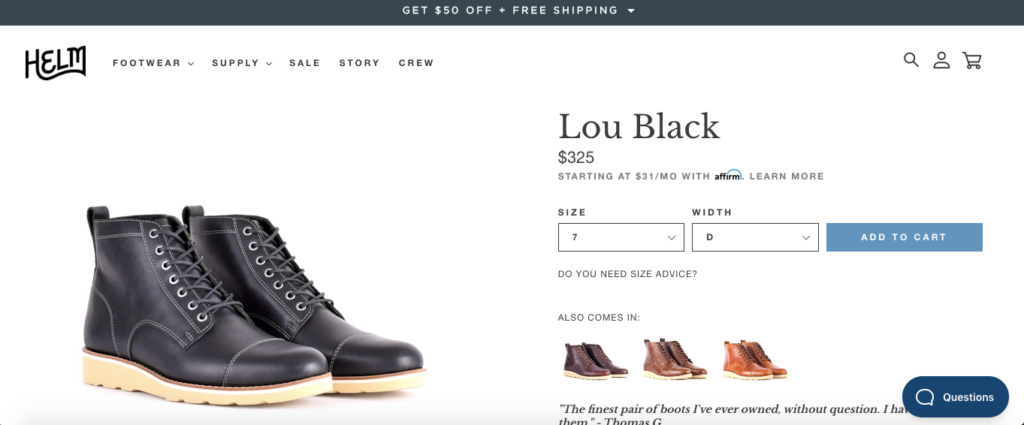
Some adjectives that instant pop into my mind once landing on their homepage are clean, classy, and elegant, yet down to earth. It’s a visually striking homepage that does a great job of showing off their products, and succinctly explains what makes them special.
For instance, you quickly see three of their top boots and how much they cost.
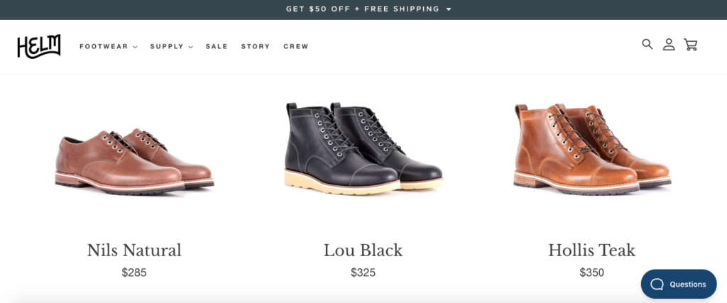
Click through to any of these boots, and you get a full rundown on the product pages.
I also like that HELM Boots shows you what separates their products from the competition, including the fact that they offer free shipping and free exchanges.
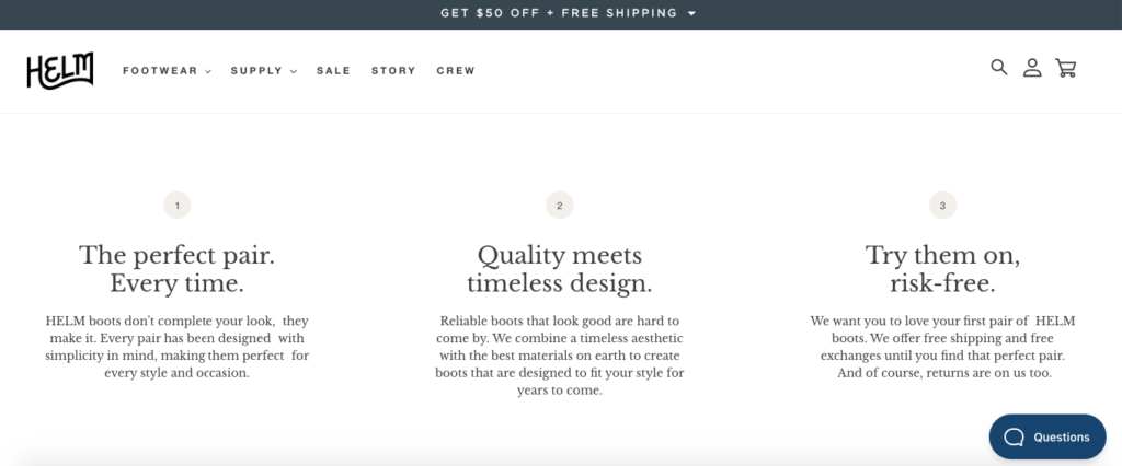
Studies have found, “79 percent of US consumers said that free shipping would make them more likely to shop online.” So, communicating this clearly on the homepage should encourage many shoppers to engage.
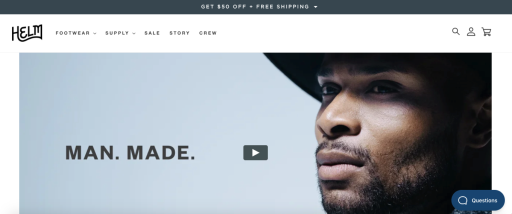
They also have a killer video that models some of their boots, and further drives home their brand identity of stylishness and sophistication, with a distinctly minimalist feel.
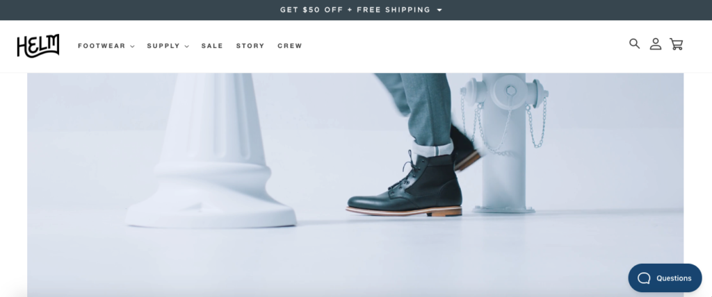
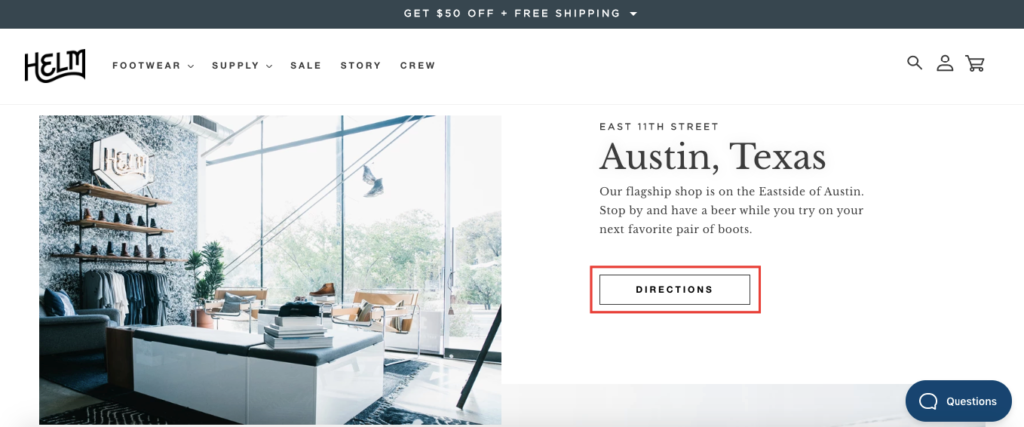
Besides that, there’s a link to a page about their story, and you can even get directions to their main store in Austin.
The amazing design, cohesive branding elements, seamless navigation, and overall flow make this one of the best e-commerce homepages I’ve seen and one you can definitely borrow ideas from.
5. LilGadgets Headphones
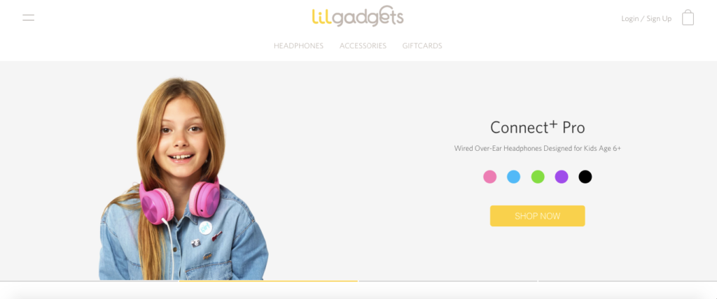
Speaking of aesthetics, LilGadgets, a brand that makes gadgets like headphones for kids, has nailed it with their homepage.
It has an ultra-clean, fresh feel to it and does an amazing job of showcasing their products. It’s ridiculously simple, where there’s a slider featuring some of their top products like over-ear headphones for kids age 3+ and age 6+, in-ear headphones for kids age 6+ and Bluetooth headphones for kids age 4+.
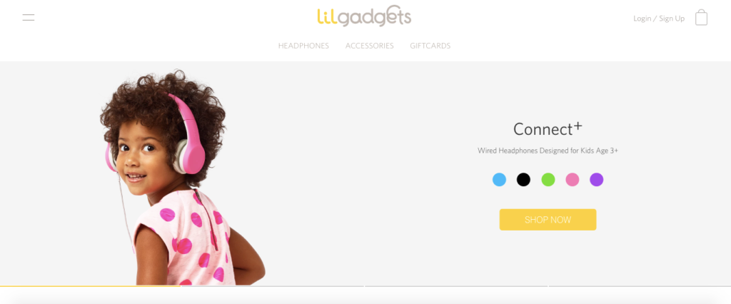
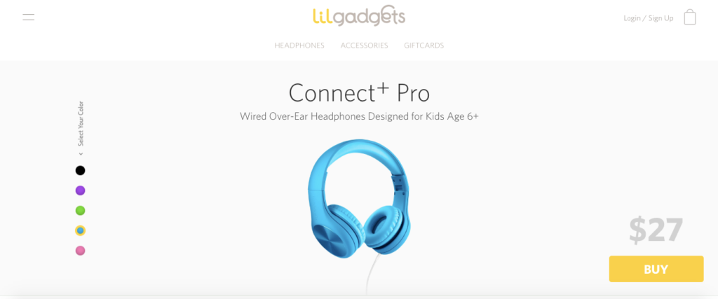
Since their products come in different colors, LilGadgets has a cool feature where you click on the color your child wants from the homepage, and that product page will pop up. So, if you wanted blue Connect+ Pro headphones, you just click on the blue circle.
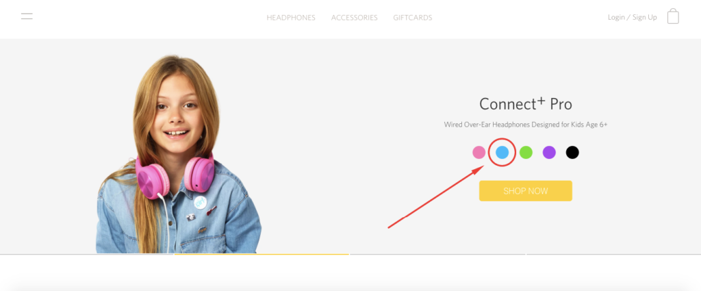
And voila, you get the blue Connect+ Pro headphones.
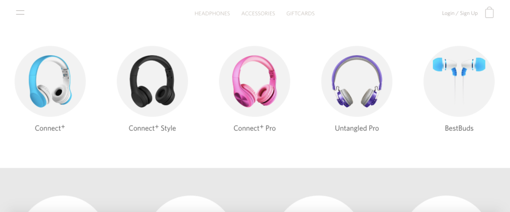
Just below the slider, you’ll find a breakdown of some of their top products.
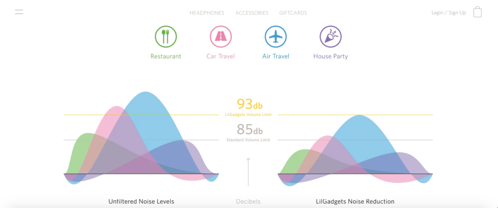
Just below that, you can find information on what distinguishes LilGadgets from other industry competitors.
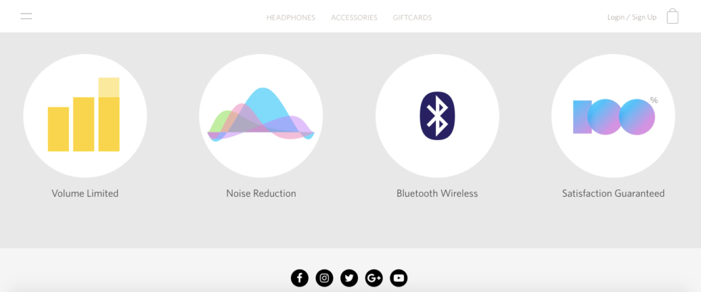
For instance, you can learn about the noise reduction technology they use and how it creates a better experience than standard products on the market.
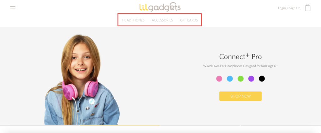
They also have a straightforward sticky menu with only three pages—headphones, accessories, and gift cards, so there’s zero fuss involved with navigation.
I just love how clutter-free this homepage is and how easy it is to browse. LilGadgets embodies the KISS principle 100 percent. It’s all about simplifying your visitors’ lives and not making them work too hard to find the products they want.
And this is one of the best e-commerce homepages at doing this.
6. POW Gloves
Here’s a company that sells snow and ski gloves specifically designed for winter sports.
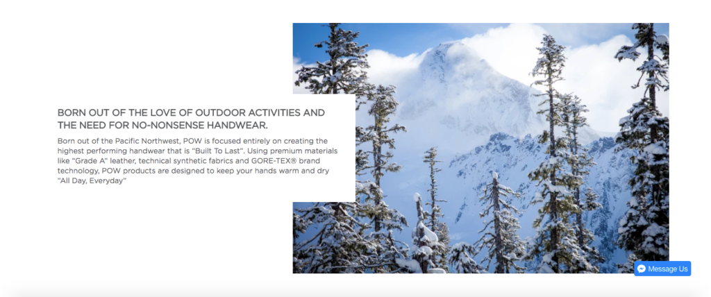
POW Gloves emphasizes offering high-quality products that are built for performance and can withstand even the coldest weather.
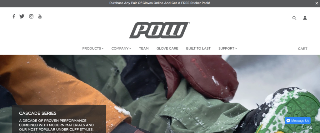
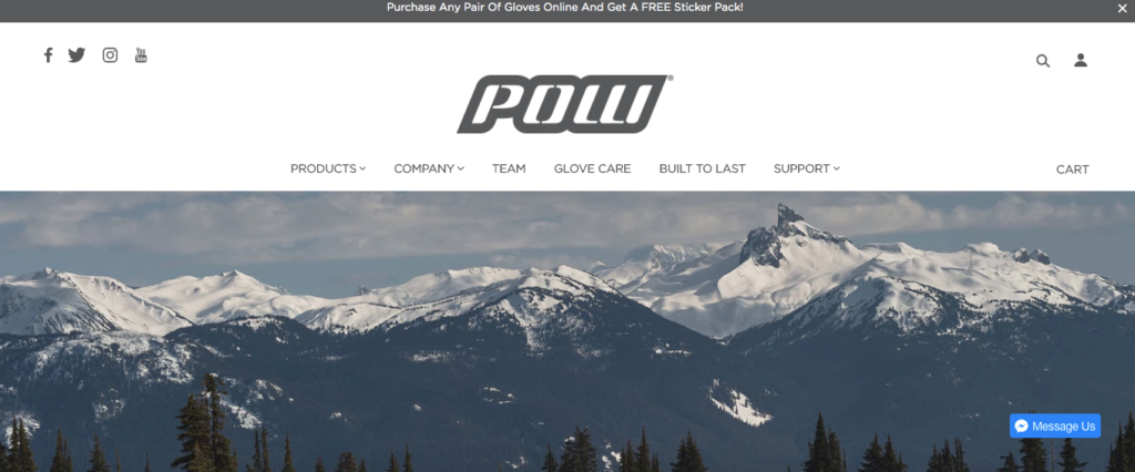
Right after landing on their homepage, you can instantly tell what their niche is with the slider featuring snow-capped peaks and scenes of winter adventure.
Just below that, you see images of some of their top gloves, along with pricing information.
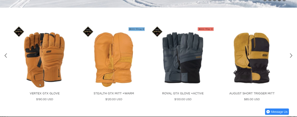
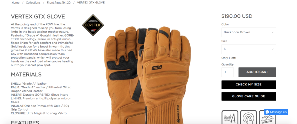
With a quick click, you arrive on the product pages and can get all of the details like materials, features, glove sizing, and so on.
Just below that, there’s an epic video that shows extreme athletes using their products.


I think this is a great way to validate their products and lets shoppers know that if they’re good enough for elite snowboarders, they should be good enough for your average weekend warriors.
And this brief section provides a bit of background. It lets shoppers know that their products use premium materials like “Grade A” leather, technical synthetic fabrics, and GORE-TEX® brand technology.
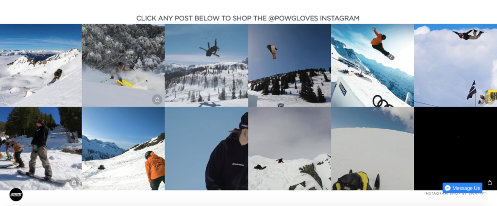
Finally, the bottom section of the POW Gloves homepage shows off user-generated content and allows visitors to shop via their Instagram page.
There’s nothing about this e-commerce homepage that’s over the top, and it’s certainly not trying to reinvent the wheel.
It just provides the information shoppers need to quickly learn about the products and what sets POW Gloves apart from the competition.
There’s a nice layout where you can painlessly find what you need without any hassle.
7. Twelve South
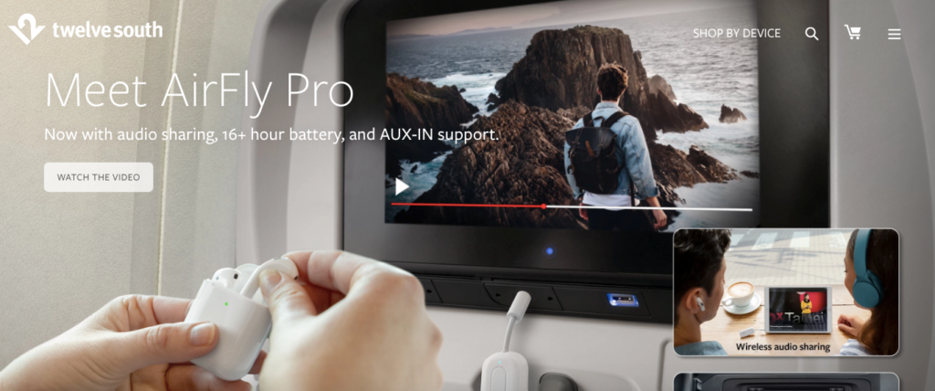
“Twelve South creates beautiful accessories designed exclusively for Apple.” They have products like iPhone cases, wireless charging stands, USB C-hubs, flash drives, and more.
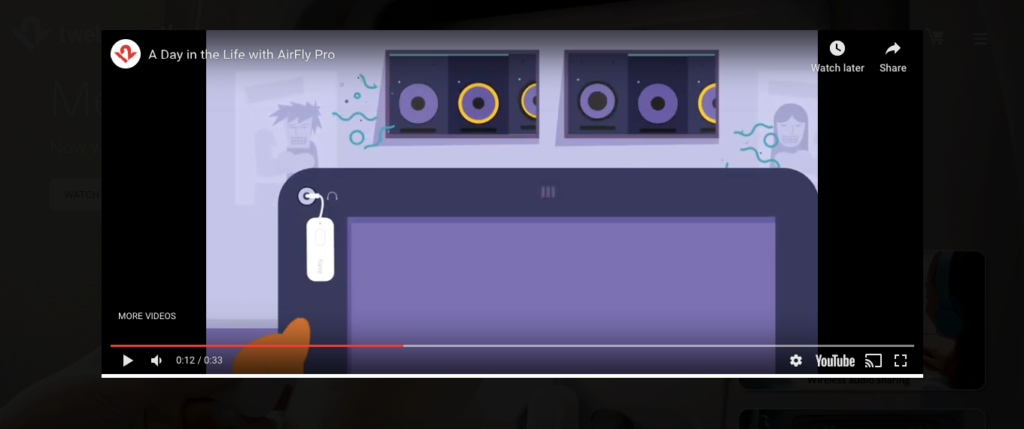
The second you land on their homepage, you see a stunning, professional design and the option to watch an explainer video for the AirFly Pro—one of their top products.
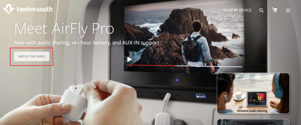
This is important considering shoppers should be able to get the general gist of what’s going on with the AirFly Pro, but they might not understand all of the details.
But after watching an explainer video that’s only a mere 33 seconds long, you know the ins and outs and why it’s so cool.
Given that 77 percent of viewers will watch a video up to two minutes long in its entirety, I would imagine that this particular explainer is highly effective.
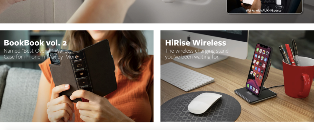
Underneath that, Twelve South features two sections for two other popular lines of products, including the BookBook vol. 2 and the HiRise Wireless.
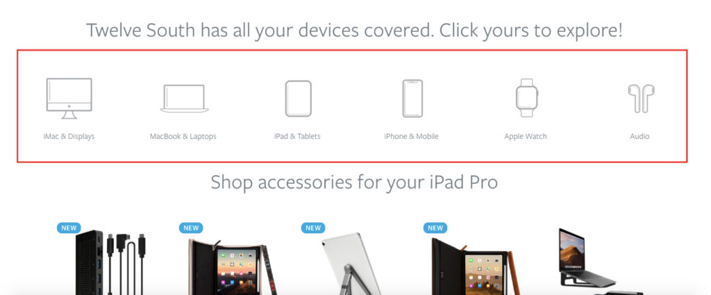
Just below that, there’s some super-intuitive navigation that allows you to search their site by specific Apple devices, which makes finding what you need a cinch.
They have a section that discusses their USP, which is “beautifully crafted innovation,” where you can click on a page to learn about their story.
And one of the more unique features that I think is brilliant is their section that gives shoppers access to free dual-screen backgrounds.
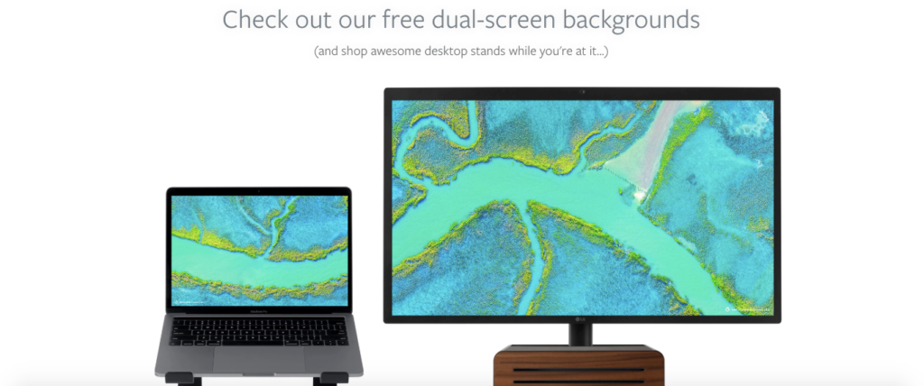
This lets you choose from one of seven beautiful backgrounds and download them for free.
It’s a great way to quickly build rapport with shoppers and subtly features some of the products they sell.
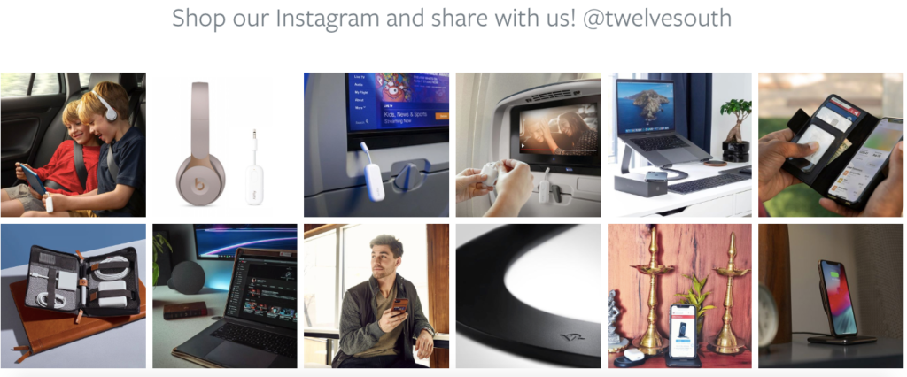
And like some of the other e-commerce homepage examples I mentioned above, Twelve South includes a section at the bottom where you can shop through their Instagram.
When you put all of these elements together, this is one heck of a homepage, and there’s a lot you can learn from it.
Conclusion
Each of these e-commerce homepages brings something unique to the table. But the common denominator between all of them is that they’re simple to follow, well laid out and aesthetically pleasing.
They also all do a great job of telling their story and clearly defining what their brand is all about. And that’s vital because creating a compelling homepage is the cornerstone of the overall e-commerce experience.
Learning from these brands and borrowing from their formulas should help you with your e-commerce design, so you can create a homepage that’s user-friendly, highly engaging, and, most importantly, converts.
Which of these seven examples is your favorite?

