

Cart abandonment is a perennial battle in e-commerce. But since the advent of mobile shopping, the battle has become more complicated. The sad truth is this:
Mobile shoppers are more likely to abandon their carts than tablet or desktop shoppers.
We’ll get to the why in just a minute. More importantly, we’ll also tackle the how to solve it issue.
But first, take a look at the problem we’re facing.
This image shows completion rates by device:
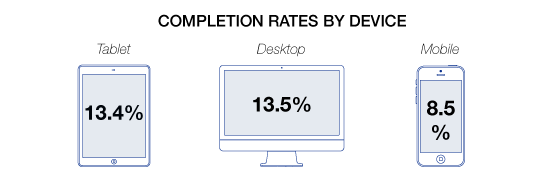
(Source: Formisimo.)
Mobile has the lowest completion rate of all three devices.
In other words, when it comes to mobile e-commerce, shoppers are having a harder time converting.
And a lot of it boils down to one main thing: the mobile checkout experience.

13 Mobile Checkout Best Practices to Try
2. Display the Most Important Product Information
3. Automatically Complete Fields
4. Use Inline Labels for Short-Form Fields
7. Maximize Trust During Checkout
8. Never Link Outside of The Mobile Checkout Process
9. Use Appropriate Input Fields
10. Use Buttons for Forward Progress
11. Use a Progress Indicator During Checkout
Why mobile users abandon their carts
In a study by eWeek and conducted by Harris Interactive, data revealed that mobile users ranked purchase uncertainty as the biggest cause for abandoning a transaction.
Following that some of the top reasons included:
- Usability issues
- Account registration requirements
- Slow loading times
- Complex checkout page processes
- Payment security concerns
Among those respondents, around 34% who admit to abandoning a transaction say they never return to complete the purchase.
Compare that to the top reasons for cart abandonment shared by EYStudios overall (both mobile and desktop).
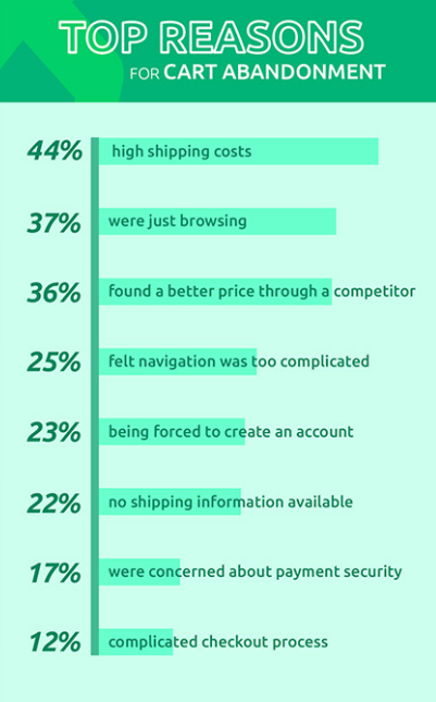
(Source: EyeStudio.)
So how do you reduce mobile cart abandonment?
There are some recurring issues in the checkout experiences seen above that must be addressed, especially with mobile.
You need to streamline a linear mobile checkout experience that makes it incredibly easy to move your customers from the shopping experience to the end of the checkout as efficiently as possible.
Here’s how to get that done.
1. Eliminate distractions
Unlike the desktop experience with variable and expansive screen sizes, multiple tabs, and a wide-open shopping experience the mobile user is fairly limited.
Tablets extend that functionality to some extent, but the mobile user doesn’t have that luxury.
Smartphone screens have a limited amount of real estate, so what you display during checkout needs to be minimal in order to eliminate distractions.
(Source: Neil Patel.)
The goal is to get them to complete the purchase, so don’t add elements that could lead them away from checkout.
Remember, the browsing space is limited, so anything that leads them to another page or screen can lead to abandonment.
For example; don’t use coupon fields in your mobile checkout.
Coupon code entry fields make the user stop and consider where they could get a coupon. Newsletter signup? Facebook? Maybe if they just browse for a few minutes looking for a coupon code…
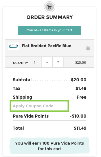
A moment’s hesitation about a coupon, and then they’re gone!
You don’t want them leaving, which can lead them to a competitor site during research or get distracted and forget about the purchase.
Strip those elements from checkout or use text links that are less likely to draw attention, and will reveal the field when clicked on.
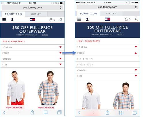
2. Display the most important product information
Depending on the length of their shopping experience, a customer may need a moment to recap their purchase as they review their cart during checkout.
It can be extremely frustrating for a customer if they need to return a product page or click elements on individual products in the cart to double-check their options.
What they ordered should be blatantly obvious, especially if there were variations or any kind of customization.
The cart should include product information like:
- Clear professional images
- The product name
- Any options they chose (such as size, color, model, etc.)
- The quantity
Equally important to displaying the information here is making it extremely easy to update the cart including adding or removing products, changing options, updating the quantity, etc.
Think about it like ordering a pizza on your mobile phone.
When you check out you want to see all the toppings you selected, flavor crust, crust type, etc. It would be frustrating if the checkout only showed “large pizza.”
Provide the customer with complete clarity during the purchase process along with as much control as possible.
3. Automatically complete fields
Autocomplete functionality can be a blessing when it’s rolled into a browser. I can autofill forms effortlessly when checking out and it makes shopping a breeze.
It makes any form that much easier, actually.
But some of your customers don’t use the autofill or store their personal information like that. Some browsers, like Safari, don’t autocomplete by default unless the user enables that function:
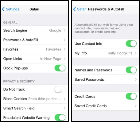
Source: Engadget
If it’s a first-time visitor you may not have data to autocomplete for them but you can still ease the process by handling some of the information.
For example, when they type in a postal code you can automatically fill in the city and state information. Or, in the case of billing and shipping info, automatically porting the information over.
One of the major indirect causes of cart abandonment is the frustration caused by re-entering information. Fifty percent of websites ask for repeat info!
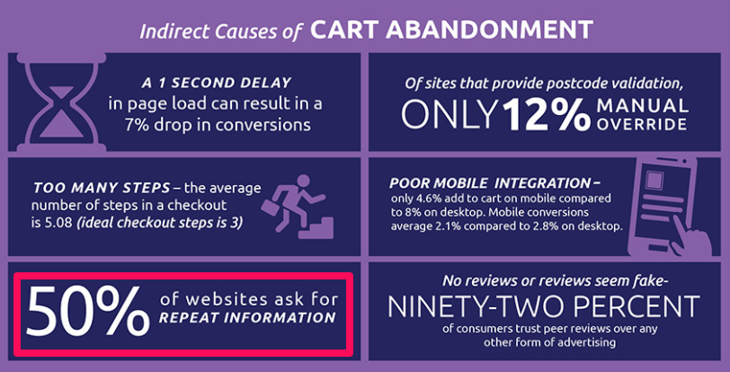
(Source: EyeStudios.)
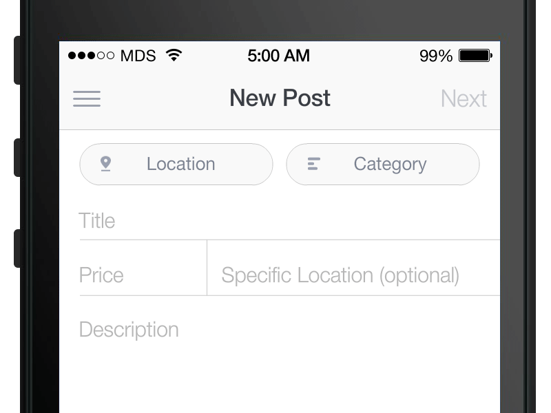
4. Use inline labels for short-form fields
If you have a very simple checkout with just a few fields you can condense the information on the screen by using inline labels, or placeholder text, within your form fields:

(Source: UXPlanet.)
These shouldn’t be used in place of field labels for larger forms because the placeholder text disappears when they tap into the field.
5. Use floating labels
When you have longer forms in your checkout this is a great way to present a clean form with less information hovering around.
Your placeholder text lets them know what to enter and then as soon as they click into the field, that text floats:
(Source: Dribble.)
This method keeps them from losing track of what they’re supposed to be entering which can create friction in the checkout for longer forms, like entering shipping information.
6. Kill popup error messages
Any interruption during checkout creates fiction.
So an error message can be extremely frustrating for the user, especially if it happens after all the information has been entered and they have to go back and find the error to modify it.
A better alternative to creating an easy checkout is to use floating errors with real-time data validation:
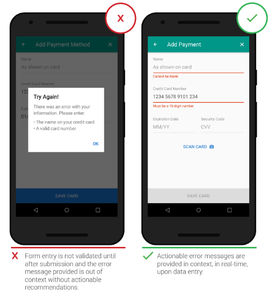
(Source: UXPlanet.)
This method lets them know immediately if there is an error and doesn’t require any kind of form reset or reload where information can be lost.
There’s no delay in the checkout process since the customer can correct the error before continuing.
7. Maximize trust during checkout with extended validation SSL Certificates
Consumers have trust issues when it comes to making payments and purchases online. Concerns over payment security is one of the top reasons for cart abandonment.
The more obvious it is that your store is secure, the better chance you have of winning that conversion and reducing friction.
Having an SSL certificate with HTTPS is a good start, but most customers don’t always notice that—especially if they’re on a mobile device.
An extended Validation SSL Certificate is a better approach.

(Source: ExpeditedSSL.)
For those customers in the know, extended validation means stricter standards and verification. For your average customer, they won’t just see your URL at the top.
Extended validation provides your company name in bright green along with a lock symbol next to it to show that it’s secured.
8. Never link outside of the mobile checkout process
Customers are bound to have questions sometimes during checkout.
What you don’t want is for the customer to exit the checkout when they’re close to completion in order to go digging through your site (or the web) to find the answer.
For this reason, never use external/internal links in your checkout save for those that take them back to shopping.
Instead, take the accordion-style site design used on some sites…
Source: NNGroup
…and apply it to your checkout.
Source: UsingCSS3
Give them access to your resources including customer service, FAQs and your knowledge base contents from within checkout using links that trigger additional drop-down information in accordion-style.
Source: Smashing Magazine
If you already use an accordion-style checkout process to eliminate multi-step checkouts then this will fit well within the process.
This is a great way to incorporate info into the checkout process to keep customers informed, such as free shipping reminders and return information as the shipping segment expands.
You could also implement payment gateway security icons and trust signals in the payment entry section.
9. Use appropriate input fields
The bulk of the friction with checkouts, especially on mobile, is entering information. The more work you require someone to do, or the more complex the task, the more likely they will be to bail.
Not all of your input fields use text, so customize the input to match the contents of your required fields.
For general text fields, your basic keyboard is fine:
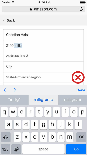
It provides all the alphanumerics necessary to fill fields. But, for fields that are numeric, only you can condense this down to a numeric pad.
You can further customize this by using calendar inputs where dates are needed or keeping those numeric-only as well.
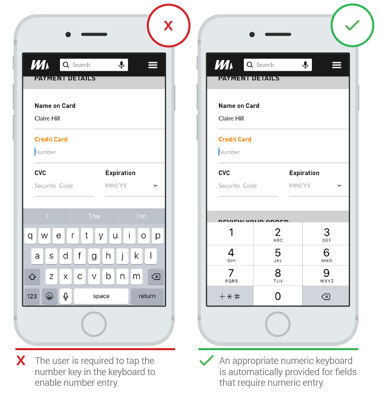
Source: UXPlanet
10. Use buttons for forward progress
If there is a specific action you want customers to take, like moving to the next step in checkout, then make sure you use a large button.
Never use text links for necessary steps.
This kind of UI mistake assumes that screens (as well as fingers) are the same size. For some users, clicking a text link can be difficult on a small screen. It’s a much smaller target to hit than a button:
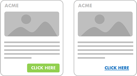
Source: 8 Seconds
You also want your call-to-action buttons to stand out. This is easy to do by making those next-step buttons full-width of the screen or window.
Color them so they contrast with the content around them, and make the font stand out so it’s easy to identify:
Source: Grapevine Group
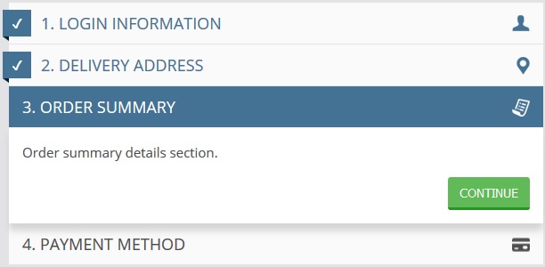
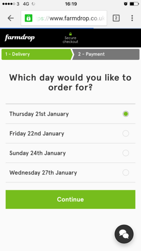
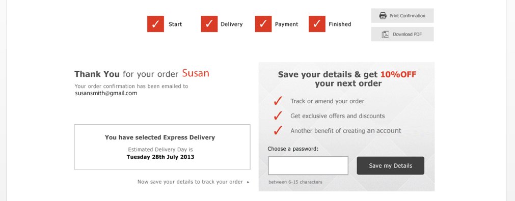
11. Use a progress indicator during checkout
While the number of people abandoning carts due to complicated checkouts is minimal (it’s the lowest on the list of reasons for cart abandonment) it’s still an issue.
When customers don’t know how much longer the checkout will take they’re likely to leave or abandon the purchase with a mind to come back when they gave more time.
Remember, they’re shopping on mobile so they’re likely trying to make a purchase while otherwise engaged or on the go.
Show them how quick checkout will be with progress indicators.
Source: eConsultancy
12. Make sure checkout is optimized for speed
With Google’s shift to using site load speed as an organic rank factor, brands continue to test and optimize their sites to improve load times.
That includes testing the shopping experience to ensure content is loading appropriately.
But are you testing all the way through the checkout process?
Studies show that 85% of mobile users expect sites to load faster than a desktop experience. That’s not much time when you think about it – just a few seconds.
Adding just 1 second to page load time, especially in the checkout process, can seriously impact conversions and cart abandonment.
Just look at this data from Kissmetrics:
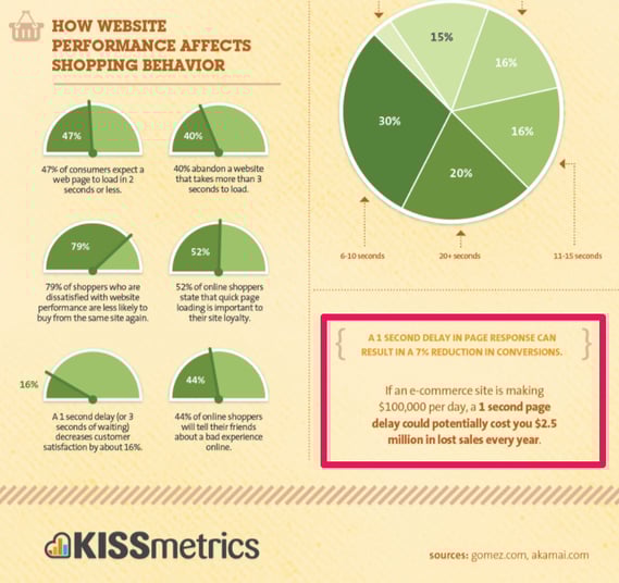
Source: Kissmetrics
To enhance your mobile checkout speed:
- Don’t use image-intensive interfaces
- Strip any scripts (social, 3rd party, etc.) that aren’t critical to page load – or load them at the end after the content processes
- Stress test your checkout process to see how it performs under heavy traffic load
- Install Google’s page speed module to optimize loading times
13. Don’t force registration
Assume your mobile customers are in a hurry and went to check out as fast as possible.
The greatest point of friction, if that’s the case, is forcing user registration. In fact, 25% of abandon carts result from required registration.
It’s understandable to want to capture customer information for marketing purposes, but don’t fall into this trap that ultimately costs you more money and lost customers.
Make it as easy as possible for the mobile customer.
There are a few options to do that:
- Always offer a guest checkout
- If you offer both a guest checkout and a login screen, keep the options and click-points limited
- Give them the option to register quickly with a social login, like logging in with Google or Facebook
If you must capture their email, take a cue from Bonobos approach.
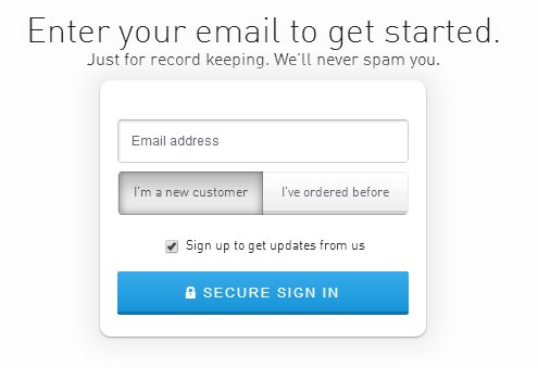
Source: ConversionXL
They ask for email up front which gives them more control over abandoned cart recovery and future marketing, but they do it with minimal information gathering to keep the checkout fluid.
The best option, which ConversionXL talks about in their post on designing better checkout flow, is one of two methods.
Diamond Candles defaults right to guest checkout, completely skipping the login screen.
Source: ConversionXL
They give you the option to create an account as part of the checkout process using the information you’re already providing.
The other is seen with Speedo where there is an incentive to register during, or after, the checkout process.
Source: ConversionXL
Domino’s also uses this tactic by letting you accrue points with your purchase toward a free pizza if you register as opposed to ordering with guest checkout:
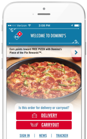
Source: AppBoy
While some of the above examples are from a desktop experience, you can still incorporate them into your mobile checkout process much the same way Dominos and other brands do.
Conclusion
Optimization of the mobile checkout process covers a number of elements, but they all orbit around a central concept.
Get your customer to the end of the checkout as easy as possible with the minimum number of clicks.
To reduce cart abandonment and improve conversions, you need to make that process as easy as possible. It should happen in just a few clicks (because the shopping experience is done and they’re ready to go), with minimal opportunities for the customer to walk away.
What does your mobile checkout experience look like? Leave a comment below.

