
Growing your e-commerce business requires you to invest in email marketing—one of the most popular permission marketing techniques.
According to Content Marketing Institute, 87 percent of marketers leverage email marketing to establish and nurture relationships with their customers.
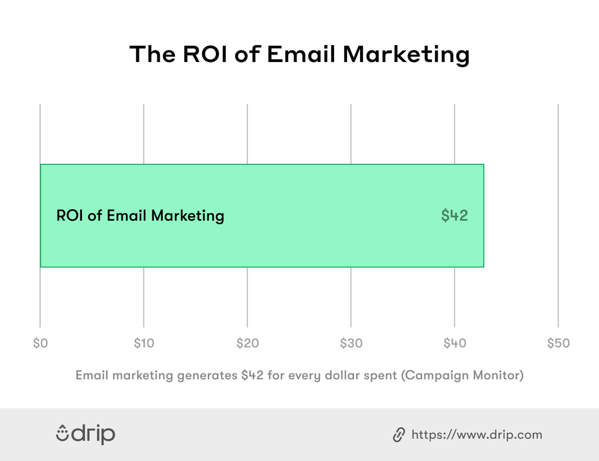
What’s more, with good email marketing, you can expect an average of $42 on every $1 you spend, according to Campaign Monitor.
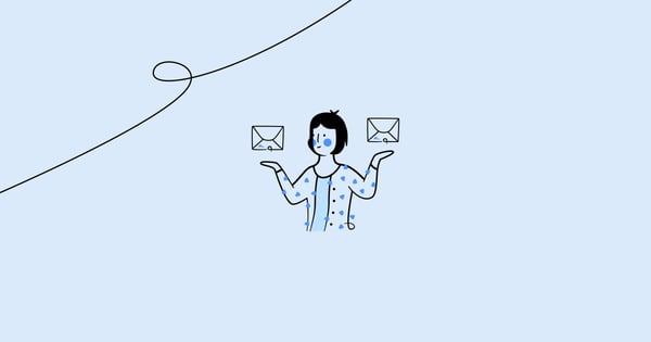
However, email marketing isn’t free from its challenges.
For instance, with the increased usage of mobile devices, it’s essential to consider your emails’ compatibility with mobile screens.
Showing data on small devices, considering adaptable images and icons, and fast loading are only some of the challenges e-commerce emails face.
But don’t worry—I’ll walk you through some of the best e-commerce email design examples I’ve seen to inspire your own.
Without further ado, let’s get to the nitty-gritty.

Table of Contents
What Is Email Design?
Email design is the process of developing unique emails that resonate with your brand’s target audience—specifically your existing customers through email marketing.
Sure, crafting compelling email marketing content is critical for your e-commerce business’s success, but a good email design will convey the information better to your prospects.
With a good email design, your prospects and existing customers can better navigate through the information and take action. Besides, a good email design captures attention and entices your audience to read more.
That said, carefully choosing the images you’ll include in your email design, colors, fonts, and font sizes will give your brand identity, build trust, and increase loyalty among your customers.
8 Awe-Inspiring E-Commerce Email Design Examples
Now that you know what email designs are and what they entail, let’s check out eight high-performing email designs that will improve your email engagement.
1. Godiva
Godiva is one of the most popular chocolate companies globally, founded in 1926, serving more than 100 countries worldwide. If you have a sweet tooth, I’m sure you’re familiar with Godiva.
Besides being known for sweet and creamy chocolate, Godiva also enjoys a good e-commerce email design.
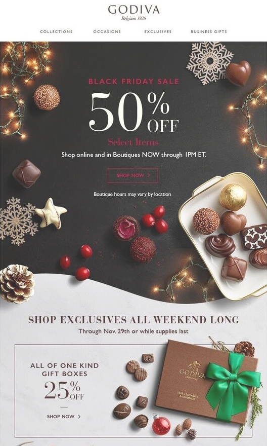
The company’s Black Friday email design is beautifully arranged. It’s giving you all the options you may need, whether you want to shop straight away or take advantage of its discounts.
The elegant layout and easy navigation make Godiva’s email design unique.
If you want to follow Godiva’s example, make sure to include a clear call to action (CTA) in your emails (e.g. “Shop Now”) and nudge your subscribers to take action right away.
2. Astley Clarke
Astley Clarke is a jewelry e-tailer founded in 2006. The e-commerce company has grown in popularity due to its colored diamonds, metals, and gemstones.
However, its products aren’t the only thing we can praise Astley Clarke for—the company also has an excellent email design with user experience in mind.
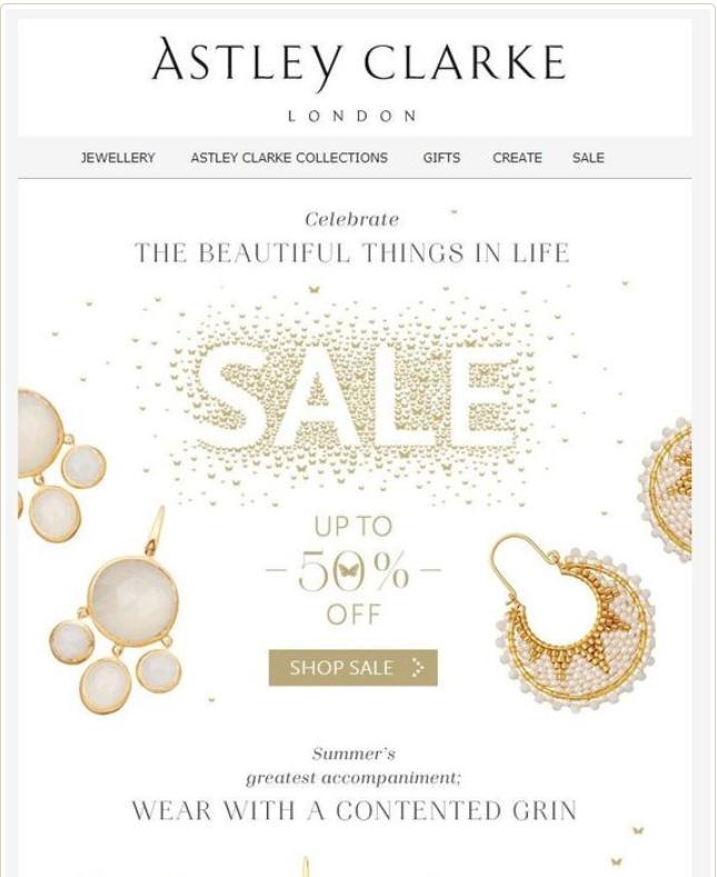
Take this promotional email design, for instance. The attention-grabbing copy, clear images, and a well-placed call to action button make it easier for its subscribers to make a purchase.
Using clear visuals, especially those of your products, can help grab the reader’s attention. Plus, breaking down your offers using subheadings as Astley Clarke does increases readability, which makes it easier for your customers to click through.
3. Esprit
Esprit is a publicly owned clothing, jewelry, footwear, accessories, and houseware brand.
In this email where Esprit promotes its recycled collection, the company gets the email design right.
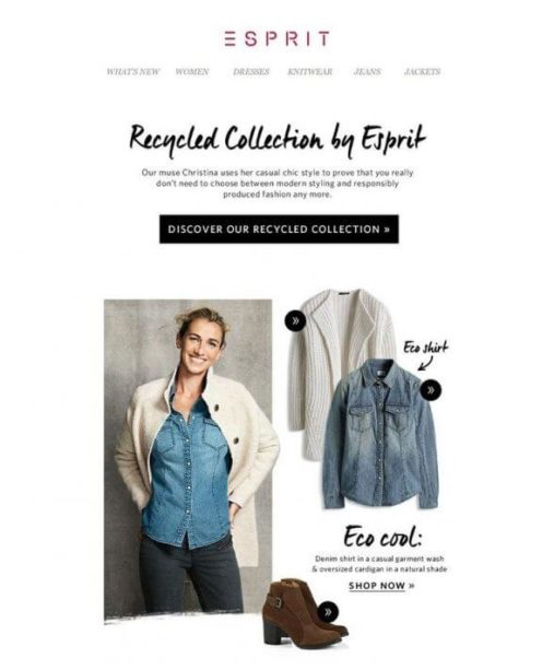
Every piece of clothing displayed in the email has a model and a clear call to action. Depending on which item you like, you can click the CTA below it and purchase or view it.
Knowing that its customers have different tastes in style, Esprit cleverly gives them a variety of items to choose from in the email:
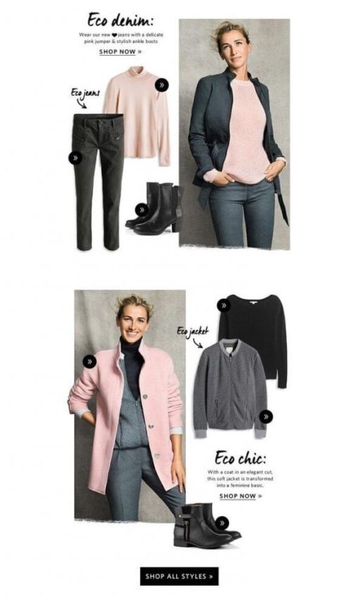
If you’re promoting a specific collection of products or new arrivals in your emails, make sure to give customers several options. What’s more, include images of those products and a clear call to action to help them take action quickly.
4. Boden
Boden is a British clothing brand that sells online, by catalog, or mail order.
In its newsletter promoting a back-to-school collection, Boden targets parents on its list:
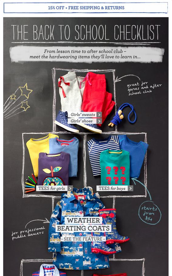
In the email, Boden includes a checklist of what children might need while going back to school. And the company does this with graphics that appeal to its target audience.
It’s essential to understand your audience when creating an email design. This can guide you into including just what your target audience might be looking for.
5. Groupon
Groupon is an American e-commerce platform connecting customers with merchants.
Groupon makes a profit through the commissions they get on every coupon it offers customers on the platform. The company is all about giving coupons and in this email too, Groupon offers its subscribers items with a 20 percent discount:
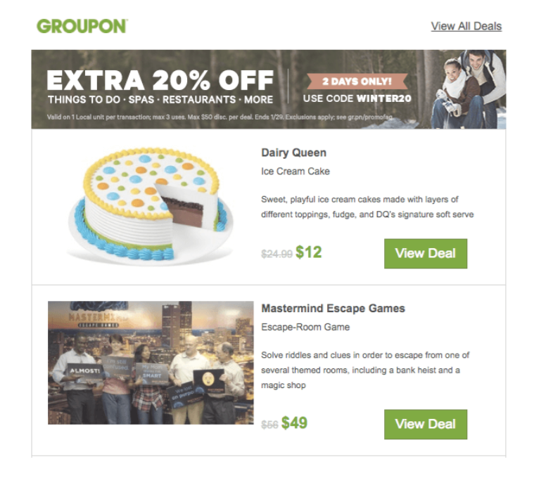
What’s unique about this email design is that it has clear graphics that quickly tells the customer that Groupon offers them a limited-time discount.
What’s more, customers can easily navigate through any of the items they’re interested in and click the green CTAs that stand out in the email design.
To follow Groupon’s approach, make sure that subscribers know what action to take once they open your email. If you’re offering multiple items at a discount, make it easy for them to navigate through all offers.
6. H&M
Hennes and Mauritz, commonly known as H&M, is a Swedish retail clothing brand dealing in men’s, women’s, and children’s fast-fashion clothing.
H&M always gets it right when it comes to email design. Take a look at this example where the company displays its summer collection with a minimalistic email design:
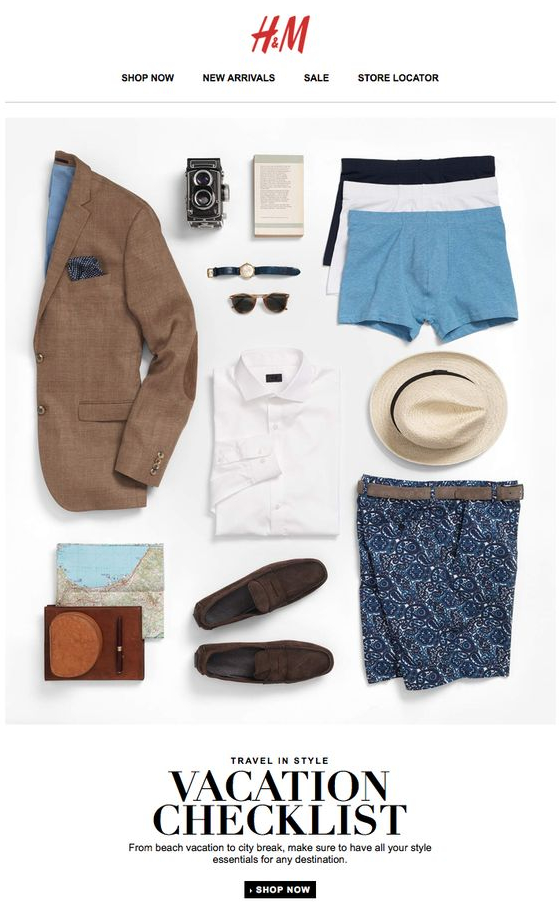
While the email doesn’t include price information, it gives customers all the details they need—such as free shipping for orders above $50, a vacation checklist, and a photo grid of the products it’s offering.
Don’t complicate it when it comes to email design. A simple layout can help customers better understand what you’re trying to communicate.
7. Fancy.com
Fancy.com is an e-commerce site where retailers bid to have their products listed on the platform.
Its business model aside, Fancy.com knows its target audience quite well. In an email to showcase its gift collection, the company displays its watches and wallets—well arranged with high-quality images:
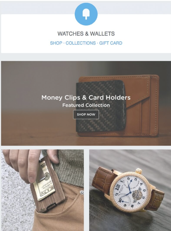
The company sends this email a few days before Valentine’s Day. Since Valentines’ Day involves giving gifts to loved ones, this timely email makes a lot of sense.
Fancy.com’s email design is simple, yet it smartly takes the upcoming Valentine’s Day into account. Before designing your next email, keep an eye out for any profitable holidays ahead and incorporate them in your email design.
8. Canon
Canon is a multinational corporation based in Tokyo, Japan, dealing in imaging, optical, industrial products, such as medical equipment, lenses, printers, scanners, and cameras.
Canon knows the power of visuals and maintains the red brand colors and green calls to action with high-quality images in most of their email designs:
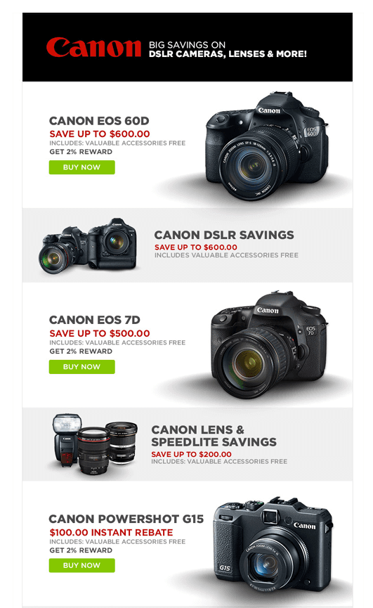
In the remainder of the email, Canon also includes an easy-to-navigate footer. Subscribers can find all the links they need, including a button to update their email preferences.
Including an “update email preferences” button is a smart element of every e-commerce email design because it gives subscribers the freedom to change their email settings and only receive emails they’re interested in.
Bottom Line
Every perfectly designed email you send to your subscribers creates awareness about your brand.
With these eight e-commerce email design examples, you can never go wrong.
Take inspiration from them while creating your own promotional emails and be mindful of your images, calls to action, and layout.

