

First impressions are everything—in real-life and with email marketing.
Create a strong connection right out of the gate and you set the stage for solid reader engagement, click-throughs, and conversions. And in many cases, this knocks down the first domino for building loyalty and getting repeat business.
But how do you make sure you make a great first impression? Simple. With a compelling welcome message. Here’s everything you need to know about creating one, along with several welcome message examples for ideas and inspiration.

What Exactly is a Welcome Message?
Simply put, it’s the very first email you send to a new reader. It’s an integral part of the onboarding process where you formally introduce your brand, thank a reader for coming along for the ride, and get them up to speed on your UVP, promotions, and so on.
A welcome message also allows you to personalize their experience right from the start, which is massively important given that nearly three-quarters (74 percent) of marketers say email personalization boosts engagement.
How Effective is a Welcome Message?
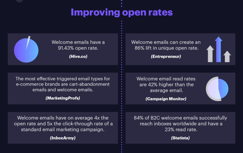
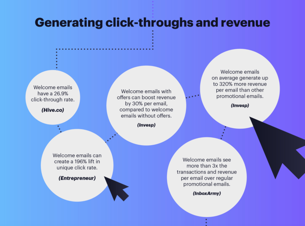
Very effective. Campaign Monitor compiled a list of stats in an infographic to illustrate the impact a welcome message has on key metrics like open rate, click-throughs, and overall revenue. Here are some that stand out:
- “Welcome emails have a 91.43 percent open rate.”
- “Welcome email read rates are 42 percent higher than the average email.”
- On average, they have 5x the click-through rate of a regular email marketing campaign.
- Placing an offer in a welcome email can boost revenue by 30 percent.
- They can generate up to 320 percent more revenue per email than standard promotional emails.
In short, they can be a game-changer. Here are some screenshots from the Campaign Monitor infographic with the full details.
Not only are most consumers receptive to welcome emails, 74% expect them when they subscribe. So, this is definitely a type of message you want to send out to get the ball rolling with new readers.
Welcome Message Examples
For the rest of this post, I’m going to share with you some of the best welcome message examples I’ve seen and point out the specific elements that make them so effective.
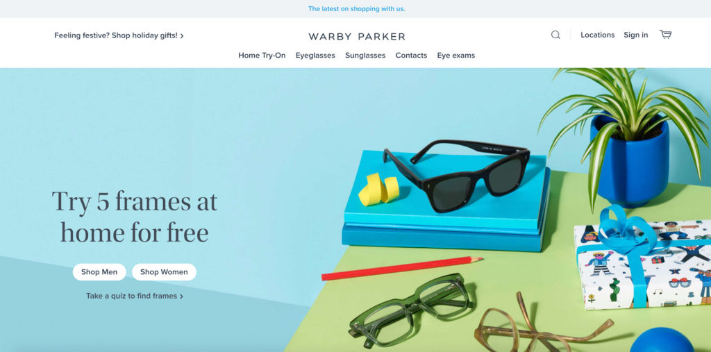
Warby Parker
This is an online retailer that specializes in glasses and sunglasses. I’m personally a big fan of Warby Parker and think it has done an amazing job at branding and creating an ultra-personalized experience from the ground up.
Giving customers the chance to try on five frames at home for free, for instance, is really effective.
And its email campaign is equally as amazing. Here’s one particular welcome message example that I think really hits the mark. It starts out with a simple yet friendly, “Welcome to Warby Parker.”
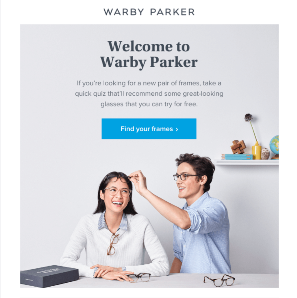
It quickly lets new readers know they can take a short quiz to find the frames that will make them look like a million bucks. All they have to do is click on the “Find your frames” CTA to get started.
It’s dead simple and immediately lets new readers know that personalization is a top priority for Warby Parker. By doing this, it’s infusing its primary UVP into the initial email and educating readers on what differentiates Warby Parker from the competition.
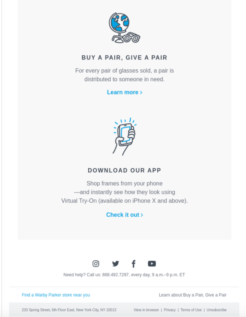
Below that, it offer a few more interesting sections, including information on how its glasses are made, how to find a physical store if a reader is interested, and info on its social responsibility initiatives.
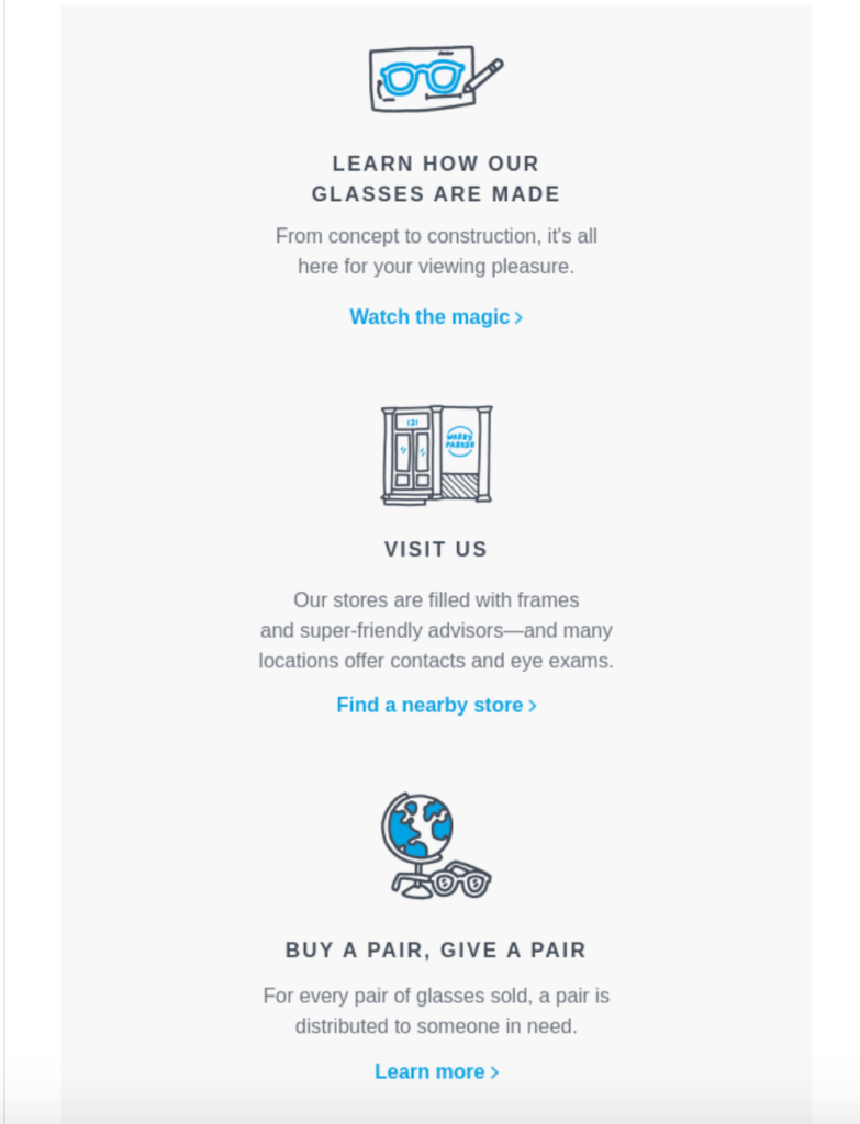
And at the very bottom, there’s a link where readers can download the Warby Parker app.
The takeaways here are to:
- Get straight to the point with your welcome message
- Project a tone of warmth in your copywriting
- Highlight your UVP
- Point readers to helpful resources so they can get started without having to figure it out on their own
It’s all about being personable and helping new readers get their bearings. And of course, always be conscious of aesthetics, keeping the design crisp and clean.
Fundrise
“Fundrise is the first investment platform to create a simple, low-cost way for anyone to access real estate’s historically consistent, exceptional returns.” Like my previous example, this welcome message is super straightforward with a subject line of “Welcome to Fundrise.”
The email specifically targets new subscribers who have expressed interest in the platform but have yet to officially sign up. Here’s the first thing readers see when opening it.
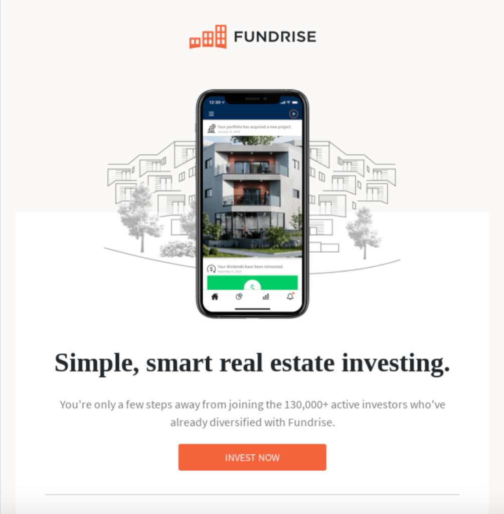
There’s an eye-popping image of a smartphone with the Fundrise app on it and a killer UVP of “Simple, smart real estate investing.” And below that there’s some brief copywriting that says, “You’re only a few steps away from joining the 130,000+ active investors who’ve already diversified with Fundrise.”
With just a glance, this gives new readers a glimpse of what Fundrise offers and lets them know why they should care. Specifically mentioning that over 130,000 investors actively use the platform gives it validity and the well-placed CTA that says, “Invest Now” lets them know what action to take next.
And to give readers a bit more persuasion, Fundrise includes this section that lets them know that real estate investors who diversify tend to outperform its counterparts that don’t and spout out some key benefits in an easy to digest bulleted format.
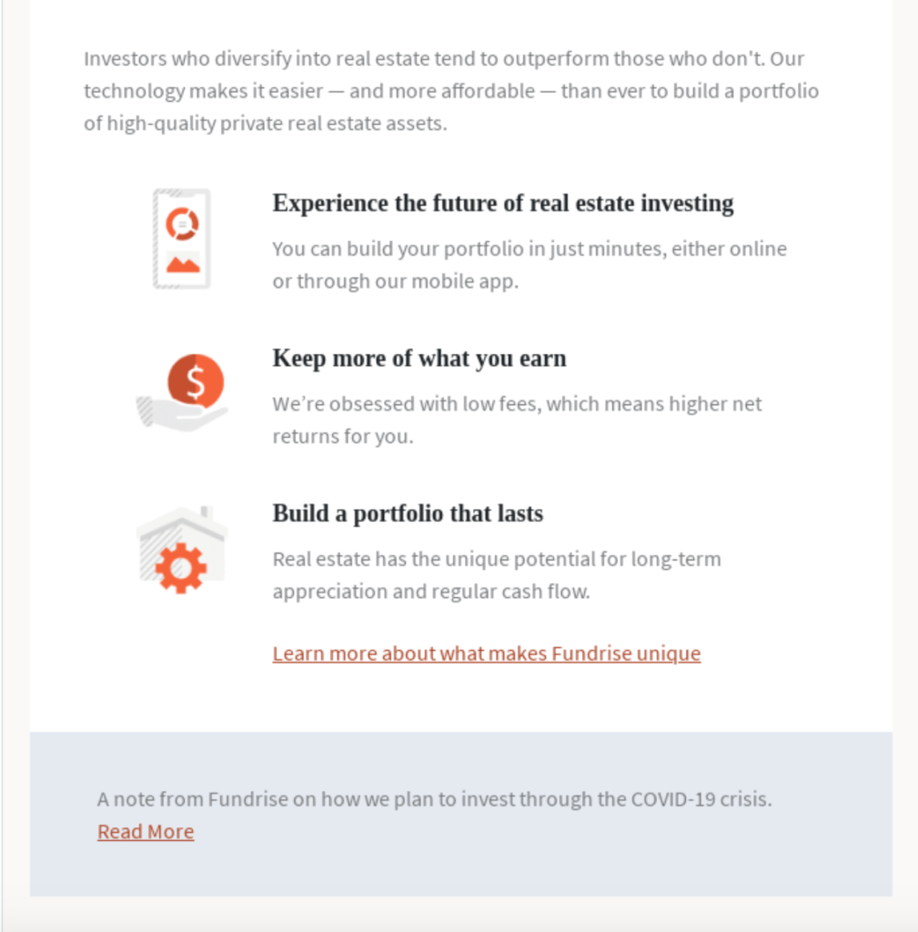
Readers learn that tapping into this platform lets them experience the future of real estate investing, there are low fees, and they can build an impressive, long-lasting portfolio.
So, with very little effort, new readers can get up-to-speed on what Fundrise is all about and see exactly how it can help them with real estate investing. I love the simplicity of this email and how well it shows up on mobile.
If you’re looking to connect with subscribers and provide a brief overview to motivate them to make an initial purchase, this is a fantastic welcome message example to borrow from.
Queen Garnet
My next example comes from Queen Garnet, an Australian-based health food brand. Queen Garnet sell a handful of different products, but its bread and butter is its Australian Plum Nectar made from Queen Garnet plums, which are reported to have six times the antioxidants of blueberries.
One of the first things you’ll notice about Queen Garnet is its one-of-a-kind branding with the signature plum color.
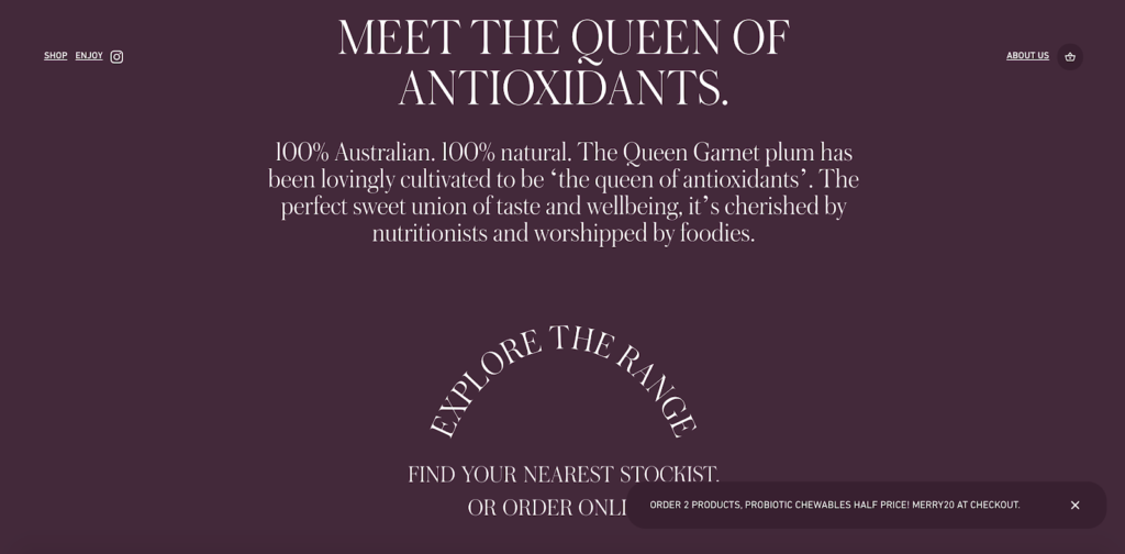
It’s very fitting, stands out, and is the theme it focuses on in this welcome message. Check it out.
It starts out with a friendly, approachable “Well hello there!” And I really like the opening line of “Here’s your official telegram on the behalf of the queen – Queen Garnet, the queen of plums…and then some!”
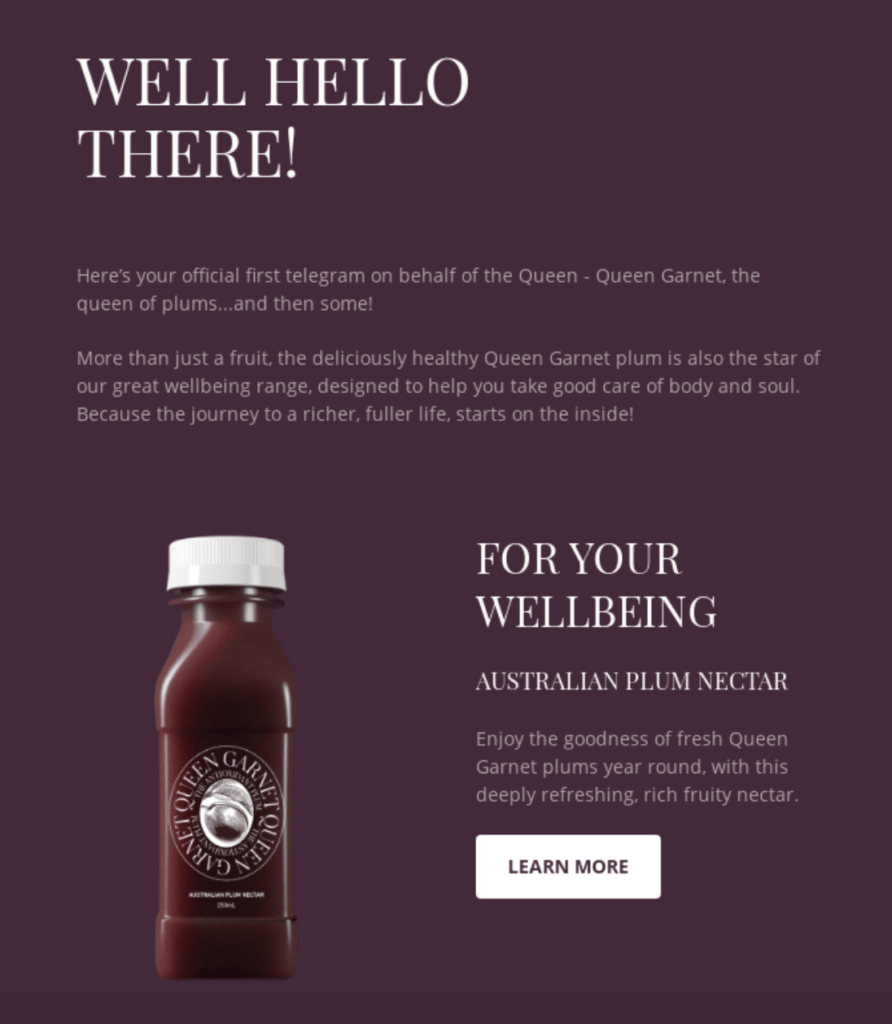
It’s super playful and catchy and even incorporates rhyming so that it rolls off the tongue. Then, it gives a quick overview of the key benefit of Queen Garnet’s products—“to help you take good care of body and soul”—and immediately launches into its top products.
It starts off with its Australian Plum Nectar. Then it jumps into other products like its Probiotic Chewables and Australian Plum Powder.
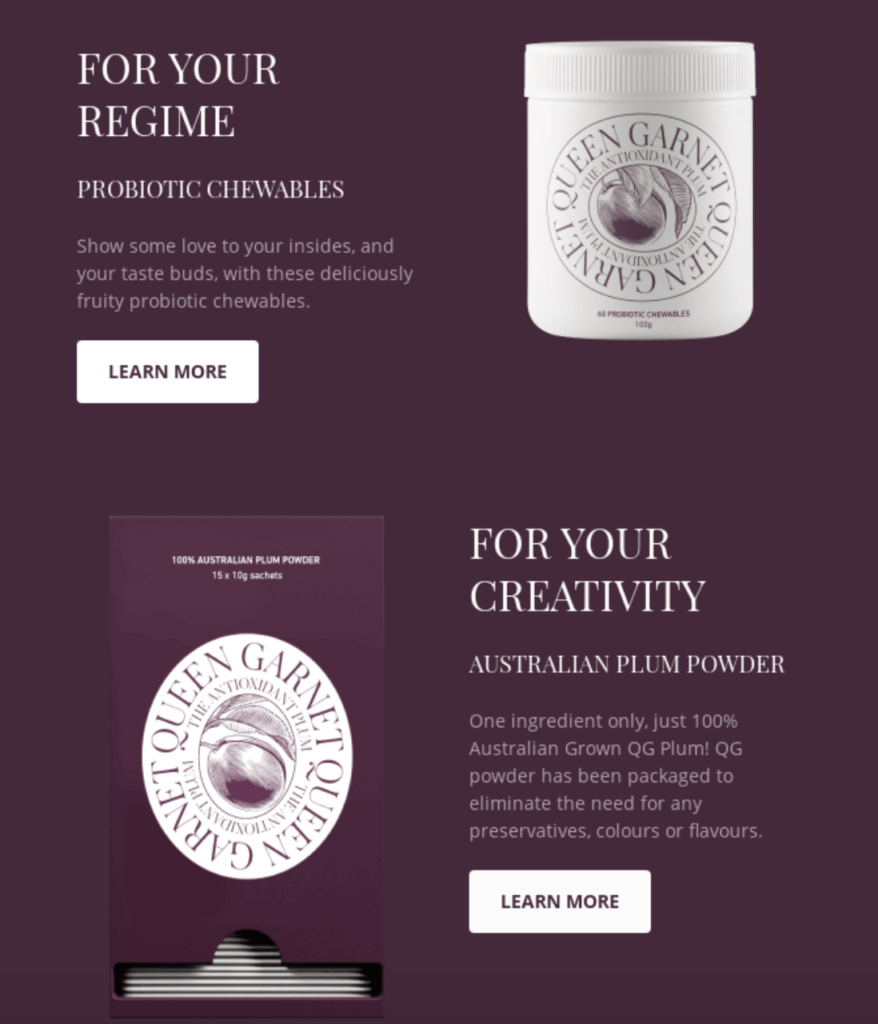
The images look amazing, and Queen Garnet includes concise paragraphs of copywriting, along with easy to follow CTAs.
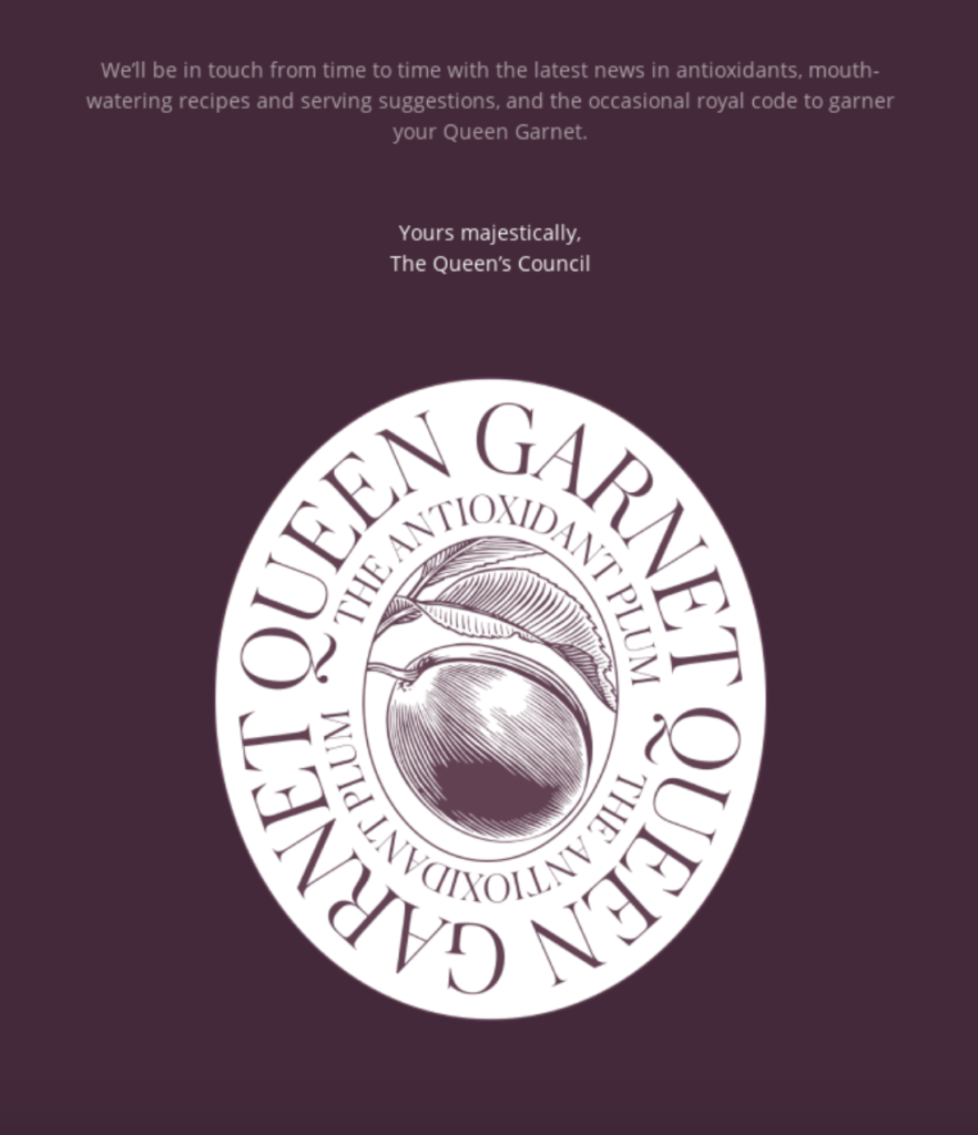
And at the bottom of the welcome message, this brand lets new readers know it’ll “be in touch from time to time with the latest news in antioxidants, mouth-watering recipes and serving suggestions, and the occasional royal code to garner your Queen Garnet.”
That way readers know what to expect moving forward. There’s also a witty close of “Yours majestically, The Queen’s Council.”
It does an amazing job of encapsulating its brand into a welcome message, injecting its unique sense of humor and brand elements, while at the same time highlighting some particular products its readers will likely be interested in. So, there’s a ton you can soak up from this example.
Supergoop!
Here’s a brand that offers high-quality sunscreen, makeup, and skincare products. And I think it’s cool that it uses an exclamation point directly in its brand name to convey enthusiasm.
Supergoop!’s welcome email by no means reinvents the wheel, but it serves as an excellent illustration of how to approach new readers. At the top is a picture of its founder and CEO, Holly Thaggard, along with a message directly from her.
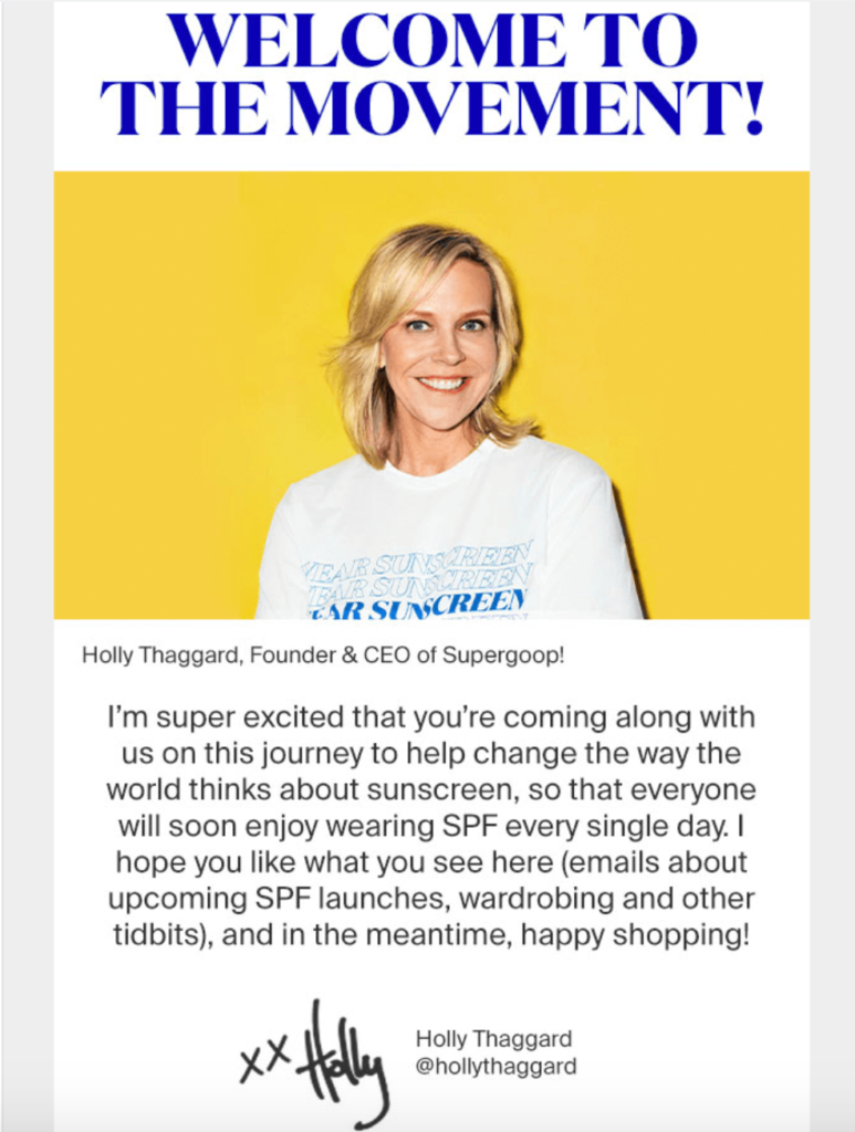
She welcomes new subscribers to the movement, says how excited she is to have them on board, and gives them a basic idea of what they can expect in the Supergoop! newsletter.
They’ll get info on new products, wardrobing tips, and more. And after that, Holly writes her signature with a link to her Instagram account so readers can learn more about her.
This welcome message has a very personal, approachable feel to it, and rather than depicting Supergoop! as some faceless brand, readers can instantly put a face to the name—a tactic that can be huge for maximizing engagement.
I personally find brands like this very likable, and I’m more inclined to do business with them. And I think many other people feel the same. Below that section, Supergoop! wraps it up by giving new readers 10% off by using a discount code.
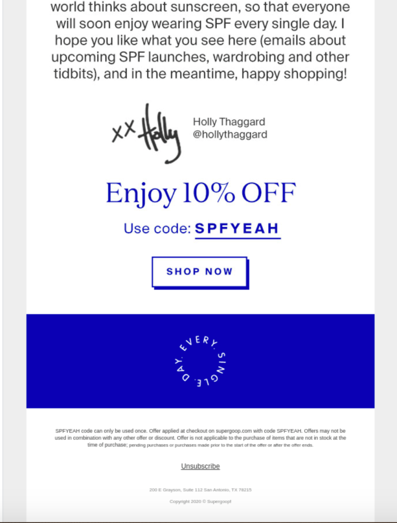
The brand also makes it easy to access its products by conveniently including a CTA that says, “Shop Now.”
So just like that, subscribers can read its welcome message, grab the discount code, and go buy a product. It’s all so seamless and silky smooth.
While this is one of the shorter welcome message examples I’ve come across, it does an amazing job of getting key information across in an easily digestible way and building instant rapport. And of course, including a discount should motivate a good chunk of subscribers to click-through and make a purchase.
Howler Brothers
Last but not least is this welcome message from Howler Brothers, an outdoor apparel company based in Austin, Texas. The entire email consists of a series of images combined with CTAs pointing readers to various sections of its website.
Here’s what the intro looks like.
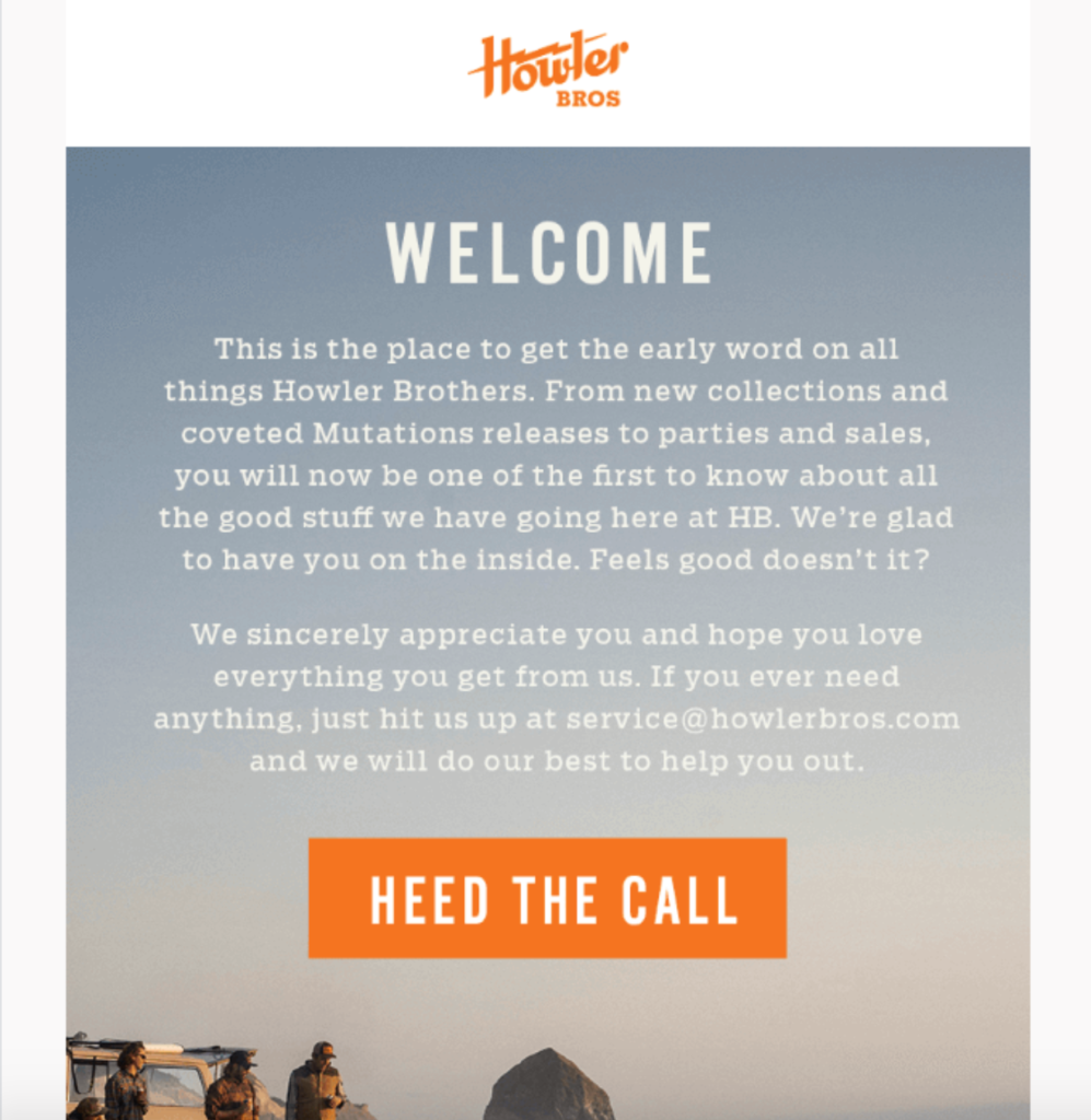
The first paragraph starts out with a formal welcome and lets new subscribers know what the perks of being signed up are, such as having inside access to new collections and releases to parties and sales.
And in the second paragraph, Howler Brothers takes an ultra-friendly, approachable tone, letting readers know they’re appreciated and how to quickly get in touch with a company rep if they need to.
Then, it jumps into a series of CTAs that take readers to different sections of its site.
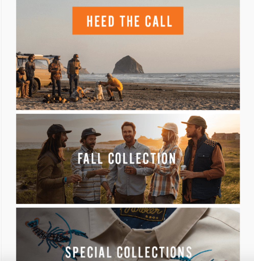
The “Heed the Call” CTA, for instance, leads to the homepage for a broad overview of the full line of products Howler Brothers offers. The “Fall Collection” CTA leads to just that—its line of products that are perfectly suited for crisp, cool fall weather. And so on.
Then, toward the bottom, Howler Brothers include links to its blog and Instagram account.
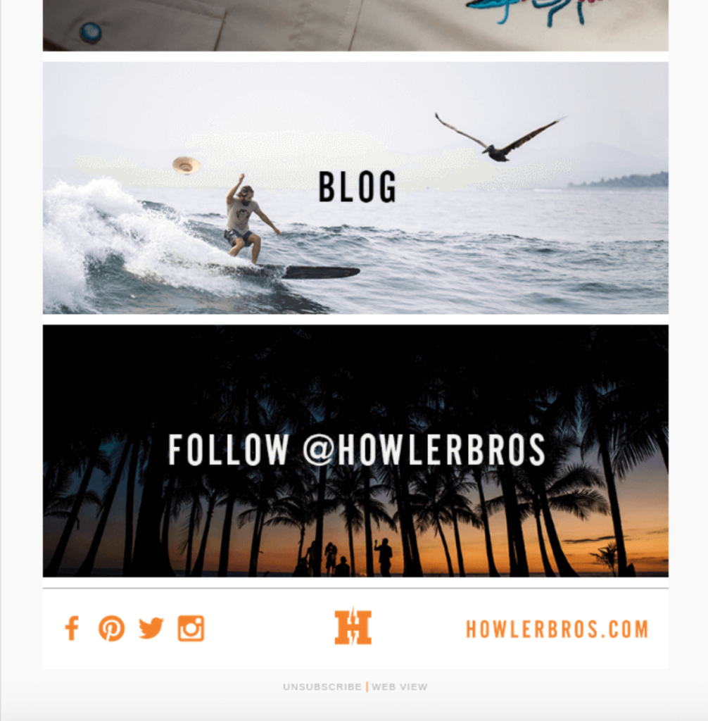
This paves the way for further relationship-building and deeper connections. And I really love the visual-centric nature of the layout. Rather than adding extraneous text for each section, it uses a beautiful image and a relevant CTA to make it self-explanatory.
So, in just a matter of seconds, Howley Brothers creates rapport with new readers, encourages engagement, and provides a personalized experience where readers are directed to where they need to go.
Conclusion
A well crafted welcome message is vital for onboarding new readers and making the all-important initial connection.
It fills them in on what’s going on, highlights specific products or offers they may be interested in and generally makes a good impression. And with nearly three-quarters of readers expecting a welcome message, it’s something you should take seriously.
On a side note, research has found that new leads are the most engaged 48 hours after subscribing, so that’s the window of time you’ll typically want to aim for with your outreach.
The welcome messages examples listed here demonstrate some of the specific techniques and strategies you can use and hopefully have given you some inspiration when approaching your own campaign.

