

Looks aren’t everything, but when it comes to mobile homepages, they might be.
Whether it’s the latest Tesla or Nike sneakers, people are attracted to strong design. The same is true for mobile homepages. Visual, intuitive, and strong designs encourage users to stay on your site.
If you’re not giving people the best design experience, you’re losing out on potential business, especially if you’re an e-commerce business.
And since mobile devices now generate over half of all global website traffic, it’s more important than ever to create a mobile-optimized homepage.
What’s more, mobile devices offer plenty of opportunities for attracting customers and driving e-commerce sales. In fact, half of the revenue generated on a typical e-commerce store takes place on mobile.
Whether you’re creating a brand new mobile-friendly site or optimizing an existing version, these mobile homepage examples should give you plenty of design inspiration.

Best Mobile Homepage Examples
1. ASOS
It takes browsers 50 milliseconds to decide if they want to stay on your site. In other words, you only get 0.05 seconds to convince users to choose your store over the competition.
When you want shoppers to stay on a page, a simple and intuitive design that makes life easy is best. Fashion retailer ASOS has a clean and minimalistic mobile homepage that makes it easy for visitors to find what they need.
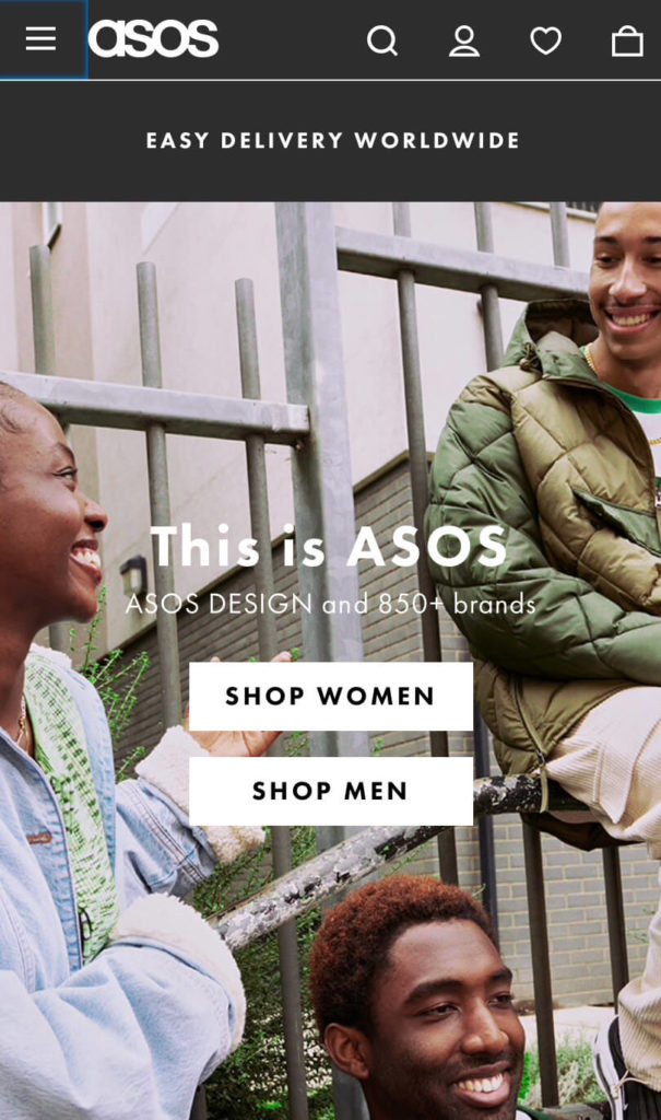
Like ASOS, sometimes all you need is a neutral color palette with concise copy to engage customers. They don’t distract customers with clashing colors, moving graphics, or anything else that could shift their focus.
It’s also clear what kind of customer service ASOS offers. A banner at the top displays current discount codes and promotes its delivery options. And clear buttons direct customers to shop for women’s or men’s collections.
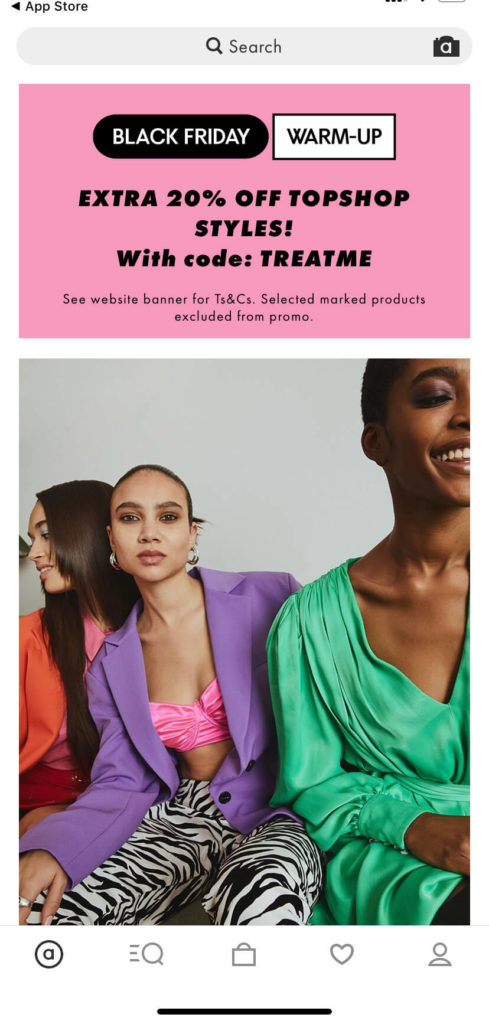
Plus, there’s a popup on the homepage guiding visitors to the ASOS app, which makes it even easier for customers to shop.
ASOS is a great example of a mobile homepage that gets straight to the point and gives shoppers what they need.
2. Nopla
Making your mobile homepage stand out from the competition is vital for keeping people on your page and winning over shoppers.
That’s definitely where Nopla, a store that stocks sustainable non-plastics shines. Its mobile homepage is eye-catching and stops people in their tracks.
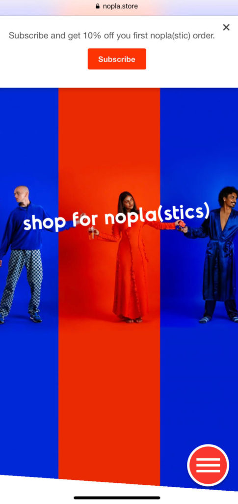
Along with a vibrant color palette, Nopla puts its mission statement front and center: “We believe that you should be able to live your lifestyle, the way you want it to be, while being kind to the planet.”
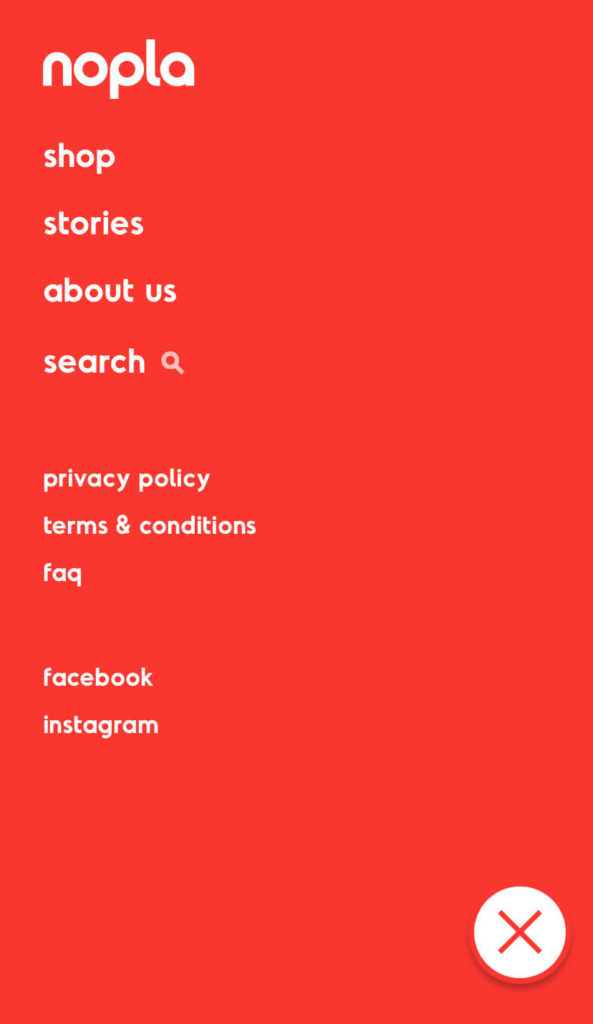
Another great thing about Nopla’s site is how easy and intuitive it is to navigate. The homepage has an easy-to-locate menu sidebar where customers can quickly shop its products.
Alternatively, they can scroll down the homepage to see the top product recommendations. Its striking branding and consistent color scheme make it easy to distinguish Nopla’s products from the competition.
3. Minori
Just like its ethos of minimalist beauty, Minori has a minimalistic and simple mobile homepage.

The company is transparent about its brand values, putting them front and center of its homepage. That way, shoppers can decide right away whether the brand aligns with their own values.
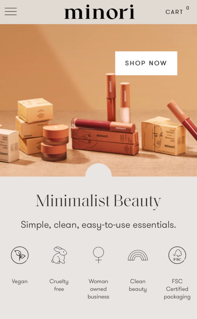
Minori also uses its mobile homepage to grab shoppers’ attention with special offers and discounts aimed at new shoppers.
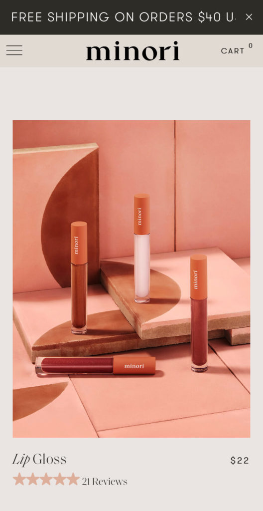
An email popup encourages visitors to sign up for Minori’s newsletter for a 10 percent discount. The company also has a floating bar at the top of the site with a 20 percent discount code, as well as free shipping on orders over $40.
Finally, Minori features its highest-rated products and magazine reviews as social proof to build trust with new customers.
4. Ostrya
There’s a lot to love about Ostrya’s mobile homepage. First, it’s visually pleasing with striking images of real people using its products in stunning locations.
The company puts its products front and center of the show and helps people imagine themselves using them outdoors.
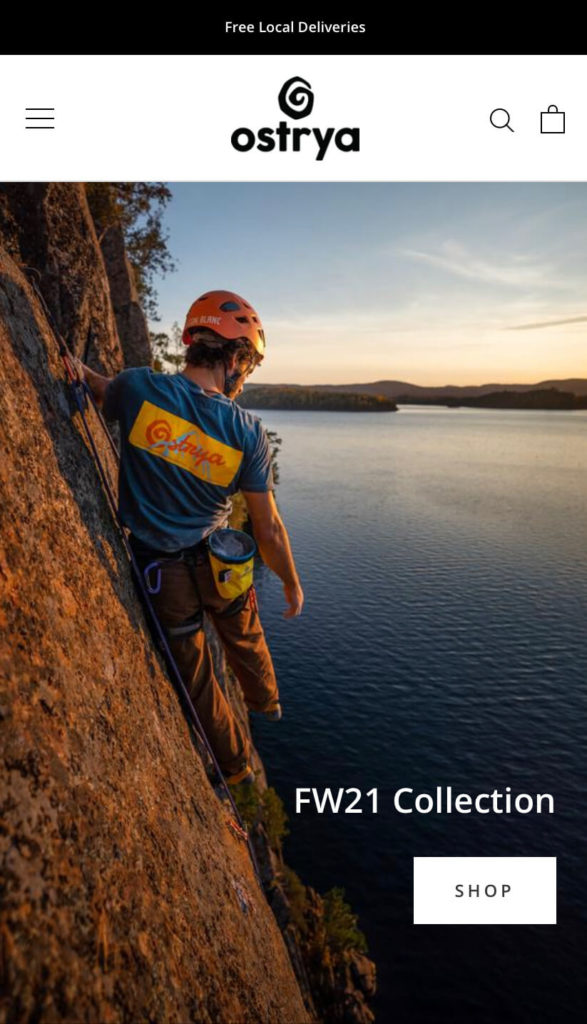
Ostrya keeps it simple with a strong call to action (CTA) that reads “Shop,” positioned below the header promoting its new collection. It also announces its free local deliveries at the top of the pages.
Although Ostrya isn’t one of the best-known outerwear brands like Patagonia, it does a great job of showcasing its mission with clear messaging and compelling visuals.
5. Orange Street Paper Co.
Orange Street Paper Co. keeps it simple and playful on its mobile homepage with a design that’s colorful, clear, and fun.
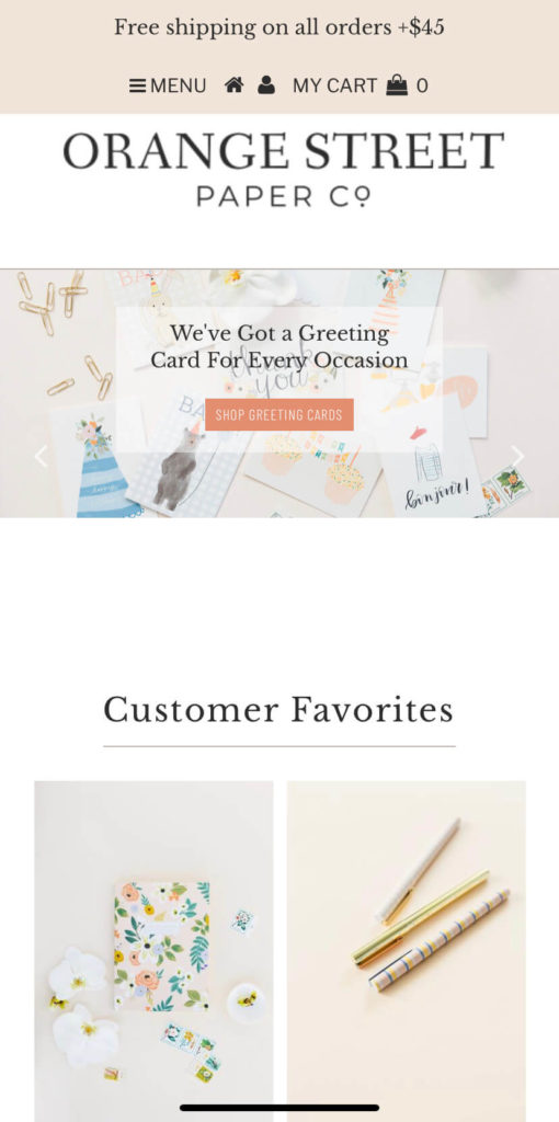
Well-placed CTAs encourage customers to shop for different products, such as greetings cards, or to explore the latest seasonal collections.
They also showcase a collage of customer favorites. People can get inspired by Orange Street Paper’s most popular products and quickly click through and buy them.
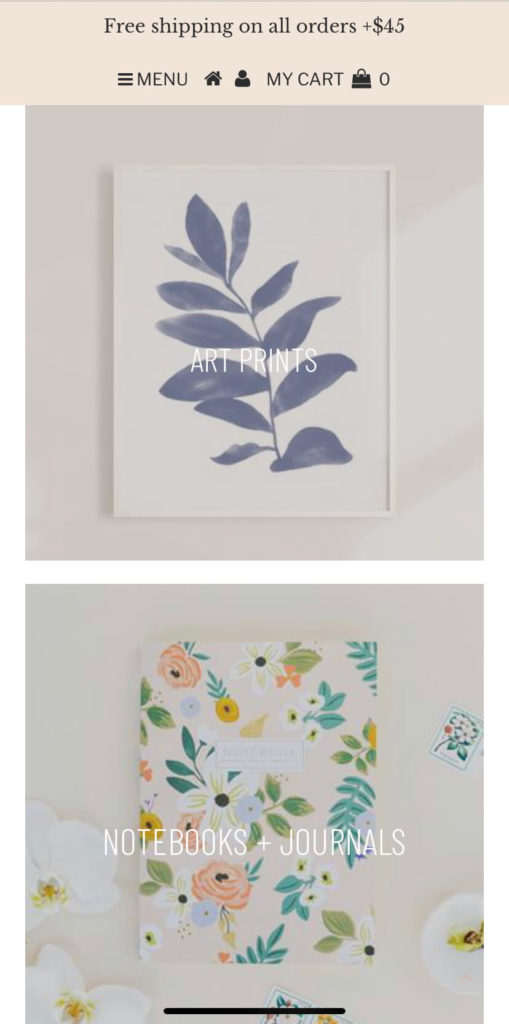
It also categorizes items by product type so people can quickly find what they’re looking for. Clear and minimalist photography limits distractions and helps people see the products in their best light.
And since 85 percent of shoppers say product descriptions and pictures are important to them when deciding which brand or retailer to buy from, displaying products in an easy-to-view way is key.
Again, Orange Street Paper Co. highlights that it offers free shipping on all orders over $45 with a simple banner across the top of its homepage.
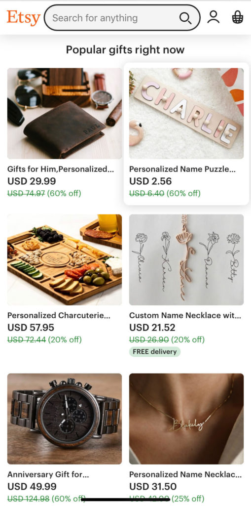
6. Etsy
The best e-commerce mobile homepages show people quickly what they can purchase along with any deals they might have on offer.
As I mentioned earlier, simple and user-friendly designs are key for helping shoppers, considering 60 percent of shoppers say website usability is important for them.
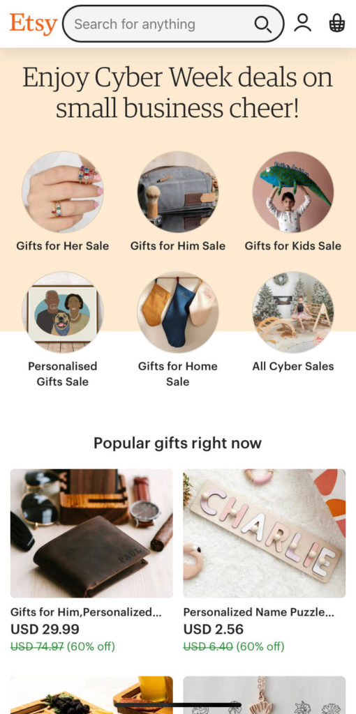
Etsy, an e-commerce site where people can buy or sell vintage and handmade items is making its featured products the main focus, together with its Cyber Week deals.
People who visit Etsy are usually there to browse categories or search for specific items.
Below the initial categories, there are images of popular gifts that highlight some of the trending things you can buy on Etsy. Mobile users see these images in a collage format and can tap on each one for more product details and images.
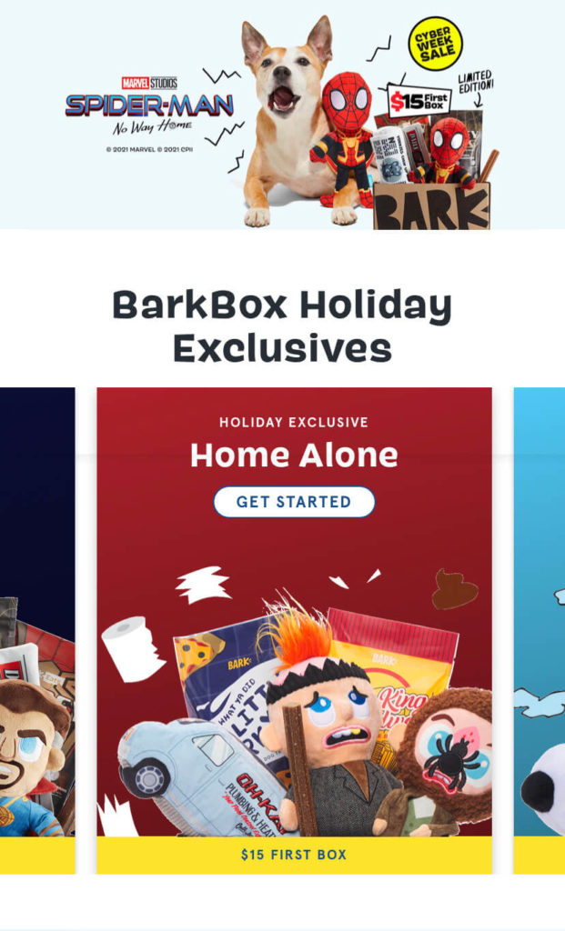
7. BarkBox
BarkBox’s mobile homepage ticks a lot of boxes. First, it makes the company’s value proposition loud and clear for new and returning customers: “Give your dog exactly what they want.”
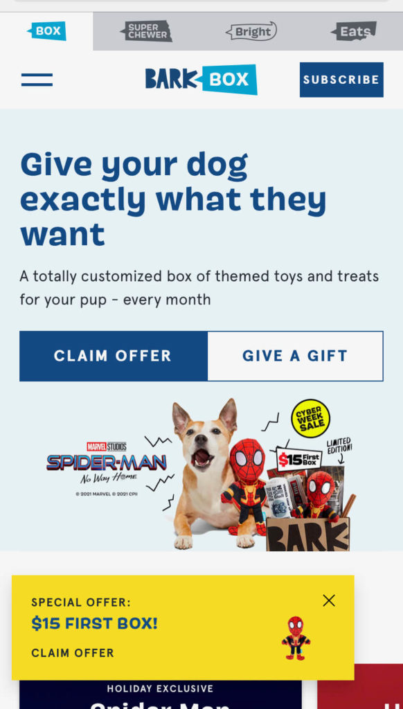
From this line, pet owners get to know what Barkbox is selling and why they should be interested. The website also has a bright color palette and eye-catching graphics to pull shoppers in.
One of the standout features on BarkBox’s homepage is the well-placed and striking CTA buttons. Customers can easily claim their offer or give a gift by clicking these CTAs.
With the holidays around the corner, BarkBox capitalizes on this and pushes its holiday collections to center stage.
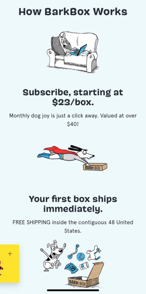
Scroll down further and there’s a clear explanation of how Barkbox works, along with a CTA button to subscribe.
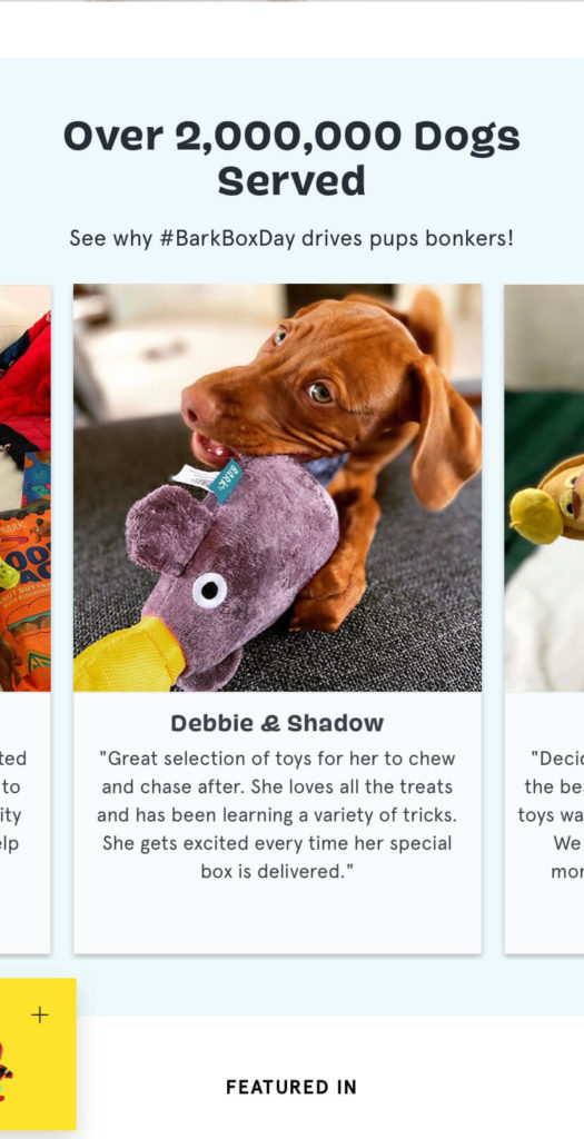
Finally, it provides engaging social proof in the form of images and testimonials of happy four-legged customers.
8. Ratio
Ratio Coffee uses a clean, sophisticated, and minimalist mobile homepage design to show it’s selling high-end coffee machines.
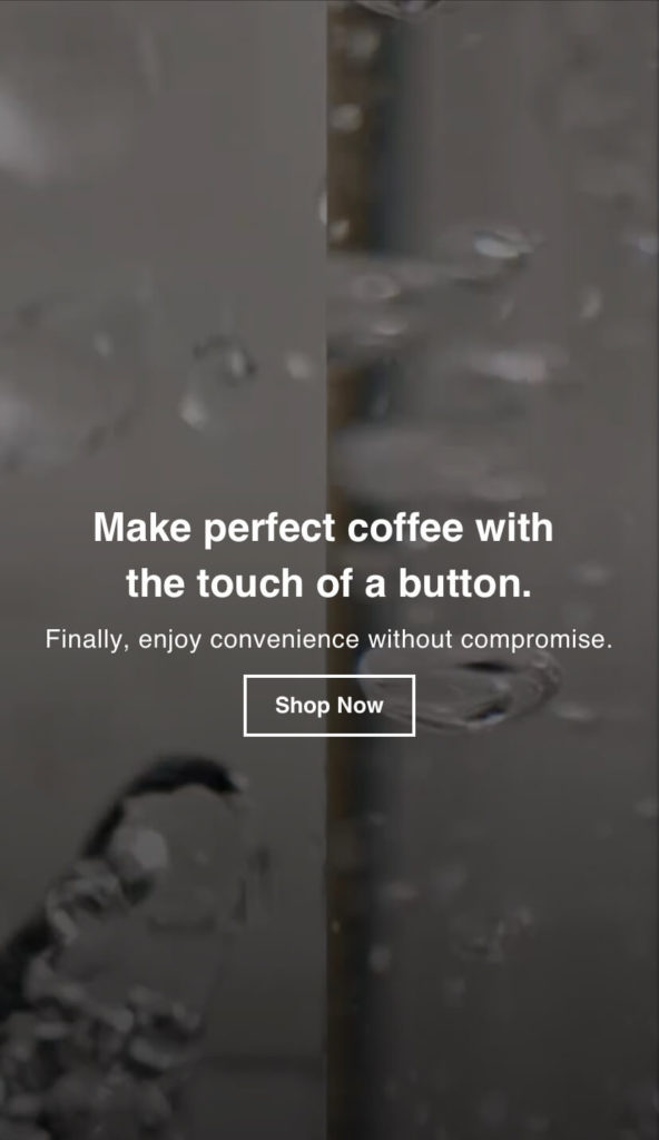
While Ratio is a luxury product, it also manages to inject humor in its copy. Its main tagline appears in the center of the page, “Finally enjoy convenience without compromise.” Below that is a CTA button inviting visitors to shop now.
As Ratio Coffee isn’t such a known name in the industry like Nespresso, they’re quick to showcase their selling points and brand values. Scrolling down, Ratio Coffee lists out the advantages of its coffee products and their key values.

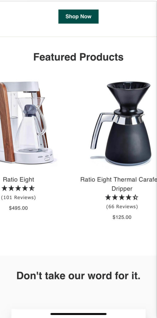
If you like what you’ve seen so far, you can browse the company’s featured products that also display their customer star ratings.
Again, since Ratio is competing with some coffee heavyweights, it’s smart to include some social proof from top publications on the homepage.
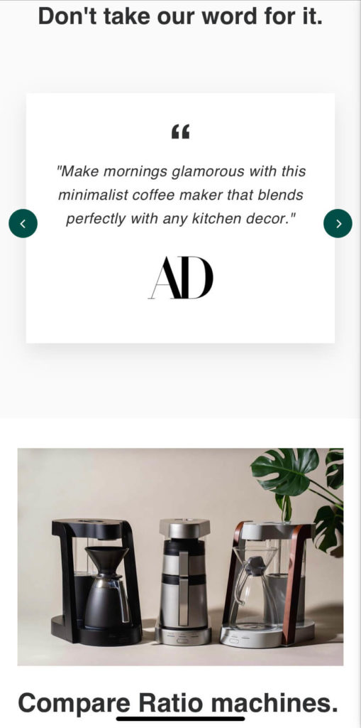
And just in case customers want a deeper understanding of its products, Ratio’s homepage has a feature for comparing models.
Last but not least, there’s a handy chat button so that customers can quickly get their questions answered too.
Conclusion
Building compelling and user-friendly mobile homepages is vital for getting people to visit and stay on your site. If you’re an e-commerce business, this is even more true, as an intuitive and visually pleasing mobile site has the chance to skyrocket your conversions.
But it’s not always easy to design a mobile homepage that your customers will love. Sometimes it’s easier to overcomplicate than simplify. With that in mind, focus on making your homepage intuitive, on-brand, and optimized for mobile devices.
Remember that looks matter and first impressions have the impact to encourage someone to learn more or leave your site completely. Get your mobile homepage right and you’ll have the chance to boost traffic, sales, and most importantly customer satisfaction.

