
Back in the day, dark was the only option for computer interfaces.
Technological strides paved the way for a world of bright and breezy design, leading to the predominance of white backgrounds that we still see on websites and in apps to this day.
But user preferences evolve over time, and it seems black is back.
In 2020, less than one-third of MacOS, iOS, and Outlook for Mac users were using dark mode email. By the end of 2022, that proportion had surged to two in five.
Email marketers have had to sit up and take notice of this growing trend. According to one study, 44 percent of marketers already consider dark mode during the email production process, while 28 percent intend to start at some point.
Planning to join the email dark mode party? You’re in the right place, because in this article I’m going to explain:

What Is Email Dark Mode?
Dark mode flips the color palette on your device — typically inverting white backgrounds with black text to black backgrounds with white text.

Android and iOS introduced their dark settings (Dark Theme and Dark Mode, respectively) in 2019, prompting pretty much every major app — including Gmail, Facebook, and Microsoft Office — to follow suit.
(Some) email clients do the whole “dark mode” thing automatically by checking whether a text or background color is defined, targeting the relevant CSS properties and HTML attributes, and making them lighter or darker as required.
However, note the word “some”.
Not all email clients currently offer dark mode as a setting that can either be:
- Manually controlled by the user
- Automatically triggered based on the user’s chosen color scheme
Which Clients Support Dark Mode Email?
At time of writing, the following clients provide some sort of email dark mode:
| Mobile Apps | Desktop Clients | Web Clients |
|
|
|
You likely noticed a glaring omission from that list: Gmail’s web client.
Technically, the Gmail web app does offer a dark theme. But it’s not a “true” email dark mode, because it doesn’t actually alter the appearance of your emails. That means when you open a message, the background retains the usual white color, which looks… pretty bad.
 The same applies to various other clients, including AOL and Yahoo Mail.
Why Is Dark Mode Email Important?
Dark mode email is important for marketers for one simple reason: a large chunk of your audience loves dark mode.
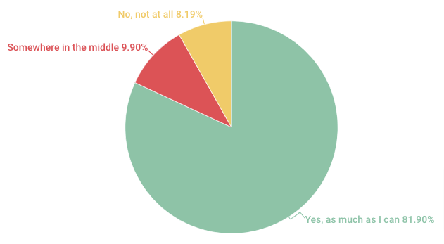
Of 2,500+ votes cast in an Android Authority poll, 81.9 percent said they use dark mode as much as they can — in apps, on their phones, and elsewhere. A further 9.9 percent flick between light and dark modes, while just 8.2 percent don’t use dark mode at all.
 But perhaps a better question is why do people like dark mode?
There are a couple different answers to that question.
First off, it improves accessibility, with Nielsen Norman Group concluding that people with cataracts and related disorders may see improved visual performance from dark mode — and that long-term light mode usage may be associated with myopia.
It also helps our phone batteries. Researchers at Purdue University found that switching from light to dark mode at 100 percent screen brightness saves, on average, 39 – 47 percent battery power.
(However, it’s worth noting that most people simply use their phone’s auto-brightness setting, which typically keeps screens at around 30 – 40 percent brightness. At those levels, the battery savings amount to just 3 – 9 percent, which is too small for most users to notice.)
Finally, and perhaps most importantly, dark mode just looks neat. Visual design trends come and go, and at the moment it seems many of us just prefer the aesthetics of dark mode.
Chances are this trend will pass.
But, for now, dark mode is simply too popular to ignore.
How to Design Emails for Dark Mode: 6 Best Practices
Okay, so we’ve established that a lot of people on your marketing list probably like email dark mode, and that the majority of marketers are either already designing dark mode emails (or planning to start soon).
To be clear, this isn’t about increasing your design team’s workload.
No one’s suggesting you design one email for dark mode die-hards and another for light mode lovers. But if you don’t take the time to consider how your emails will display across both light and dark themes, you risk sending a bunch of inaccessible or just downright ugly emails.
Of course, one solution is to only ever send plain text emails. That way, you don’t have to worry about dark mode at all — recipients will either see black text against a white background, or white text on a black background. Simple!
But stripping all the design elements from your email makes it far harder to engage readers and build your brand (and forget about showcasing your products). So it’s rarely the right choice for ecommerce marketers.
Instead, follow these best practices to design dark mode emails that your subscribers will be positively itching to open, read, and click through.
1. Optimize Your Brand Logo
One of the biggest issues with designing for dark mode is the impact on your logo.
Most brands add logos to their emails as PNGs, because they’re transparent, making them easier to design around. As a result, they typically use dark logos, which display clearly against a light mode background.
But if the recipient is using dark mode, your transparent, dark logo will blend into the background. Which looks terrible.

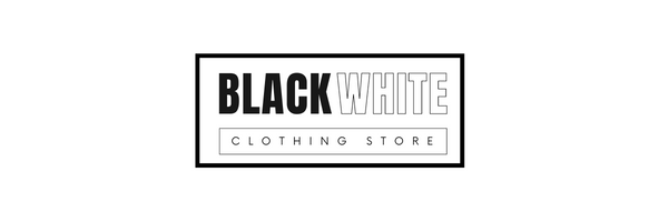 For that reason, you should optimize your logo by adding a translucent outline around it, ensuring it’ll display correctly — even in clients with more limited like dark mode customization.
2. Switch JPGs for PNGs
Sure, JPGs take up less space than PNGs, which helps your emails load faster.
But JPGs with white backgrounds stay just as they are, leaving you with a hideous white box surrounding your images when viewed in dark mode. Not good.
As a general rule, stick with PNGs when designing dark mode emails, because they:
- Look more defined
- Are higher quality
- Support transparency
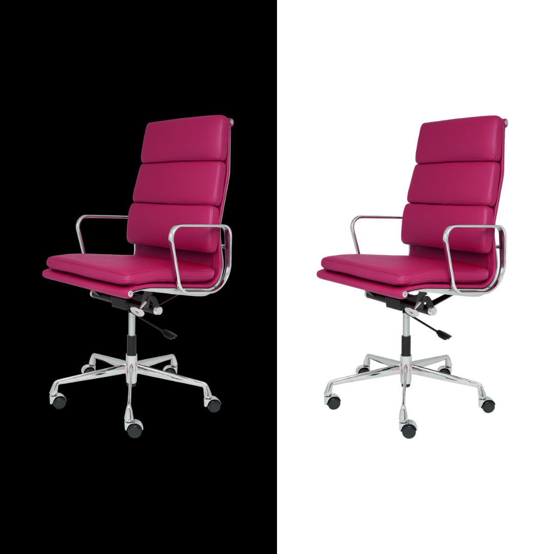
3. Increase Padding Around Non-Transparent Images
Maybe there are times where you’ve got no choice but to include non-transparent images in your emails. For instance, not all web browsers support PNGs, meaning there’s a greater chance your images won’t be seen at all. Which is obviously a bad thing.
In that case, make sure to add proper padding around the cropped area of all non-transparent images to create the smoothest possible transition between the white image background and the dark mode email background.
It won’t look brilliant, but at least your images will be totally visible, which is better than nothing.
4. Update Individual Email Elements
Logos and images are important, but they’re not the only factors to consider when designing emails for dark mode. You should also review design elements like icons and CTA buttons — because what looks good in light mode might not survive the transition to the dark side.
One common issue is saturation. Colors that are too saturated look pretty harsh in dark mode, so you might consider switching to a more muted color palette.
Even if it’s less eye-catching, it’ll look good whether viewed in light or dark mode.
5. Use Fewer Colors
Simply put, the more colors you add to your emails, the more variations will be applied when switching from light to dark mode (and vice versa).
And the more changes that are going on, the greater the chance that you’ll miss something, heightening the risk of sending aesthetically unappealing emails. And no one wants that.
Try to stick with a basic color palette. Not only does it make your life easier when designing for email dark mode, but it’ll also help keep your branding simpler, more consistent, and more memorable.
6. Test Dark Mode Email Appearance
If I could only give you one tip for designing dark mode emails, it’d be this: test, test, and test some more.
Among email marketers who design with dark mode in mind at least some of the time, 62 percent say they always preview or test emails prior to sending. Sure, testing takes time, but there’s no better way to weed out design issues before your emails land in thousands of customers’ inboxes.
Manual testing is relatively simple, if a little labor-intensive, because it requires sending test emails to dark mode-enabled devices or email accounts.
One easy way to do this is to create a free Outlook.com address, switch it to dark mode, and send all your emails to it before sharing with your marketing list.
If your email displays as intended, congratulations — you can go back and hit send on your campaign. If not, fix the issues and send another test email to make sure everything works second time around.
Design Beautiful Emails With Drip
Light mode, dark mode, minimalism, flat illustration… Design trends come and go. What’s most important is that you consistently create beautiful emails, whatever the email client or the current “big thing” in design.
Drip can help.
Our intuitive point-and-click editor makes it super simple to build stunning, on-brand emails incorporating top-selling products and dynamic elements (like cart URLs).
And if you’re ever short of inspiration, you can browse our library of 50+ professionally designed email templates — then customize each and every aspect to fit your brand.

