
Cart abandonment is all every online retailer talks about and for a good reason.
Abandoned carts are costly for e-commerce marketers—costing $18 billion in revenue each year, to be precise.
But there’s another type of shopper behavior that is just as crucial for your revenue: browse abandonment.
An abandoned browsing session signals buying intent, albeit lower than cart abandonment. So, while you may not want to go straight for the conversion, you may want to recover otherwise-lost sales opportunities with a timely email or two.
Browse abandonment emails allow you to remind shoppers what they’re leaving behind, recommend alternative products, and incentivize their orders.
If you’re unsure where to start, take inspiration from these nine browse abandonment email examples and study what they do well.

9 Best Browse Abandonment Email Examples
What Is a Browse Abandonment Email?
A browse abandonment email is typically sent after a visitor views a product or category page and leaves the site without adding an item to their cart.
Browse abandonment emails are a type of behavioral email, similar to abandoned cart emails. However, unlike the latter, you avoid waiting for the “add to cart” action to happen before sending a browse abandonment email.
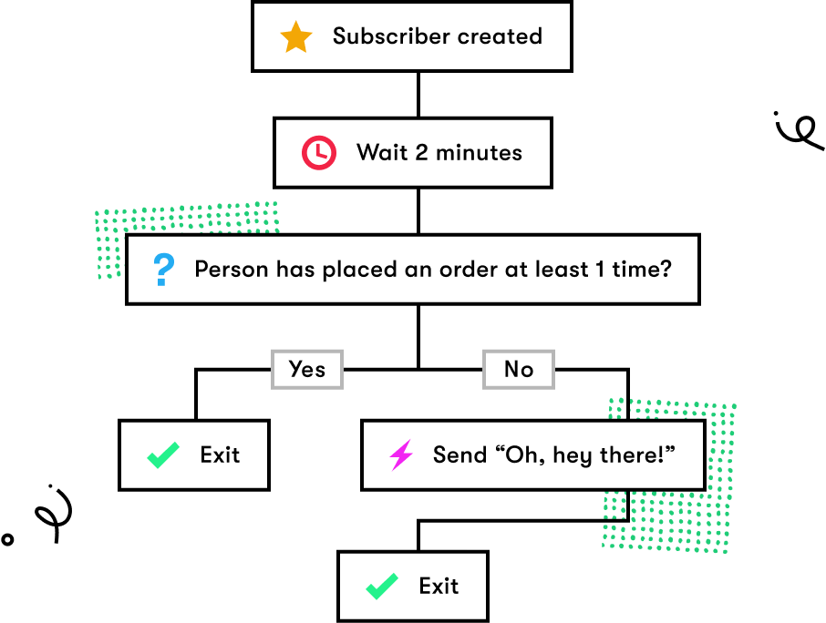
Browse abandonment emails are ideal for tracking an email subscriber’s behavior on your site and retargeting them with promotional emails.
For instance, if you’re using an email system like Drip, you can easily set up browse abandonment workflows and determine when and how your emails should be triggered.
Alright. Let’s take a look at nine examples of browse abandonment emails done right.
1. The Frye Company
When it comes to behavioral emails, less is often more.
You don’t want to raise privacy concerns while using first-party data, such as browsing behavior, but you don’t want to send a generic email, far from being personalized either.
The Frye Company strikes a good balance in its three-part browse abandonment email series, combining well-designed emails with straightforward copy to get its point across.
If you visit one of Frye’s product pages without taking action, you see this in your inbox:
A friendly subject line reminding you that you’ve recently been on Frye’s website, followed by an email acknowledging your browsing.
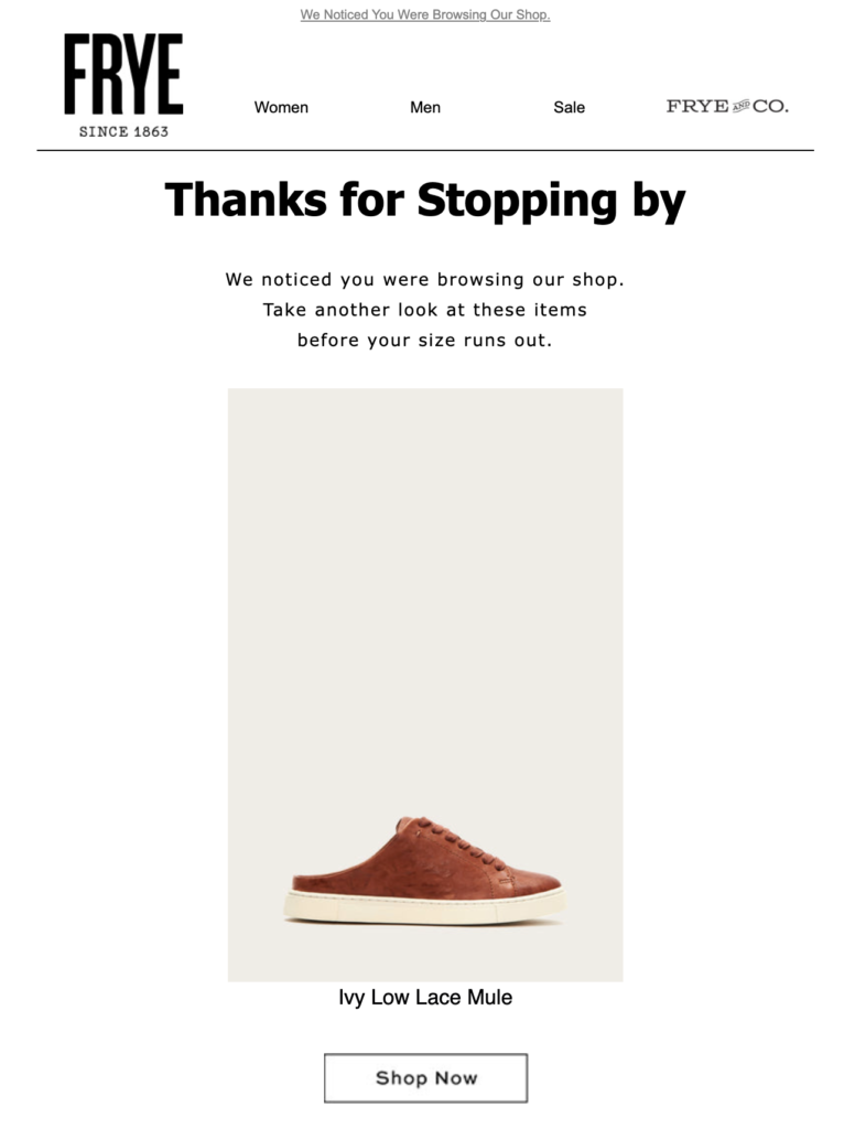
Frye thanks you for browsing its shop and invites you back without being too pushy.
Given the brand sells footwear, “Before your size runs out” is a valid reason to return to the Frye website, and the product’s name and image serve as powerful reminders of what you left behind.
Two days later, Frye sends you a follow-up email with the same copy and email content, but this time asks if you saw something you liked.
If you still don’t click through, Frye tries one last time, but more directly:
Granted, this subject line may sound too aggressive for some shoppers, but it’s a smart way to get your final browse abandonment email opened as a last resort.
All in all, Frye’s browse abandonment email series is a great example to follow if your goal is to stay top of mind, without sounding too salesy.
2. REBEL8
One way to be more persuasive in your abandonment emails is to give shoppers more reasons to return to your store.
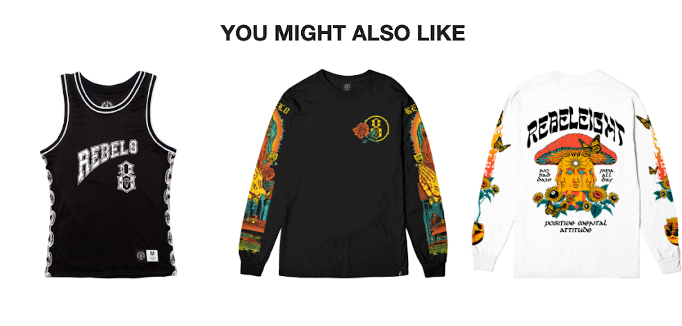
REBEL8 combines a few in its emails. Its first email lands in your inbox after browsing and abandoning a product.
Curious as to how the brand caught you, you open the email and see this:
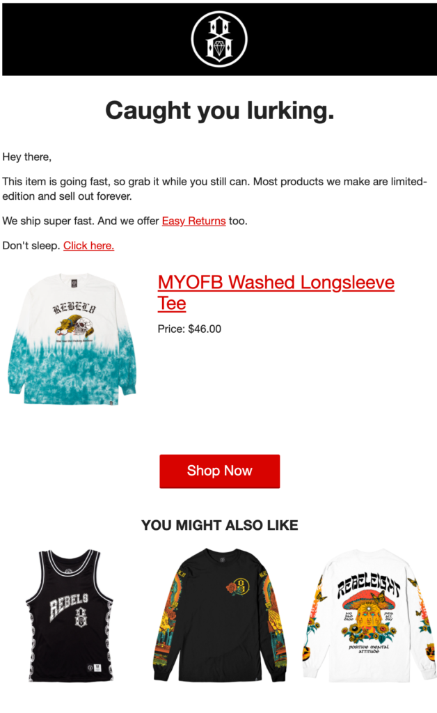
REBEL8 gives you multiple reasons why you should shop this product, including:
- The item’s popularity;
- The fact that most of its products sell out forever; and
- The brand’s quick delivery and easy returns.
There’s no fake scarcity here—REBEL8’s products might indeed sell out as they are often limited edition.
It’s a simple email without any fancy design or copy. All the benefits of shopping from the company are laid out clearly and communicated naturally.
And in the event the original product wasn’t quite right for you, REBEL8 recommends other products you might like at the bottom of the email.
3. EyeBuyDirect
Personalization is the key to all email marketing, and browse abandonment is no exception.
But there’s more to personalization than merely adding first name merge tags to your emails. Personalization means giving every subscriber relevant content based on where they are in the buyer’s journey.
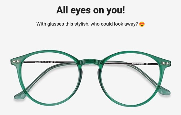
EyeBuyDirect has a brilliant example of using segmentation in browse abandonment emails. This is the first email you get from the company after abandoning a product page:
Ten points for the wordplay and a timely use of emoji in the subject field.
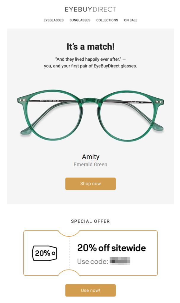
EyeBuyDirect makes my abandoned product the center of attention in the email. But more interestingly, the company knows that I’ve never shopped from them before, so the copy speaks to me as a first-time buyer.
Next, the brand borrows a page from the cart abandonment playbook and incentivizes purchases with a 20 percent discount—a tactic you can easily replicate if you want to go straight for the sale.
In the following days, EyeBuyDirect sends two more emails, with the subject lines “Remember this pair? 😄”…
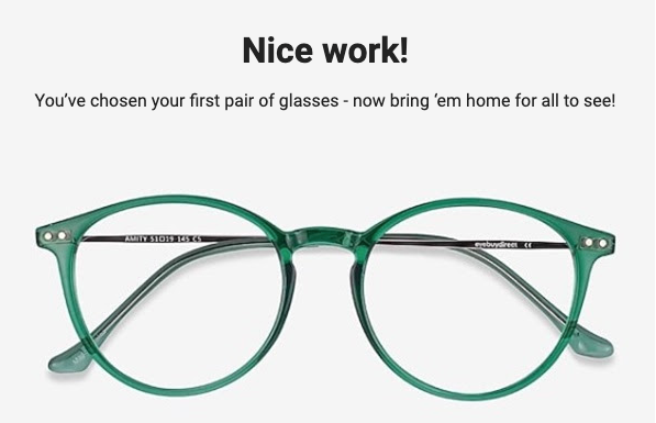
… and “You’re all set! 👍”
The only thing that changes in these follow-up emails is the introduction copy. But most importantly, the brand sticks to using puns and language directed at you as a first-time buyer.
4. Mavi
All three email examples I’ve included so far use the call to action (CTA) Shop Now. And I get that—it’s tempting to ask people to buy a product right off the bat when you know they’ve shown interest.
But visiting a page doesn’t necessarily mean readiness to buy. Shoppers might need a day or two to think it over and look for alternatives. Knowing this well, Mavi approaches browse abandoners rather subtly:
By including the product’s name (ADA jeans) in the subject, the brand reminds you of your recent browsing and asks you to consider taking another look.
The email itself is far from pushy too:
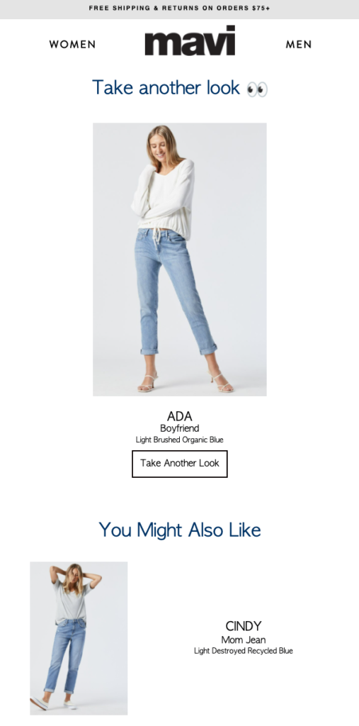
The email consists of a product photo, a brief description, and a gentle call to action. Mavi knows this isn’t as serious as a case of cart abandonment, and so only invites you to take another look, rather than “buy now” or “add to cart.”
If this product wasn’t right for you, you get a recommendation similar to the item you viewed. And a few days later, you get another email from Mavi dedicated to product recommendations:
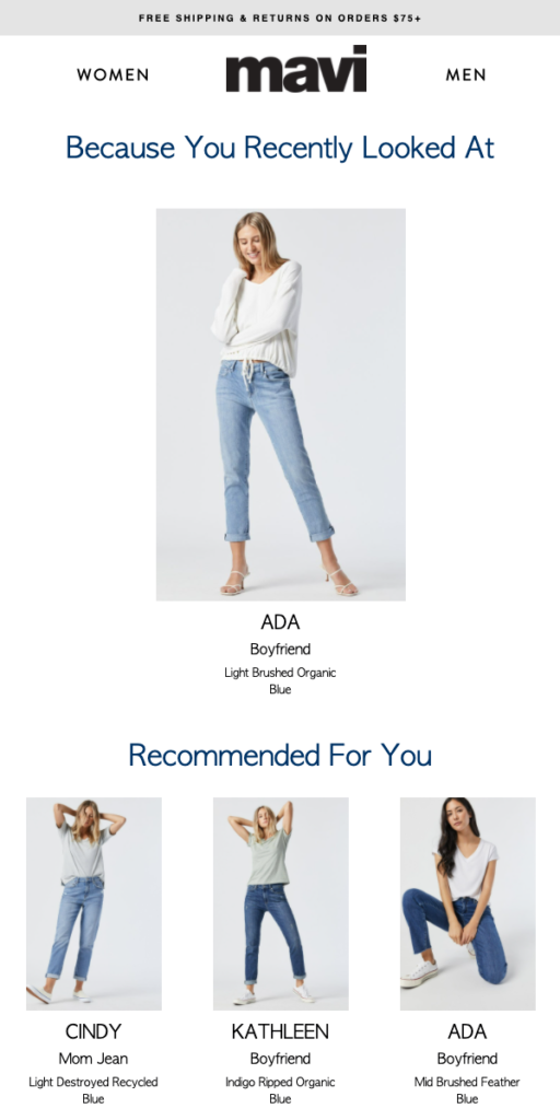
No pushy language or big buttons here either. But Mavi doesn’t give up on you, in case the first product wasn’t the right choice.
5. Buffy
Browse abandonment emails are ideal for removing potential customer objections. By promoting your return policy, delivery options, or payment methods, you can help shoppers take one more step toward the checkout.
And if you offer any additional services, you can include that in your emails too, as Buffy does.
The bedding e-tailer gets straight to the point in its subject line after you abandon its product pages without placing an order. This is what you see when you open the email:
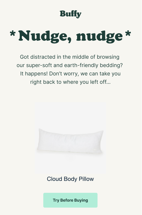
Admitting that it’s giving you a nudge, Buffy acknowledges that something might have distracted you while browsing this product and helps you pick up where you left off.
The CTA here is particularly brilliant: try before buying. Buffy expands more on this offer in the next part of the email:
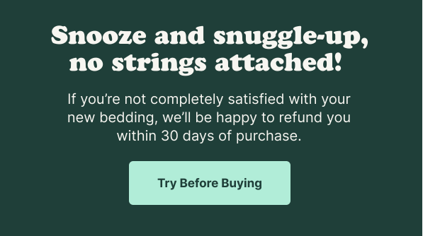
Instead of paying for a product you’re on the fence about, you can try it at home for 30 days, and send it back for free if you’re not satisfied. Buffy’s trial program and flexible refund policy make it easier for shoppers to commit to a purchase without risk.
While you’re in the email, in the mood for trying some bedding risk-free, Buffy also invites you to check out its bestsellers:
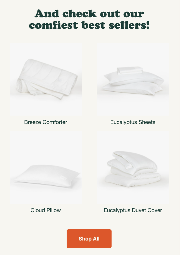
Since the try-before-you-buy policy applies to all Buffy products, Buffy can take you up to a higher price point than you originally intended.
6. J.Crew Factory
Whether it’s a must-have product or an experience of a lifetime, nobody wants to miss out on something positive.
J.Crew Factory uses this insight in its email and targets browse abandoners by speaking to their desire of looking good.
Even if you don’t remember what products you’ve been browsing, it’s hard to resist this subject line. You simply have to know what would look good on you. J.Crew Factory closes this curiosity gap in the email:
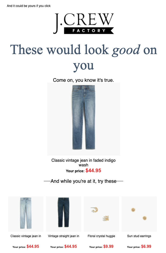
The FOMO-inducing language continues in the preview text and body copy.
J.Crew also uses visual cues in the email. Notice how “your price” is colored red, reminding you of a discounted item. I have no idea if they are “my price” or just the regular price, but I don’t want to miss out in case they are.
Finally, the brand’s recommendations are a good mix of similar items and complementary products—all marked as “your price,” in red.
7. Bliss
When writing a behavioral email, you want to come across as insightful, not creepy (especially if you’re using a subscriber’s data to influence sales).
Bliss finds the sweet spot in its browse abandonment emails, starting from its subject line:
Bliss doesn’t assume you loved its products, either.
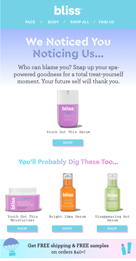
The email follows a friendly tone, supporting your decision to check out the brand’s products. Following best practices, the name and photo of the product you had viewed is the star of the show, followed by three relevant recommendations.
Next, Bliss promotes other benefits of shopping from its store. The free shipping and samples are a timely reminder that can nudge people to take action.
The next day, Bliss sends you another email, this time with the subject line “This Would Look SO Good On Your Shelfie 😉”:
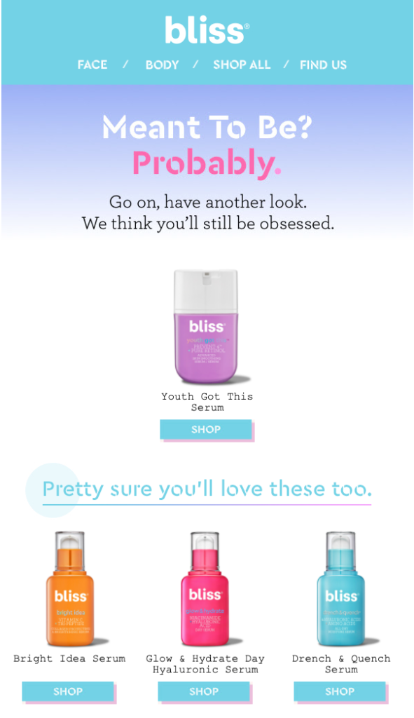
Similar in design, Bliss’s second email is even simpler than the first one. There are no pushy calls to action or urgency here either. The brand thinks you’ll be obsessed with this product if you give it a try, and you two are probably meant to be.
Bliss’s emails are a great example of how to remind shoppers of their abandoned items without making them feel uncomfortable.
8. Kina and Tam
Some e-commerce brands go all-in to bring the sale home, and Kina and Tam is one of those.
The company’s three-part browse abandonment flow contains several marketing tactics including social proof, urgency, discounting, and more. But first, it starts with a simple subject line.
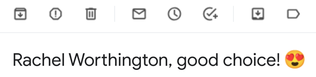
Addressing Rachel by her full name, Kina and Tam reaffirm her decision of browsing its products. It’s not every day that you see your full name in your inbox, so the subject line stands out among others.
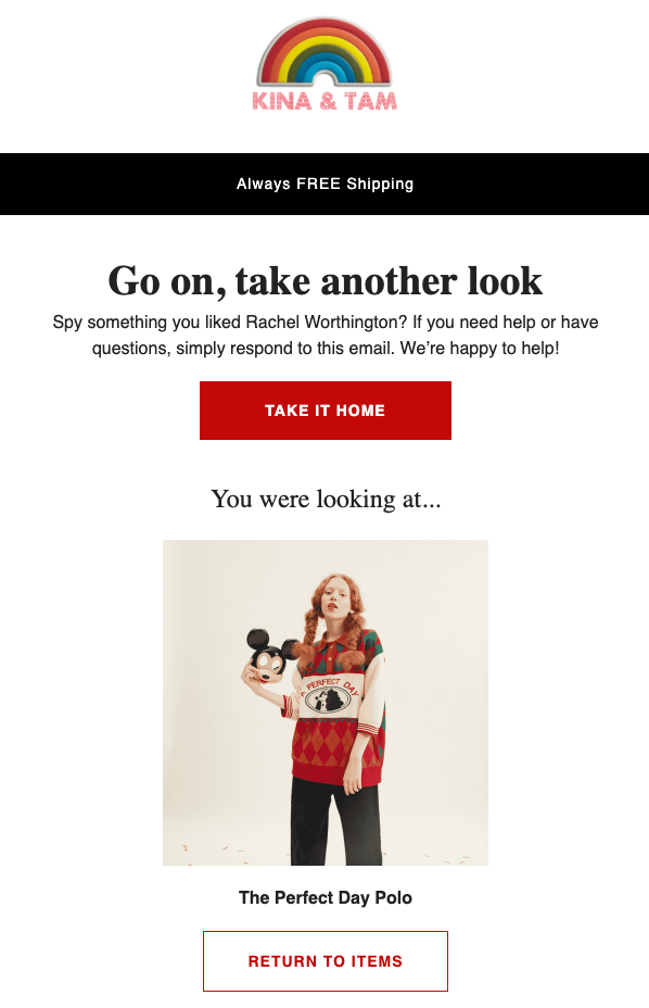
At first glance, the email looks similar to the other examples I’ve featured so far. However, unlike any other e-commerce brand I’ve seen, Kina and Tam encourage shoppers to reply to this email to get support, and thus remove any obstacles to purchasing.
In its follow-up email, Kina and Tam feature customer testimonials to persuade you further:
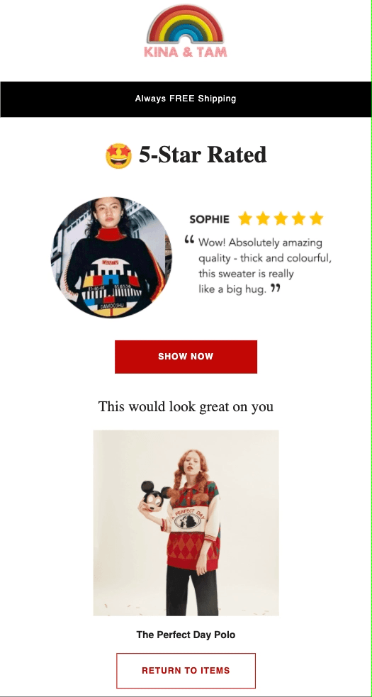
The reviews included in the email don’t necessarily belong to the product you left behind. However, they are still authentic five-star reviews for the store’s products, with customer names and photos, to help convince you to check out that product again.
If you’re still not convinced after these two emails, Kina and Tam tries one last time, this time with the subject line “FLASH SALE | 10% OFF ⚡️”:
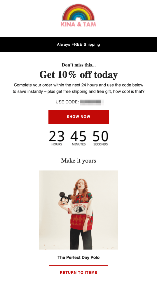
Discounts are a common incentive for preventing cart abandonment but aren’t used as widely in browse abandonment. Kina and Tam is an exception. Rather than “reward” your abandonment, the company reframes its discount as a flash sale.
If you buy the product you recently viewed within the next 24 hours, you get a 10 percent discount, free shipping, and a gift. If that’s not enough, the email countdown timer helps you make a faster decision by driving urgency, too.
9. Shinesty
I know too few e-commerce brands that can add a fun twist to everything they do. Shinesty surely takes the lead, and its browse abandonment emails are no exception.
When you browse a product on the Shinesty store and leave it behind, you get three brilliant emails, each one carrying a different theme, all cleverly funny.
Starting with this Bob Ross-themed one:
The signature words of the painter and the sender name tease what’s inside Shinesty’s email:
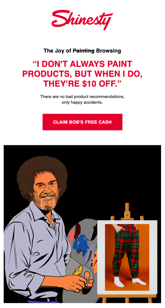
And the email doesn’t disappoint. Besides the humorous copy, Shinesty uses dynamic content to add your abandoned item to Bob Ross’s canvas. So it’s not all for the laugh—Shinesty wants you to remember what you left behind.
One day later, you see this in your inbox:
And unsurprisingly, you click the subject line to see a The Office-themed email:
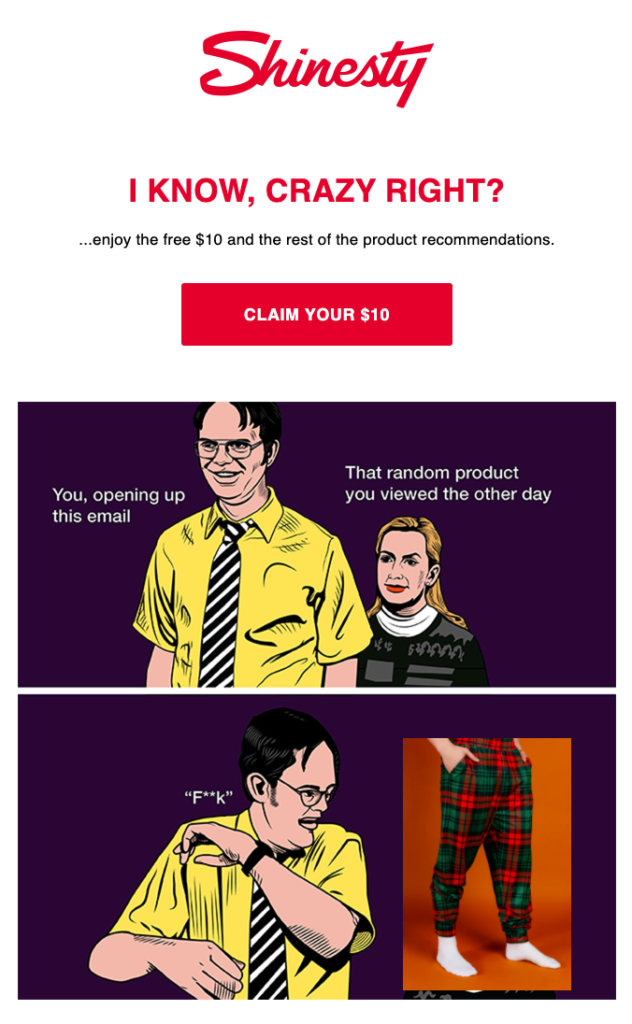
Recreating an iconic The Office moment (and a popular meme), Shinesty reminds you of the product you abandoned once more. The $10 coupon offer is also still on the table.
Finally, this email lands in your inbox:
When you open the email, not sure what to expect, you see this hilarious meme:
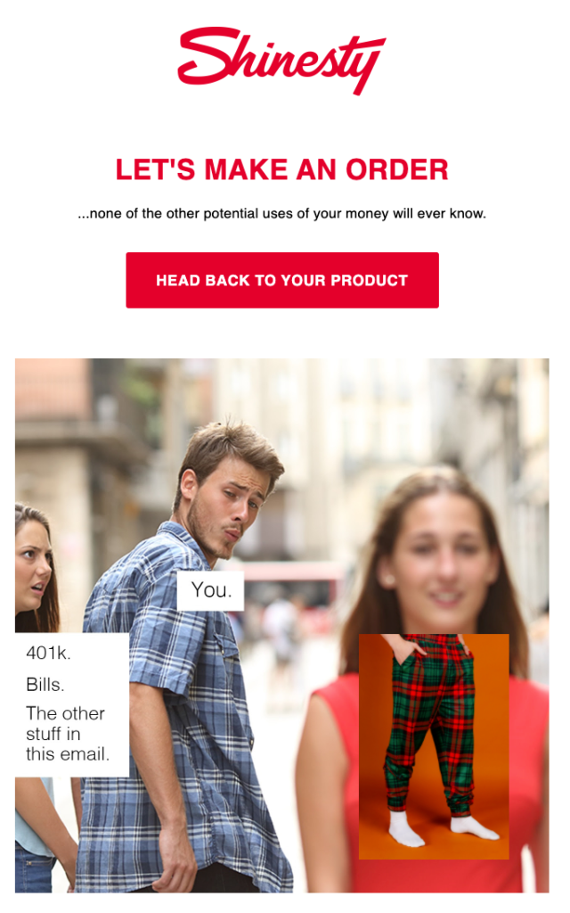
Granted, Shinesty’s humor isn’t for everyone, but it doesn’t mean you can’t have fun with your emails—as long as you keep focusing on the product shoppers left behind.
Conclusion
There’s no right or wrong way to send browse abandonment emails.
But there are many ways you can stand out from the competition, and these nine examples can help you find out how.
Whether you want to subtly follow up on a shopper’s interest in your products or go straight for the sale, take inspiration from these browse abandonment email examples.

