
Making a sale is all about that first impression. If you get that right, the chances you'll land a customer rise high.
And your site is precisely that — the first opportunity for your ecommerce store to make an impact on your customer.
But not all ecommerce websites are winners. The best ecommerce websites do more than get the job done — they foster trust, convert, and make customers feel like they’re part of something bigger than just the purchased product.
So, we’ve compiled a list of the 11 best ecommerce websites that share these qualities, and highlight why they seem to be clearly winning the game.That way, you’ll hopefully walk away with some inspiration that you can apply to your own ecommerce site.
Let’s jump in!

What Makes a Best Ecommerce Website — and Why
There are a ton of great ecommerce websites out there. But in order to be considered one of the best, they have to have a few key attributes.
- Clear Navigation: The best ecommerce websites help you get where you’re going and find what you need quickly and easily. There’s a clear path from the homepage to products with breadcrumbs so you can navigate backwards as well.
- Appealing, Responsive Design: The best ecommerce websites practice responsive design, and look great from mobile to desktop (and everything in between). Bonus points if the site is mobile-first.
- Gorgeous Product Images: We’re visual creatures — and we love gorgeous images. The best ecommerce websites include jaw-dropping product images that seduce even the most discerning of buyers.
- Fast UX/UI: Speed feels like a no-brainer, but you’d be shocked at how many ecommerce sites actually neglect this. Reduce image size as much as you can without losing quality, and focus on improving the speed of your site. You can’t afford not to.
- Accessibility: You want your site to be accessible to everyone. The best ecommerce websites offer:
- An organized content structure
- Alt tags on images
- Descriptive titles on links
- High-contrast colors
- Keyboard-friendly navigation and shortcuts
- Trust Signals: Ecommerce merchants already have to work double-time to earn their customers’ trust. Make it easier for them with trust signals: customer reviews, testimonials, star-ratings, etc. It helps customers to know others like them have purchased from you with great results.
- Welcome Offers & Discounts: The absolute best ecommerce sites have a welcome offer shortly after you land on the page. A well-timed welcome or exit-intent popup offers your customer an incentive to sign up in exchange for a first-time purchase discount.
The 11 Best Ecommerce Website Examples That Nail User Experience
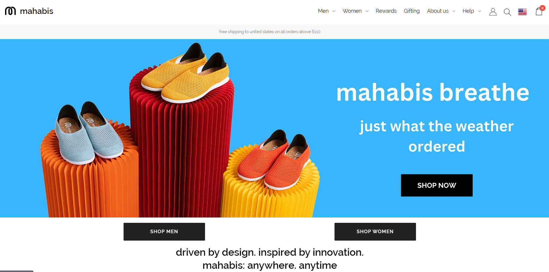
1. Mahabis
Mahabis describes itself as a sophisticated footwear brand that combines aesthetics and innovative technology to produce high-performance shoes and slippers for work and leisure.
What Makes Them a Best Ecommerce Website?
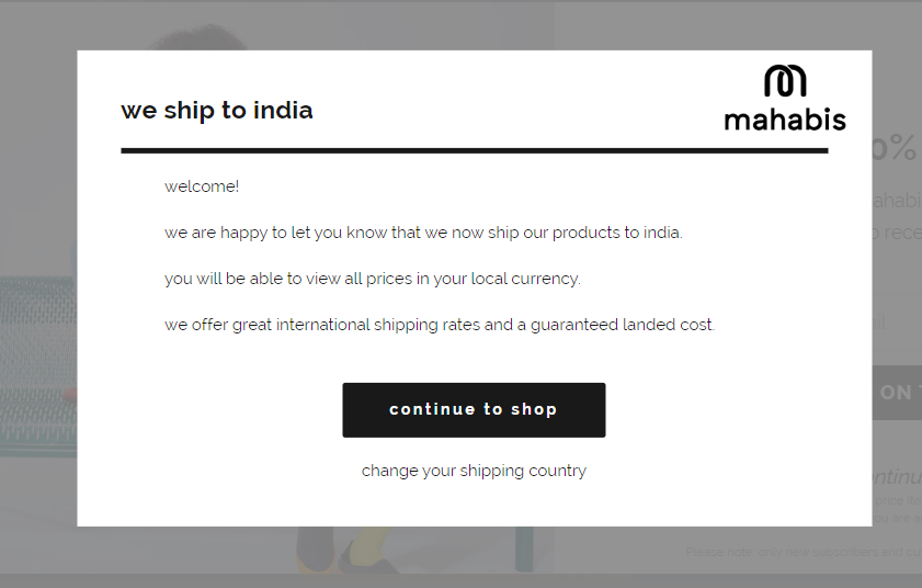
- Localization popups and ease-of-purchase: When you visit Mahabis' website, a popup informs you that their products can be bought and shipped to multiple countries. Plus, you can view the product prices in your local currency — which increases the easy-buying quotient. This addresses two major concerns: worldwide shipping availability and reasonable international shipping costs.
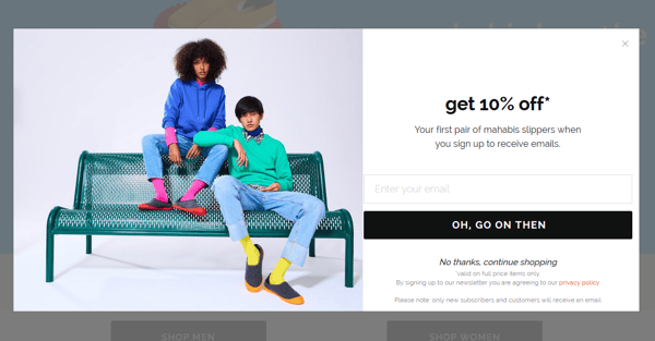
- Incentives for a first purchase: After that, another popup appears offering a 10% discount on your first purchase if you sign up. This incentive encourages online window shoppers to explore their products (and maybe even buy right away), and helps reduce the website's bounce rate.
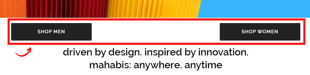
- Easy navigation and smart UX: Typically, when you visit an ecommerce site, you have to search around and toggle your gender preference. But, Mahabis simplifies this process by prominently displaying SHOP MEN and SHOP WOMEN options right below their header image. This subtle but thoughtful navigation helps you quickly get to the products you’re looking to buy.
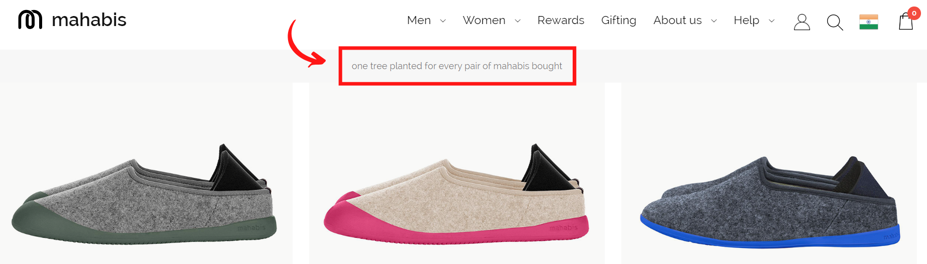
- Clear core values prominently displayed: Mahabis knows that its target audience deeply cares about sustainability. So, they highlight their commitment to planting a tree for every pair of Mahabis shoes sold on a sticky navigation bar. Target audience targeted well!
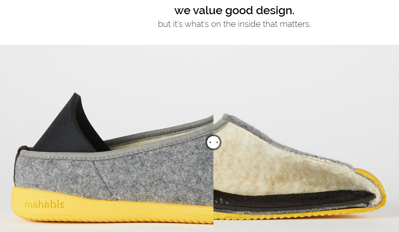
- They know their core audience values quality: As you scroll down the homepage, you come across the statement — we value good design, but it's what's on the inside that matters. This reflects their emphasis on comfort, a key consideration when buying footwear. They use a gamified slider to reveal the materials used, as you slide from left to right. This playfully boosts confidence in potential customers, making them more likely to invest in the product.
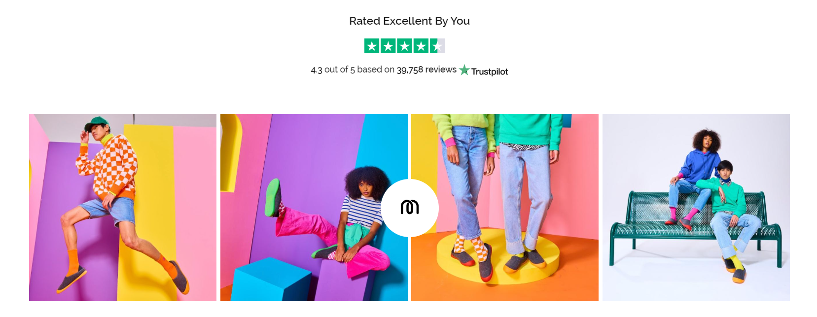
- They use social proof to build trust: Mahabis boldly flaunts its 4.3 rating based on almost 40k reviews — which reinforces its brand credibility and product trustworthiness to help seal the deal.
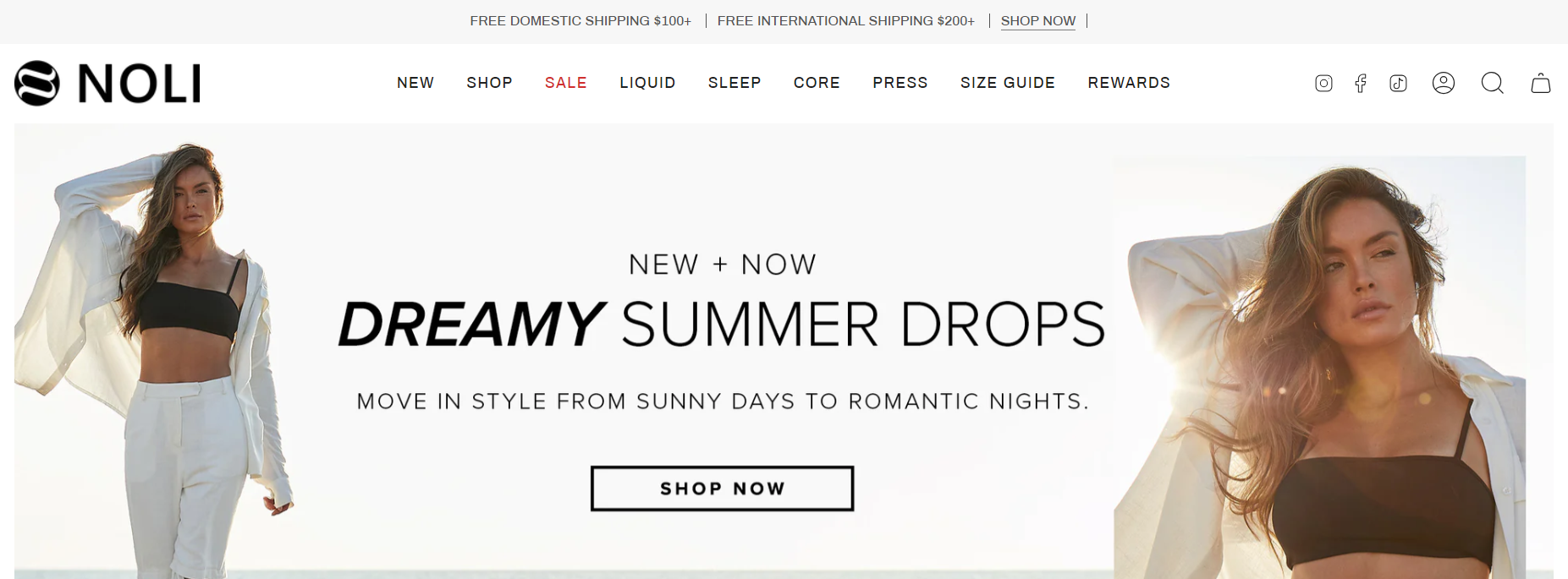
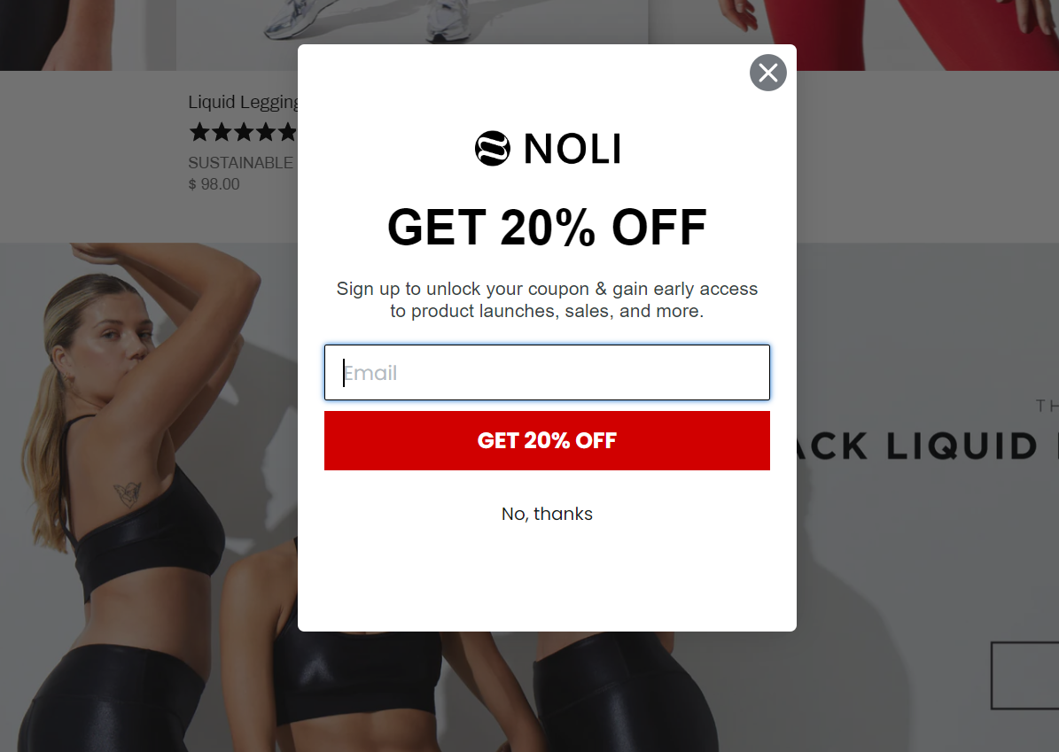
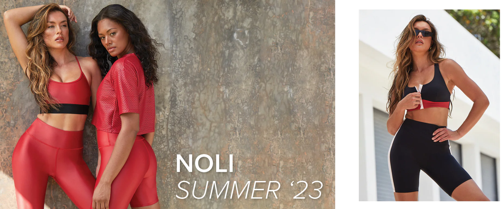
2. Noli Yoga
Noli Yoga is a women's yoga apparel and activewear brand, known for its solid bold colors and great fit.
What Makes Them a Best Ecommerce Website?
- Quick incentivization to land customers faster: When you visit their homepage, you immediately meet a 20% discount popup if you sign up for their newsletter, and receive even more discount offers on future purchases. This helps convert more lurkers into buyers in the first website visit.
- They understand how women shop: The homepage focuses on what women value most in their wardrobe selection — trendy styles, powerful fashion statement, availability in various sizes, and affordable pricing. The models on the website are wearing Noli Yoga’s flagship colors like black and red — designed to fit well, look attractive, and communicate the brand identity. This realistic visual representation has a significant impact on how customers perceive the products.
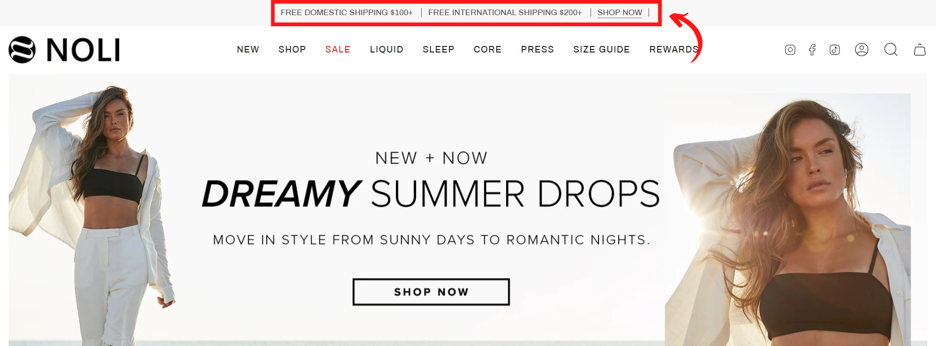
- Shipping policy transparency for a seamless shopping experience: Noli Yoga understands that shipping costs matter to online customers — both international and domestic. So, they display the free shipping fees offer upfront on the top of the navigation bar to lure them into buying quickly.
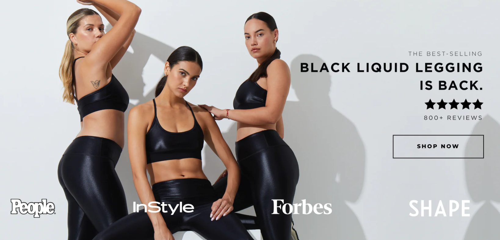
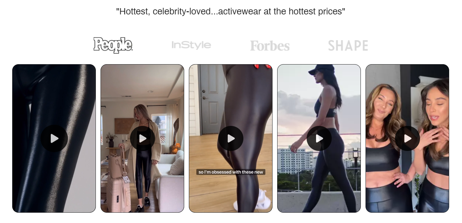
- Quick access to their best-selling product: As you scroll down, you see a banner featuring their best-selling product — black liquid leggings. This is accompanied by 5-star ratings from over 800 reviews, and mentions in reputable magazines — such as Forbes, Shape, InStyle, and People. The endorsement from these magazines helps validate the product's popularity.
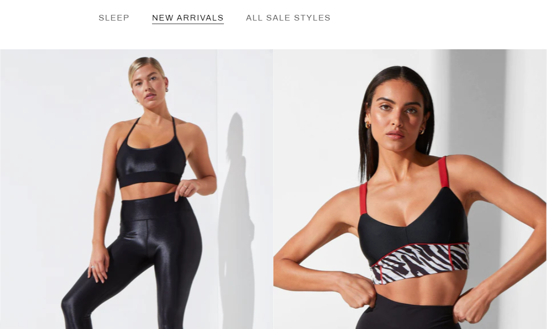
- Simple navigation for easy browsing: They have a crisp, clean layout, allowing you to find what you’re looking for quickly without getting lost in the clutter. And they take it even up a notch by including the three main categories (Sleep, New Arrivals, and Sale) as menu options right below the header image. So, if you’re looking to find a good discount, clicking on the sales section provides you with a full selection of products.
- Strategic video usage to increase conversions: According to EyeView, including a video can increase conversions by as much as 86 percent. And Noli Yoga has pulled vid off brilliantly. The page features videos where influencers demonstrate different ways to style the leggings. Watching the product being used in real life on various body shapes makes the products relatable. Interestingly, this also shortens the buying journey.
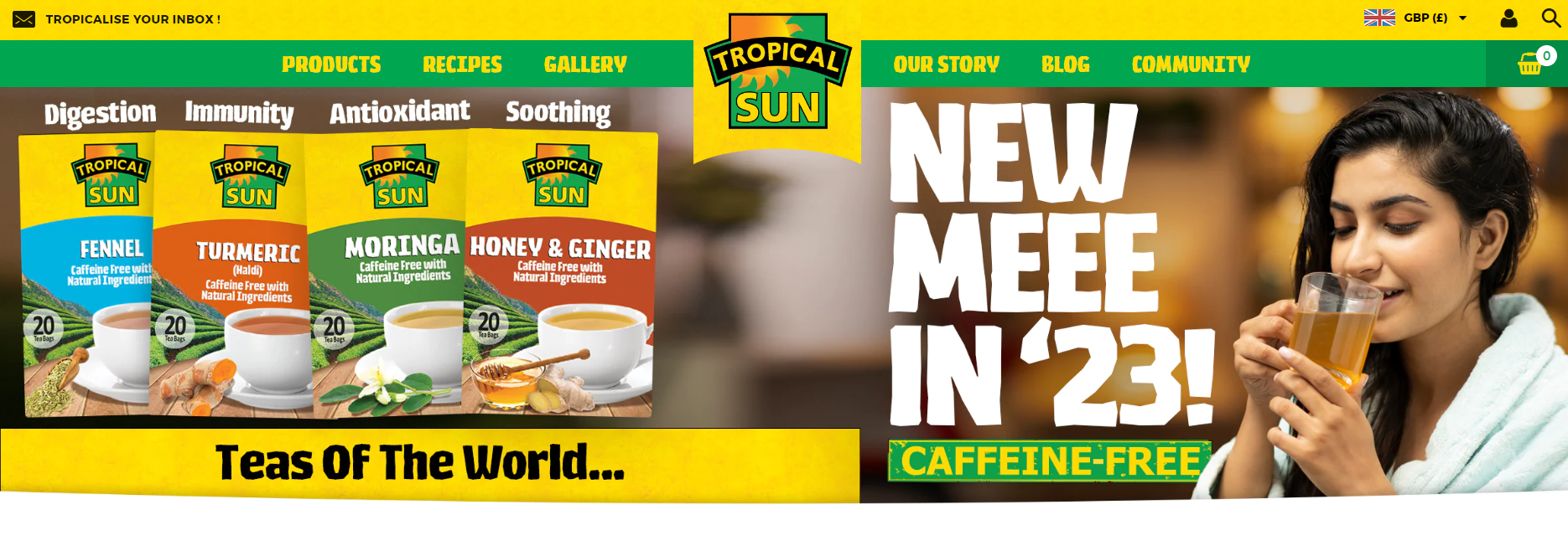
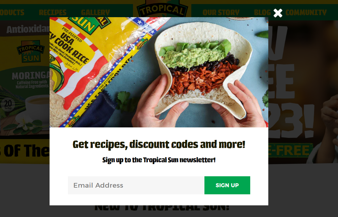
3. Tropical Sun Foods
Tropical Sun Foods provides high-quality ingredients for ethnic cuisines such as Thai, Indian, and Caribbean.
What Makes Them a Best Ecommerce Website?
- They match their branding color scheme with their company name: After all, their homepage has a nice tropical feel with juicy, vibrant colors. A quick scroll and you see some of their popular products with primarily yellow and green coloring that offers a nice contrast to the white background.
- Distinctive newsletter popup: What sets this popup apart from simple discount offers is the inclusion of healthy recipes as well. This aligns with the brand's vision and purpose — providing visitors with a mouth-watering reason to explore more about their product(s).
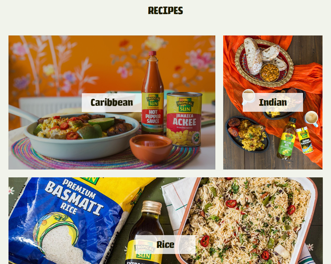
- Much like Apple, they persuade customers with the product potential: As you continue scrolling, you'll discover a section featuring recipes categorized by different cultures. When you click on any of the images, you're directed to a page with a variety of recipes (specifically from that country) that can be cooked using their ingredients. This approach captures global customer interest and demonstrates the endless possibilities with their products.
- They focus on building a community: Tropical Sun Foods offers their customers the chance to share their own recipes on the company's website. This provides their customers with a platform to showcase their culinary creativity. Whether cooking is a passion or you're seeking quick recipe ideas for a busy schedule, customers are encouraged to interact and connect with the brand. This strongly helps grow their customer base.

4. HELM Boots
HELM Boots offers handcrafted premium leather footwear for men.
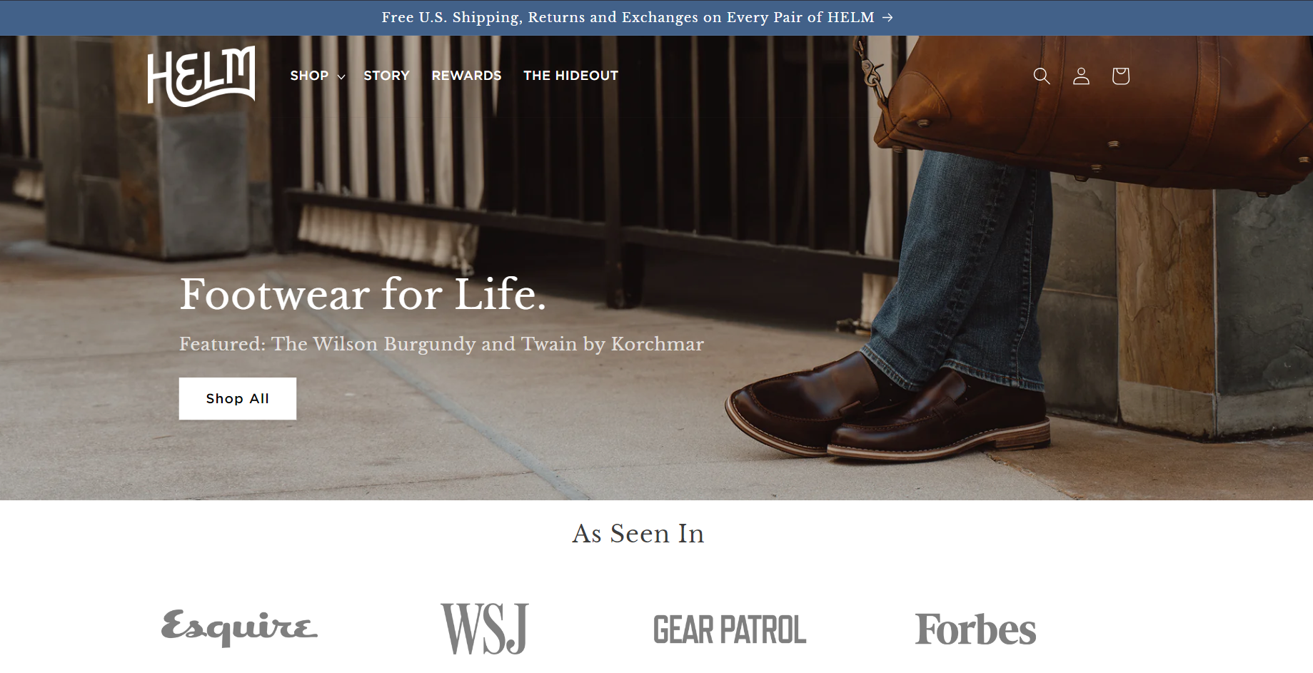
What Makes Them a Best Ecommerce Website?
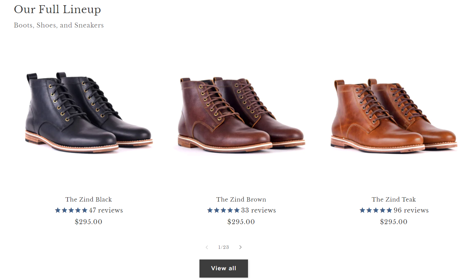
- Clean UI and easy UX to impress customers on the first website visit: Some adjectives that instantly pop into my mind once landing on their homepage are clean, classy, and elegant, yet down to earth. For instance, you quickly see their full lineup and how much they cost. And click through to any of these boots, and you get a full rundown on the product pages.
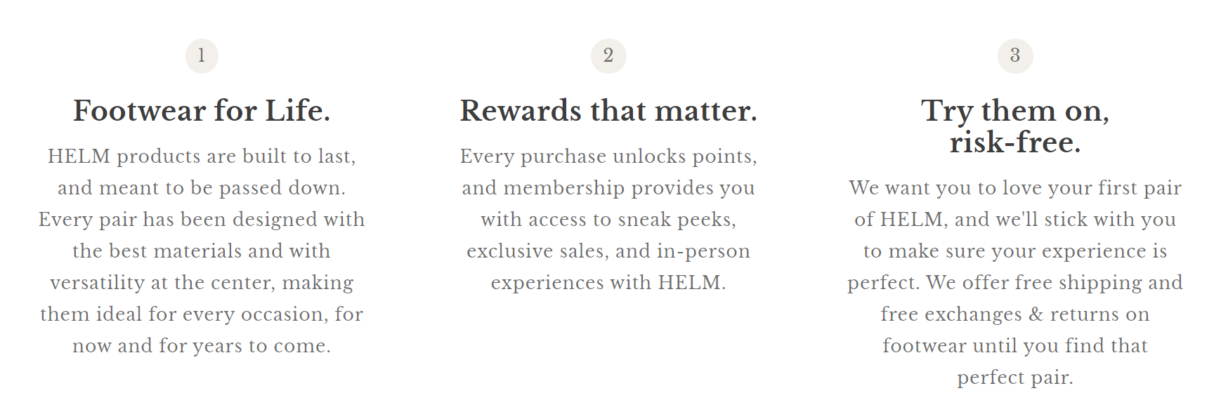
- Bold tagline to quickly convey brand identity: Footwear For Life suggests durable design and that’s what they’re about. Plus, the catchy header image includes the name of the featured footwear, accompanied by a Shop All button just below it to capitalize on the attention real estate.
- They storytell brand origins to build a connection with customers: When you click on their Story page, you can explore the fascinating manufacturing process behind their shoes. This connection to the essence of dedication and meticulous craftsmanship allows customers to appreciate the time and effort invested in creating each pair of shoes.
- Unabashed confidence in their products: I also like that HELM Boots shows you what separates their products from the competition, including the fact that they offer free shipping and free exchanges. Studies have found, ‘79 percent of the US consumers said that free shipping would make them more likely to shop online.’ So, communicating this clearly on the homepage should encourage many shoppers to make a purchase quickly.
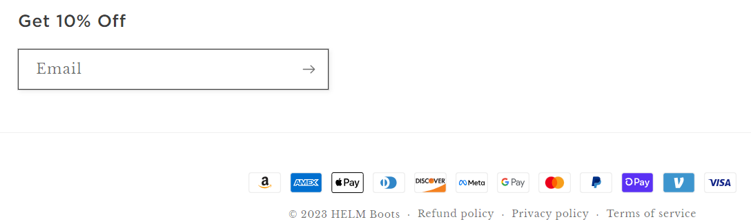
- Strategic discount placement: At the bottom of the page, a 10% discount incentive has been just rightly positioned to coincide with the customer's buying journey. It serves as a final push to solidify their purchase decision.
5. LilGadgets Headphones
LilGadgets specializes in premium headphones and in-ear wearables, especially designed for children across the age spectrum.
What Makes Them a Best Ecommerce Website?
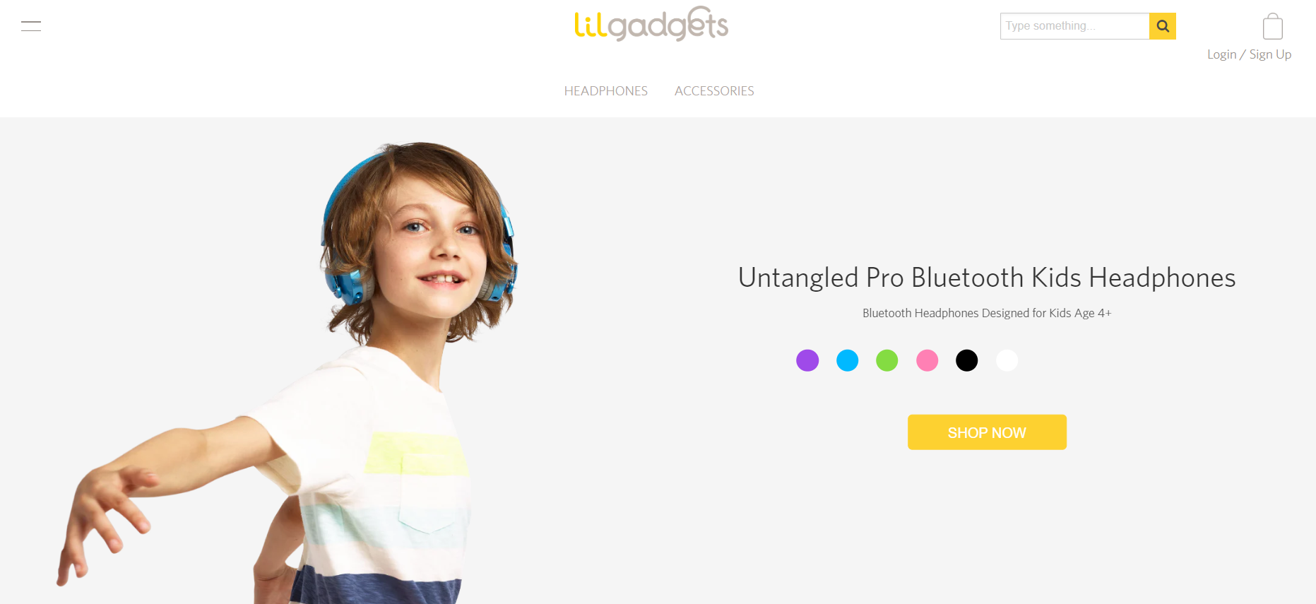
- Easy-to-follow product layout: It has an ultra-clean, fresh feel to it and does an amazing job of showcasing their products. It’s ridiculously simple, where there’s a slider featuring some of their top products like over-ear headphones for kids age 3+ and age 6+, in-ear headphones for kids age 6+ and Bluetooth headphones for kids age 4+.
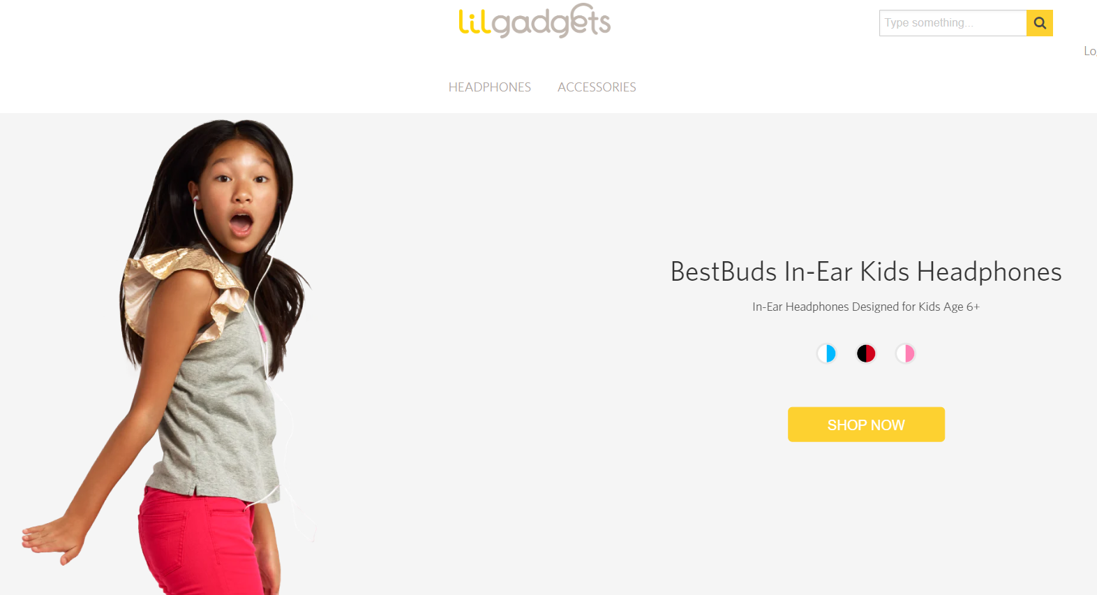
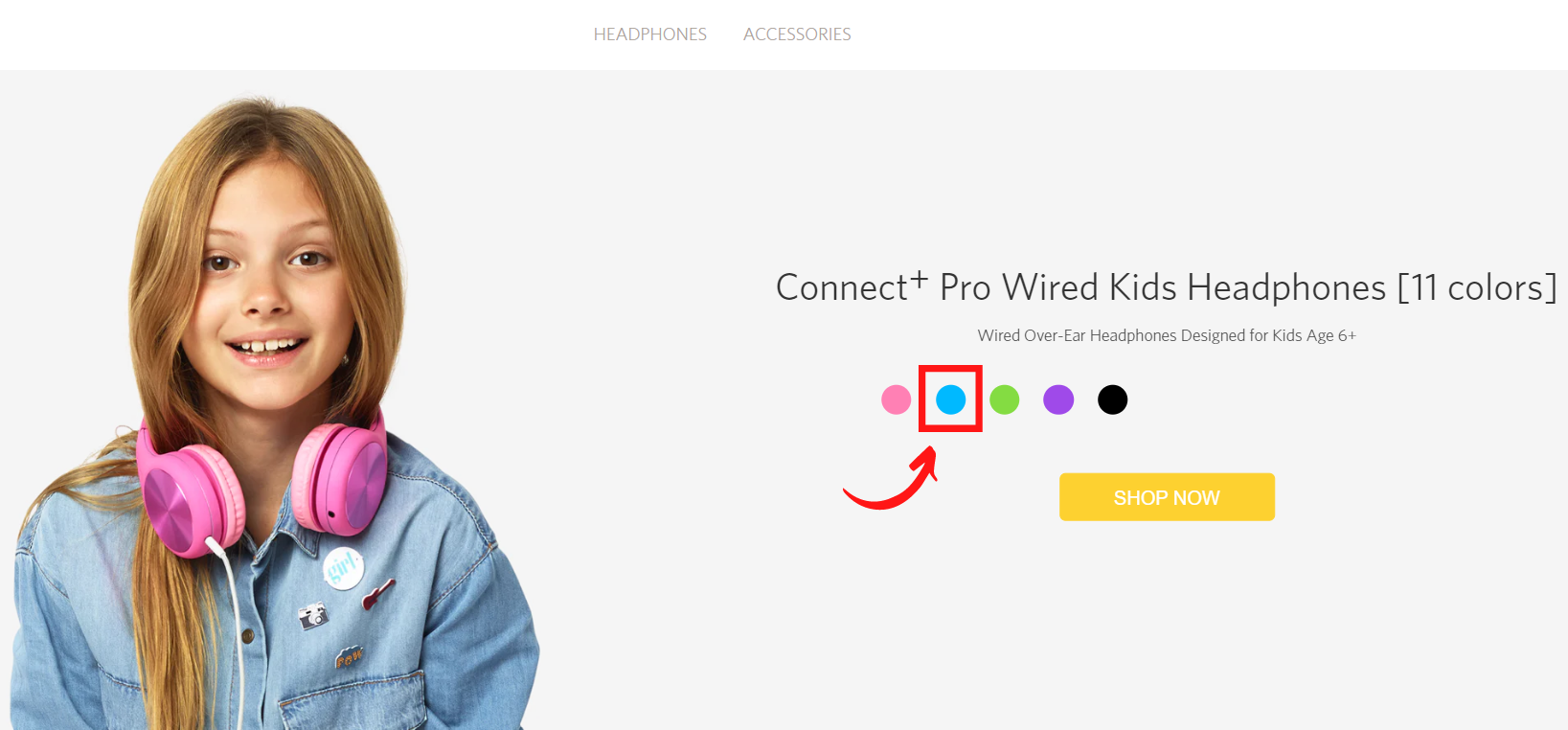
- Intuitive product selection: Since their products come in different colors, LilGadgets has a cool feature where you click on the color your child wants from the homepage, and that product page will pop up. So, if you wanted blue Connect+ Pro headphones, you just click on the blue circle. And voila, you get the blue Connect+ Pro headphones.
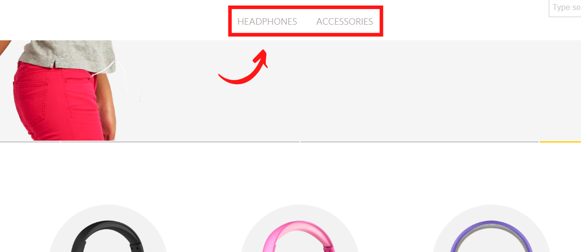
- Smart navigation: Right below the slider, you’ll find five of their top products. Clicking on any product leads you to its product breakdown page. They also have a straightforward sticky menu with only two pages—headphones and accessories, so there’s zero fuss involved with navigation.
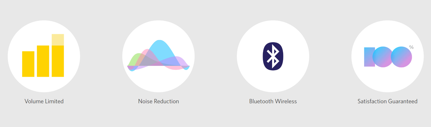
- They don’t just say, they demonstrate what makes them the best: Just below the slider, you can find information on what distinguishes LilGadgets from other industry competitors. For instance, you can learn about the noise reduction technology they use and how it creates a better experience than standard products on the market.
6. POW Gloves
POW Gloves makes high-quality functional handwear that can withstand even the coldest weather.
What Makes Them a Best Ecommerce Website?
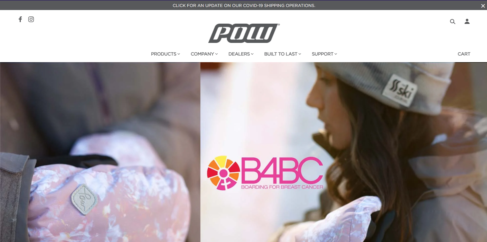
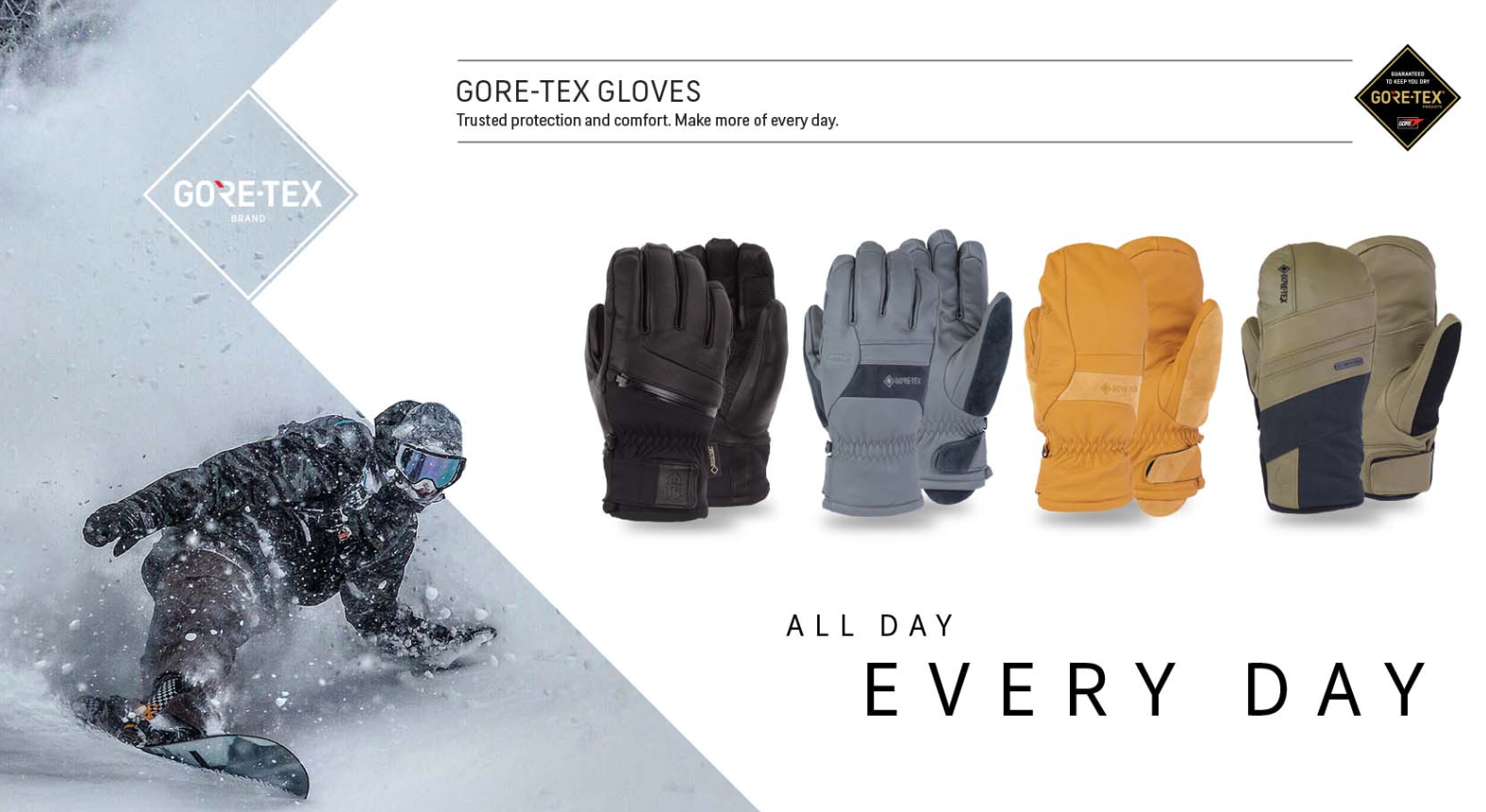
- They showcase their star products right in the header: The homepage greets you with a slideshow of four product pictures in the header, each with a caption explaining its purpose. For instance, among them, a picture of Gore-tex gloves featuring a confident skier demonstrates their comfort and practicality for everyday use.
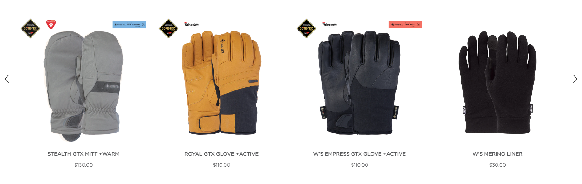
- Handy access to key product details: Just below the header, you see images of some of their top gloves, along with pricing information. With a quick click, you arrive on the product pages and can get all of the details like materials, features, glove sizing, and so on.
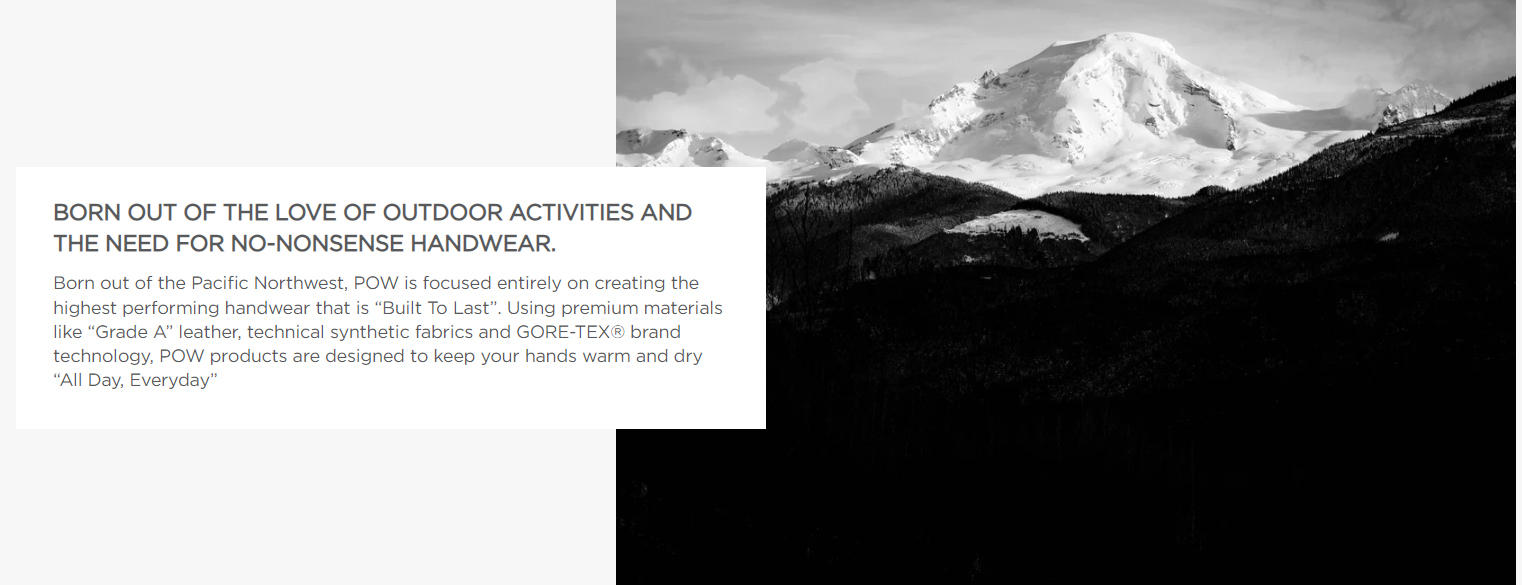
- They detail their material expertise to increase brand credibility: As you scroll further, they reveal the brand’s origins and obsession with practical handwear. Plus, it lets shoppers know that their products use premium materials like Grade A leather, technical synthetic fabrics, and GORE-TEX® brand technology. This increases customers’ confidence in the brand.
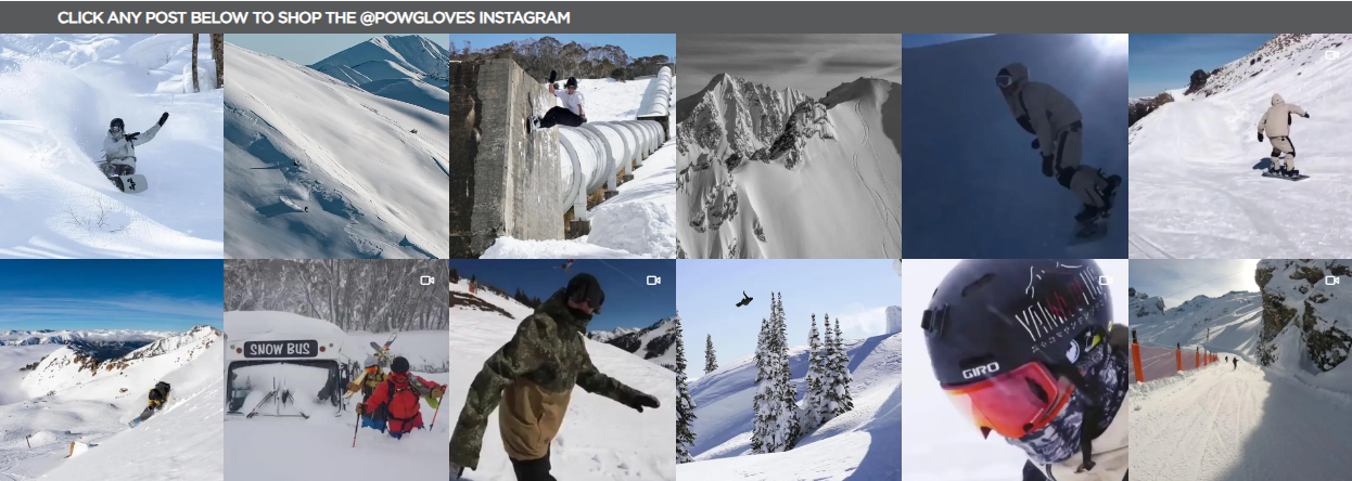
- Ease-of-purchase: Finally, the bottom section shows off user-generated content and allows visitors to shop via their Instagram page. Simply click on any post in the Instagram post collection section, and you can make your purchase. Their Instagram features adrenaline-filled photos and videos that highlight their gloves in thrilling activities, following a marketing approach similar to Red Bull or Land Rover. POW Gloves focuses on showcasing the limitless possibilities their products provide, rather than relying on heavy discounts.
7. Twelve South
Twelve South specializes in crafting beautiful accessories exclusively for Apple products.
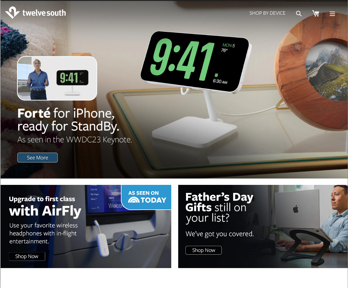
What Makes Them a Best Ecommerce Website?
- They believe in selling by educating: The second you land on their homepage, you see a stunning, professional design and the option to read every detail about their newest product Forté targeting the latest Apple feature — the StandBy mode. This is important, considering many Apple shoppers might not yet know all that’s going on with this new feature. But after watching the complete breakdown of Forté, you know the ins and outs and why it’s so cool.
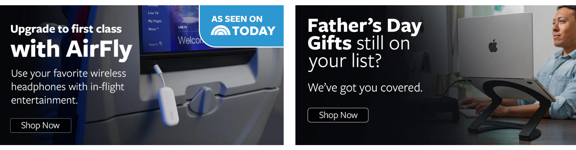
- Stunning self-explanatory visuals to save customer’s time: Unlike many ecommerce websites, Twelve South's homepage skips unnecessary selling foreplay and provides a straightforward and uncomplicated Shop Now button, allowing you to start browsing and making decisions promptly. The images describe the featured products within seconds you take a look at them. Also, they cleverly suggest their accessories as Father’s Day gifting options, widening their customer appeal and purpose.
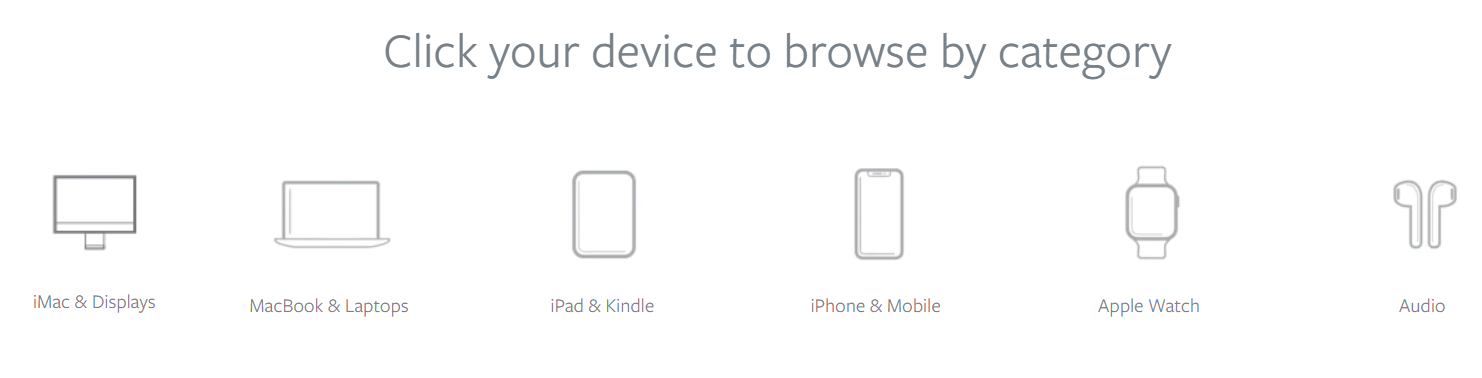
- Dead simple search for smooth UX: Just below that, there’s some super-intuitive navigation that allows you to search their site by specific Apple devices, which makes finding what you need a cinch.
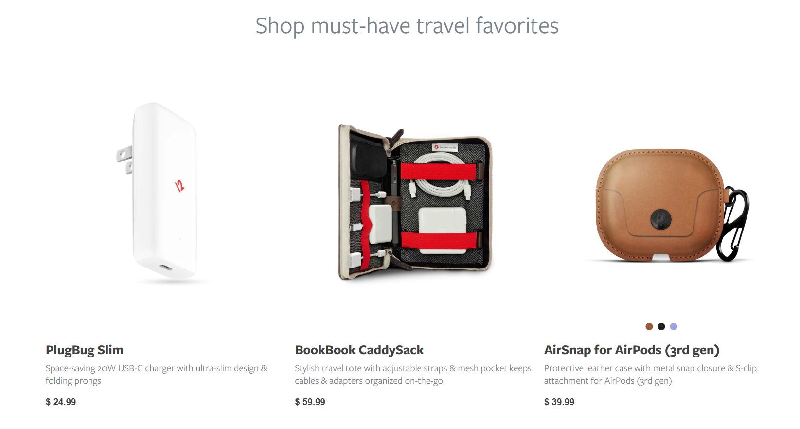
- They know what their core customers truly value: Twelve South deeply understands the importance of organization and productivity for their customers, not just at their home or office, but also when it comes to traveling. So, they provide a range of travel accessories to help customers stay productive while on the go. You can quickly find them under a carousel of the must-have travel gadgets listed along with their prices.
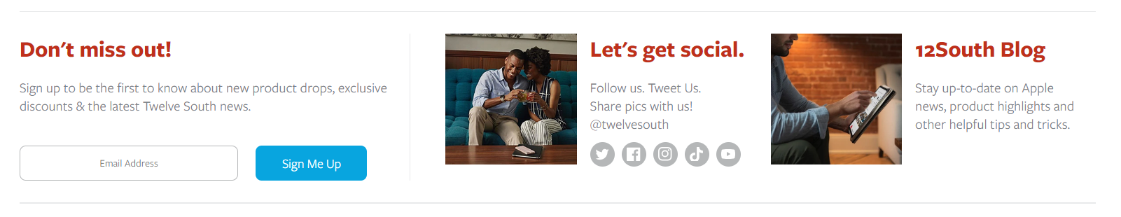
- Multiple interaction channels for more customer trust: At the bottom, Twelve South features three sections to provide you with quick access to their newsletter, blog posts, and social media handles. What sets this apart is that, unlike most ecommerce brands, these key marketing and customer relationship building assets are not buried in the footer navigation. Instead, they are given the attention they truly deserve.
8. ambsn
ambsn is a California-based swim and lifestyle clothing brand that began as a fundraiser for a friend-in-need.
What Makes Them a Best Ecommerce Website?
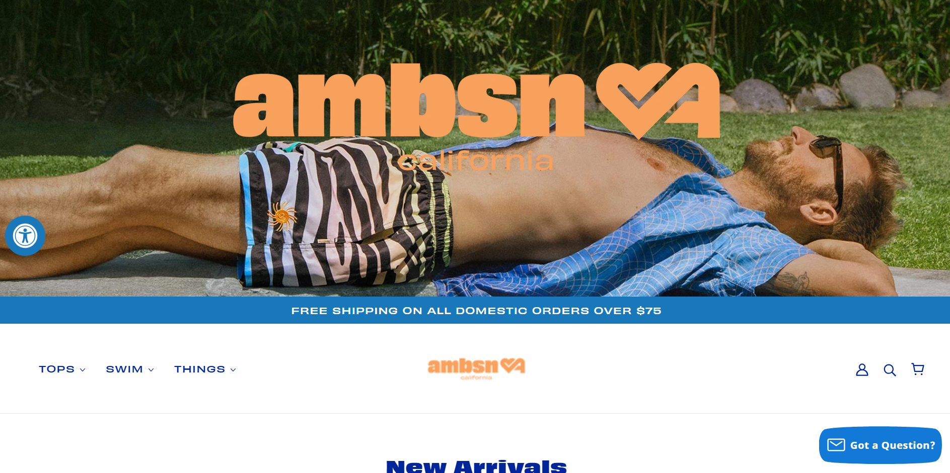
- Exciting header to pique customer interest: Right as you visit ambsn’s homepage, you meet a visually pleasing header image that combines youthful colors and sets off the relaxing beach vacation vibes. The pic makes you excited to explore the brand more (assuming you landed on their website upon clicking a paid ad).
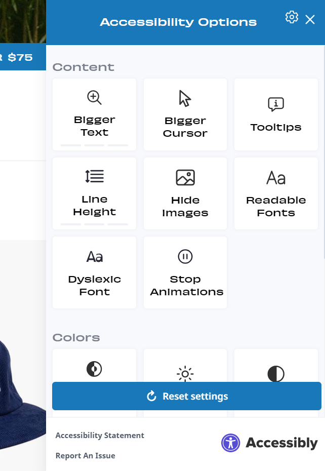
- Unique customization options for better UX: A blue icon stays fixed on the left side of the page, as you continue scrolling. When clicked, you’ll find some unique website preference settings that I’ve never seen on any other website. It’s a quirky addition that helps set a distinctive brand image.
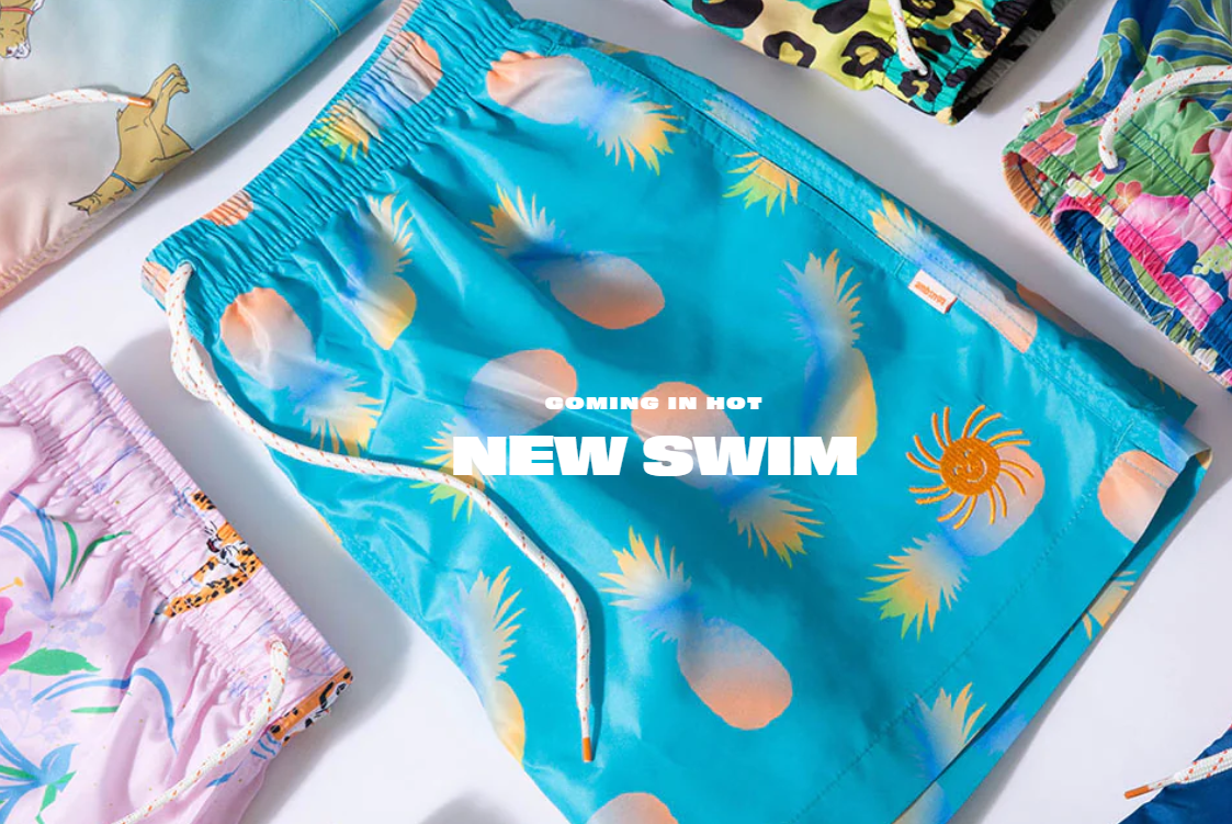
- Homepage copy written how their customers speak: As you move forward, you can’t help but be drawn to the image showcasing a stunning collection of contemporary California-style shorts. Coming in Hot New Swim carries a subtle hint of youth slang, which helps its target audience relate more to ambsn’s identity.
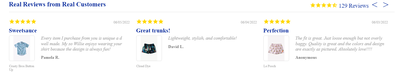
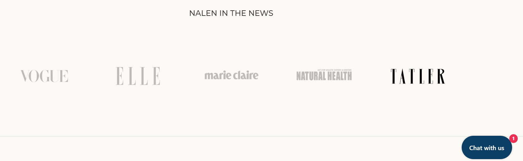
- Multiple social proof to seal the deal: A brand’s credibility is based on how loyal customers perceive it. As you scroll, you'll see that ambsn has been featured in top fashion magazines like Esquire and Vogue. Since these magazines have many readers, customers know that if a brand is endorsed by them, it means the brand is of high quality. Also, a collection of 129 textual reviews is featured as a carousel along with the specific product. This further confirms their quality and ongoing appeal to customers.
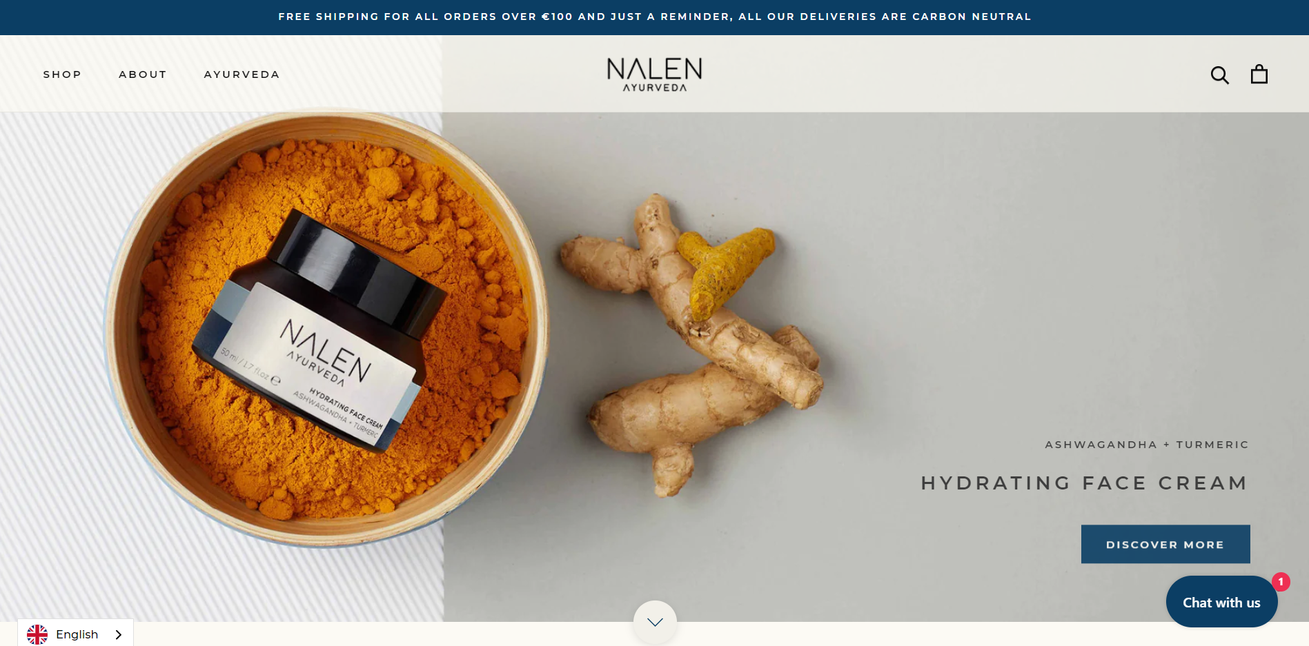
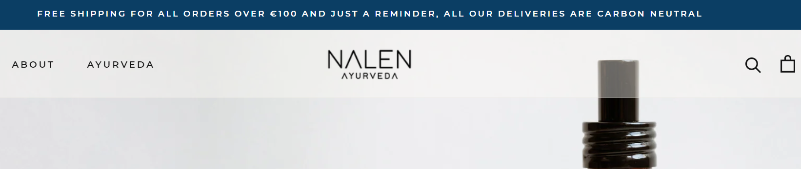
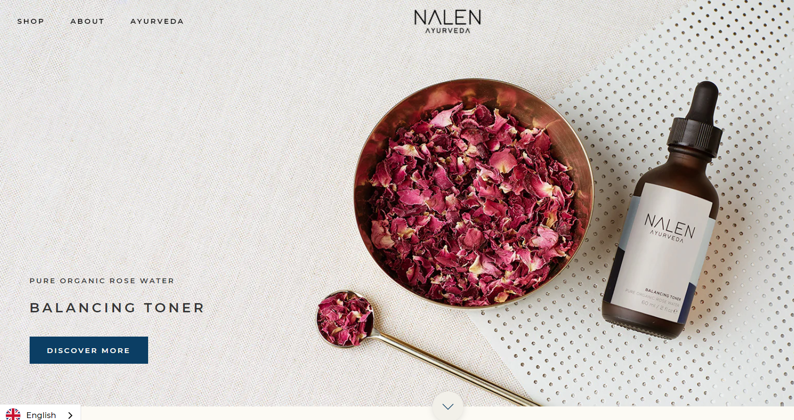
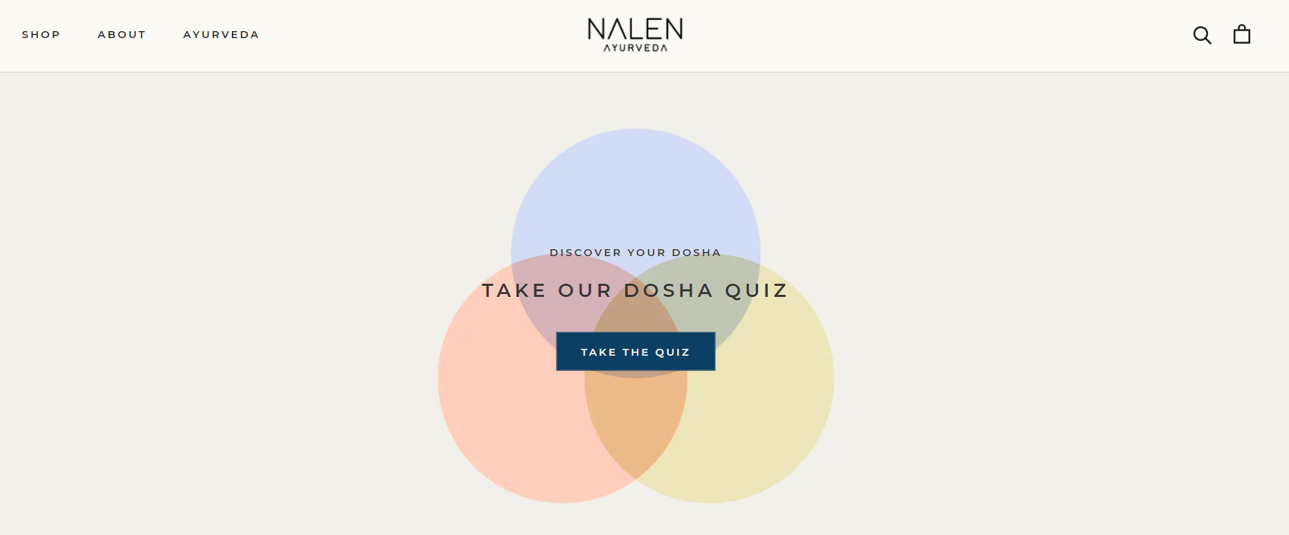
9. Nalen Ayurveda
Nalen Ayurveda sells ayurvedic skincare products to help people live a healthy, happy, and balanced life.
What Makes Them a Best Ecommerce Website?
- Complementing website design: The brand understands that there are a gazillion other companies claiming to do the same. And they’ve only a few seconds to set themselves apart. So, they use a Webflow template that perfectly complements their core brand essence — calmness.
- Customer-centric selling approach: At the top of the homepage, Nalen Ayurveda hits two birds with one stone. They use a blue banner to grab customers' attention with a free shipping offer and inform eco-conscious visitors about their carbon-neutral deliveries. This approach helps them boost sales and establish a positive brand image.
- Laser focus on first-visit conversion: Unlike typical ecommerce homepages, the header images focus on converting customers rather than just making a visual impact. These images have a minimalist and rich design, highlight the main ingredient(s), and include a simple Discover More button that takes visitors to the product page. This approach reduces the time it takes to make a purchase as it provides visitors with a quick access to the essential information they need to buy.
- Highlighted customer support: Located in the bottom right corner, the Chat with us icon gets your attention as it features a message notification in bold red. This subtly conveys to visitors that they can easily get in touch with the customer support team, in case they need any assistance.
- Gamification to reduce bounce rate: As you continue scrolling, you’ll find the Take Our Dosha quiz, which is a fun and gamified method to boost customer engagement, reduce bounce rate, collect in-depth customer info to target via personalized email marketing, and lower cart abandonment rate.
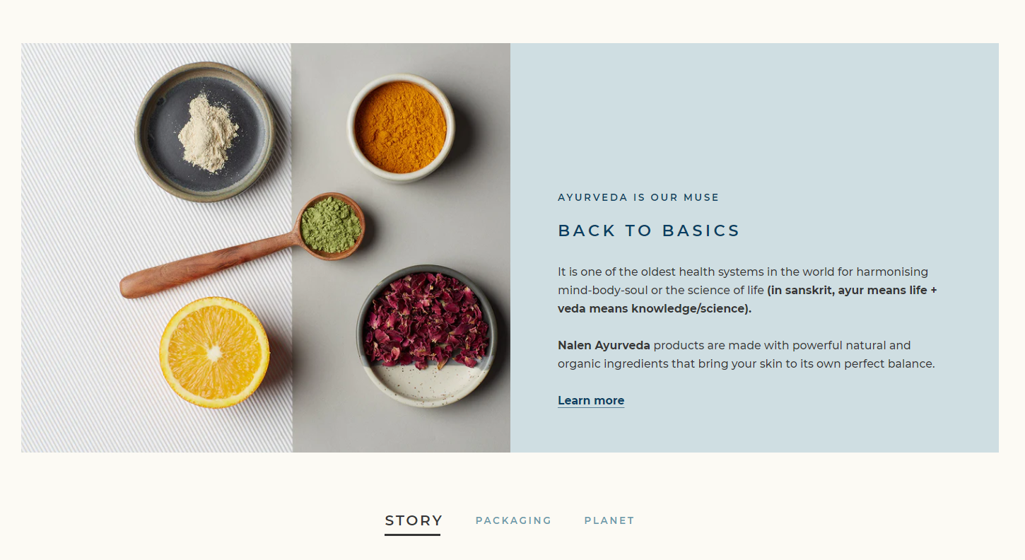
- Brand details to increase customer engagement: Further down, you’ll see three sections that demystify the concept of Ayurveda and its benefits, detail how their packaging is sustainable, and how they protect the Himalayan range. This transparency about their mission and vision helps instantly build customers’ trust in the brand.
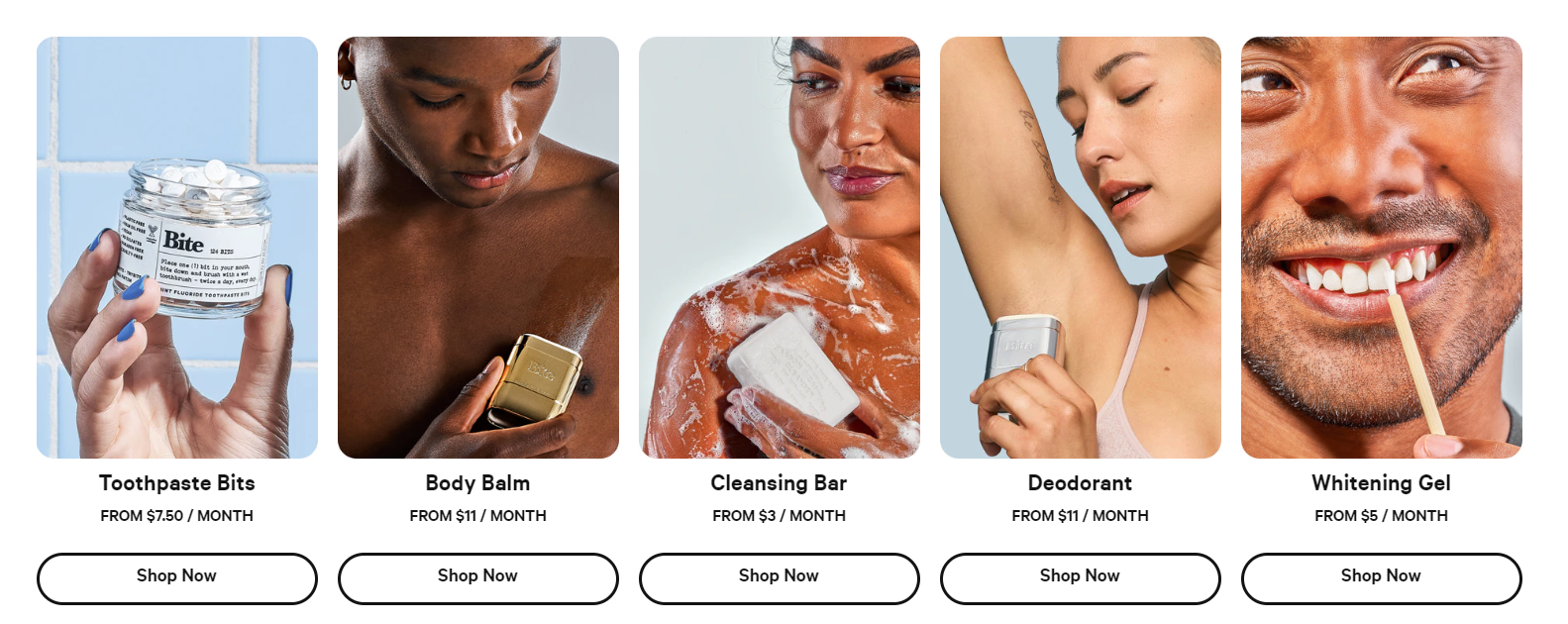
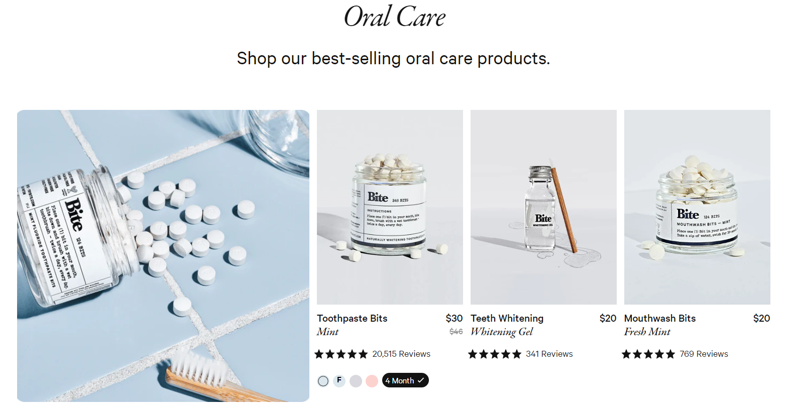
10. Bite
Bite specializes in sustainable oral and personal care product range.
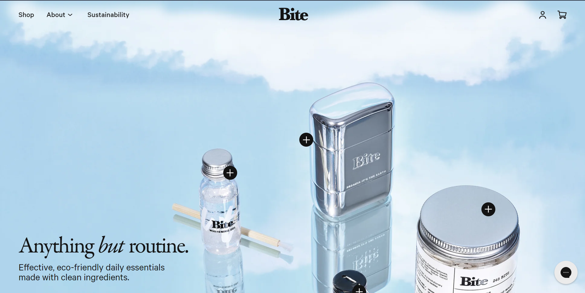
What Makes Them a Best Ecommerce Website?
- Interactive header elements: When you land on their homepage, you'll notice three products displayed in the header image, each with a plus sign. Clicking on the plus sign reveals a detailed product description, along with a Shop Now option. Bite has designed an interactive website that offers clear information to its customers right from the start.
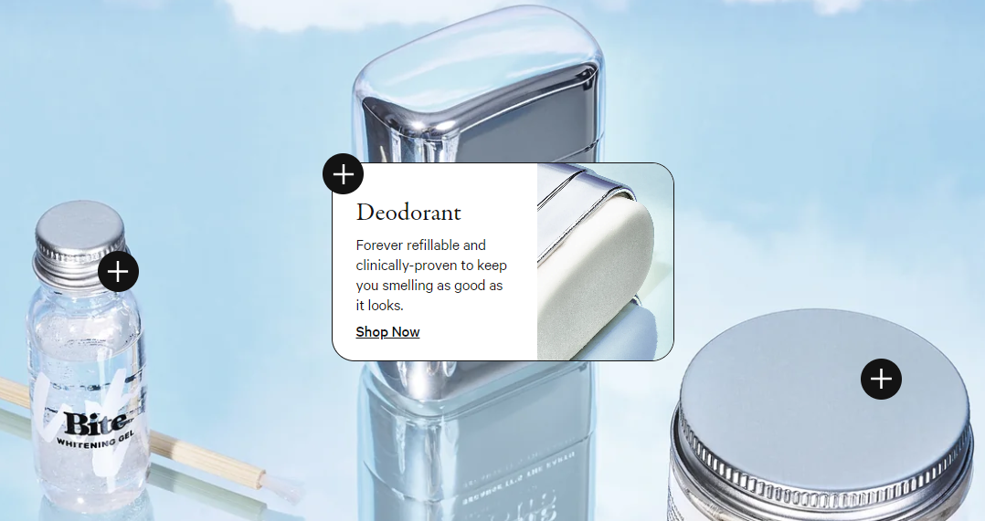
- Inclusive product showcase: As you scroll down, you'll notice the brand's commitment to diversity and inclusion in how they showcase their products. There is a positive and joyful vibe in their approach. Hovering over on an image will show you a clear picture of the product, along with a Shop Now option right below.
- They include media recognition and rave reviews to build brand trust: You’ll notice that Bite is recognized in multiple well-known magazines, which adds to the credibility of their products. This is further reinforced by 5-star reviews displayed right below their best-selling products — indicating that many customers keep coming back to buy from them.
11. Magic Spoon
Magic Spoon is a high protein low-carb cereal brand.
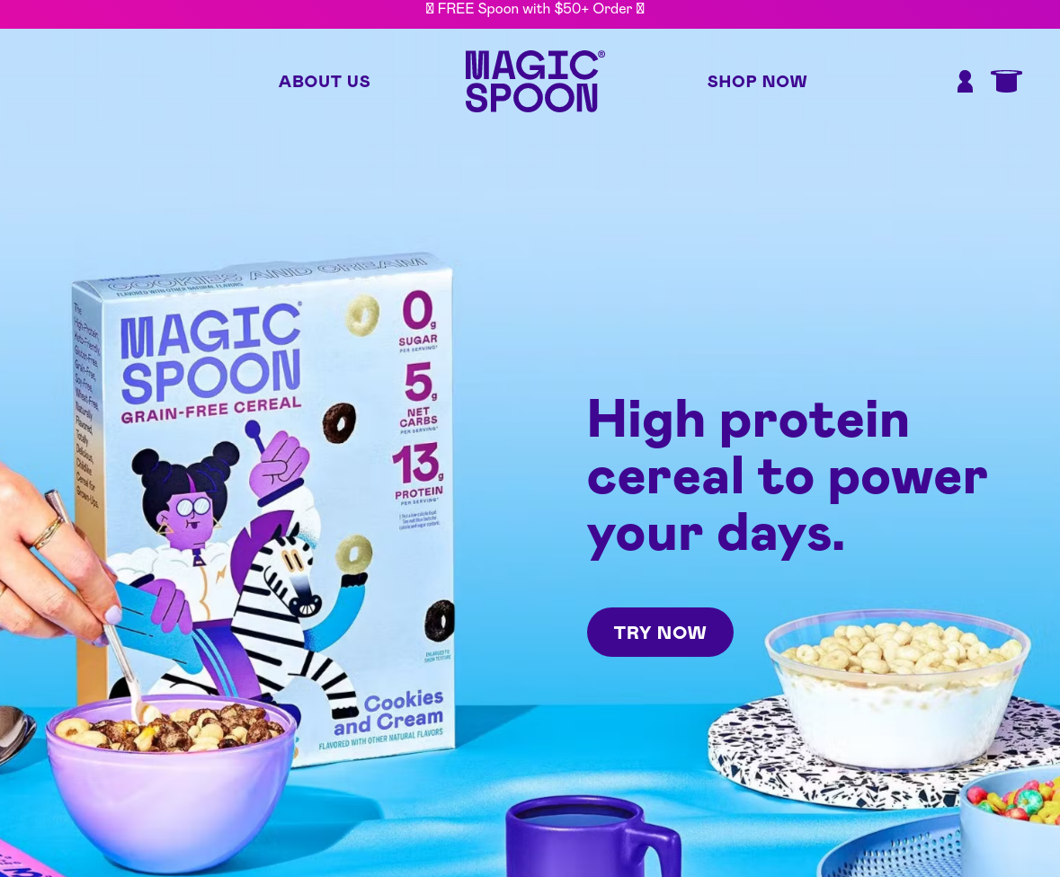
What Makes Them a Best Ecommerce Website?
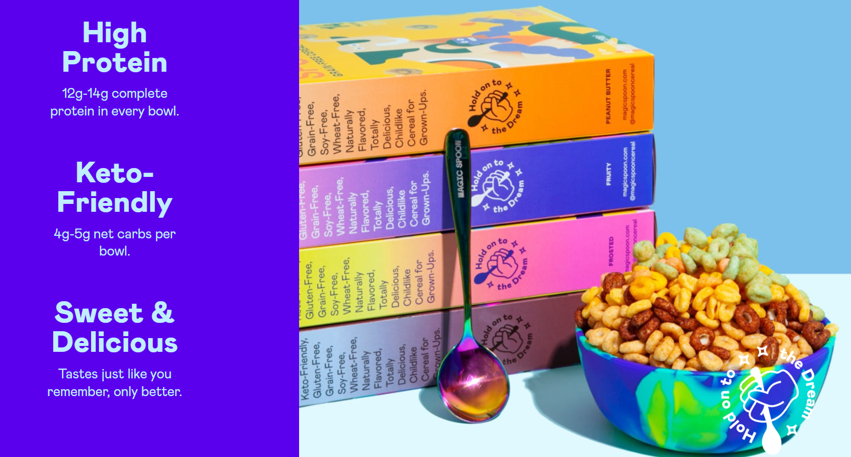
- Unique attention-grabbing banner: As soon as you land on their homepage, you notice a dynamic color-changing bar that practically is the brand’s elevator pitch — High Protein, Keto-Friendly, and 60,000+ 5-star reviews. This clever color-changing feature is a great way to continuously engage the customer’s attention while they navigate through the various sections of the homepage.
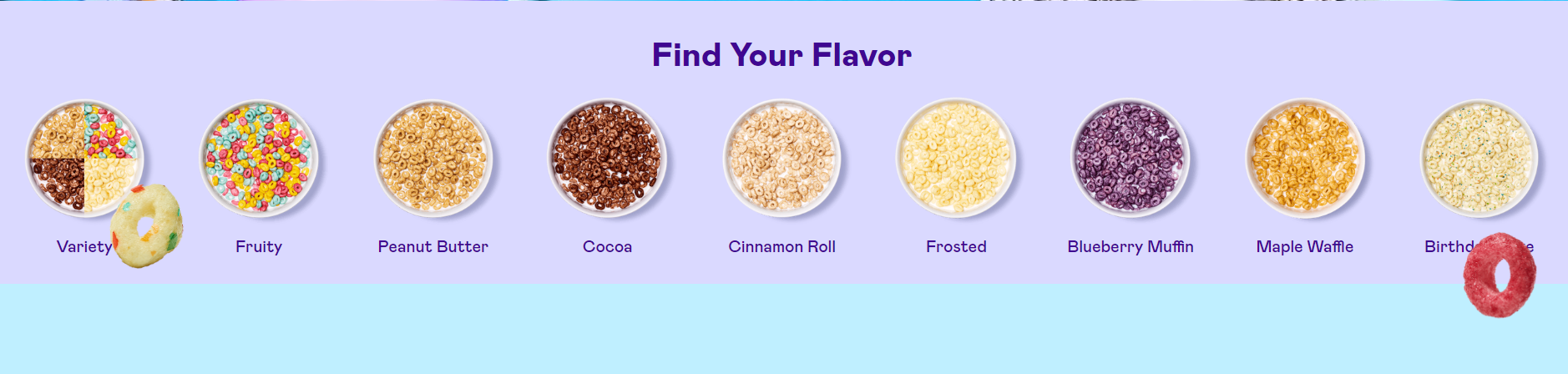
- Vibrant images to match their brand: The product images are poppy and convey the health-oriented nutrition of the products — like the cereal box in the opening picture. And just below that, there's a colorful series of cereal options to choose from. The images are as crisp as their cereals seem to be. Plus, the homepage features floating cereal loops that have a playful and gamified appeal, making you want to click on them, just like a child!
- USP displayed upfront: Moving ahead, there's a screen-wrapping image of their cereal box, along with the information about the nutrient composition and the goodness it offers. There's a circling hand holding a spoon with the message Hold on to the Dream — reflecting the desire of many customers to eat clean and lead a healthy life.
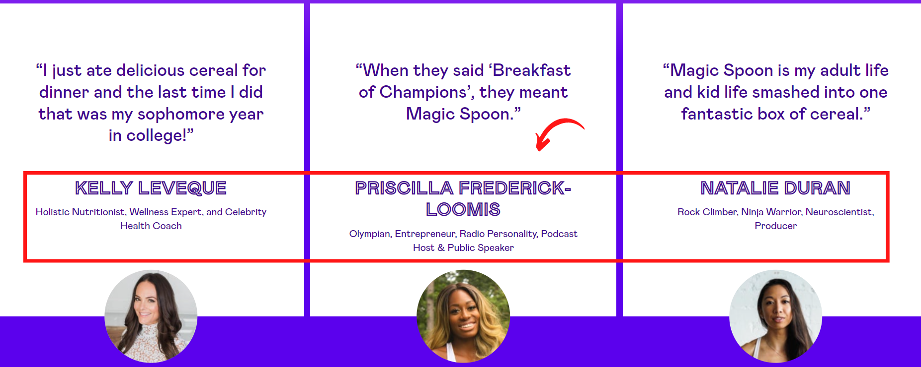
- Reviews from key people: As you scroll further, you'll come across testimonials from influencers like health coaches and Olympians, suggesting that the product is a valuable addition (even) to the most health-conscious and performance-oriented customers’ routine.
- Website copy speaks emotions: Magic Spoon's founder has aptly dubbed the brand as childlike cereal for adults — capturing the USP in just four words. The playful statement invokes a deep sense of nostalgia because who doesn’t want to relive the good old childhood years. Am I right or am I right?
Wrapping Up
Each of these ecommerce websites brings something unique to the table. But the common denominator between all of them is that they’re simple to follow, well laid out and aesthetically pleasing.
They also all do a great job of telling their story and clearly defining what their brand is all about. And that’s key because creating a compelling homepage is the cornerstone of the overall ecommerce experience.
Learning from these brands and borrowing from their formulas should help you with your ecommerce design, so you can create a website that’s user-friendly, highly engaging, and, most importantly, converts.
Converting your customers with your site is only half the picture though. What you need is to be able to follow up with your customers once you've gotten them to fall in love in the first place.
Drip offers sophisticated marketing automation and email sending so you can do just that — with an easy-to-use platform. Try Drip free for 14 days — you won't regret it!

