
Maybe it’s just me, but when I think of email, I can’t help picturing a desktop environment.
Perhaps it’s because of all those years I spent in an office, constantly responding to emails in Microsoft Outlook.
Whatever the reason, that’s not how the world works today. In reality, mobile represents a massive chunk of all email opens, and has done for some time now.
Unsurprisingly, mobile email usage dropped off at the start of the coronavirus pandemic as we adjusted to a world of remote working and spent more time on our laptops. But by the end of 2020, mobile had once again reclaimed its crown as the single biggest source of email opens, with a 43.5 percent share.
In contrast, desktop represented under 20 percent of all email consumption, while webmail held a 35.2 percent share.
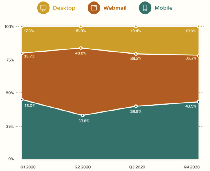
Source: Litmus
What does this tell us?
Firstly, perhaps I spend too much time thinking about emails.
Secondly, and more importantly, if your emails aren’t mobile-friendly, you’re potentially turning off a huge chunk of your audience, which could be massively hampering the performance of your email marketing campaigns.
Take a look these two statistics for a moment, again from Litmus:
- 45 percent of consumers have unsubscribed from a brand’s promotional emails because its emails or website displayed poorly or didn’t function properly on mobile.
- 34 percent have flagged a brand’s marketing emails as spam because they didn’t work well or display properly on mobile.
I’m sure you put a lot of time and effort into building quality emails and managing your email list to avoid falling victim to spam filters, so the last thing you want is to get marked as spam because your emails look bad to smartphone users.
So we’re agreed: mobile-friendly emails are important.
Now, here are nine examples of mobile-friendly emails to inspire your future campaigns.
Table of Contents
1. Songkick
Let’s kick things off with a simple example of an email that’s clearly been designed with mobile in mind.
In fact, this email from Songkick is so mobile-friendly that the desktop version almost looks like an afterthought in comparison.
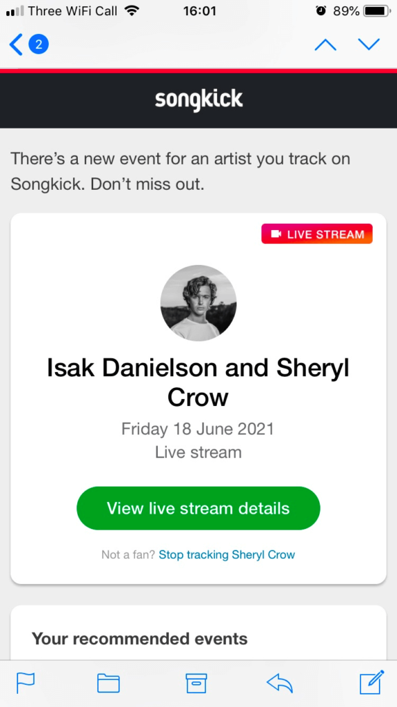
Mobile version
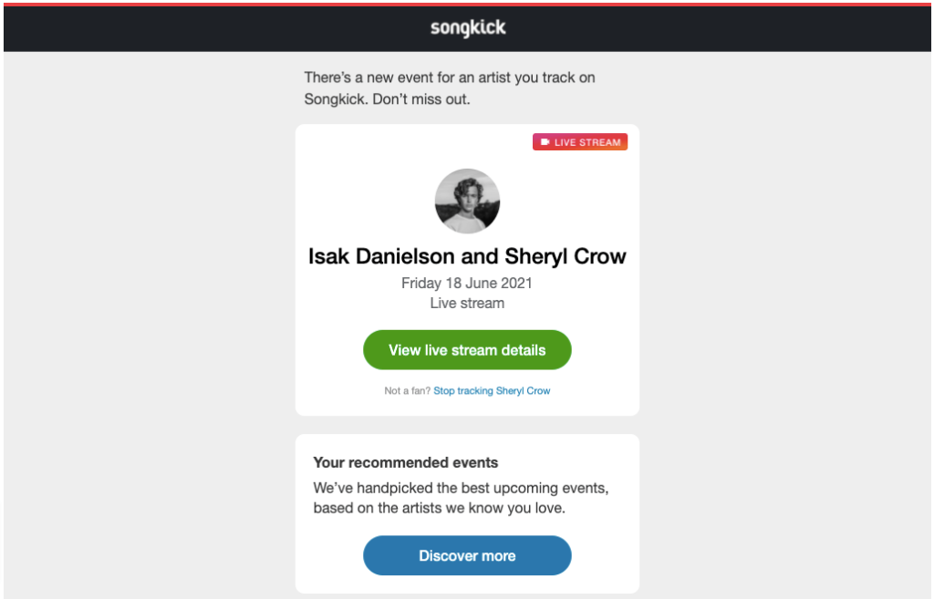
Desktop version
The only difference between the two versions is the vast expanse of white (well, gray) space surrounding the email on desktop. Compare that to the much more pleasingly proportioned, mobile-specific variant, which looks a lot slicker.
It’s also worth noting that the big, green call to action (CTA) button really stands out against the white background and is easy to click on mobile. That’s important because mobile users don’t want to struggle to click a tiny button or link in the body copy.
2. Trello
Mobile phone displays have come a long way since the days when the average handset was about 10 percent screen, 20 percent keyboard, and 70 percent chunky plastic.
In fact, the average mobile display size increased by 50 percent between 2015 and 2019. However, I don’t think it’s too controversial to say that phone displays are still smaller than desktop and laptop displays.
As such, one issue with mobile-friendly emails is that complex graphics can sometimes be lost because of the smaller dimensions.
Still, Trello gets it right here. The image looks just as striking on mobile and effectively communicates the purpose of the article.
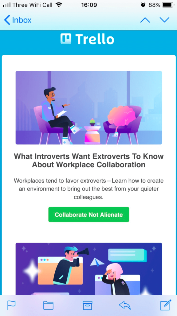
Mobile version

Desktop version
Again, we can also see a big, bold CTA button here—perfect for attracting clicks from mobile users.
3. Wayfair
In both of the two previous examples, the only thing separating the two email variants is a wide band of color spanning the desktop version.
While that works well enough for Songkick and Trello, it’s certainly not the only way to design a mobile-friendly email. That’s a relief, because it’s not exactly inventive.
Wayfair gives us a glimpse at a different way to do things.
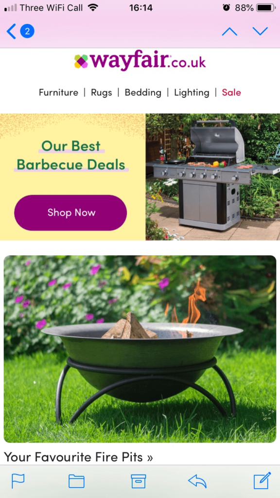
Mobile version

Desktop version
Specifically, Wayfair shows us how playing around with hero imagery can make an email more mobile-friendly.
The desktop layout features a hero image spanning the full width of the email, with two columns of product categories beneath it. Switch to mobile and the banner image is reduced, while the product images appear comparatively larger.
To fit everything in on mobile, Wayfair opts for a single-column layout, rather than two columns side by side. It’s a simple approach, but it makes for a more mobile-friendly email in which the products clearly stand out.
4. ASOS
E-commerce giant ASOS saw its revenue more than triple between 2015 and 2020, so it clearly understands a thing or two about marketing.
This example tells us plenty about the benefits of playing around with font sizing and proportions.
Now, for a fashion brand like ASOS, visuals are super important. It needs eye-catching imagery to sell its products.
However, that presents a potential email marketing headache. By giving over so much space in this email to the hero image, it leaves much less space for copy. And quality copy can be the difference between someone clicking through and buying, or looking elsewhere.
So how does ASOS get around this particular challenge?
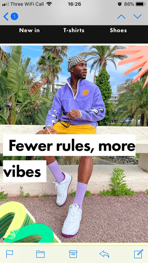
Mobile version
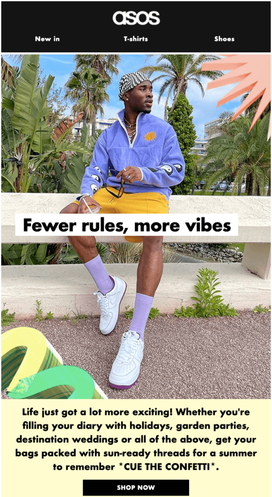
Desktop version
As you can see, the copy in the mobile variant is proportionally much larger than on desktop, which makes the email more accessible for mobile users. There’s no need to squint to read the text on a smaller display.
The use of the black text against the white background is simple but effective too, ensuring the copy is easily readable regardless of where the responsive email design positions it on the screen.
That’s important given that there are lots of colors in the hero image, and the black copy wouldn’t stand out so well against all of them.
5. UberEats
Here’s an interesting one. We’ve spoken a lot about imagery so far, but not at all about typeface. It’s about time we changed that.
In this example, we can see UberEats uses a different typeface on mobile and desktop.
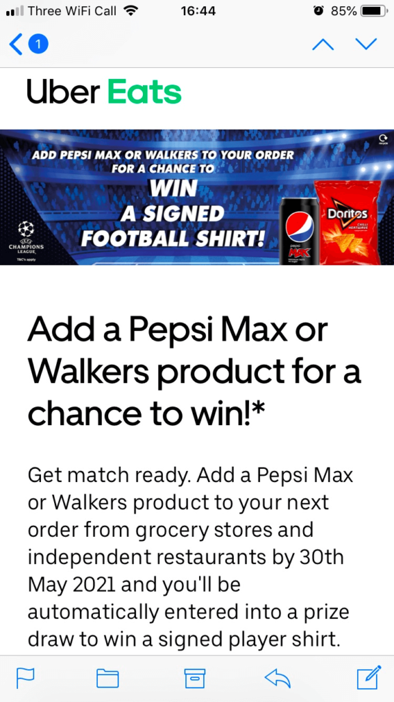
Mobile version
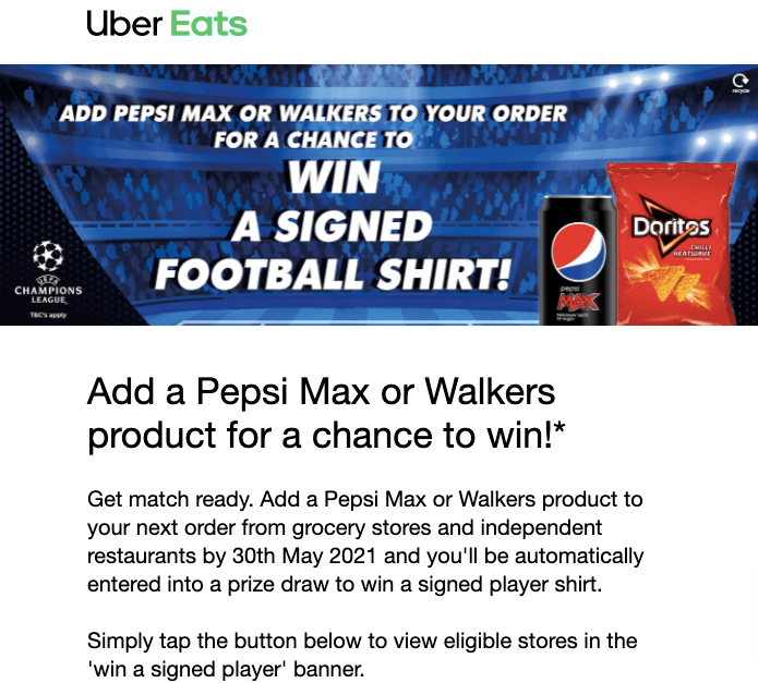
Desktop version
Okay, they’re not a million miles apart. We’re not talking Times New Roman vs. Wingdings—they’re both sans serifs. But the mobile typeface looks cleaner. Even something as simple as the asterisk at the end of the intro text looks sharper on the mobile email.
Obviously, I don’t work for UberEats. I don’t know why its marketing team has done this.
There’s no specific reason why any given typeface should work better on mobile than desktop. But there’s presumably a good reason for it.
Most likely, UberEats has taken the time to test different typefaces across different channels and has deduced that these are the best options for mobile and desktop.
You should absolutely A/B test elements like this yourself and see what works best for your audience.
6. Twinings
Unfortunately, email design is about more than just making something look pretty.
You’ve got to effectively communicate the purpose of the email, too. That can often be a lot harder on mobile than desktop because there’s less space to play with.
Clearly, Twinings understands how to overcome this challenge. Take a look at how much detail it crams into a far smaller space on mobile without making the entire email look cluttered.
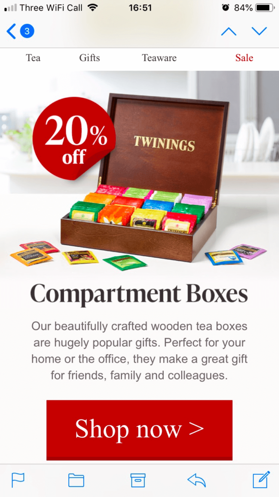
Mobile version
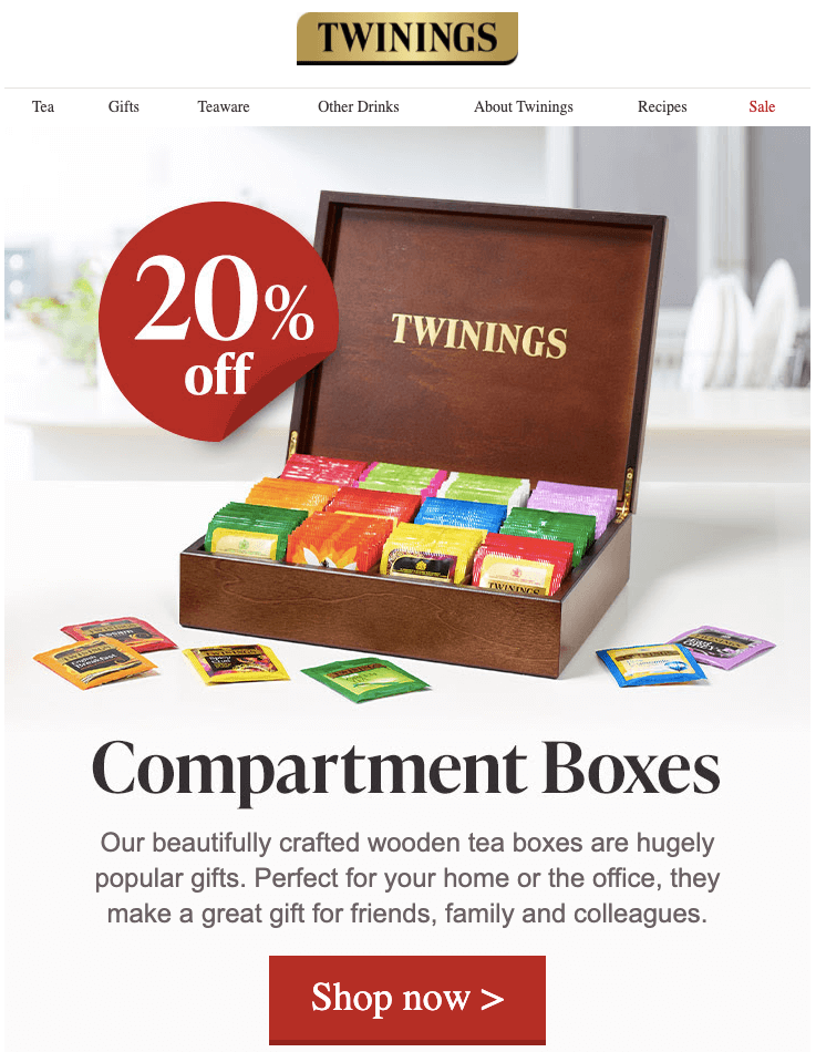
Desktop version
On desktop, it takes a couple of scrolls to view all that information. Yet on mobile, it’s all there on a single screen.
Despite that, all the key elements—the CTA, the “20 percent off” sticker, the headline—still stand out effectively on mobile. In fact, looking at proportions, they’re actually larger on the mobile-specific version, which makes the email look even more impactful.
7. Booking.com
Here’s another fantastic example of email design by Booking.com that’s not just mobile-friendly—it’s mobile-first.
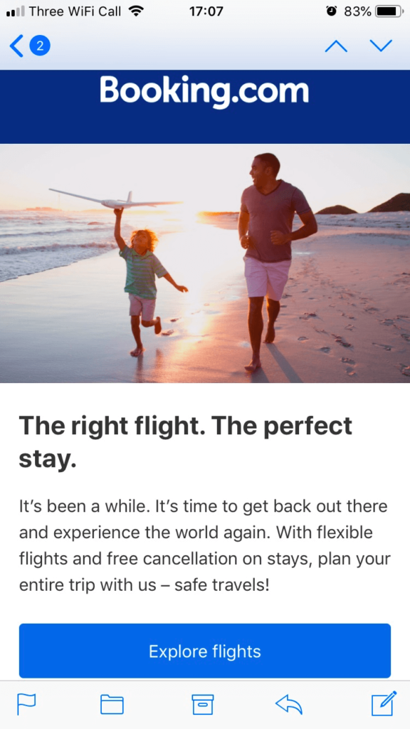
Mobile version
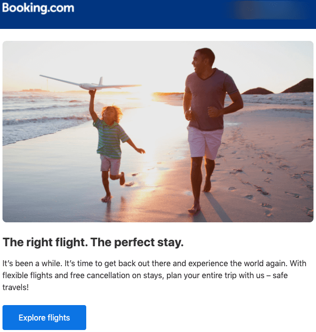
Desktop version
The mobile version of this email fits the layout so much more effectively than its desktop counterpart.
For instance, look at how the word “travels” is left all on its own line in the desktop version. In newspaper terminology, it’s a widow.
By contrast, the mobile layout is a lot cleaner. And with the CTA button spanning the full width of the email too, it’s also more actionable.
8. Bloom & Wild
Effective email design—for mobile or desktop—is often about knowing when to stop.
By which I mean, white space can be an extremely effective element of design when used intelligently, which is exactly what Bloom & Wild does here.
Mobile version
Desktop version
Now, white space isn’t necessarily something you’d think of straight away where mobile-friendly emails are concerned. Because there’s obviously less space to squeeze in all your information, it’s tempting to fill every last pixel with words, visuals, and colors.
Yet the mobile version of this email actually features comparatively more white space than the desktop version. That makes the image (which is actually a GIF) a lot more eye-catching and impactful.
In short, this email shows you don’t need to overdo the design. Include one or two striking elements and allow them the space to stand out.
9. Lastminute.com
Much like in fashion, high-quality imagery is super important in the travel niche.
Brands want to inspire people with spectacular landscapes and beautiful architecture in the hope that they’ll immediately book a holiday. And that’s exactly what Lastminute.com does here.
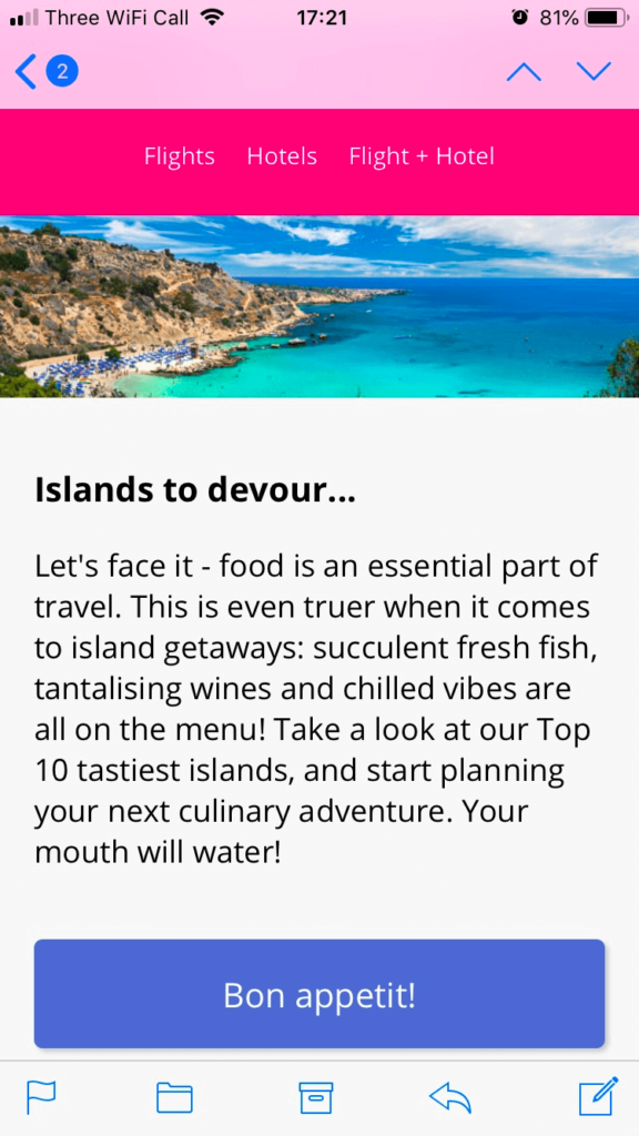
Mobile version
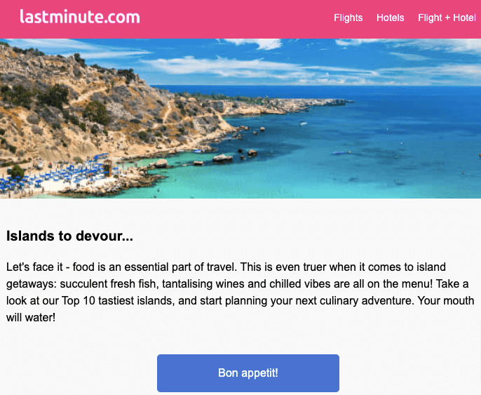
Clearly, on the mobile version of this email, Lastminute.com has a lot less space to fit in that eye-catching banner image. However, because they’ve chosen an image with such vivid colors, it still stands out, even when viewed on a smartphone screen.
Once again, it’s worth highlighting how much more space has been given over to the CTA button on mobile, too.
The mobile button also features some subtle drop-shadowing, making it extra clear that it’s a clickable element. That’s important because you can’t “hover over” the button on mobile like you can with a mouse on desktop.
Conclusion
Clearly, designing emails for mobile means finding an effective way to communicate your key messaging and imagery in a smaller space than on desktop.
But, as the examples in this article demonstrate, that doesn’t mean mobile-friendly emails have to look busy and untidy.
Done well, mobile-friendly emails can be just as clean and impactful as their desktop equivalents. It just requires some smart thinking and clever design, plus a clear understanding of the key information you want to communicate.