
If you’re looking for good hello bar examples, you’re in the right place.
In this guide, I’ll share seven of the best hello bar examples I’ve seen.
I’ll also explain why they work and how you can model them on your own website.

Hello Bars (Made Simple)
1. Link to Important Information
4. Highlight Your Satisfaction Guarantee
What Is a Hello Bar Popup?
A hello bar, also known as a floating bar or banner bar, is a bar that sits on the top or bottom of a shopper’s browser screen, often below the main navigation.
As we’ll discuss in a moment, hello bars are a non-intrusive alternative to popups, giving website owners a means to collect emails, welcome visitors, and more.
1. Link to Important Information
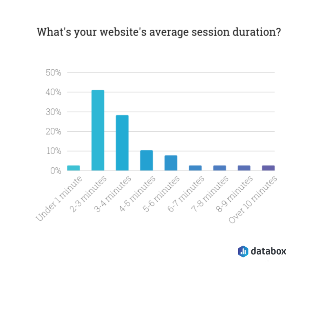
According to research from Databox, the average session duration for a website visitor is between two to three minutes.
Conveying crucial details about your brand, then, is vital for website visitors, particularly those who might not be familiar with your brand.
One brand that informs its visitors well is Adidas. If you visit the company website, you will notice a hello bar at the top of the page.
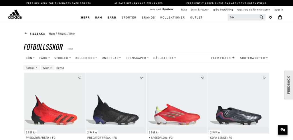
Here it is zoomed in:
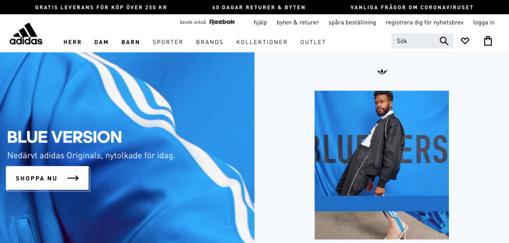
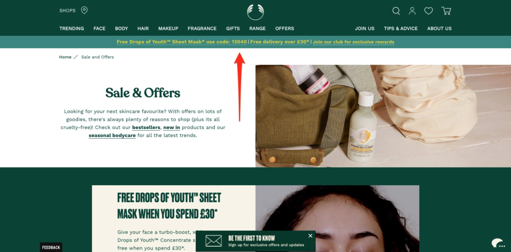
As a Swedish visitor, Adidas wants me to know that it offers “Free Delivery for Purchases Over SEK 250” and “60 Days Returns and Exchanges.”
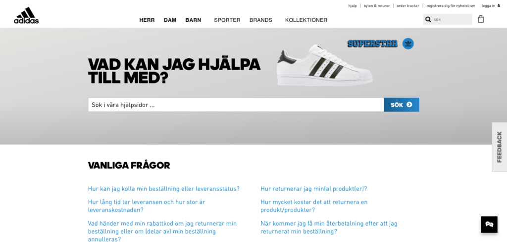
And if I have concerns about Covid-19, I can read “Frequently Asked Questions About the Coronavirus,” by clicking a link in the bar to a dedicated page on Adidas’s website.
Given Adidas’s reach, it makes sense that the brand uses dynamic content in its hello bar, which changes its “free delivery” copy based on the visitor’s location. When Seray visited the Danish page, for instance, the copy changed to include Danish Kroner instead.
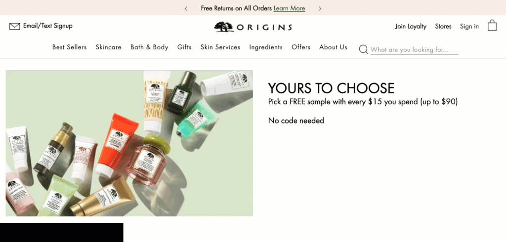
Origins follow a similar route on its website, opting for revolving content instead to promote its free returns policy and more.
If you want to make new visitors aware of details about your brand without being annoying, then a hello bar is the best, non-intrusive way to go.
2. Run a Promotion
It’s no secret that email is one of the best ways to promote a sales campaign. But what about prospects that aren’t on your email list, and how can you notify them of new promotions?
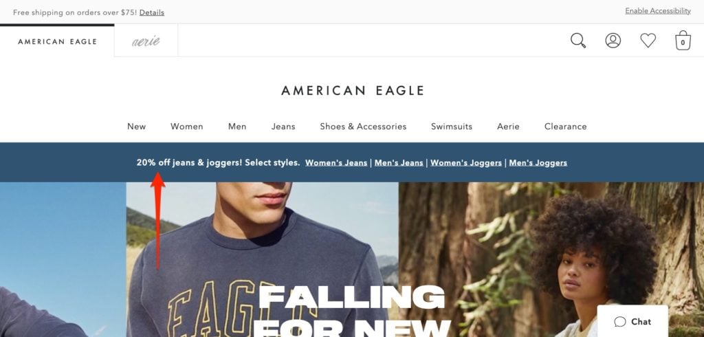
American Eagle is an excellent example of a brand that uses a hello bar to promote its discounts. At the time of writing, the brand is promoting 20 percent off jeans and joggers, organized by category.
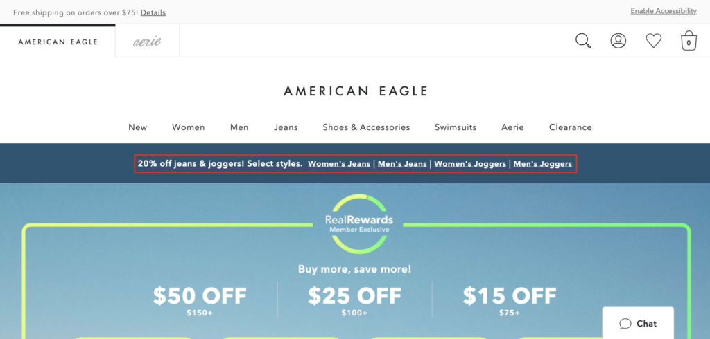
Here it is zoomed in:
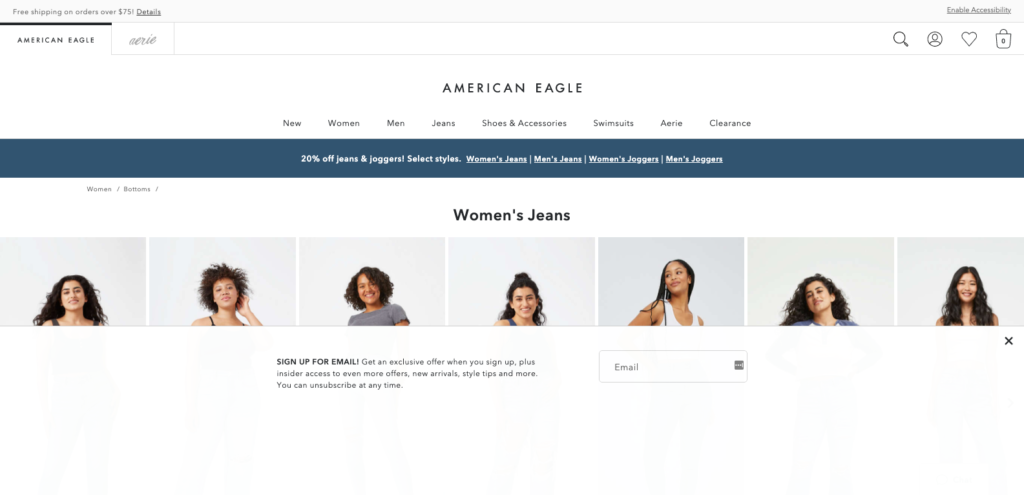
What’s interesting is how American Eagle treats its visitors. For non-subscribers like me, I saw an email optin after clicking through to one of the category pages.
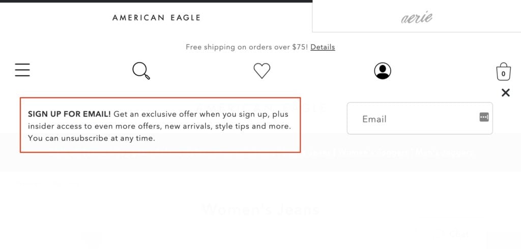
Here’s a closer look at American Eagle’s email form:
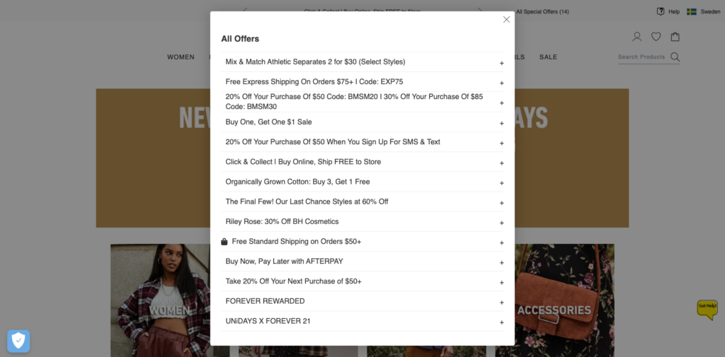
Forever 21 goes a step further on its website. When I visited its website recently, I saw a hello bar teasing “All Special Offers (14).”
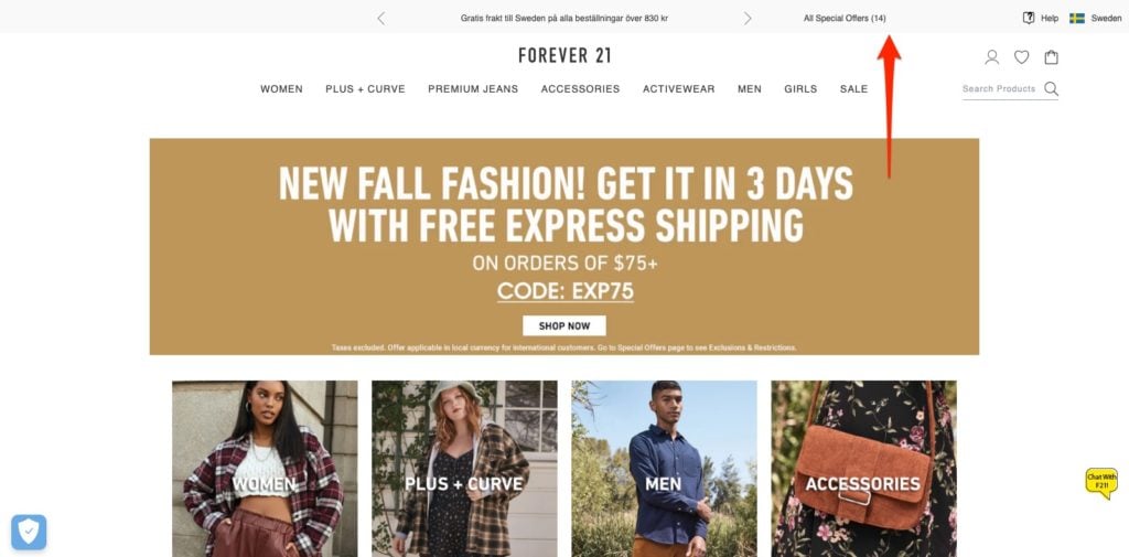
The number caught my attention, and when I clicked the link, a popup appeared, sharing all offers currently active on its website. (The option to click a drop-down to learn more was an exceptionally nice feature.)
Continue using email to promote sales campaigns, but cover all bases on-site for non-subscribers by giving new visitors the option to learn about your current promotions.
3. Promote Pay Later Options
Many online retailers offer the option to buy now, pay later (BNPL) at checkout. And with benefits for both merchants and buyers, it’s not hard to see why it’s earned its place in e-commerce.
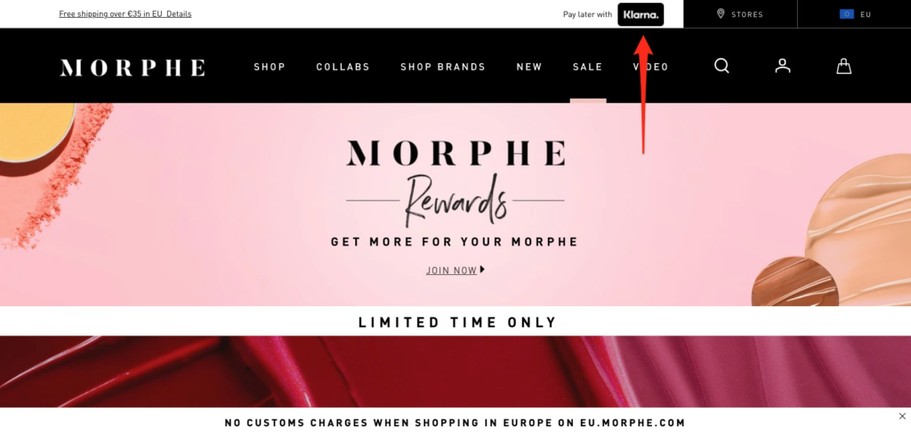
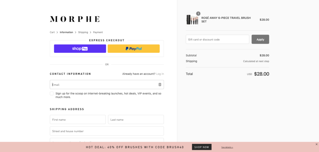
One brand that offers BNPL and promotes such in its hello bar is cosmetics and beauty manufacturer, Morphe. After visiting the brand’s website recently, I saw the option to buy now and pay later.
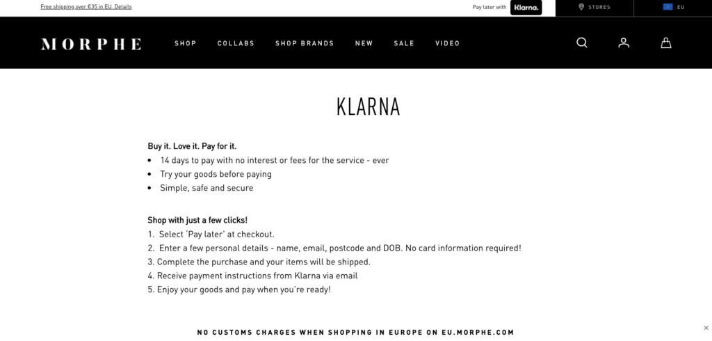
After clicking the link, Morphe redirected me to a dedicated page on its website, promising me a chance to try before I buy, as well as the option to make a purchase with just a few clicks.
Similar to Adidas changing its currency depending on the shopper’s location, Morphe changes its payment processor. For Swedish visitors, like me, I saw Klarna, but when I visited the US store, I saw Afterpay.
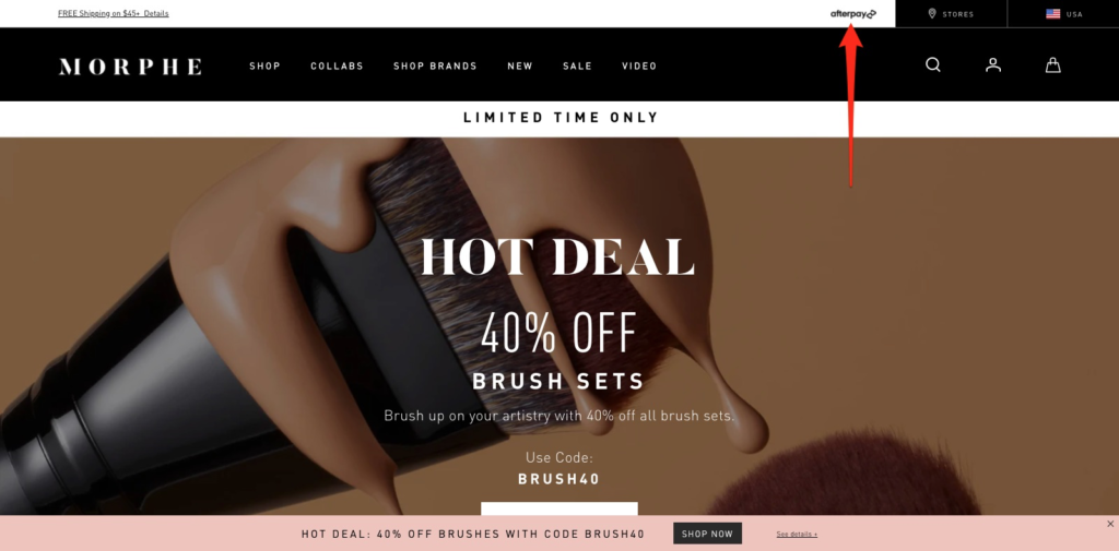
There is one alteration I would make, however. When I tried to check out, I only saw Morphe’s second bar—the one at the bottom that offers “60% off brushes with code [Redacted].”
I would remove the bottom bar and add the top bar from the homepage to continue reminding buyers that they can BNPL. Here’s how that might look.
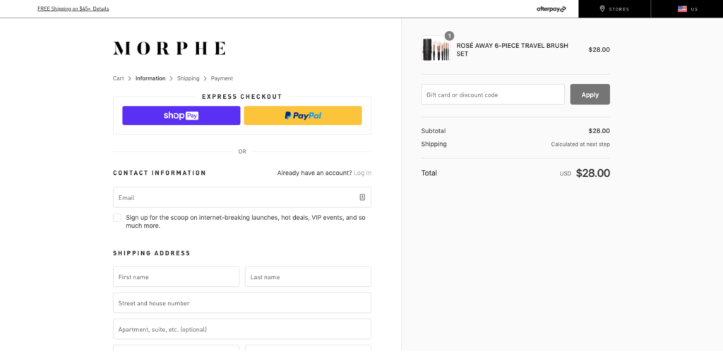
It’s easy to assume visitors will remember or have even read key buying details on the homepage, but that’s rarely the case. Offer gentle reminders to simplify the buying experience and put the buyer at ease.
4. Highlight Your Satisfaction Guarantee
Having a compelling risk-reversal or satisfaction guarantee can often be the difference that makes a difference when a prospect is considering which brand to buy from.
Sadly, few brands go beyond a generically worded promise and those that do, rarely promote that guarantee anywhere other than a page like its shipping policy page.
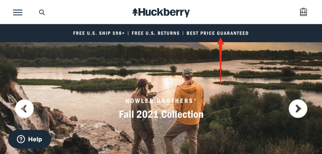
One brand that nails its value proposition and places it front and center for all visitors is Huckberry. If you visit the brand’s homepage, you will see a hello bar promising “Best Price Guaranteed.”
And if you click the copy, a popup appears, sharing the brand’s guarantee. A lot is going on here, so let’s break it down in more detail.
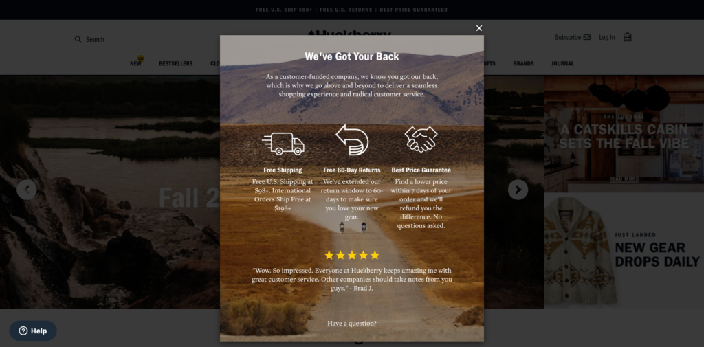
Prefaced with the headline, “We’ve Got Your Back,” Huckberry showcases several satisfaction guarantees, including free shipping, free 60-day returns, and the lowest price online.
The popup also has a five-star rating from a satisfied customer praising Huckberry for its customer service before ending with a CTA to ask a question.
Bottom line: if you’re in a competitive category, like fashion, and you have a guarantee that many can’t match, don’t be afraid to flaunt it for all to see.
5. Link to a Piece of Content
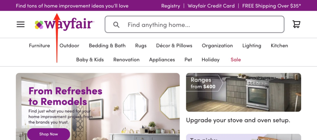
Say you have a resource like a page for home improvement ideas. One way to promote it, as we often do on our website, is with a slide-in popup. Another, as Wayfair can attest to, is with a hello bar.
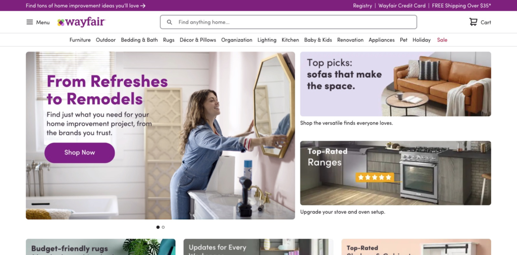
Here it is zoomed in:
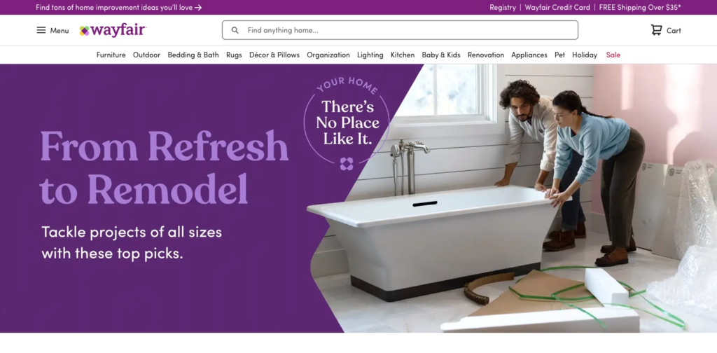
After clicking the link, the brand redirects you to a page offering “home improvement ideas” with “top picks” to help you “tackle projects of all sizes.”
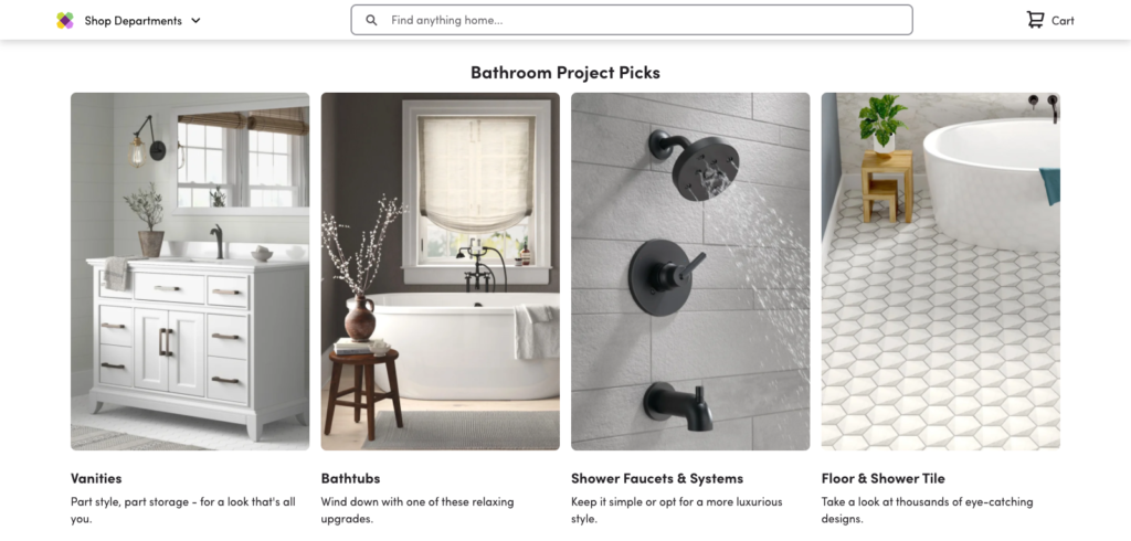
When you scroll down, there’s an option to get design inspiration based on the room. Here’s an example of what I saw when I scrolled through to “Bathroom Project Picks”:
After clicking on one of the options, you realize that the resource is nothing but a clever way of organizing Wayfair’s vast collection of product pages. Here’s an example of what I saw after clicking “Vanities”:
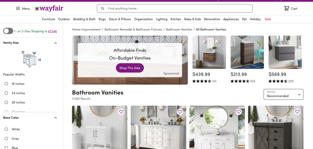
It just goes to show that a piece of content doesn’t necessarily have to be a blog post; sometimes, a page with links to your best product pages is enough. And a hello bar is the perfect way to get new eyes on the page.
6. Promote Corporate Social Responsibility
Corporate social responsibility, or CSR, not only increases employee engagement but can also increase how customers rate a brand’s products.
In fact, when subjects in one study earned the wine they tried supported a charity, they rated the wine as tasting better than those who had not been given the additional information.
Unsurprisingly, then, many brands in certain markets prioritize promoting their CSR at every available opportunity—from its emails to, of course, its homepage.
Too Faced is a brand that prides itself on “trendsetting cruelty-free makeup,” which is precisely why it promotes its CSR on its homepage using a hello bar.
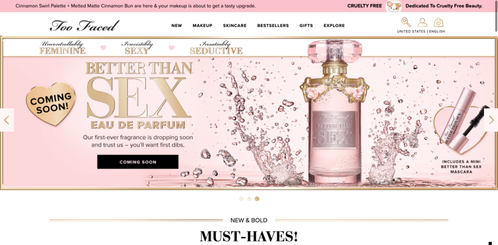
Here it is zoomed in:
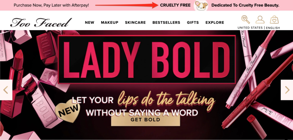
Frustratingly, the copy doesn’t redirect to a page for the visitor to learn more about the brand’s policy. (They do, however, link from their BNPL copy on the left-hand side.)
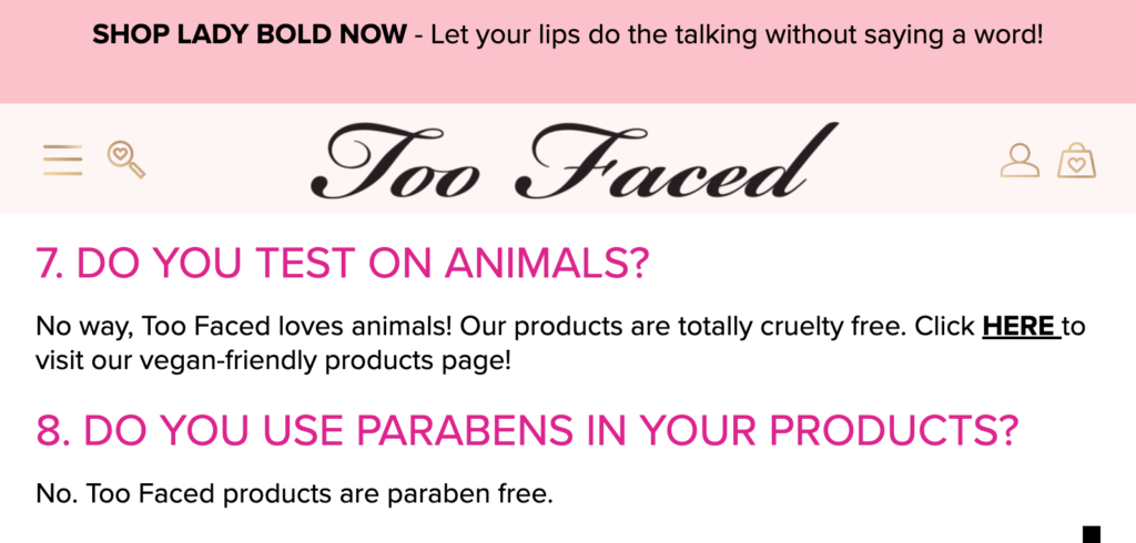
Given that many people are likely not only googling whether Too Faced is cruelty-free, it feels like the brand is missing out on an easy opportunity to inform new visitors of what makes it unique.
In fact, the only cruelty-free mention I could find was a single paragraph on its frequently asked questions page.
I risk repeating myself, but the lesson is important: if you have a unique value proposition, or a CSR that’s important to buyers, tell visitors and link to a page where they can learn more. It goes a long way.
7. Invite Users to Take a Quiz
Many e-commerce brands are now using quiz funnels to give buyers better recommendations and build an email list of engaged, ready-to-buy subscribers.
Care/of is a personalized vitamin brand that has not only nailed—but also continues to draw attention to—its lead quiz, due in part to its hello bar.
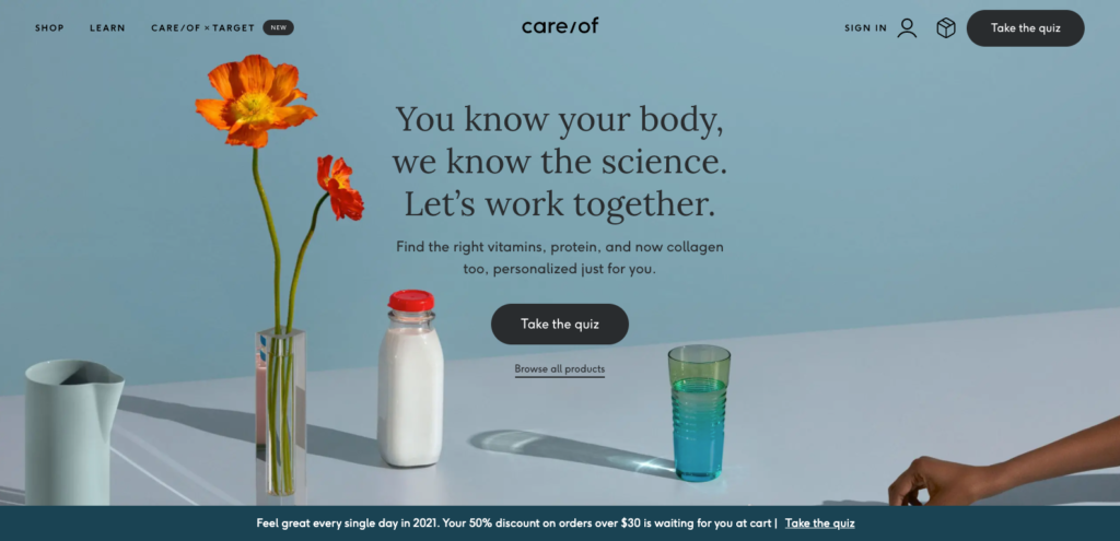
The bar’s copy reads, “Feel great every single day in 2021. Your 50% discount on orders over $30 is waiting for you at cart” and ends with an invitation to “Take the quiz.”
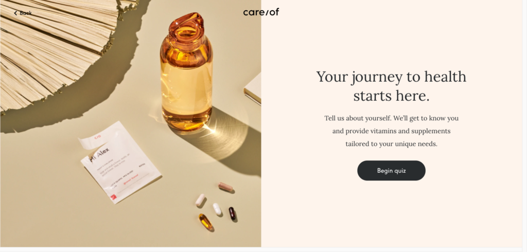
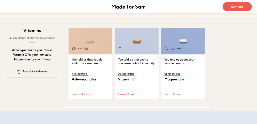
The quiz is thorough, asking questions about age, gender, and preferences, before ending with a personalized product recommendation page with offers tailored to my answers.
Floating bars offer an effective way to continuously drive traffic to your quiz funnel and can easily be hidden from returning subscribers to ensure a sleek, non-intrusive browsing experience.
Conclusion
Hello bars are fast becoming an essential tool for online retailers. Whether collecting emails or welcoming visitors, hello bars offer a wide range of conversion opportunities without annoying visitors.

