

I can’t think of anyone who enjoys filling out digital forms. You have to take time out of your day to manually enter information you’ve entered a thousand times before—your name, address, phone number, payment card information, and so on.
It’s an almost robotic process that many people naturally find tedious and monotonous.
Whether it’s purchasing a product, signing up for a newsletter or anything else, you have to collect the user’s information.
The key is to make the process as seamless as possible—without disrupting the user experience.
Fortunately, that’s completely doable as long as you follow certain form design best practices.
Here are 11 that I’ve found to be particularly potent and make the process as painless as possible.

11 Form Design Best Practices You Need to Follow
2. Eliminate Extraneous Fields
3. Indicate Which Fields Are Optional
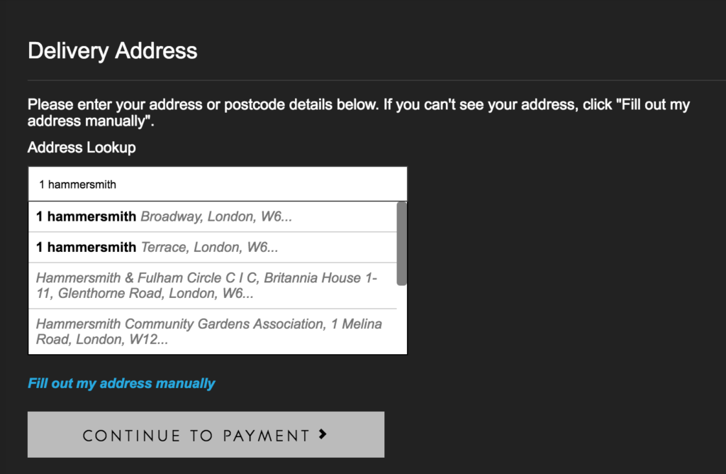
4. Auto-Detect as Much Information as Possible
6. Use Predictive Search Whenever Possible
7. Prevent the User from Making Unnecessary Clicks
8. Don’t Ask for Unnecessary Sensitive Information
9. Make Error Messages Crystal Clear
1. Stick with Just One Column
Speed is a critical component of filling out a form.
Users want to move through it as quickly as possible without having to overthink anything.
One way to accelerate things is to use only one column as opposed to two or more. Why?
This format is faster to complete.
Research by ConversionXL found, “Survey participants completed the linear, single-column an average of 15.4 seconds faster than the multi-column form.”
In other words, you can shave off more than 15 seconds by simply using a one column form.
The reason for the added efficiency is because a person’s eyes can move down from the top to the bottom in a natural, comfortable way when there’s only one column.
But when there are multiple columns situated horizontally, the eyes are forced to go back-and-forth, making the process more sluggish.
On top of that, a person must use more cognitive effort to figure out where they should start and in which sequence fields should be filled out. It can be mentally exhausting.
Just check out the difference. Here’s Airtame’s contact form with only one column.
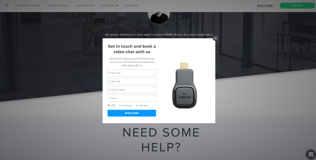
It’s well-organized, quick and painless.
And here’s a form with two columns.
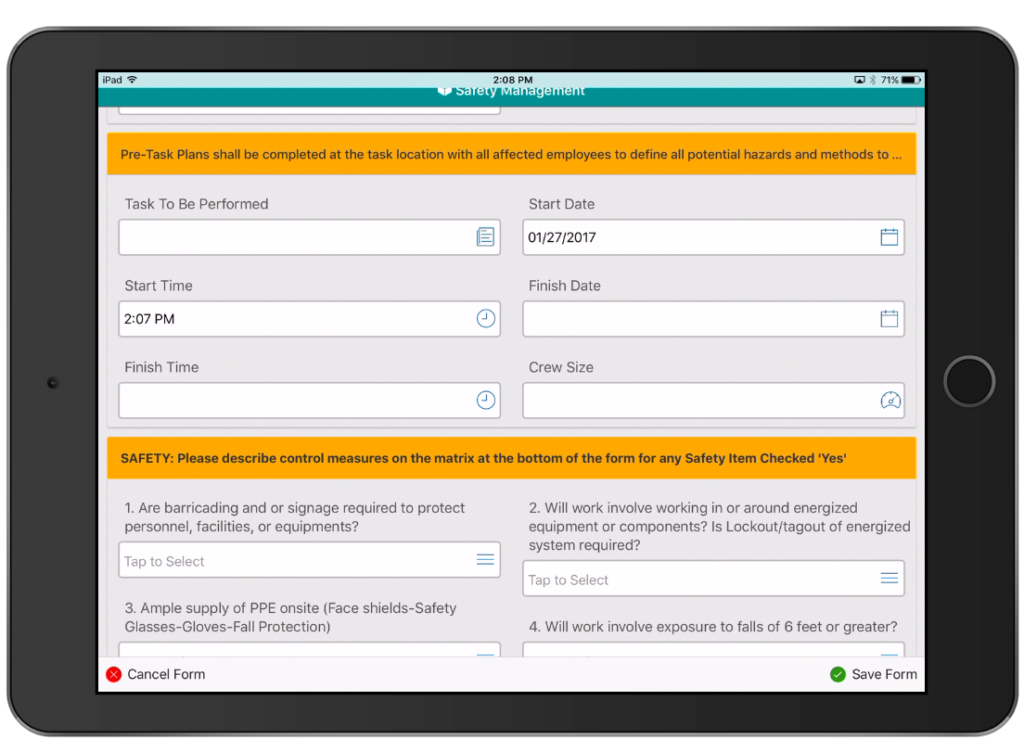
It’s not super-taxing, but it definitely requires additional thinking, and a user is more likely to hit a snag along the way.
So, sticking with just one column is always your best bet.
Further Reading
2. Eliminate Extraneous Fields
The “keep it simple, stupid” (KISS) principle applies to numerous aspects of sales and marketing.
And web forms are no exception.
Most experts agree that you should only ask for information that’s truly necessary and ditch the rest. And I couldn’t agree more.
A bare-bones approach is almost always the best route.
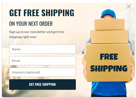
Here’s a good example:
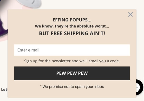
This particular lead capture form is brief and to the point.
In turn, users are less likely to feel overwhelmed, and a higher percentage will follow through with completion, resulting in higher conversions.
Quicksprout discovered a clear correlation between the number of fields and conversions.
In their study, a company went from a 5.4 percent conversion rate with 11 fields all the way to an 11.9 percent conversion rate with four fields—a 120 percent spike.
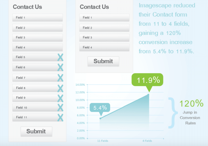
By these numbers, it’s obvious that it’s in your best interest to ask for the bare minimum.
This is basically guaranteed to boost conversions.
If you absolutely have to have more information, then I suggest doing some A/B testing to see what you can get away with.
The key is to strike a balance between collecting critical information, while still maintaining a solid conversion rate.
3. Indicate Which Fields Are Optional
When filling out a form, many people want to do the bare minimum.
Maybe they’re in a rush. Maybe they want to disclose as little information as possible. Maybe they’re a little lazy.
Whatever the reason, you can make everyone’s life a little easier by being clear about which fields are optional.
Here’s a super simple example.
The word “optional” is placed below “Email.”
That way users know that they’re not required to enter their full name and can still subscribe without doing so.
There’s just one more matter to clear up with this strategy. And that’s whether you should only indicate which fields are optional or indicate which are optional as well as mandatory.
Some authorities say that it’s best to include both optional and mandatory fields because it eliminates any guesswork.
Others say that you should strictly indicate the optional fields because less is always best.
And that’s the tactic that makes the most sense to me. Simply list the optional fields.
This should still make it clear to most users what information isn’t absolutely necessary without weighing the form down.
And as Nielsen Norman Group explains, “Limit the form to only one or two optional fields, and clearly label them as optional.”
In other words, don’t have 10 fields with five of them being optional. Instead, just reduce your number of fields, and only ask for the essentials.
4. Auto-Detect as Much Information as Possible
You can save users a ton of time and spare them a lot of frustration by having your form auto-detect basic information.
Here’s what I’m talking about.
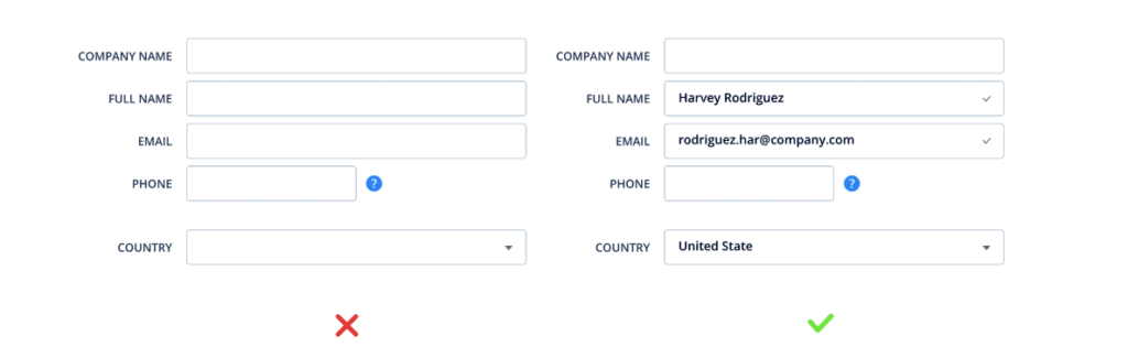
Notice how it automatically inputs the user’s name, email, and country.
This way they’re able to input 60 percent less information and go from dealing with five fields to only two. Nice!
I know that I personally love it when I can plow right throw a web form when a big chunk of it is pre-filled for me.
Fortunately, this is fairly easy to do.
One way is to grab information like a person’s country or ZIP code by detecting their ISP.
Or if someone who’s about to buy a product has already subscribed to your newsletter, you obviously have their email address.
So you can just plug it right in.
Just be cognizant of security because you’ll want to keep your users’ identities safe.
5. Insert Placeholder Text
Also known as “helper” text, this provides users with an example of the information they need to input as well as how the format should be.
Like Typeform does on their login page.
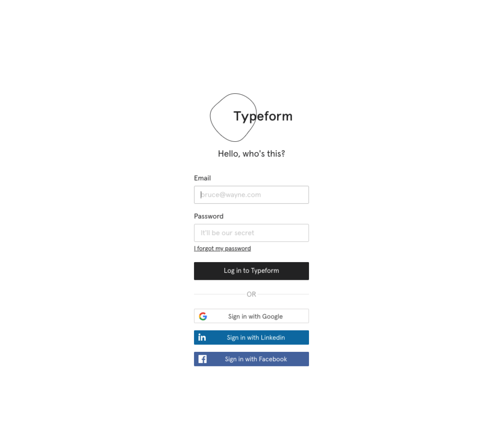
While this may be obvious for 99 percent of users, there’s always the one percent that isn’t completely sure.
Inserting placeholder text helps move things along and minimizes the potential for any confusion.
This lessens the cognitive load and gets users from one field to the next with ease.
6. Use Predictive Search Whenever Possible
I should first say that this won’t apply to every type of form.
It’s mainly for those where users are asked to input information into a field with a lot of predefined options.
Like selecting a flight for example.
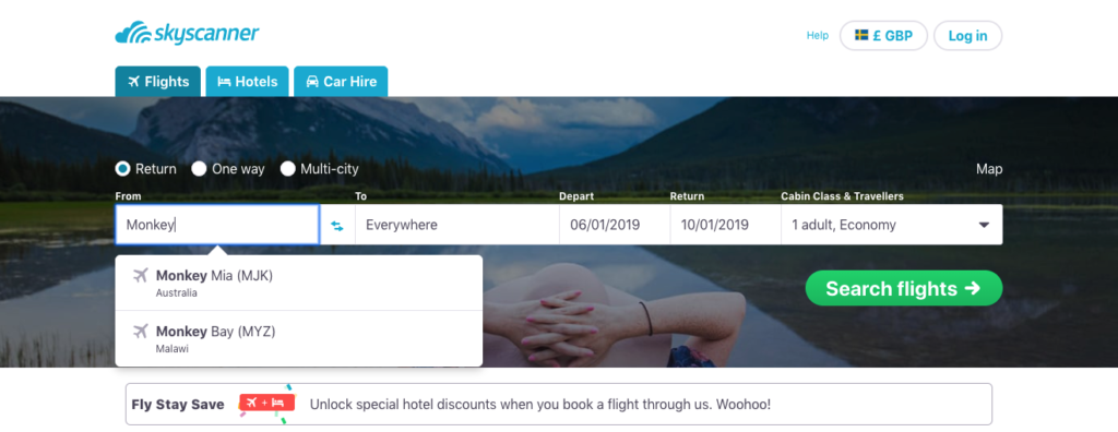
In this case, a user only has to enter a few letters to find their destination city, rather than entering the entire name of the city.
Or say that someone is entering their address.
You could use predictive search to help them do so without doing the whole thing manually—a task that can be quite onerous.
This helps quickly narrow options down, which makes for a more seamless experience.
It also reduces the odds of a failed search because users are less likely to misspell words or place them in the wrong order.
To learn the nuts and bolts of integrating predictive search, check out this guide from Justinmind.
7. Prevent the User from Making Unnecessary Clicks
Each time a person has to move their cursor from one field to another, it creates a little bit of friction.
If they have to do that numerous times, it can really be disruptive.
So the fewer the clicks, the better.
A good example would be entering a phone number.
You could break it down into three separate fields—the area code, the first three digits, and the last four digits.
The problem is that a user would have to click on three different boxes.
A better way is to set it up so that a user can enter their entire phone number in just one field.
Some other examples are social security numbers and payment card numbers.
Though simple, this can make the user experience far more fluid.
8. Don’t Ask for Unnecessary Sensitive Information
Online security is a major concern these days.
Just look at the rate in which data records are lost or stolen.
It’s an astonishing 72 records every second.

So it’s no surprise that people are cautious about giving out sensitive information. It could easily come back to haunt them.
And you can bet that asking for too much can adversely affect your conversion rate.
Given the current climate with an intense focus on data security, not asking for unnecessary sensitive information is a big part of form design best practices.
For instance, to process an order, you’ll no doubt need a person’s payment card information.
However, you probably don’t need their social security number.
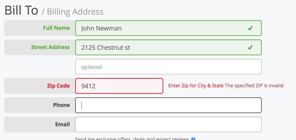
9. Make Error Messages Crystal Clear
Errors will inevitably occur.
And it can be incredibly frustrating if a user is unsure of exactly what went wrong and what they need to do to correct it.
If it just says something vague like “Something went wrong,” a person can be left scratching their head.
But if you clearly state precisely what went wrong, they can quickly pinpoint the issue and fix it.
For example, this form lets the user know that they entered their ZIP code incorrectly.
And this form indicates that the email that’s been entered is already registered.
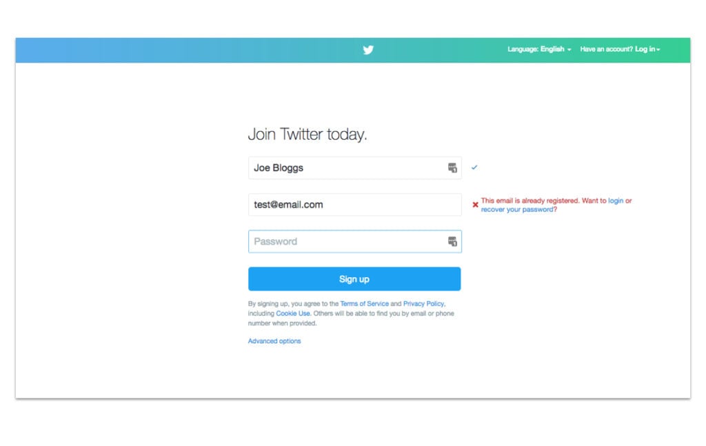
They can make the necessary changes, and it’s no big deal.
10. Allow for Some Validation Wiggle Room
Let’s say that you’re asking for a person’s phone number.
There are a few different ways that someone could enter it.
- 555 555 – 5555
- (555) 555 – 5555
- 555 – 555 – 5555
- 5555555555
If you make your validation too strict and only accept one format, it’s going to create issues.
But if you offer some flexibility and accept information in a variety of formats, this should reduce friction, and users can work their way through your form more smoothly.
So this is definitely something to keep in mind during programming.
11. Make the Call-to-Action (CTA) as Specific as Possible
I feel like CTAs are such a simple, core element of digital forms that they’re sometimes overlooked.
But just like choosing the perfect CTA is vital for optimizing a landing page, you’ll want to make sure that you nail it on a digital form as well.
For instance, some people might find a CTA like “Submit” a little ambiguous and wonder exactly what’s going to happen after entering their information.
But putting something more specific like “Send Me a Free Phrasebook” makes it totally clear as to what will happen—a person will click through to learn more.

In other words, it’s best to foolproof it so that there’s zero room for misunderstandings.
Conclusion
Filling out an online form isn’t something that most people look forward to. I know I don’t.
It’s mildly bothersome at best and potentially maddening at worse.
Without proper design, there’s a lot that can go wrong along the way.
Users could feel overwhelmed with an excessive number of fields, get hit with confusing errors and generally be frustrated at the lack of intuitiveness.
But there are a lot of ways to streamline the process and optimize the user experience.
Following these form design best practices should help users work their way through your web form smoothly and easily.
It makes their lives easier while increasing your conversion rates. Win-win.

