
How long does it take you to send the average marketing email?
Factor in everything. The overall concept, the subject line and body copy, the imagery, the layout, and anything else.
You’re probably looking at a couple hours’ work. Maybe longer.
So it’s pretty heartbreaking that recipients spend just 10 seconds reading the average brand email.
Ten seconds? That’s not even enough time to reach the piano bit at the start of Bohemian Rhapsody.
But this isn’t about wasted effort. It’s not even about Bohemian Rhapsody. It’s about all the important stuff that your email recipients are never even seeing.
If someone only spends 10 seconds scrolling your email, they’re unlikely to fully absorb the products you’re recommending or the discount you’re promoting.
Which means there’s much less chance of them clicking through to your website.
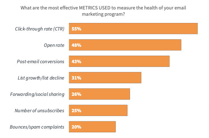
And given that click-through rate is the number one metric for measuring email marketing success, that’s a big problem.
 An engaging email header is one of the best ways to persuade your audience to spend a little more of their valuable time reading your emails.
To be clear, we’re talking about aesthetics here, not coding.
Sure, the phrase “email header” refers to the HTML snippet that contains key information (like your sender details).
But in this context, I’m using the term to simply describe allthe stuff that appears above the fold in your email content, such as:
- Your logo
- Headline copy
- Product imagery
- Calls to action
Okay, so what are the ingredients of an impactful email header? One that compels people to read on and truly engage with your email?
To answer that question, I’ve taken a look at some of my favorite email header examples.

Table of Contents
1. Away: Choose a Striking Image
As humans, we’re highly adept at taking in and understanding visual information.
In fact, our brains process it 60,000 times faster than text.
So if you’re trying to grab your audience’s attention fast, a compelling image can help.
And that’s not the only benefit of adding an image to your email header.
According to one study based on an analysis of more than 5,000 email campaigns, emails containing images have a 42 percent higher click-through rate than those without. So an image-based email header also gives you a better chance of recipients clicking through to your website.
Luggage and travel accessories retailer Away consistently uses this tactic in its email marketing campaigns:
 Sure, it might feel a little risky to have no copy above the fold other than the brand name. But this approach works well by drawing the eye through its striking color palette.
The contrast of the mostly white-and-silver image against the bold orange background helps it “pop”, which instantly stands out to the user.
And once you’ve caught their eyes, there’s a far greater chance of them reading more of your email (and, hopefully, clicking through to make a purchase).
2. Billie: Tease a New Product
Remember: each and every person who signs up for your email marketing list has at least some level of interest in your brand and product.
Even if they only handed over their email address to unlock a 10 percent discount code, they still have a reason to look out for your next message.
So it stands to reason that if they liked the look of your products at the time they signed up, they’d be interested to hear about any new products you’re planning to launch.
Also, bear in mind why you’re sending emails in the first place.
For ecommerce brands, it most likely boils down to cold, hard cash. Loyalty and engagement are important, but ultimately you’re not doing this to make friends—you’re trying to sell something. So it definitely makes sense to showcase your latest products.
Bodycare brand Billie understands this. It routinely sends emails about forthcoming product launches:
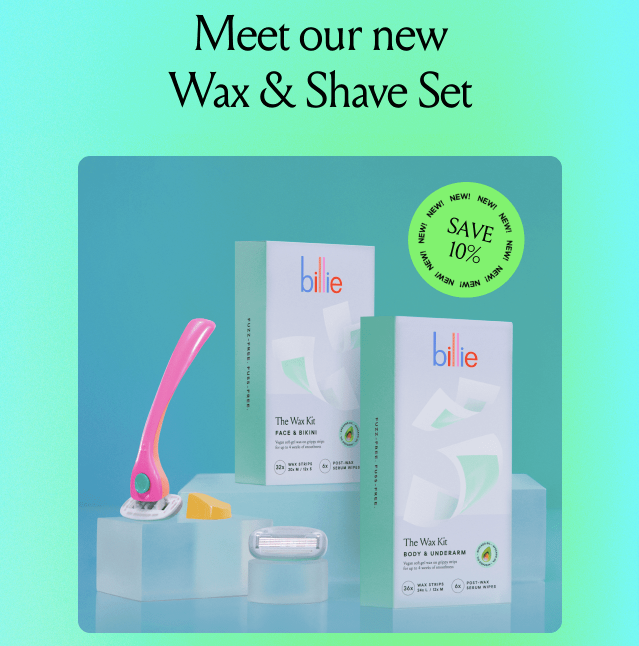 For me, there are a couple reasons this email header example works so well:
- It’s highly visual. And as I discussed in the previous section, including images in emails helps to increase click-through rates.
- It introduces the product in words. The copy spells out that this is a wax and shave set. If that’s interesting to you, you’re more likely to pay attention to the rest of the email.
- It includes a special offer. So not only are email recipients getting a first glimpse at this fantastic new product, they also get a discount on it. That makes your email subscribers feel like they’re part of an exclusive club.
3. Casper: Announce a Promotion
I’ve already pointed out that for the vast majority of ecommerce brands, email marketing is all about sales.
But it pays to think about this from a consumer perspective, too. What compelled them to bite the bullet and give you their name and email address in the first place?
Because the more you understand your subscribers’ motives, the more likely you are to send them content that they find relevant and engaging.
According to HubSpot, more than one-quarter of subscribers to branded emails say they signed up to be notified about sales, promo codes, or coupons.
Hardly surprising, is it?
Now, there are a couple schools of thought on how best to incorporate special offers in email marketing.
Some marketers argue that it’s best to tease a promo in the subject line, then reveal the details toward the end of the email copy to persuade people to read right to the end.
I’m very much in the second camp: give people what they want, when they want it.
Email marketing shouldn’t feel like a battle. You’re not trying to trick customers into engaging; you want them to genuinely enjoy the content and offers you send them. So if you’re launching a promo, spell it out in the email header, just like Casper does here:
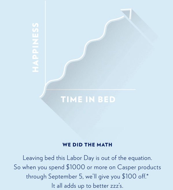 I like the combination of visual and copy-based elements here.
The illustration at the top of the email draws the reader in without distracting attention from the copy, which contains all the important information.
Of course, you don’t have to explain literally everything in the email header; you’ve only got so many pixels to play with.
Instead, describe the discount you’re offering, then add an asterisk (or similar) to the email footer section, where you set out things like:
- The dates of the promotion
- Who’s eligible for the discount
- Which products or categories it includes
- What, if anything, is specifically excluded from the discount
4. Chubbies: Add a CTA
Including a call to action in your email header might sound a little counterintuitive.
After all, isn’t your job as a marketer to hype up a product or discount, then invite readers to click? In which case, you’d expect to find the CTA somewhere toward the bottom of the email.
However, lots of brands think differently.
According to one report, the top one-third of an email is actually the most popular place to add a CTA, with 38 percent of emails incorporating a call to action near the top. Typically, these above-the-fold CTAs appear within, or directly below, an image.
Here’s how that looks, courtesy of direct-to-consumer fashion brand Chubbies:
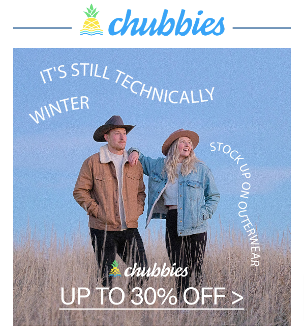 When you think about it, there’s sound logic to this approach.
Chances are, you’re going to include multiple calls to action in most, if not all, emails you send. In fact, Really Good Emails found that the average email contains 2.1 CTA buttons, with 20 percent of emails containing three or more.
Why?
Because more CTAs mean more chances to drive clicks. And more clicks will hopefully translate to more sales.
So if you’re going to litter your emails with calls to action, it makes sense to include one above the fold in the email header section.
It’s the only part of the email that everyone who clicks is guaranteed to see. So why not take the opportunity to add a CTA?
Worst case scenario, no one clicks it. Best case scenario, everyone clicks it and you smash your revenue target.
5. Everlane: Use Copy (Sparingly)
They say a picture is worth 1,000 words.
And they might be right. But where email headers are concerned, a little copy can go a long way.
Practically speaking, you can only include a small number of images in your email header, because there’s limited space to play with. Plus it’s hard to communicate the purpose of your email without using a few well-chosen words.
At the same time, don’t go overboard.
Your audience is busy, and they already receive a ton of emails. The last thing they want is to be hit with a wall of copy when they click your latest message.
Fashion brand Everlane gets the balance right in this email header example:
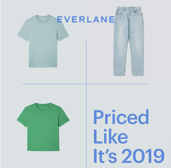 It makes sense to include the product imagery, because that’s the “thing” that will ultimately persuade a customer to click. If they don’t like the look of what you’re selling, why would they visit your website?
But the copy ties it all together by giving some context to the visuals.
Because if you just send your subscribers a bunch of product images with zero accompanying text, they’re going to have a tough time figuring out what your email is about.
6. Glossier: Embed a GIF
By this point in the article, I hope I’ve made it clear that the email header section is an extremely valuable piece of marketing real estate.
With limited space to play with, it’s your job to ensure that each and every pixel is packed with value—something that makes people want to read on, scroll down, or click through.
For most brands, this is about crafting a harmonious blend of copy and imagery.
But Glossier isn’t most brands. It takes things a step further by regularly embedding GIFs within its email headers, like in this example:
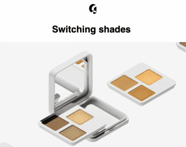 Sure, it’s harder to create a high-quality custom GIF than it is to copy-paste your product imagery into an email template.
But if you get it right, it’s worth the effort, because a GIF can communicate a lot more information than a static image.
Which makes it all the more impactful.
7. Outdoor Voices: Offer Product Recommendations
Pandemics. Wars. Gas prices. Ever feel like everything just happens so much?
No wonder, then, that one-quarter of consumers say they no longer bother trying to keep up with fashion trends.
That creates a problem for brands. It’s in your interest to keep pushing trends forward, but you don’t want people to feel left out. So what can you do?
Perhaps the best solution is to offer product recommendations.
Consumers love them, with 91 percent saying they’re more likely to buy from brands that recognize and remember them, and provide them with offers and recommendations that feel relevant to their needs.
Athletic apparel brand Outdoor Voices has found a novel way to incorporate above-the-fold product recommendations into its email marketing:
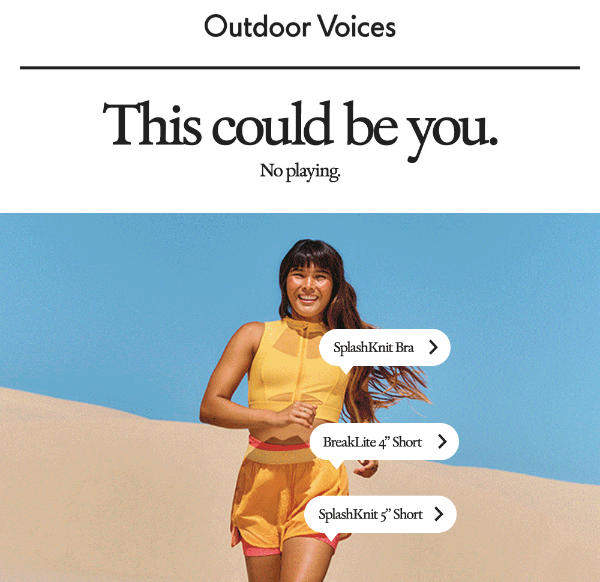 Sorry to shatter the illusion, but those Instagram-style “tagged product” CTAs aren’t real; they don’t actually link to the products in question.
But that’s not the important thing. What really matters is that users understand the context of the image.
They know that if they click, they’ll be taken to a landing page where they can learn more about—and buy—the products in question.
Create More Impactful Email Headers With Drip
The theme of this whole article has basically been about doing more with less.
Less space; more compelling copy and imagery that compels users to engage.
Part of the puzzle lies in sharing highly relevant content that speaks to the preferences of specific audience segments.
Drip can help you do that.
Our tools let you segment everyone and personalize everything, allowing you to send hyper-targeted messages that convert.
See it all in action by signing up for your 14-day free trial.

