
Every cloud has a silver lining. Even if your visitors end up on a 404 page, you can make something good out of an almost bad shopping experience.
Every now and then, I see humorous error messages that aim to turn frustration into fun. But why should you stop there?
Often associated with disappointment for online shoppers, 404 pages are still highly underused by e-commerce marketers.
An optimized 404 page can help visitors stay on your site, sign up for your email list, and even become customers.
And the best part is, you can start converting more visitors on your 404 pages today with a few minor improvements.
In this article, I’ll share seven of my favorite strategies used by top e-commerce brands to increase signups and sales, and how you can optimize your error pages for higher conversions, too.

Table of Contents
1. Display Your Most Popular Products
2. Guide Your Visitors with Categories
3. Help Visitors Find What They’re Looking For
1. Display Your Most Popular Products
Whether it’s down to a misspelled URL, a broken link, or a product page that doesn’t exist anymore, 404 pages are still a part of your online store.
If a visitor ended up there, it means that they showed an interest in you and they tried to reach a certain page on your site.
And if it’s an e-commerce site, chances are they were looking for a product they might consider buying.
Now, can you see the sales potential here?
A disappointed visitor, who just found out that the product they liked isn’t there anymore…
What can you do to calm them down (and win their hearts back)?
Suggest something else.
Unlike a sold-out product page, it’s difficult to make personalized recommendations on 404 pages.
In this case, your most popular products give you the your upper hand.
Here’s how Urban Outfitters uses 404 pages to their advantage:
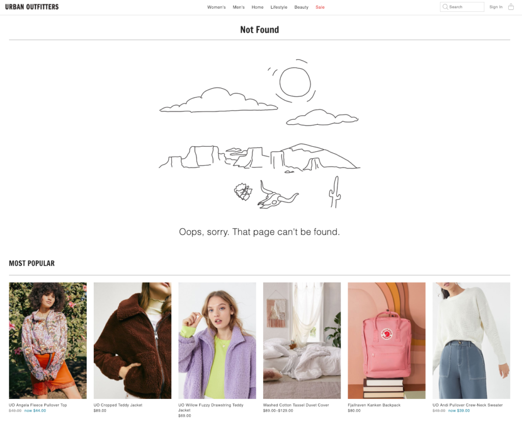
First, they inform you with a minimal GIF in their style:
Then, they display their most popular products with compelling visuals and price information.
The page is spacious, so popular products easily catch the visitor’s attention.
Instead of directing the visitor back to the homepage, they give them a starting point. And if many people purchased these items, chances are they’re worth checking out. (Notice how social proof works here, too.)
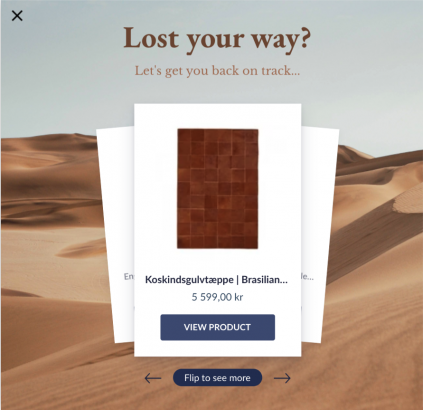
Another approach is diversifying product categories and adding the items you want to promote manually.
Take this example from One Kings Lane:
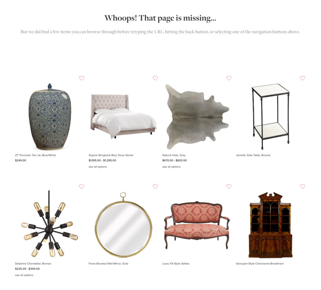
Instead of drawing an automated list of best-sellers, they suggest items they’ve picked manually for this page.
If you want to do something similar for your online store, you can even tweak the copy to focus on how you took your time and handpicked them to give the visitor a more exclusive feeling.
What I like the most in this example is how they include heart buttons to help you add the items quickly to your wishlist. Even if the visitors don’t buy these products right away, you can help them enter the consideration stage of the buyer’s journey and, even better, retarget them later.
ProTip
If you don’t want to overwhelm frustrated visitors with too many options, you can create an onsite campaign that recommends alternative products and only shows on 404 pages.
2. Guide Your Visitors with Categories
Let me tell you the one thing that I hate the most about 404 pages:
Getting no guidance at all.
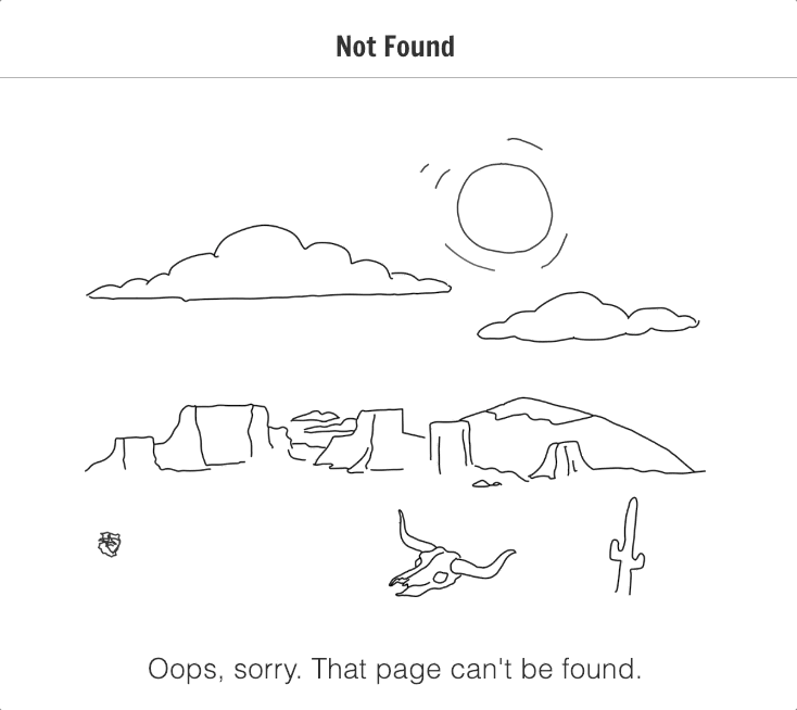
I stumbled upon this 404 page a few days ago:
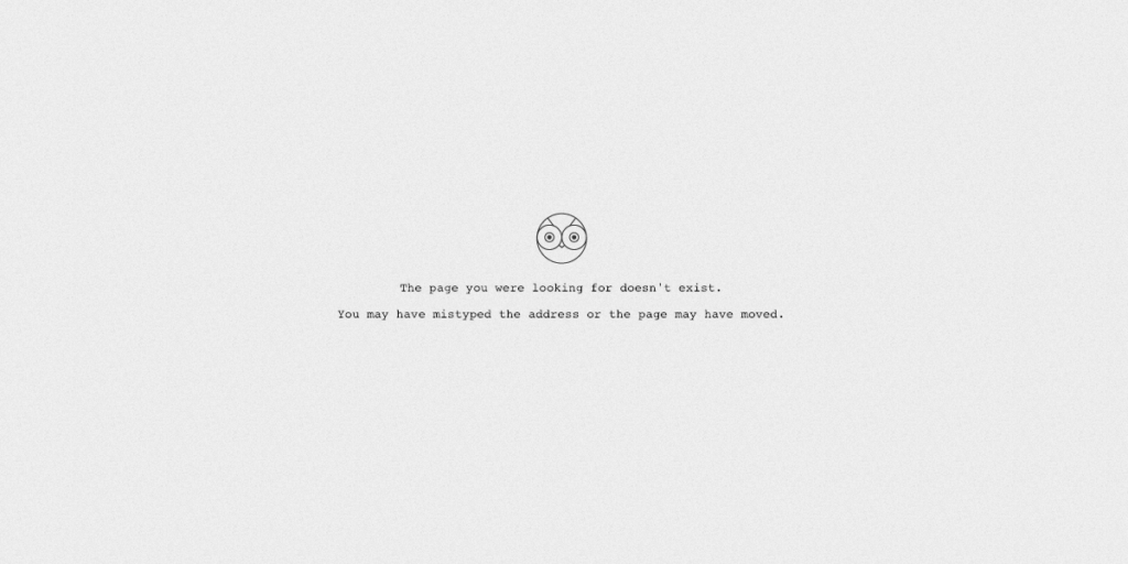
No direction, no link, no navigation… No guidance whatsoever.
What do you think I did next?
I closed the tab and never returned.
And this is the last thing you want your visitors to do.
As explained in the Strategy #1, suggesting a list of curated products to visitors gives them a good starting point.
But if you want to guide visitors in an even more gentle way, you can ask them to start with category pages.
For one, it’s easier for the visitor to take the next step with product categories. If they were looking for a dress before landing on a 404 page, for example, they can easily move forward by clicking a related category.
Here’s an example by Missguided:
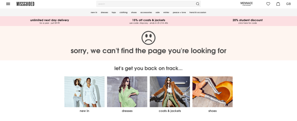
When you visit a page that doesn’t exist anymore, Missguided “gets you back on track” by suggesting you to start with one of the main product categories.
(You can make this 404 page even stronger by adding “Sale” as a category. After all, who can resist a good discount?)
Another option is to make the transition from error to shopping even smoother for the visitor.
Birchbox offers you two paths:
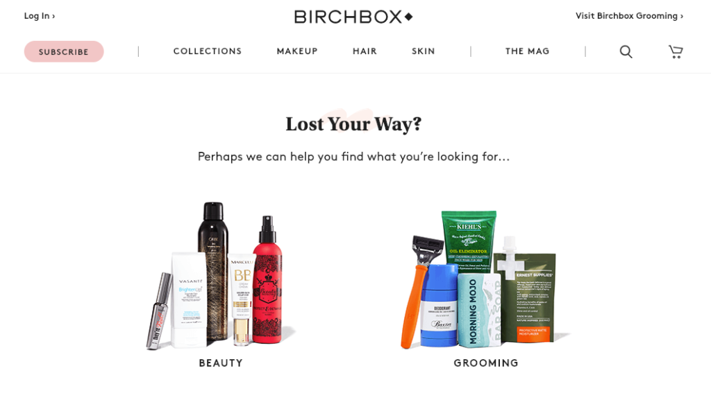
If you get lost, they help you find your way back. And they only ask you one question: Are you interested in male or female personal care products?
Simplifying the suggestions is a better option than listing all the product categories you have on your site. Pick the ones that perform the best or divide them by gender, and find out what works better for your online store.
3. Help Visitors Find What They’re Looking For
Sometimes users will land on your site knowing exactly what they want to buy. (And isn’t that the best type of customer, anyway?)
Recommending individual products or product categories as the next step is a great idea, but make sure that you support recommendations with a search bar.
Giving your visitors the ability to search the product or the feature they have in mind is (almost) a guaranteed way to help them find the page they’re specifically interested in.
And that means a higher likelihood of conversion.
Check this simple 404 page design by Need Supply Co.:
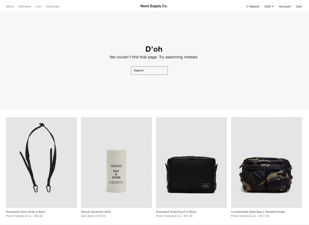
It’s clean and neat, and the search bar is the central feature of the page.
Notice how they also support the search option with recommended products—in case you don’t know what to search for.
What I suggest is taking a more mix-and-match approach here.
Combining multiple strategies and supporting them with one another will strengthen your 404 page and improve the user experience.
Ted Baker knows this well:
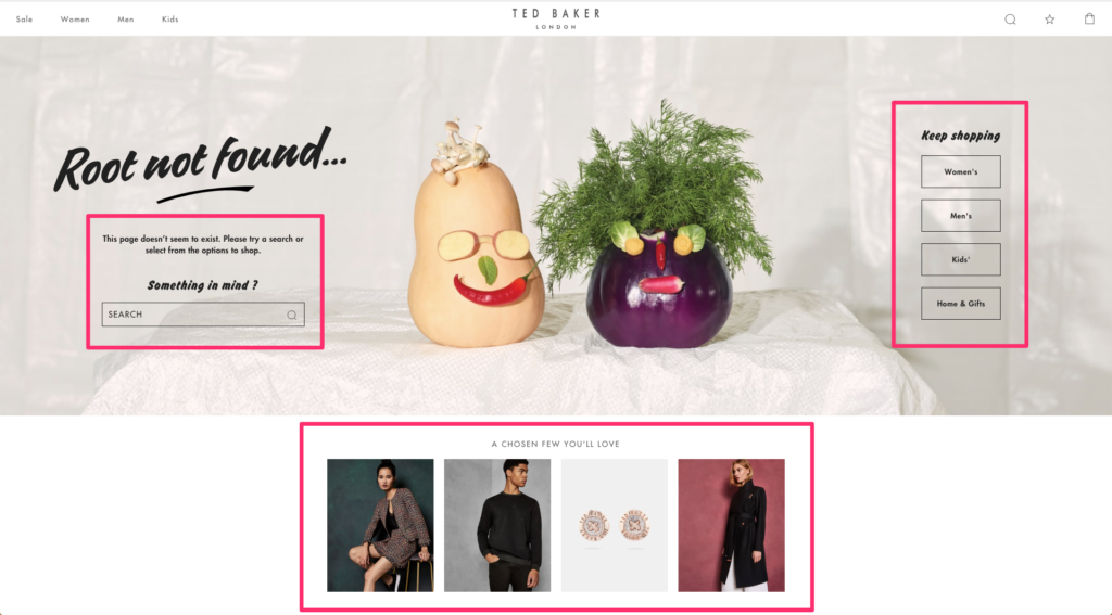
Using a search bar, product categories, and handpicked items, the company makes sure they cover every position the visitor might be in.
(Note: You should be mindful while combining these strategies. You don’t want to confuse visitors with too many calls-to-actions and multiple directions.)
The focus of your 404 page also depends on the type of business you’re running.
If you own an e-commerce site selling technical products and if your customers are usually informed about what they’re looking for, you can make the search bar the focus of attention on your 404 page.
If you’re a fashion e-tailer, it might be a good idea to prioritize selected categories or best-sellers on the page.
And if you’re selling hard-to-categorize or high-end items, you might want to handpick the products you want to put on display (and even rotate them monthly.)
4. Offer More Than Products
When you run an e-commerce site, it’s quite normal to give all your energy (and attention) to your product pages.
But keep in mind that your visitors won’t always be looking for a product you offer.
There might be several other reasons why people visit your site—getting after-sales support, asking for product information, submitting a complaint or giving you a praise, or simply having a chat with you on any matter that is important to them.
If you ignore these possibilities and get too salesy on your 404 pages, you might scare those visitors away.
Give your visitors a chance to reach out to you, whether it’s a customer service request or the reason why they’ve ended up on a 404 page (which might give you a chance to fix it.)
Look at this example by Harvey Nichols:
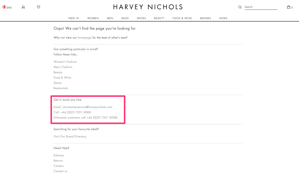
The company prefers a simple and text-based design. They include links to the homepage, product categories, contact information, and other relevant pages (such as delivery, return, or careers).
Harvey Nichols doesn’t assume that every site visitor comes with an intention to buy. Instead, they try to be helpful.
How can you take this example and make it even better?
Rather than simply listing your contact information, you could create a “Get in Touch” onsite campaign that only shows on certain pages (including 404). This way, you’ll both help your visitors with their problems and collect valuable leads.
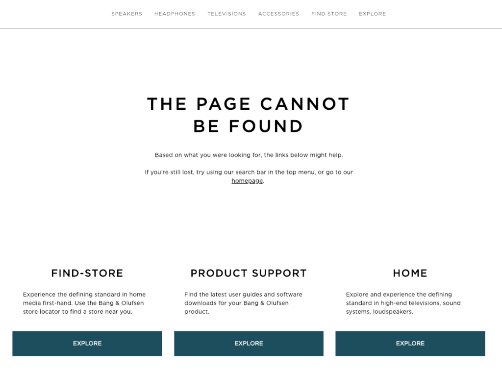
If you’re offering product support, user guides, or a store locator on your site, they can be good additions to your 404 page, too.
Just like Bang & Olufsen:
If you have any other pages on your site that have a high traffic volume (for example, a quiz or a blog post that received lots of attention), you might consider adding them to your 404 page, too.
Who knows? Maybe it’s the page visitors are looking for.
5. Collect Email Addresses
If you’re already collecting email addresses on your e-commerce site, you must know that offering an incentive can significantly boost your signup conversions.
In a recent consumer study, more than 80% of the participants reported that they sign up for email lists in order to receive special offers and discounts.
Offering a coupon on your 404 page can ease the frustration of your visitors and motivate them to continue shopping. Plus, collecting their email addresses gives you a second chance to make a better impression with email marketing, and bring visitors back to your site.
Here’s how ban.do uses an email signup form on their 404 page:
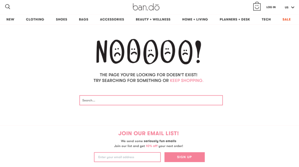
The page is quite simple—fun illustration, informative copy, search bar, and email signup form.
Sure, this might work. But you can always do better.
The problem, here, is that I can’t see the connection between the error I got, the search bar, and why I should join their email list…
I like the incentive (10% off) but I would be more willing to sign up if they showed me some top-selling products and gave me a real reason to claim my discount.
If you want to keep your 404 page simple, you can still improve it by customizing the copy in a way that communicates regret and compensation.
You can change the signup form copy to something like: “Let us make it up to you with a special coupon code.”
It’s a strong incentive to sign up and make a purchase. Plus, it evokes curiosity.
A better example comes from Vero Moda:
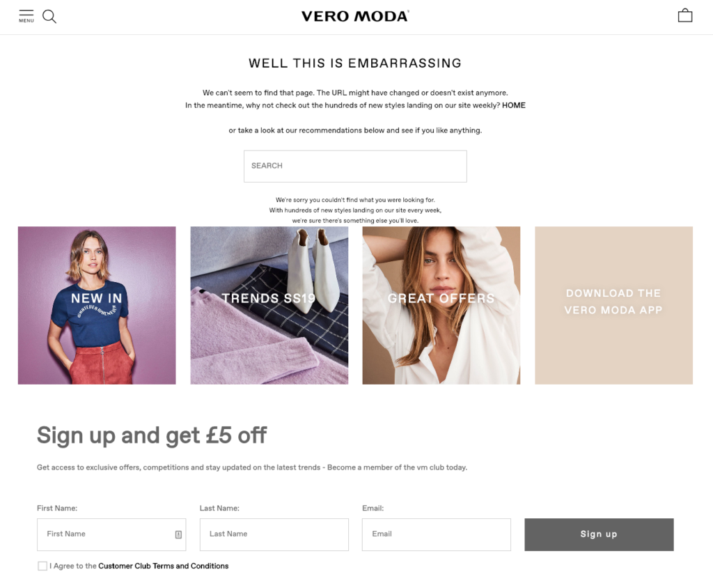
Their 404 page follows a logical order. First, they inform you about the error you got. Then, they suggest running a search or looking at their recommended product categories: “New In”, “Trends”, and “Great Offers”.
And if you want Vero Moda to inform you about what’s new, trending, or on sale, then you can sign up for the email list. Plus, you get £5 off. What more can you ask for?
The flow makes sense to the reader and gives them multiple actions t0 choose from—without overwhelming the visitor with too many messages.
6. Optimize Your 404 Page Copy
I’ve seen so many error pages putting the blame on the user by saying things like: You must have clicked a wrong link, taken a wrong turn, made a typo or so on…
You can almost feel someone rolling their eyes and judging you behind the screen.
Another common practice I see is redirecting 404 pages to the homepage. But this might scare the visitor away if they don’t understand what just happened.
That’s certainly one way of doing it. But you can easily optimize your error page copy to give the visitor an explanation, reduce frustration, and guide them to something better.
Check this example by Beauty Bay:
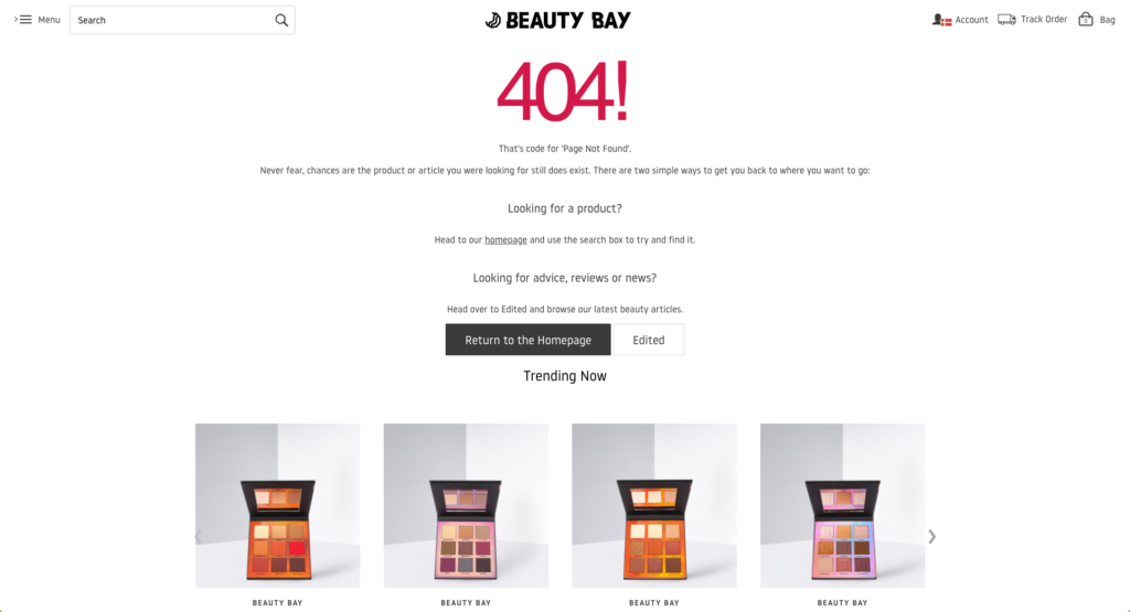
First, they explain why you get this error code and reassure you by saying “Never fear, chances are the product or article you were looking for still does exist.”
Then, they show you the ways to find what you were looking for. (And they consider that it can be something other than a product.)
Lastly, they suggest you some trending items, in case you want to continue shopping from there.
It doesn’t take much effort but you can see how they try to connect and empathize with the visitor to ease their frustration.
Another position you can take on your 404 page copy is humor and Vinomofo does it so well:
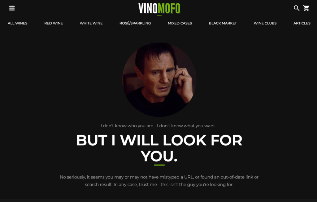
Using Liam Neeson’s famous lines from the movie Taken, the company tries to cheer you up and create an understanding.
It works for Vinomofo because this tone is consistent with their overall voice. Of course, this may not be an option for every e-commerce business out there, but you know your visitors better.
You can always find something that resonates with your audience and tweak your error page copy based on that.
(Going back to the Vinomofo example, I’m a bit disappointed that they didn’t guide me to a product page or offer a search option after taking the pressure off.)
7. Get Creative
Maybe you can’t write bold or funny 404 messages on your site, but you can still get a little creative.
This next one is, by far, my favorite. And it’s not because they just wrote something funny or used a cute GIF.
They actually went the extra mile.
So this is what you see when you end up on a 404 page on the Tattly website:
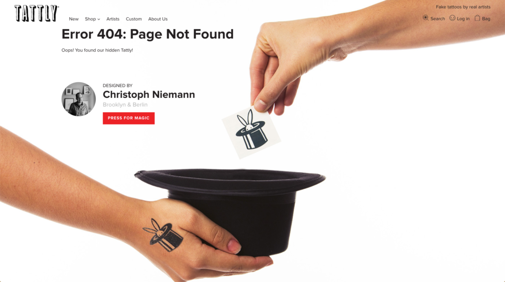
You actually find a hidden product.
Isn’t that smart?
And it gets better. When you click the “Press for Magic” button, it takes you to a special product page:
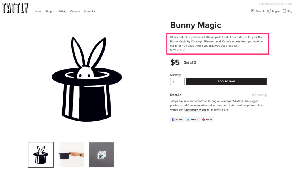
The product description reads: “It’s only accessible if you land on our Error 404 page. Aren’t you glad you got a little lost?”
I surely am!
This is a good example of getting creative on 404 pages because it’s fun and catches attention. It also creates an exclusive feeling by letting you know that you unlocked something not everyone can easily access.
Tattly knows their products and the audience so well. When I reached out to Cristina Gómez, Tattly Design Director, she told me,
Tina, our founder, loves it when 404 pages are joyful or fun, and at Tattly we love injecting fun into whatever we can. Hiding a product on our 404 page seemed like the best way to bring the Tattly spirit to a normally mundane page on a site.
So how you want to get creative depends on your business and customers but I’m sure you can come up with something even better, if you’re willing to take that extra step further.
Conclusion
I visited more than 150 e-commerce sites while looking for examples for this article.
You’ll be surprised to know how many big brands are underusing their 404 pages. There are so many hidden opportunities; so much lost potential revenue.
404 doesn’t necessarily have to mean exit.
That’s why I wanted to share how you can learn from the better examples and start helping visitors stay on your site, collecting their email addresses, and even converting them to customers—with only minor improvements.

