

There’s a lot that goes into getting a land page “just right.”
It’s a challenge for B2Cs.
But I think it’s even trickier for B2Bs because there’s so much information to unpack.
While a B2C landing page is usually pretty cut-and-dried where physical products are featured, a B2B landing page may feature a complex offer that isn’t so easy to explain.
Therefore, it takes some finesse, and you need to make it crystal clear what you’re offering, why it’s of value, and what specific steps leads need to take next.
All the while, the experience needs to be engaging enough to hold leads’ attention and make them want to learn more.
Here are some of my favorite B2B landing page examples that hit all of the right notes so you’ll know how to better approach the construction of your own B2B landing page and convert leads like a champ.

Our Favorite B2B Landing Page Examples
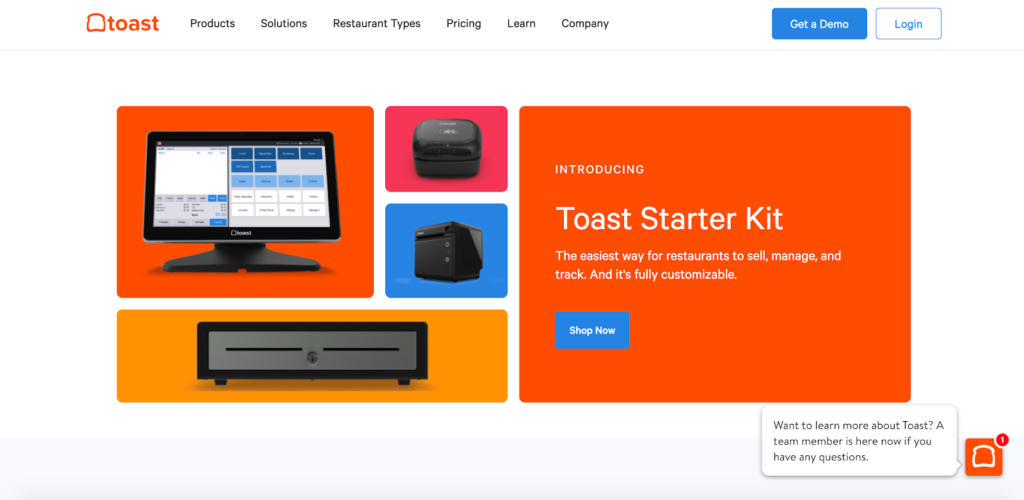
1. Toast

“Toast is a restaurant point of sale and management system that helps restaurants improve operations, increase sales, and create a better guest experience.”
And this simple yet highly effective landing page does a great job of conveying this message.
Right off the bat, Toast delivers a rock-solid unique value proposition (UVP) with “Built to make restaurants better.”

It’s front and center and one of the first things a visitor’s eyes are drawn to.
Below that, Toast elaborates with their copywriting saying, “Toast gives your restaurant the technology you need to succeed in today’s fast-paced environment.”
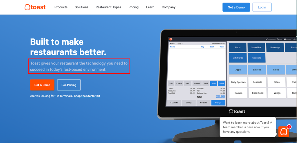
This along with the strong visual on the right of the Toast platform in action paints a vivid picture that quickly gets visitors oriented with minimal cognitive expenditure.
Within a matter of seconds, a lead arrives on this landing page and knows what’s being offered and why they should care.
From there, they’re given two CTAs—“Get a Demo” and “See Pricing”—which cater to leads at different stages of the sales funnel.
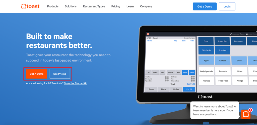
The first and more noticeable CTA of “Get a Demo” targets leads at the bottom of the funnel with a strong interest in buying.
While the other “See Pricing” CTA targets those that are higher up and still want to learn more about the platform.
So, Toast has it all covered here with two excellent CTAs, both of which are above the fold.
And with a bit more scrolling, leads can quickly learn the rest of the details, features, benefits, and more.
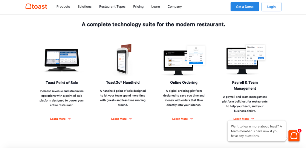
The information is presented clearly and succinctly, and Toast uses plenty of stunning visuals to maximize engagement.
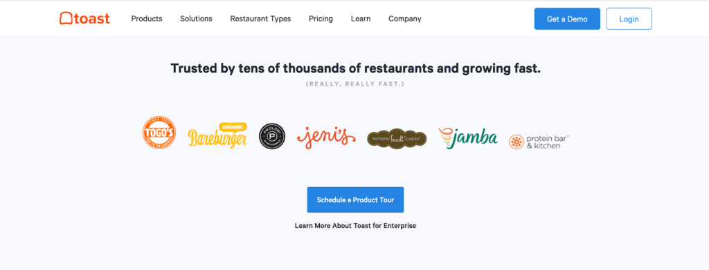
One final element that I love is the social proof they offer toward the bottom of this B2B landing page.
Here they mention some restaurants that use Toast, using their logos as validation.
And just below that, they take it one step further by featuring three ultra-professional videos of restaurants explaining what their experience has been like using Toast and how it’s helped them grow their businesses.
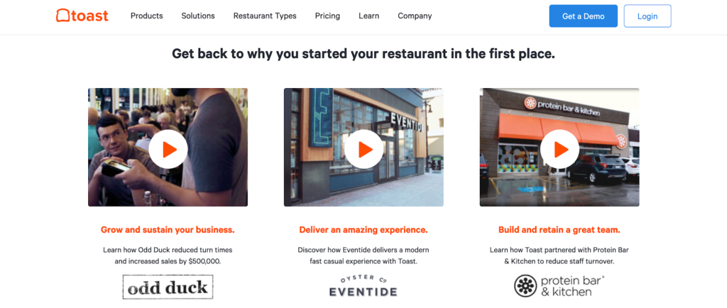
Given that “59 percent of executives would rather watch a video than read text on the same topic,” using this format can be huge for winning leads over and appealing to key decision-makers.
So, there’s a ton that can be learned from this B2B landing page example, and it perfectly illustrates the fundamentals.
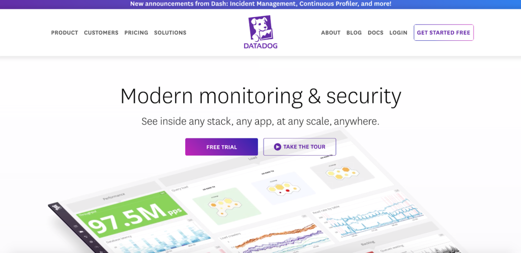
2. Datadog
Let’s start with the obvious.
This landing page from cloud monitoring as a service company, Datadog, has brilliant aesthetics.
The visuals are crisp, clean, and “pop,” and the second I arrived, it instantly grabbed my attention.
That’s massively important because this is what makes leads take a B2B landing page seriously and makes them more receptive to hearing out the message.
Next, Datadog concisely explains the basics of what they do with their header that says, “Modern monitoring & security.”
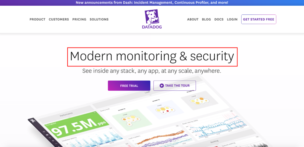
Although first-time visitors won’t know all of the intricate details, they can get a baseline reading of the offer in just a few words.
Brevity is massively important in copywriting, and this is especially true when writing headlines.
“People have short attention spans,” says Eddie Shleyner of HubSpot. “If we’re not interested, we tune out, sometimes within seconds.”
Therefore, “copywriters don’t use two or three words when one will do.”
And brevity is something Datadog uses in its UVP as well where they say, “See inside any stack, any app, at any scale, anywhere.”
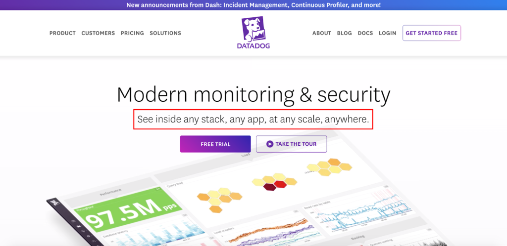
It’s razor-sharp, rolls off the tongue, and lets leads know the value Datadog offers.
They go on to elaborate on the value and fully discuss the benefits further down the landing page, but this helps leads quickly get their bearings, compelling a sizable percentage to explore the content further.
As for the CTAs, they’re clearly presented and placed in an ultra conspicuous location so leads can’t miss them.
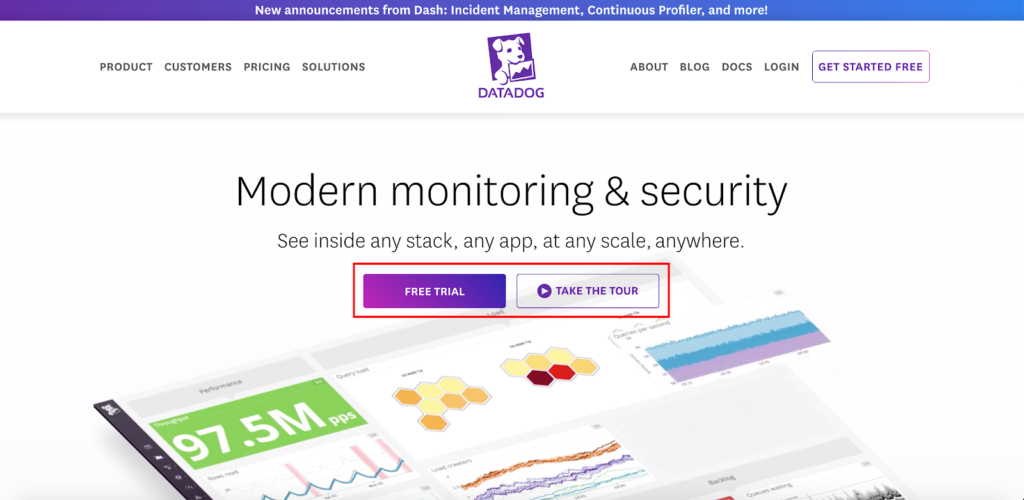
Just like my earlier B2B landing page example from Toast, these CTAs target leads at different stages of the sales funnel.
“Free trial” goes after those at the bottom of the funnel with a strong interest in buying, while “Take the tour” goes after those who are a bit higher up and want to learn more about Datadog.
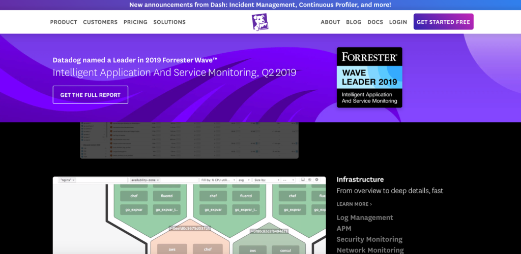
They’ve also got social proof covered, featuring logos from some heavy hitters, including Peloton, Samsung, and Whole Foods.
They even mention that they were named a Leader in 2019 Forrester Wave, which gives Datadog even more credibility.
Leads can even get the full report if they want.
Add all this up, and it’s a very well put together landing page with plenty of juicy takeaways.
3. Miro
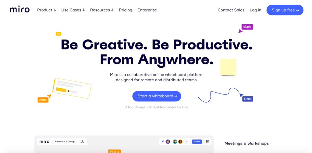
Here’s a B2B company that offers an amazing collaboration whiteboard for modern teams.
Right out of the gate Miro makes it clear what their UVP is with, “Be Creative. Be Productive. From anywhere.”
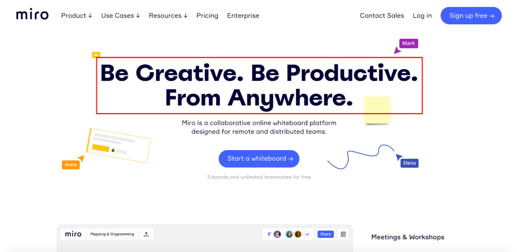
It’s short, it’s punchy, and it lets leads know why they should be interested.
Below that, Miro provides some more detail saying exactly what the product is—“a collaborative online whiteboard platform designed for remote and distributed teams.”
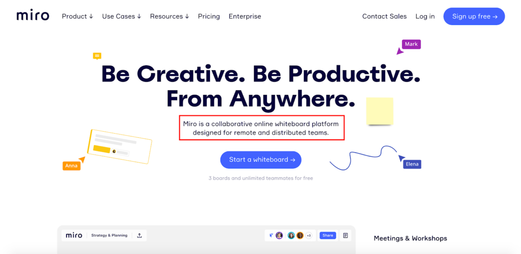
So, at a glance, visitors know what’s going on and why they should care about Miro.
I like the CTA because it’s well designed and dead simple saying, “Start a whiteboard.”
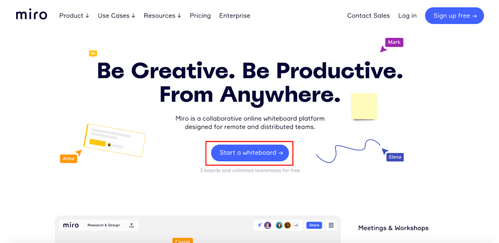
I also like the little snippet Miro places just below that saying, “3 boards and unlimited teammates for free.”
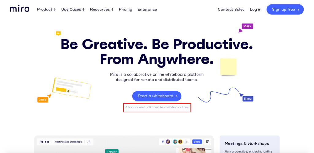
This helps lower peoples’ guards and pique their interest a bit more.
So, with very little copy, Miro accomplishes a lot above-the-fold—something that’s essential for motivating leads with limited attention spans to explore further.
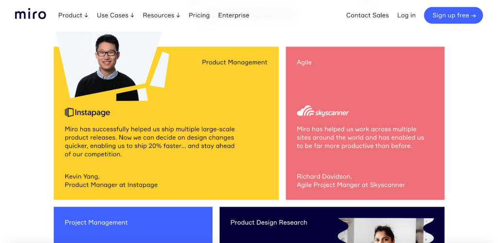
When visitors scroll down, they get an even better feel for how Miro works and see the product in action with these sliding screenshots.
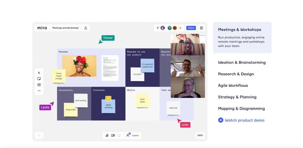
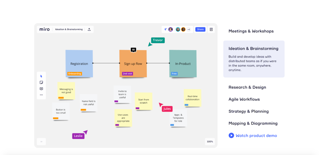
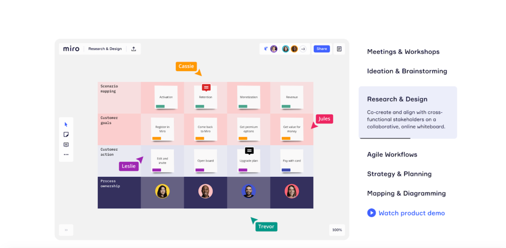
Miro lists off some of their more notable features that leads will be interested in.
They also offer some killer social proof further down, explaining that 9 million+ users trust their product worldwide…
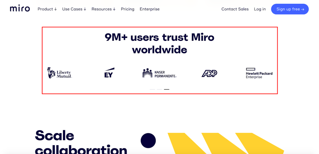
…and provide compelling testimonials.
This way everything ties together fluidly and allows leads to effortlessly digest the key points so they can make an informed choice.
4. WeWork

I’m a sucker for simplicity. And few B2B brands keep it more simple, while still creating an amazing visitor experience than WeWork, a company that “provides flexible shared workspaces for technology startups and services for other enterprises.”
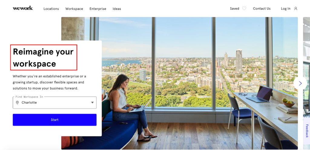
Here’s why it works. First, the initial image that leads see is absolutely breathtaking.
The ultra-clean, modern office space with a woman working on her laptop against a beautiful city view is definitely eye-catching and sets the right tone.
Next, the main header, “Reimagine your workspace” does a great job at spelling out WeWork’s UVP, which is providing businesses with epic workspaces and using cutting-edge technology to put them ahead of the game.
Next, the copywriting below that does a great job of elaborating further on what WeWork offers and why leads should care.
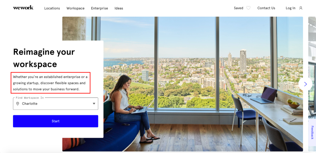
With a single sentence, leads know what’s going on and the benefits they’ll get.
The “Find Workspace In” feature lets leads quickly choose what area they’re in so they can conveniently find workspaces near them.
And the “Start” CTA is super self-explanatory and features a bold purplish-blue color that stands out well from the white background.
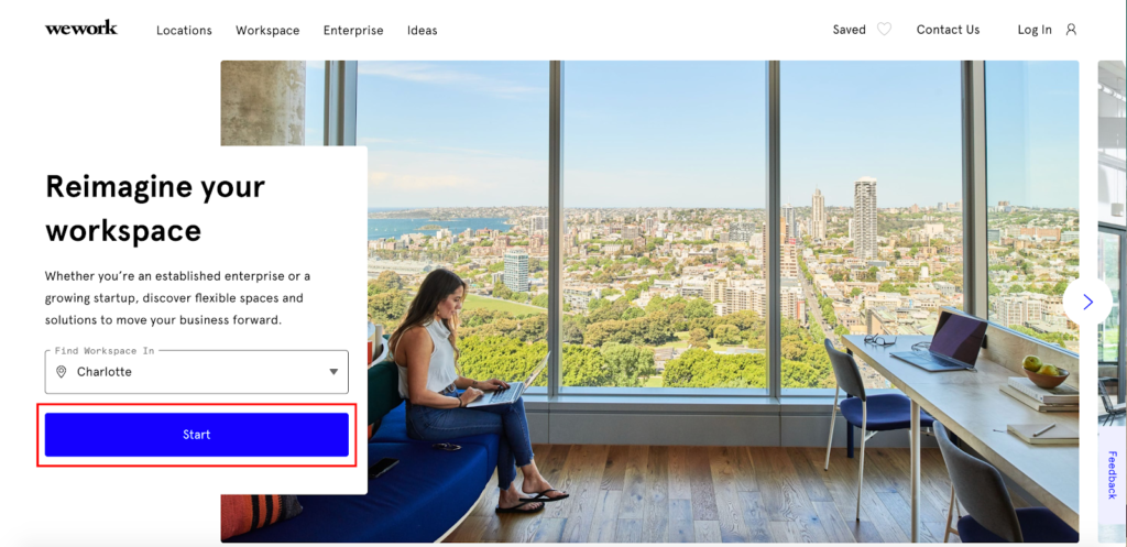
So, without any scrolling and very little thinking, WeWork gets their leads up to speed, conveys their value, and directs them to take action.
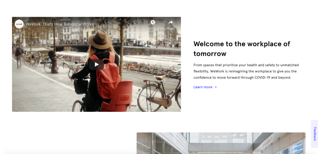
And for the leads that do end up scrolling down further, WeWork continues to create an engaging experience by offering a brief video that specifically addresses the current elephant in the room of safety concerns that many business owners have as we transition into a post-COVID world.
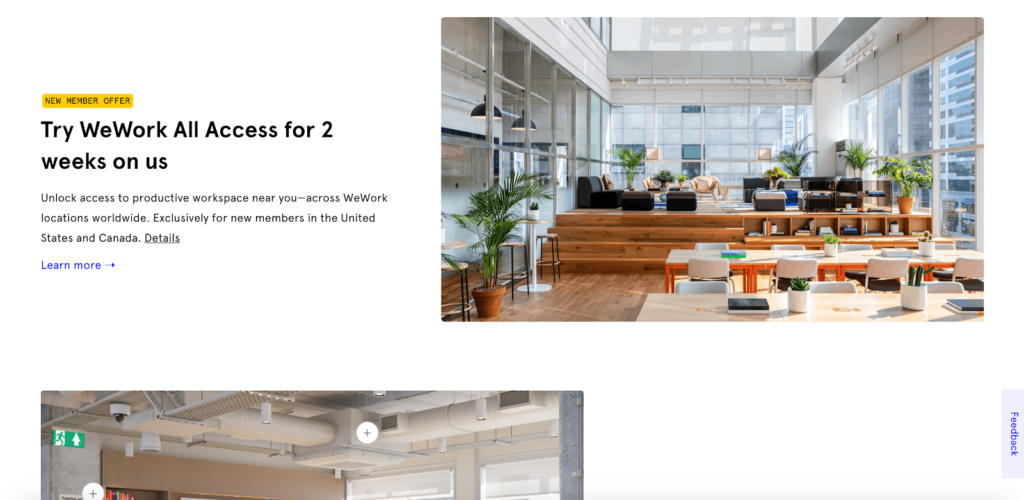
There’s an offer where new users can get two free weeks of WeWork.
And this brand includes some nice social proof, which provides instant authority by associating themselves with the likes of Microsoft, Samsung, Sprint, and Visa.
5. Filevine
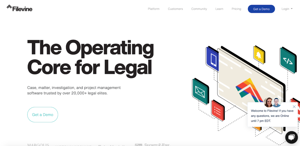
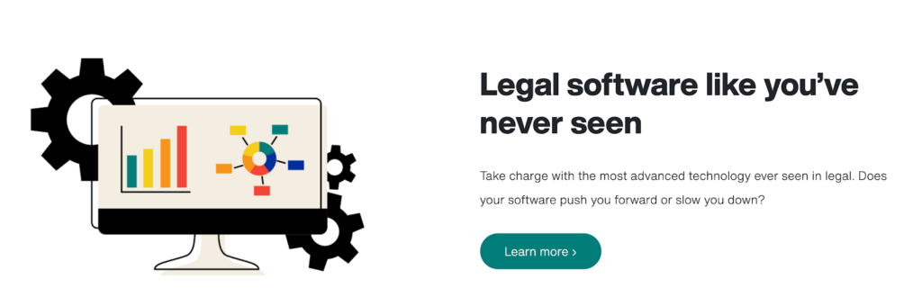
This B2B landing page example comes from Filevine, a case management software product for small to mid-sized law firms.
For starters, it’s got great aesthetics and a rock-solid header that says, “The Operating Core for Legal.”
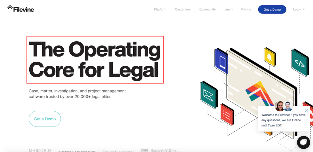
The copy below that succinctly lets leads know exactly what this product is, while also subtly throwing in some nice social proof, letting them know that it’s trusted by over 20,000 legal elites.

With very little effort, leads can figure out what’s going on and why checking out Filevine is worth their time.
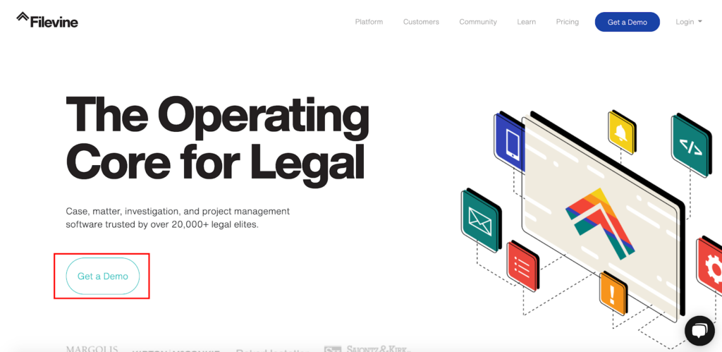
CTA? They’ve got that on lock with the “Get a Demo” button right here.
So, all of the essentials are conspicuously located above-the-fold and well designed to increase engagement.
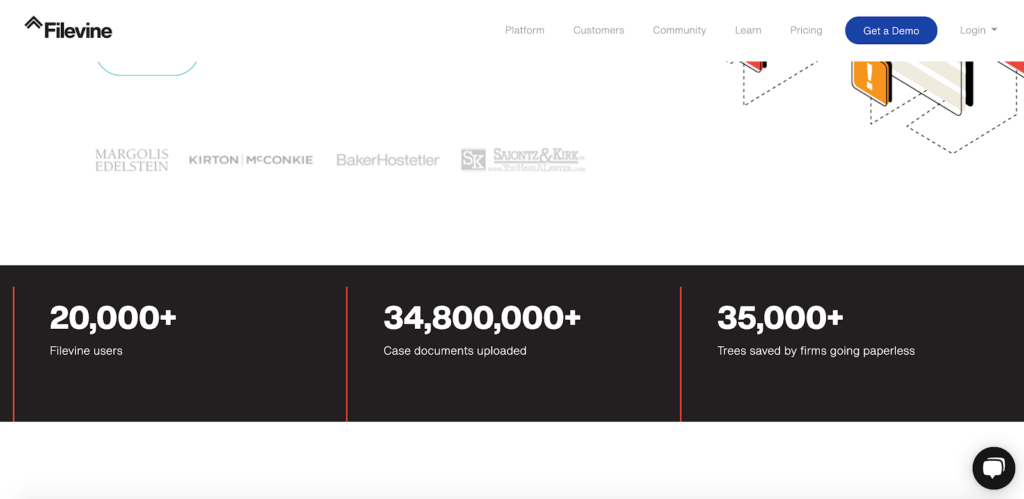
But when leads scroll down a bit further, they come across this social proof section, which really hammers home the popularity of the platform, as well as its environmental impact because lawyers can drastically cut back on their paper consumption by using it.
Scroll down even further, and they get a full rundown on Filevine’s key features, along with more striking visuals.
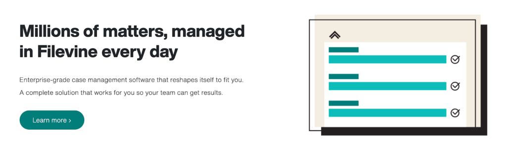
This makes it another fine example of how to present critical information to visitors, generate interest, and persuade them to take action while avoiding extraneous details.
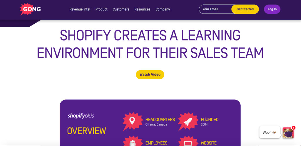
6. Gong.io
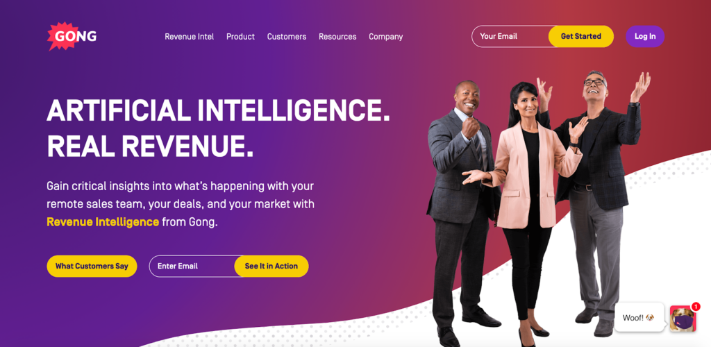
For my final B2B landing page example, there’s this one from revenue intelligence platform Gong.io.
Awesome visuals? Check. A killer main header? Check.

Concise copy that lets leads know what the product offers and why it’s valuable? Check.
Well placed and well designed CTAs? Check.
Solid social proof featuring recognizable brands. Check.
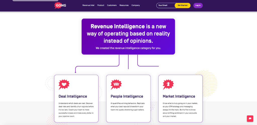
I also love this section that speaks to the value of revenue intelligence and the three different types of intelligence that Gong.io offers.
This landing page fires on all cylinders and truly delivers an electrifying experience that captivates leads.
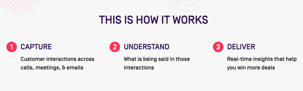
And if that wasn’t enough, they offer a straightforward breakdown of how their product works further down the page…
…along with some quantitative data of the impact it has for companies that use Gong.io.
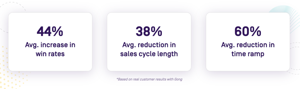
These are legit results based on real customers, which instantly gets most leads to take notice.
I especially like this section featuring highlights of case studies from notable users like Shopify Plus and Genesys.
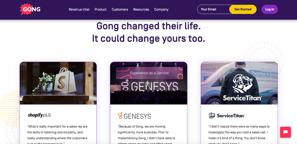
If a lead wants to know more, they can click through to get the full rundown.
I know from experience how potent case studies can be, and they’re something we use to win over Drip customers as well.
And this section toward the bottom cements Gong.io’s legitimacy and is just what it takes to get many leads over the buying hump.
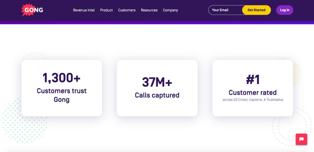
The numbers speak for themselves and should put any doubts to rest.
I’m honestly fanboying over this landing page example, and it serves as a fantastic blueprint to borrow from.
Conclusion
As we’ve just learned, the details of a B2B landing page will vary, but there’s a basic formula in place that all of the great ones follow.
And that is:
- Letting leads know what you’re selling
- Why they should care
- What they need to do next
If you can do that and keep it engaging, you should be in good shape and solid conversions should follow.
The B2B landing page examples listed here all do an amazing job of following this formula and hopefully have given you some inspiration that will help you take your own landing page to the next level.

