

There are a lot of conversion rate optimization (CRO) tips online. And while most touch on copywriting best practices and checkout optimization tips, few, if any, address website popups.
That changes right now.
In this post, I want to do more than share seven CRO tips, and instead, talk about the seven principles that govern how we, at Drip, think about popup conversions in 2020.
You heard it here first, folks. (Competitors, take note.)
Popup Optimization Best Practices
1. Use Popups for More Than Email Collection
4. Make Mobile-Specific Popups
5. Use Real-Time Data as a Trigger
1. Use Popups for More Than Email Collection
It’s no secret that most marketers use website popups with list building. And it makes sense. After all, that’s what website popups are mostly used and known for.
Whenever you find yourself on the side of the majority, however, it is time to pause and reflect. And at Drip, we reflect a lot on how to use website popups for more than they’re intended use.
To use website popups to their full advantage, you must think beyond list building (the old way) and, in addition, use popups to help website visitors.
To do that, though, you must…
2. Create Multiple Popups
As mentioned previously, most marketers use website popups to grow their list and, moreover, show it to all visitors on all pages of their website. The problem, though, is, in doing so, they ignore where each visitor is in the buyer’s journey.
A returning email subscriber sees a popup asking for their email (again). A return buyer sees a popup promoting a product they bought on their first visit. The list goes on.
A better approach, we’ve found, is to make one popup for each stage of the buyer’s journey. That way, you can move each user down your funnel, from a visitor to a subscriber to a buyer and beyond.
The buyer’s journey varies from market to market, of course, so for simplicity, think of the buyer’s journey in three stages:
- First-time visitors. These are visitors that are not on your email list;
- Returning subscribers. These are subscribers that are on your email list; and
- Returning customers. These are subscribers that have bought from you.
For instance, if you’re running an online perfumery, you might want,
(1) First-time visitors to join your email list;
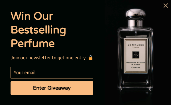
(2) Returning subscribers to make a purchase; and

(3) Returning customers to make a second purchase.
Bottom line: meet users where they are in their journey and use targeted website popups to show them the message that’s needed to move them down to the next stage.
3. Use Multistep Popups
If you’re like most marketers, you want to know as much as possible about your subscribers.
After all, the more information you have, beyond a name and an email address, the easier it is to send better, more personalized emails, and therefore, drive more clicks and conversions.
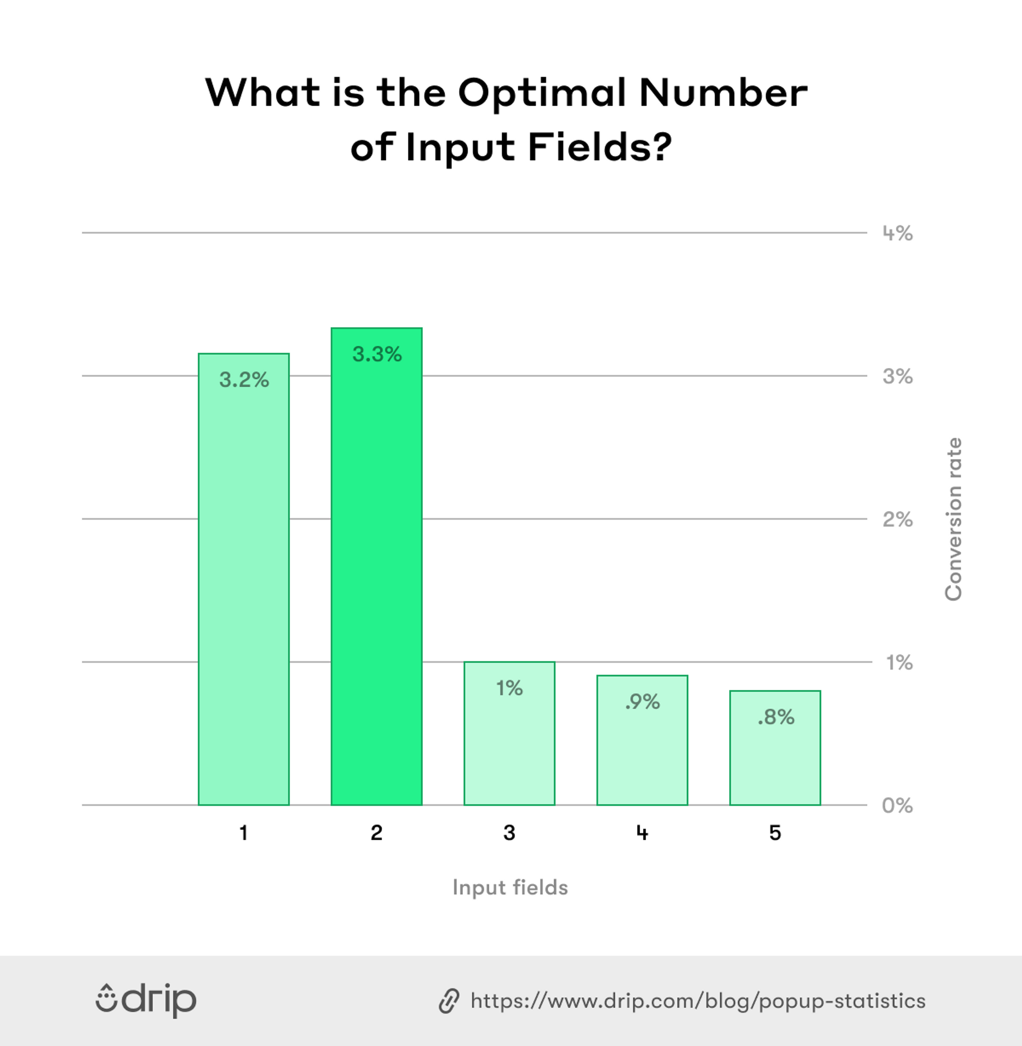
The problem, though, is additional fields add friction… and friction means fewer optins and fewer conversions.
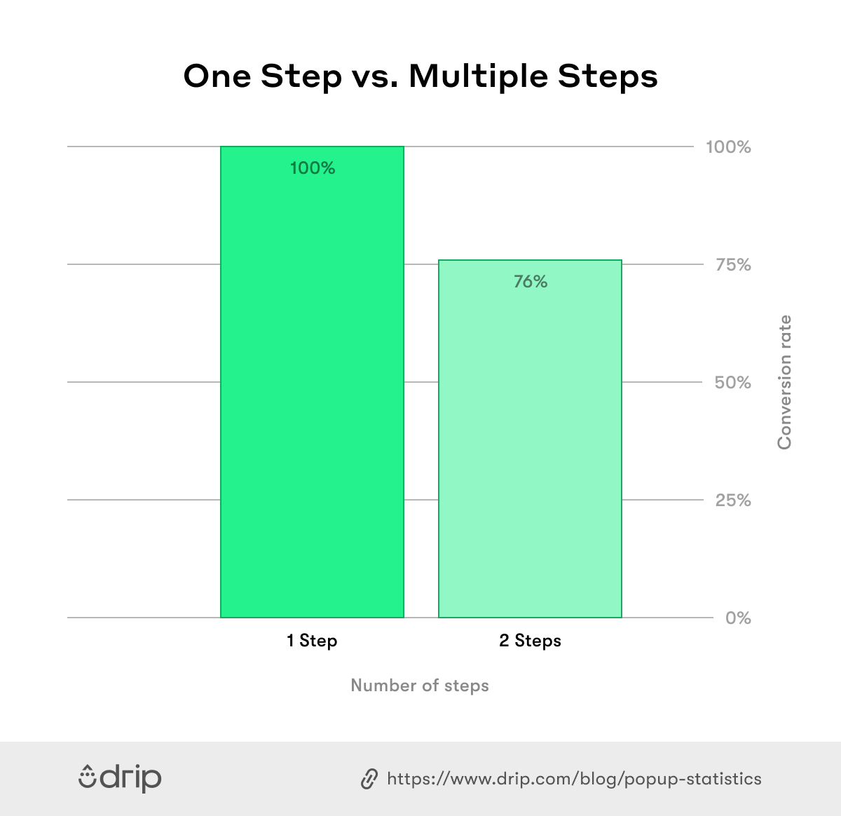
We found from our research that popups with two input fields convert better than popups with three input fields by a whopping 206.48 percent.
So, does that mean that lead enrichment and high conversions need to be mutually exclusive? The answer, if it weren’t obvious, is a no—if you’re using multistep popups.
If you’re unfamiliar, multistep popups are email popups that capture the visitor’s email in the first step (or form), and then collect more information in the following steps such as gender, preferences and more.
The best part is, popups with a second step see a staggering 76 percent of its subscribers input more details.
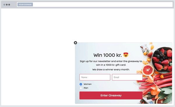
One online retailer that uses multistep popups is Apuls. In one recent campaign, the brand ran a competition where they offered a chance to win a gift card worth 1,000 DKK (around $146).
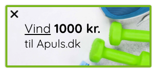
After clicking the teaser, Apuls asked for a name, email address, and gender.
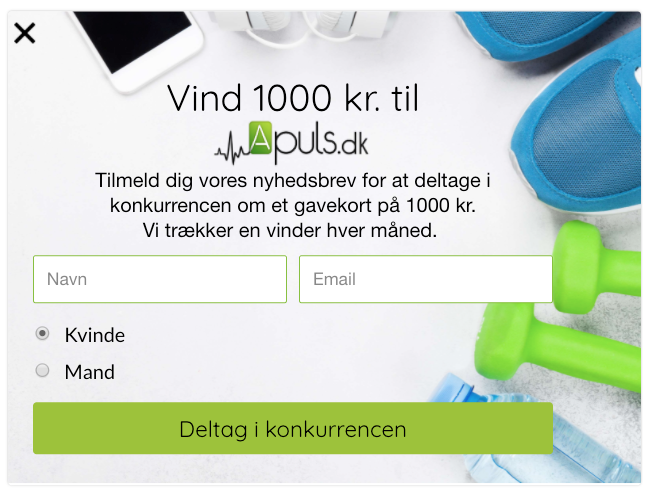
But here’s where it gets interesting. In the second step, Apuls asked for the visitor’s category preferences, such as cycling, fitness, and more.
With that information, they could then send targeted emails based on the subscriber’s interests, thus increasing the likelihood of them becoming a buyer.
So effective are multistep popups, that we’re using them on our blog, which you can see by clicking the teaser on the bottom left-hand side of the screen (or bottom of the screen if you’re reading on mobile).
4. Make Mobile-Specific Popups (But Not for That Reason)
Marketers know mobile browsing has overtaken desktop, so it makes sense to want to convert as much of that traffic as possible into leads, using a website popup (provided it doesn’t hurt the user experience).
But there’s another reason to show mobile-specific popup, and that’s to change the popup’s call-to-action (CTA) due to having device-specific goals.
Let me explain with some examples. Suppose you manage an online retailer and want to get more email subscribers. On desktop, you might do that by using an exit-intent popup.

On mobile, however, you might want to avoid intruding on visitors with an exit-intent popup and ask them to follow you on Instagram instead.

Or, let’s imagine you’re a SaaS, like Drip. On desktop, you might ask new website visitors to start a free trial, whereas, on mobile, you might want visitors to book a demo instead. Why? Because your software might not be mobile-friendly, and asking for free trials on mobile would create a poor user experience.
There’s more to optimizing mobile conversions than adding a website popup. Conversions matter, of course. But what happens after is more important.
5. Use Real-Time Data as a Trigger
If you’re using website popups, you might have encountered a common challenge: knowing when to show your popup(s).
While it’s easy to default to a timed or scroll trigger, the best trigger, in our experience, is to show a popup based on a visitor’s real-time behavior, such as:
- Watching a video;
- Adding an item to their cart;
- Exceeding a predetermined basket size;
- Visiting a certain category page;
- and more.
The best part is, if you use Google Tag Manager, you can customize a trigger based on any Data Layer on your website.
Let me share an example from our blog.
We know from split testing that the optimal time to show our slide-in popup is when a reader has scrolled 30 percent of a page. To make our popup more personalized, though, we made author-specific campaigns.
If you read a post from me, versus Seray, you’ll see my avatar in the top right-hand corner of the campaign.
You don’t have to go to this length, of course, but it is a nice reminder that triggers can be just as personalized as popups.
6. Use a Nice Design (Or Don’t)
Front-end developer and musician Brian Reed once said, “Everything is designed. Few things are designed well.” No truer is this than with popups.
Most are, to put it mildly, forgettable, and leave little to be desired. But with thousands of sites competing for attention online, that’s only a good thing, because it means there’s a better chance of standing out.
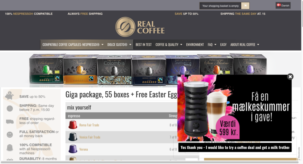
One brand that does that is Real Coffee, an online retailer that specializes in affordable coffee capsules for coffee aficionados.
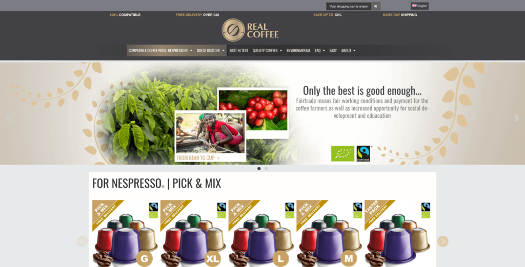
If you visit one of its product pages, you immediately notice a beautifully-designed teaser offering the chance to “get a free milk frother as a gift.”
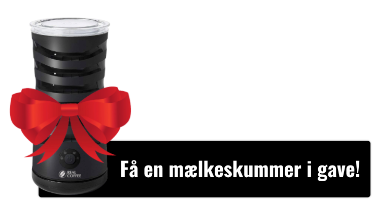
When you click the teaser, the form appears, and Real Coffee invites you to learn more about its offer:
While it’s nice to have a popup with all the bells and whistles, a minimalist design can convert just as well, if not better, than a well-designed popup.
On my personal website, for instance, I have a basic slide-in popup asking for the visitor’s email.
 Yet, despite its simplicity, that one popup has netted me more than 11,508 email subscribers.
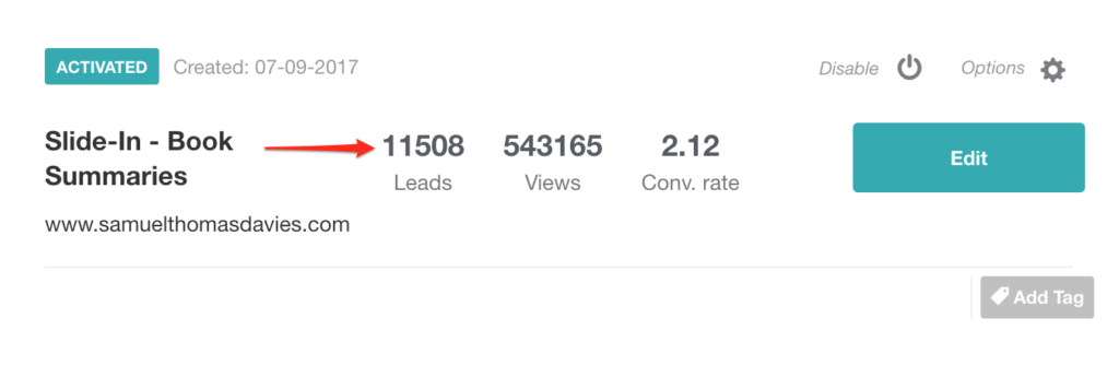
To summarize, then, you can and should use a nice popup design—if you have the means to do so. Using a floating image, as Real Coffee does, can differentiate your popup from your competitors’.
If you’re not a designer, however, there’s no harm in opting for a simplistic design, provided, of course, you follow the most important best practice of all…
7. Write Better Popup Copy
If there’s one thing we hate at Drip, it’s ugly, intrusive popups. But if there’s anything we hate more, it’s ugly intrusive popups that ignore copywriting best practices.
Oftentimes, these are popups with little creative flair (“Join our free newsletter!”), few sign-up benefits (“Get weekly updates!”), or move visitors to action.
One brand that differentiates itself with its popup copy is Topshop.
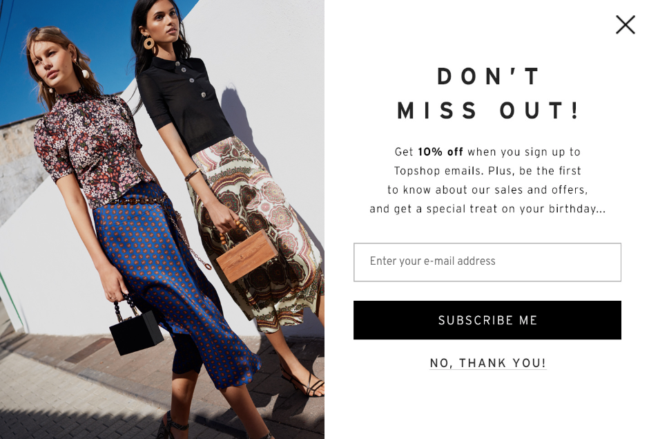
At first, it looks like a normal fashion popup, complete with an offer for 10 percent off a future purchase. But upon closer inspection, it promises “a special treat on your birthday…”
And boy did Topshop deliver.
Five months after opting in, I got a celebratory email wishing me a happy birthday.

When I scrolled to the bottom, the brand offered me a 20 percent discount off my next order, ten percent more than promised in the popup’s copy five months earlier.
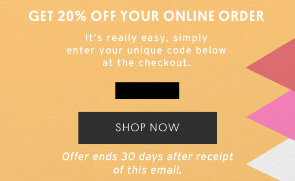
Not only did Topshop masterfully close a curiosity gap they opened (as much as 364 days earlier), but it did so on the one day people are most likely to splurge on themselves: their birthday.
Learning how to write good popup copy goes beyond the scope of this article. But for now, I recommend reading my articles on persuasive copywriting techniques and, of course, popup copywriting tips.
Conclusion
There’s more to popup CRO than using power words or removing input fields. To maximize popup conversions, you must consider the buyer’s journey, user to user, from beginning to end.
If you do that and continue to improve with each iteration, over time, you will turn more visitors into subscribers and, above all, turn subscribers into buyers and more.

