
Website popups are a marketer’s best friend, allowing us to capture leads and target them with conversion-oriented messaging.
Figures show the average email popup converts three percent of website visitors, rising to a whopping 60 percent or more.
In other words, if your site attracts 10,000 people monthly and you run a top-performing email popup campaign, you can expect to capture over 3,000 email addresses a month.
Just think what you could do with all that juicy data.
Of course, not all website popups are that effective. I’ve seen my share of popups and some of them are just plain bad—they’re generic, they look hideous, and they interrupt the user journey.
What separates the best popups from the rest? Personalization.
A personalized popup reaches the prospective customer at exactly the right time, understands their preferences, and serves them with an offer or recommendation that’s simply too good to ignore.
They also play into consumer preferences, with research from McKinsey & Company revealing that:
- 71 percent of consumers expect companies to deliver personalized interactions
- 76 percent feel frustrated when their experiences aren’t personalized
Fortunately, Drip makes it simple for marketers to craft personalized popups based on real-time visitor data.
Our tools unlock practically infinite popup personalization opportunities. But because I don’t have practically infinite space or time to write this article, I’ve rounded up seven of my favorite personalized popup examples for your enjoyment and inspiration:
Top 7 Personalized Popup Examples
- 1. Show Off New Products to Returning Customers
- 2. Add “Similar Product” Popups to Sold-Out Pages
- 3. Share USPs With New Customers
- 4. Reduce Cart Abandonments With Free Shipping Popups
- 5. Promote an Incentive-Based Upsell
- 6. Cross-Sell By Highlighting Complementary Products
- 7. Build Personalized Multi-Step Popups
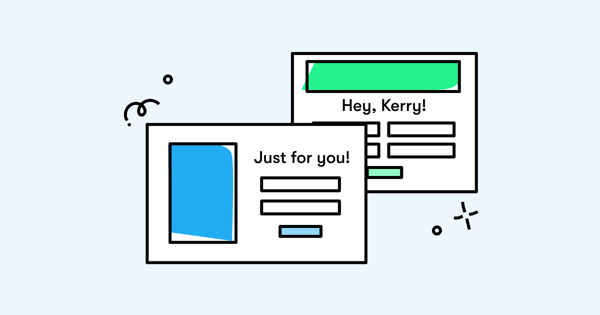
Show Off New Products to Returning Customers
Unless you exclusively sell high-ticket, long-lifespan products—like mattresses or couches—returning customers will be an extremely valuable audience for your ecommerce site.
When a shopper returns to your website after making their first purchase, they’re well on their way to becoming a loyal customer.
And loyal customers are an absolute goldmine of opportunities. They’ll buy from you repeatedly; convert at a higher rate; tell friends and family about your products; and 56 percent will even choose you over a cheaper alternative.
But there are no guarantees in marketing.
Just because someone has bought from you before, that doesn’t mean they’ll do it again. There are plenty of other retailers who’d love to steal them away from you.
If you’re going to drive repeat purchases from returning customers, it’s in your best interests to point them toward your best and brightest products.
One tactic is to target them with a personalized popup that:
- Welcomes them back to your ecommerce store
- Showcases your latest product arrivals
 With this popup, you’re effectively telling customers: “We value your business—and we’re excited for you to see our new collection.”
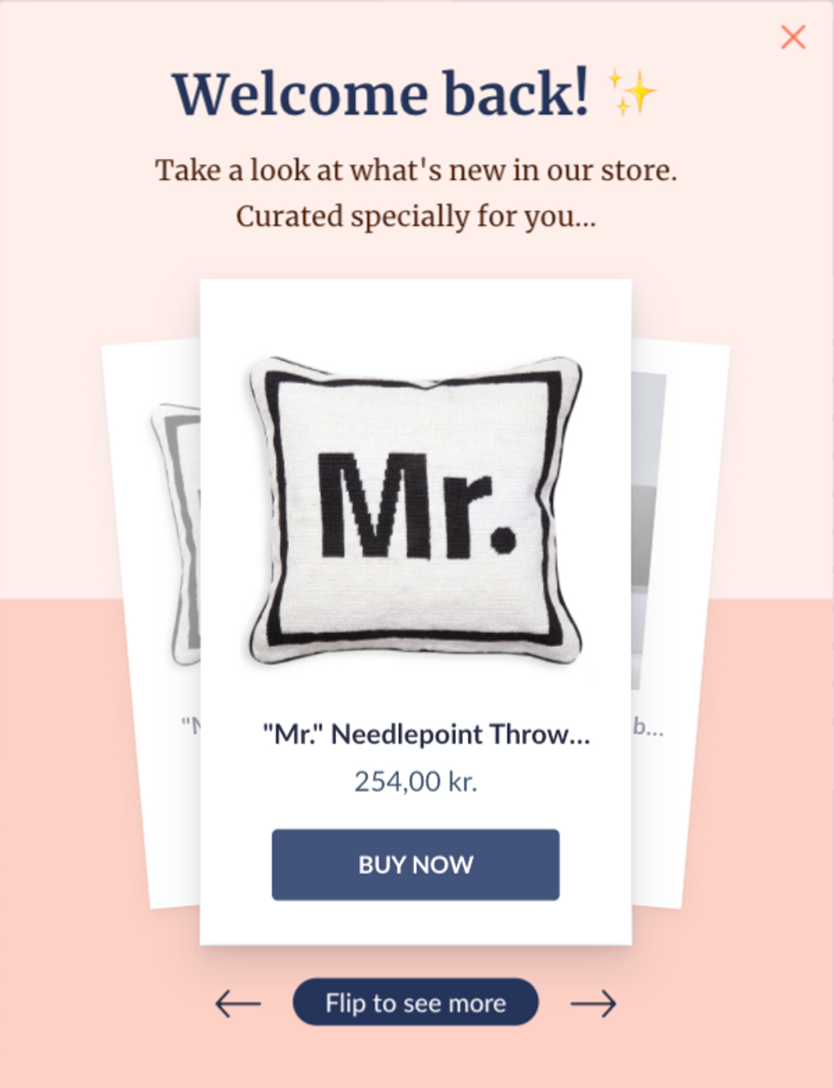
Add “Similar Product” Popups to Sold-Out Pages
You’ve persuaded a potential customer to visit your website.
They’ve clicked around and found a product they love. They’re about to add to cart—only to realize it’s out of stock.
Stockouts are annoying for consumers—but they’re a nightmare for retailers. You’re not just losing a single sale; you’re potentially missing out on a whole lifetime of future revenue.
A 2021 survey from McKinsey revealed that just 13 percent of shoppers who experience out-of-stock products will wait around for the item to return, with 32 percent saying they’d buy it from another retailer instead.
I know what you’re thinking: “If a product’s out of stock, can’t I just remove or hide it?”
Maybe. But if you’ve got thousands of items in your ecommerce store, each with multiple colorways or other variations, it becomes a little more complicated.
But it’s not all bad news: two-fifths of respondents to McKinsey’s survey revealed they would switch to a different brand or product if the item they originally wanted was out of stock.
That’s why you should add a related product popup to any out-of-stock product pages:
 If you can point the disappointed customer in the direction of a similar, in-stock product, you’ve got a fighting chance of retaining their business.
Share USPs With New Customers
Of course, not all your marketing efforts will be geared toward existing customers. If you’re going to hit your growth goals, you’re going to need to attract and convert plenty of new customers too.
That can be easier said than done. Generally speaking, new customers convert at a lower rate than returning ones.
Research from Episerver revealed that 92 percent of consumers visit a brand’s website for the first time for reasons other than buying. Instead:
- 45 percent are searching for a product or service
- One-quarter are comparing prices or other variables
- More than one in 10 are looking for store details
So should you just accept that first-time visitors are unlikely to convert? Or target them with messaging that moves them along the path to purchase?
I don’t know about you, but I prefer option #2.
One approach is to create a personalized popup that only displays to first-time website visitors and showcases your most attractive USPs:
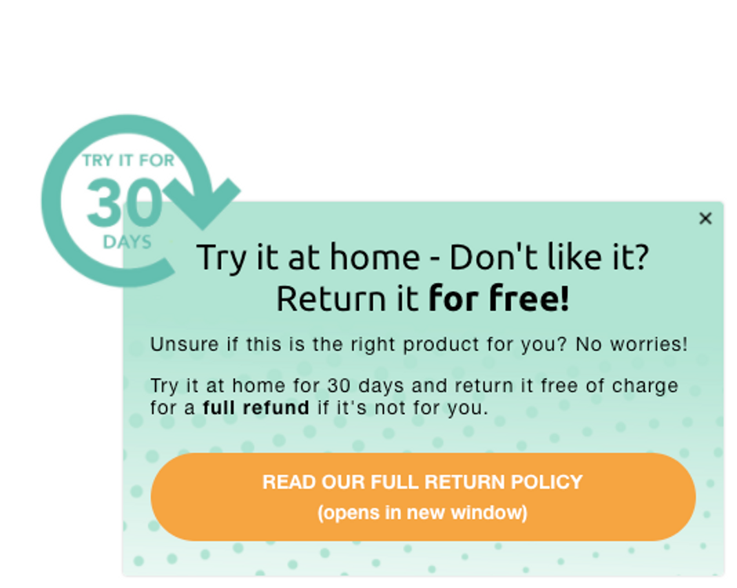 Naturally, you’ll have to decide which USPs to include in your popup.
But I like the above example because it removes a potential barrier to purchase: if the new customer in question doesn’t like their purchase, they can try it out at home for 30 days and get a full refund, free of charge.
Given that cart abandonment can happen because customers feel the returns policy is unsatisfactory, it’s easy to imagine this popup resonating with new website visitors.
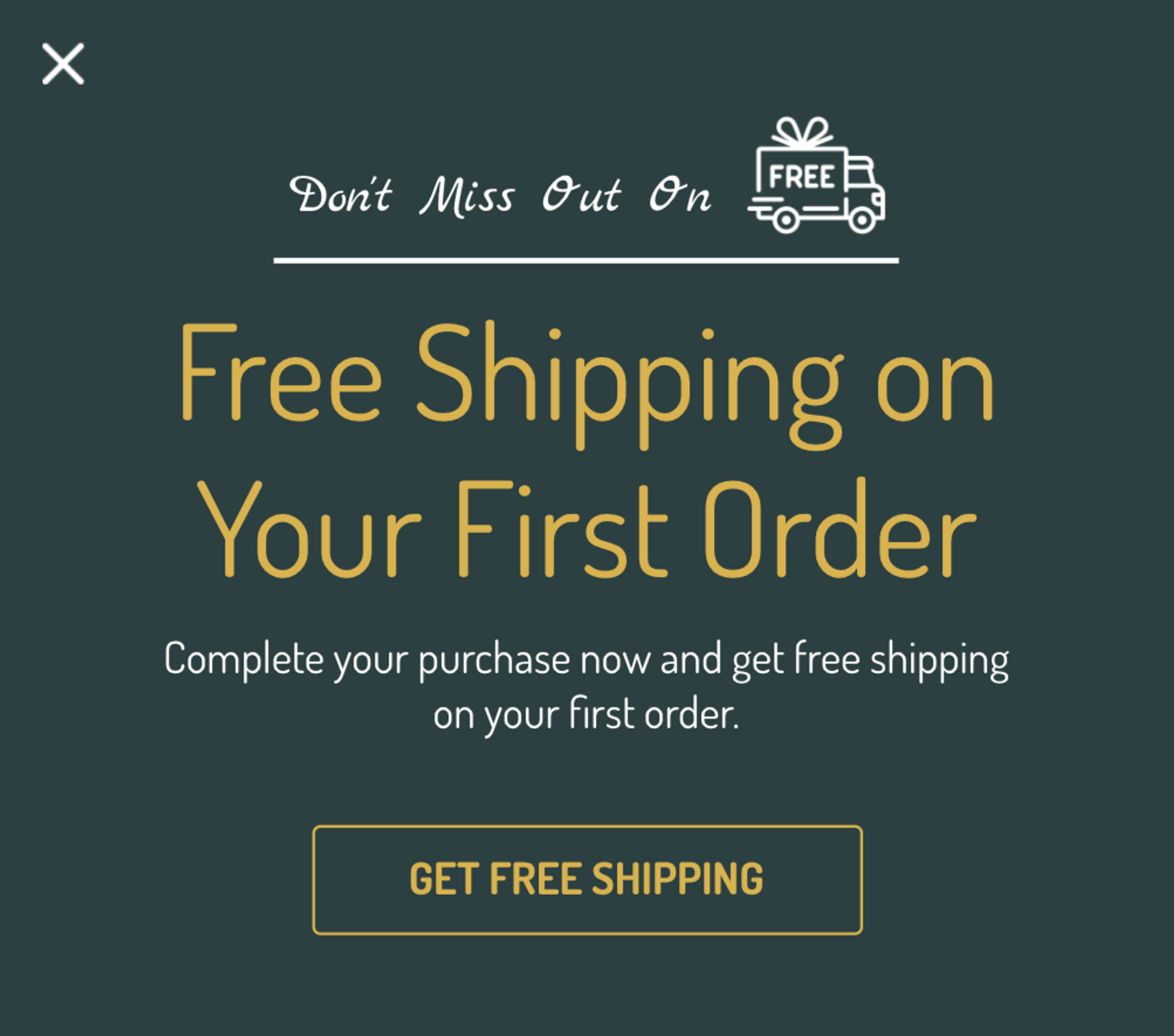
Reduce Cart Abandonments With Free Shipping Popups
Let’s stick with cart abandonments, because they’re another major headache for online retailers.
According to the Baymard Institute, almost 70 percent of all shopping carts end up being abandoned. Sure, some of those customers might go on the convert at a later point. But a lot will simply bounce, never to be seen again.
What’s going on here? Are consumers playing games with you? Do they just love the act of clicking “add to cart”?
Actually, there are a whole lot of reasons why potential customers might drop out during the checkout process. And, according to X Delivery, some of the most common causes are related to shipping:
- 28 percent of cart abandoners needed the product faster than the delivery date for standard/free delivery, and weren’t prepared to pay a premium for expedited shipping.
- 27 percent ditched their carts because the retailer didn’t offer free shipping and the standard shipping was too high.
- 26 percent needed the product immediately, but the website didn’t offer same-day delivery or in-store pickup.
This tells me two things.
Firstly, you should absolutely use personalized popups to target customers who are “in the act” of abandoning their shopping carts.
And secondly, you should offer free shipping in your abandoned cart popup.
 Still not convinced? Here’s one more statistic for you:
Free shipping offers are far more effective at driving conversions than price-related discounts.
That’s right. According to Retention Science, conversion rates for free shipping promotions range from 0.22 percent – 1.9 percent, compared to just 0.1 percent – 0.8 percent for “percentage-off” discounts.
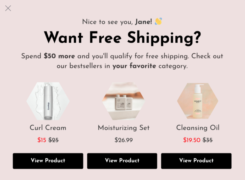
Promote an Incentive-Based Upsell
So free shipping-based offers are an impactful way to reduce cart abandonments.
That’s all well and good. But wouldn’t it be just peachy if you could leverage consumers’ love of free shipping to drive upsells too?
Turns out, you can—and personalized popups can make it happen.
Before I dig into best practices for free shipping-based upselling, let’s discuss how not to do it.
Imagine you’ve just arrived on a category page. At this stage, there’s nothing in your shopping cart. Yet you’re instantly served with a popup that says something like: “Spend $100 more to qualify for free shipping.”
Spend $100 more? You haven’t spent anything yet—you’ve barely had the opportunity to look around.
Spammy tactics like this give popups a bad name. At best, they interrupt the buyer’s journey; at worst, they make you look pushy and desperate.
That messaging feels a lot more compelling if you’ve already added an item or two to your cart and are approaching the free shipping threshold.
Better still, personalize it further by suggesting products that align with the customer’s previous browsing or buying habits:
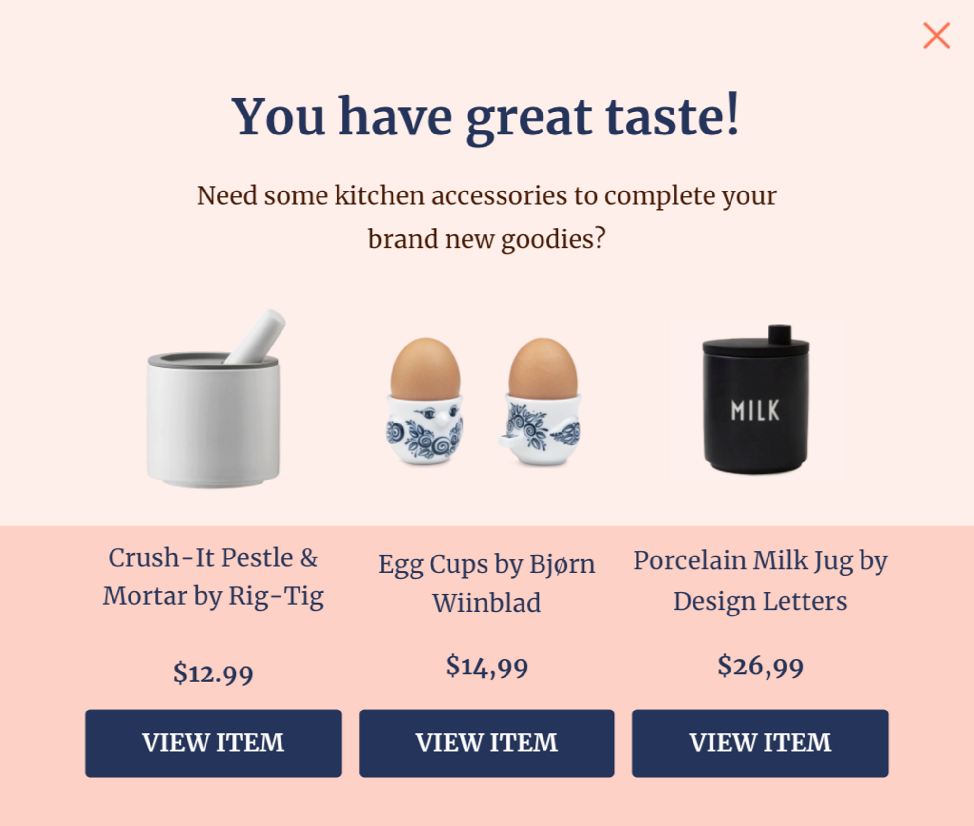
Cross-Sell By Highlighting Complementary Products
Upselling is one way to increase revenue without having to generate more site traffic.
Another approach is cross-selling—adding to an existing sale by recommending one or more complementary products. Done well, it can have a powerful impact on your bottom line, with research from McKinsey revealing that cross-selling and category-penetration strategies boost sales by 20 percent and profits by 30 percent.
As with any type of popup, the key to this approach lies in targeting customers with the right messaging at the right moment.
You don’t want to derail the path to purchase by hitting them with a cross-sell popup before they’ve added-to-cart.
And you definitely don’t want to interrupt them while they’re midway through the checkout process. Remember, the shopping cart abandonment rate is almost 70 percent, so your sole focus at this stage is to convert them as quickly and painlessly as possible.
Instead, wait until they’ve completed the transaction, then serve them with a personalized popup featuring relevant, related products:
Build Personalized Multi-Step Popups
You’ve probably heard that adding lots of input fields to a website popup will torpedo your conversion rate.
Our data definitely backs this up. We analyzed one million popup views, filtered out those with 2,000 views or fewer, and segmented average conversion rates by the number of form fields:
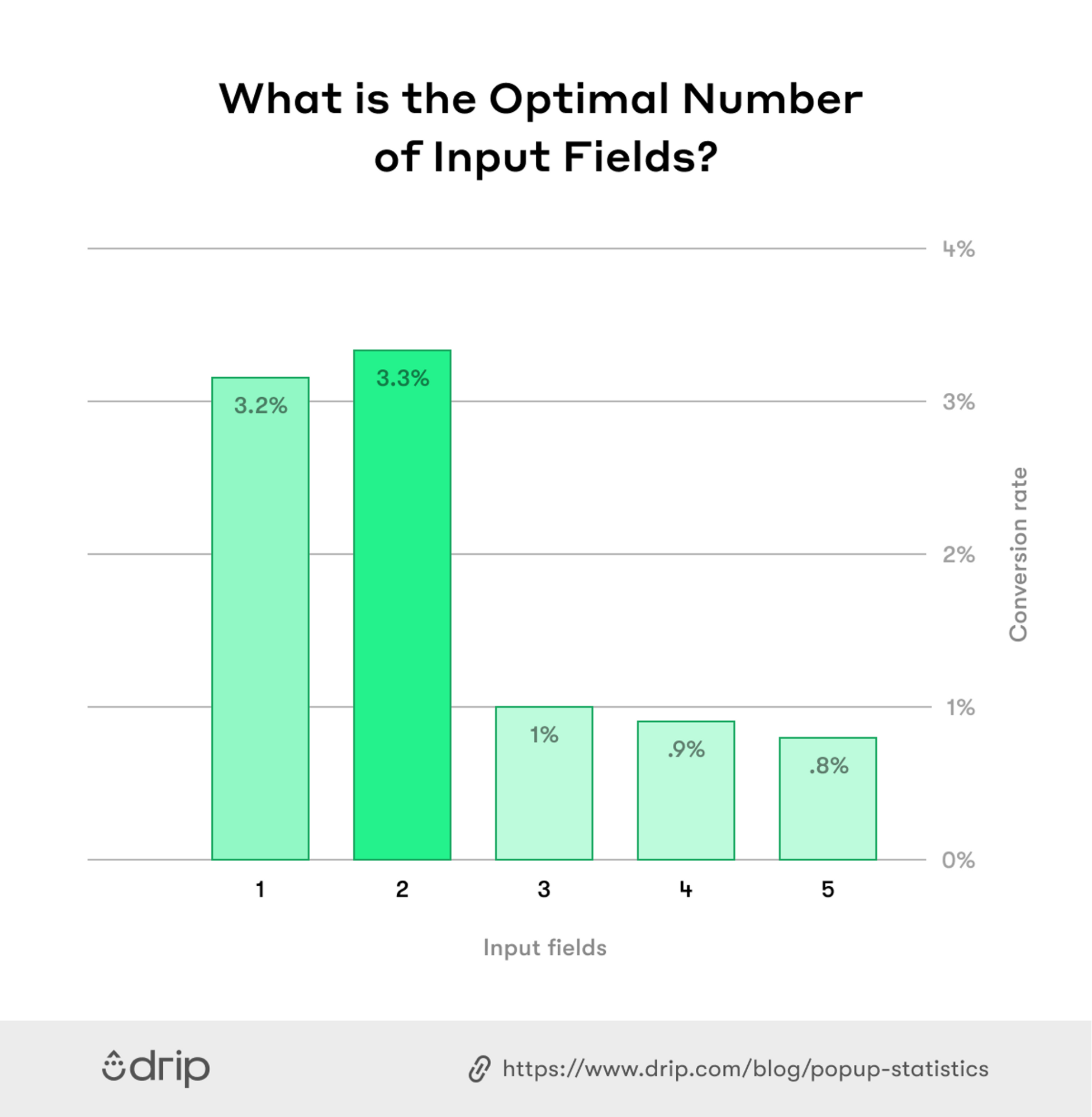 So there you have it. One and two-field forms convert at a similar rate. But conversion rates drop off a cliff if you add a third input field (and fall even lower if there’s a fourth or fifth field).
That’s a shame, because it only allows you to capture the most basic customer data—most likely name and email address.
But wait: there’s a twist to the tale.
Sure, website visitors don’t like popups packed with lots of fields.
But our research also found that when a popup has multiple steps, three-quarters of leads who complete the first step will input more information in the second step.
Let’s consider how that might look.
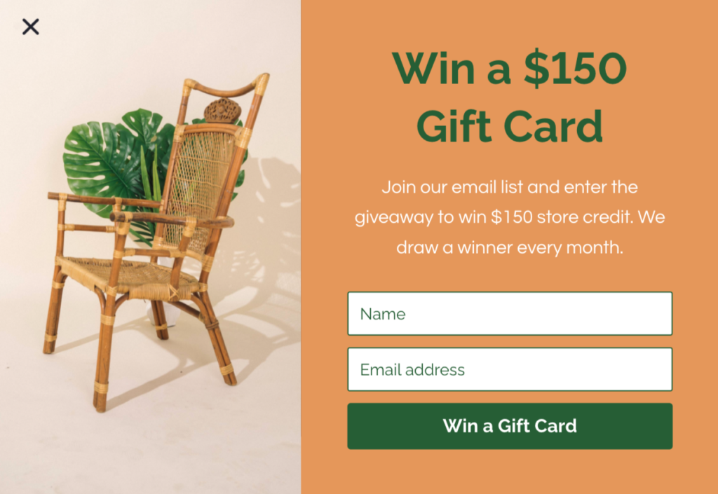
You could have a popup that asks visitors for their name and email…
…followed by a second step that asks for their product preferences:
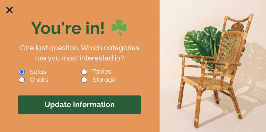
Why does any of this matter?
Because it allows you to immediately serve them with a popup directing them to your most relevant products, based on the preferences they just gave you.
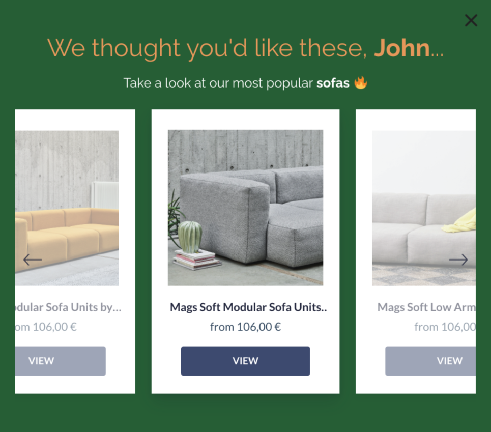
How’s that for a personalized shopping experience?
Boost Conversions With Personalized Popups From Drip
Understanding the most effective types of personalized popups to drive sales and revenue is only one part of the puzzle.
Having the technical skills to build and implement dynamic, engaging, on-brand popups is a whole other challenge.
But there’s a simple solution: Drip.
Start out with our pre-built popup templates then customize to your heart’s content—buttons, fonts, colors, and styles.
Choose who you target, when, and with what messaging. Want to engage a customer who hasn’t purchased in a while? Hide signup forms from loyal customers? Target new visitors with an exclusive offer for first-time buyers? Drip makes it easy.
Find out for yourself by signing up for your 14-day free trial today.

